ivwilsoniv
- Aurora, IL
Looks like our graphic design team has no idea where the "I" is supposed to be positioned either...

Or what kind of helmet both teams use.Looks like our graphic design team has no idea where the "I" is supposed to be positioned either...
View attachment 4911
Love those. Very disappointed we didn't have some form of these for the Michigan gameIf we're going to stick with the simple, somewhat throwback, jersey design, I really think this is the way to go with the helmets. Use the Butkus-era design, and add theon the back of the helmet like Oregon does with their O. (Excuse the very amateur graphic design).View attachment 4994
View attachment 4995
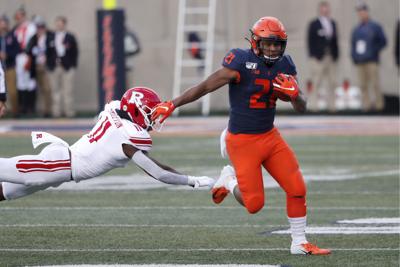
I thought the uniforms looked bad against Rutgers. The orange looks a lot brighter than I remember it in this O/B/O Combo.
I thought the uniforms looked bad against Rutgers. The orange looks a lot brighter than I remember it in this O/B/O Combo.

I don't see us leaving Nike, or a change to someone else being a huge improvement on what you don't like with Nike currently. UA isn't as great as people want to make them out to be, and I'm a hard pass on Addidas. I would be curious about Jordan Brand and if that would create any waves in Chicago for the obvious reasons. But I would assume Jordan brand will come with the same color formats as Nike. Win more games, and we will be more important to Nike.I agree, they don't look good. I'm hoping that we are looking at options other than NIke for the next sponsorship (current runs through 2025/26). Don't like their color palette, designs or where we fall in their pecking order. Let's look at options where we can be more of a priority for the supplier and be somewhat different from everyone else.
I thought the uniforms looked bad against Rutgers. The orange looks a lot brighter than I remember it in this O/B/O Combo.
I don't see us leaving Nike, or a change to someone else being a huge improvement on what you don't like with Nike currently. UA isn't as great as people want to make them out to be, and I'm a hard pass on Addidas. I would be curious about Jordan Brand and if that would create any waves in Chicago for the obvious reasons. But I would assume Jordan brand will come with the same color formats as Nike. Win more games, and we will be more important to Nike.
I don't see us leaving Nike, or a change to someone else being a huge improvement on what you don't like with Nike currently. UA isn't as great as people want to make them out to be, and I'm a hard pass on Addidas. I would be curious about Jordan Brand and if that would create any waves in Chicago for the obvious reasons. But I would assume Jordan brand will come with the same color formats as Nike. Win more games, and we will be more important to Nike.
I think every single component of our new uniforms is substantially darker than our pre-rebrand look.
Agree to disagree I suppose. I like the current ones miles better. So much cleaner.The only thing wrong with those uniforms was the slant ILLINOIS. The perfect shade of orange (the current version is too dark and too red), great striping, white numbers, white facemask. Replace that helmet decal with anything -- block I, arched ILLINI, nothing, whatever -- and you have a permanent classic.
Why the pass on Adidas? I don't think they're any worse than Nike, just got caught with their hand in the cookie jar and Knight's boys didn't.
We rarely seem to be treated like a favorite child of Nike's, but a switch to adidas is not the way to go. The quality of the product is worse and their design team is terrible. I could attach a thousand pictures as an example, but I'll just post the link to this article as my exhibits A-Z of why I don't want adidas designing Illinois' uniforms.
https://www.sbnation.com/college-fo...-notre-dame-nebraska-ucla-why-why-why-why-why
If we bail on Nike, Under Armour should be the only alternative. They do a much better job of meaningful uniform and alternate designs. But they also are facing logistics issues that may not make them an ideal partner.
IMO, Nike is the ideal partner for the future. But Illinois should try to gain a little negotiating leverage by threatening to leave, so that we can be treated as a higher priority.
Honest question; Do we not have a say in the uniforms they design? Shouldn't someone say hey these suck. Bring us back something original
I am not saying I hate the current unis, always been a supporter of the grey ghost (even more now considering the nostalgia of the Wisconsin game). Yes I would REALLY love an updated style of the Butkus era stars, and I wasn't even alive when he was rocking the ILL. I am really wondering though if Whitman can say, hey these are Syracuse's old uniforms, do better.I like these uniforms. I didn’t care for the ones from the 90’s. I also like the variety of helmets. Gray uniforms. White helmets. More choice. To be honest I used to feel like you. I wanted uniforms from the 60’s and 70’s back because that was when I first started watching Illini.
I thought the uniforms looked bad against Rutgers. The orange looks a lot brighter than I remember it in this O/B/O Combo.
Took my buddy to his first Illinois game vs Rutgers. As soon as the IL players come out, he looks at the video board and says whats up with the red pants?I like the new uniforms , especially the OBO Combo - but they did look significantly brighter on TV than they do in Pictures. They looked like they were glowing
Took my buddy to his first Illinois game vs Rutgers. As soon as the IL players come out, he looks at the video board and says whats up with the red pants?
Huh?
I think every single component of our new uniforms is substantially darker than our pre-rebrand look.
I like the new uniforms , especially the OBO Combo - but they did look significantly brighter on TV than they do in Pictures. They looked like they were glowing