You are using an out of date browser. It may not display this or other websites correctly.
You should upgrade or use an alternative browser.
You should upgrade or use an alternative browser.
Basketball Uniforms
- Status
- Not open for further replies.
Illini BasketballVerified account @IlliniMBB 3m3 minutes ago
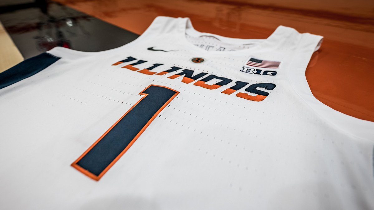
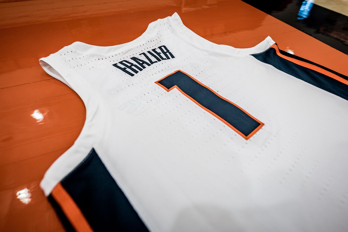
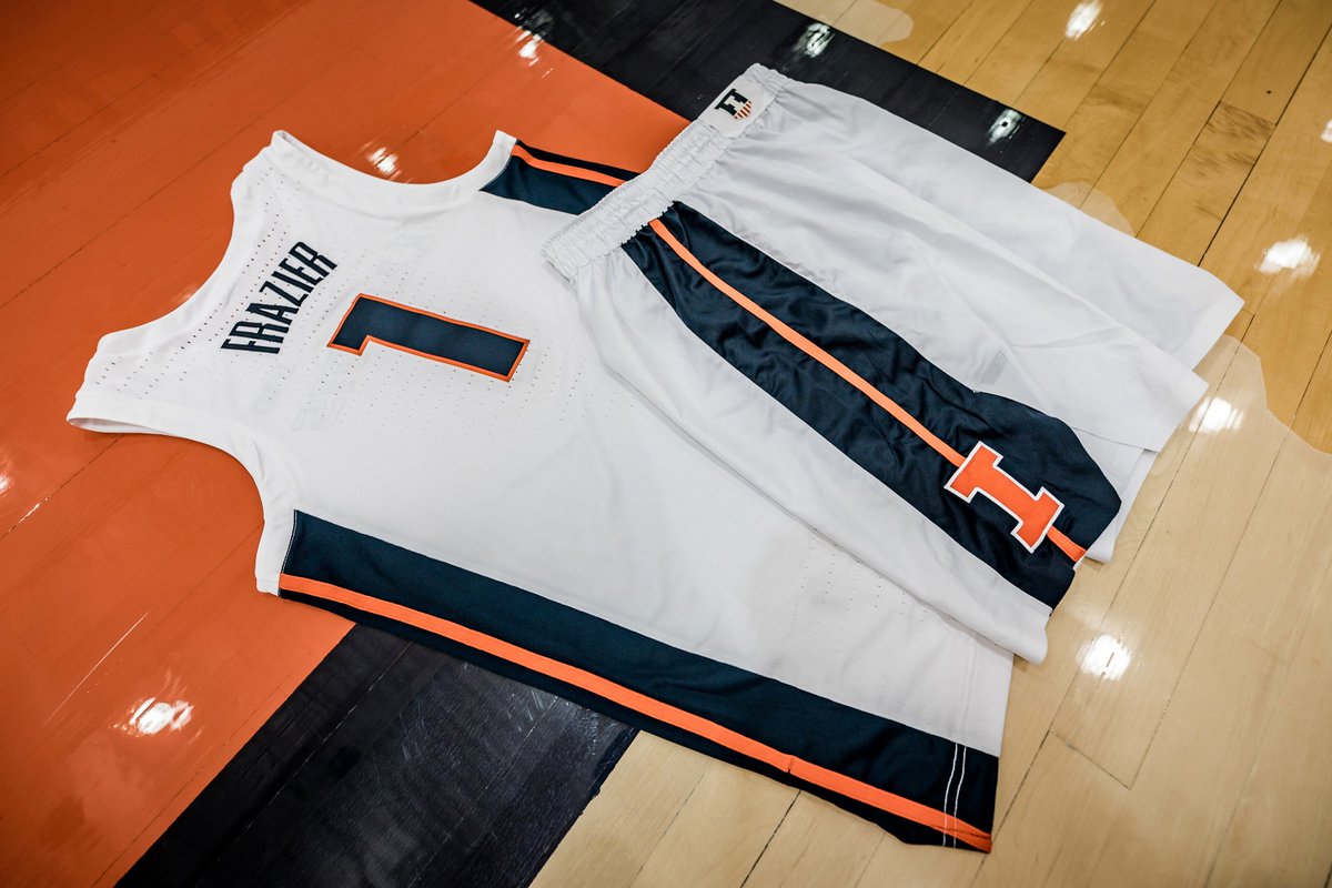
First look at the fresh new whites for this season
#Illini x#NikeBasketball pic.twitter.com/Me2eLe8b2a

12:48 PM - 20 Sep 2018
Awful. These look just thrown together with little thought or effort. They look like the unofficial sort of knock-off "uniforms" you can buy for a discount. Can we get some Syracuse hand-me-downs still?
Count me out on these. Pretty sure I own a pair of those shorts from 2001. I'll wait till I see a play in them, but highly disappointed.
LOL
Siri, combine everything bad about what we're doing with everything bad about what Kentucky's doing
Siri, combine everything bad about what we're doing with everything bad about what Kentucky's doing
Actually, no, that's not even quite it.
This is actually Peak Rebrand, in that it utilizes the "columns" striping from the initial rebrand football uniforms in a way that would have made a lot of sense at the time. But we've entirely ditched that element with the new football uniforms, and as far as I know it's nowhere else in any of the other sports either.
And all the other sports have been ditching the two-tone lettering over the past year too.
I'll tell you what this is: it's a b-side castoff idea from like 2015 that we're bringing into the light of day just for the hell of it, probably because they just ran out of time to do it properly for this year. Which, y'know, whatever. But just know that this Nike template with white-on-white piping looks terrible on actual players:
ivwilsoniv
- Aurora, IL
At least... no more zig zags?
TheFlyingIllini1317
- Chicago, IL
Awful. These look just thrown together with little thought or effort. They look like the unofficial sort of knock-off "uniforms" you can buy for a discount. Can we get some Syracuse hand-me-downs still?
Agreed, low effort and lazy. Looks like it was made in a day, the stripe is too wide and that triangle thing at the bottom of the shorts look awful. In graphic design classes we sometimes need over 50 thumbnails for an idea and it's a shame the university and or Nike doesn't put anywhere near that amount of effort.
I would bet you this arises from a mock-up created when Nike first debuted this uniform template two-plus years ago. "Here's what this would look like in an Illinois version"
I can't believe I'm saying this, but I think I preferred the zig zags... these are awful. Here's hoping it's one season stop gap.At least... no more zig zags?
wILL-INI
- Charlotte, NC
Actually, no, that's not even quite it.
This is actually Peak Rebrand, in that it utilizes the "columns" striping from the initial rebrand football uniforms in a way that would have made a lot of sense at the time. But we've entirely ditched that element with the new football uniforms, and as far as I know it's nowhere else in any of the other sports either.
And all the other sports have been ditching the two-tone lettering over the past year too.
I'll tell you what this is: it's a b-side castoff idea from like 2015 that we're bringing into the light of day just for the hell of it, probably because they just ran out of time to do it properly for this year. Which, y'know, whatever. But just know that this Nike template with white-on-white piping looks terrible on actual players:
That's the thing i think I hate the most. The cut is WAY too slim. They look more like wife beaters (god I wish here was a better word for these shirts), rather than bball jerseys.
Here's hoping it's one season stop gap.
It is, that's been made publicly available. That's why it says "for this season"
ILL in IA
- Iowa City
For the past week, after other Nike schools have dropped the new uniforms, we were all pretty set on that being the layout, and mostly ok with it. The only thing that shocked me with this is the 2 tone Illinois. If it was one color, are we ok with this? Because this is the uniform we thought we were going to get.
Epsilon
M tipping over
- Pdx
In general i like a clean a crisp look, but yeah this does kind of look like the TJ Maxx version. I could do without the orange stripes. Even change the wider blue stripes to orange fading or transitioning into blue with the orange block I in the field of blue part.
At least the era of Fat Lightning is over.
t7nich
- Central IL
If the big changes are coming next year, as tweeted out by Werner, then this is Nike putting us in the new cut that they have all Nike Elite schools wearing. And that is it.
Right. The only thing I'm truly bothered by is the lettering. Need to put that font and the two-tone to rest.
RedWing - these are not what you saw, correct? You had mentioned no more two-tone lettering...
RedWing - these are not what you saw, correct? You had mentioned no more two-tone lettering...
Good question.
Deleted member 2050
D
Guest
Tevo
- Wilmette, IL
At least the era of Fat Lightning is over.
Oddly enough, that was the name of our band in college...
- Status
- Not open for further replies.