Tevo
- Wilmette, IL
This is a personal and professional opinion, but i refuse to use anything Frutiger.
Sometimes you just have to take a stand.
This is a personal and professional opinion, but i refuse to use anything Frutiger.
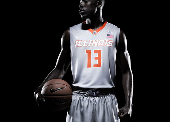
We really need to do something to spice up that Block I or just do away with it. It looks so weak and amateur and boring. I get using a Block I for some things and I understand it's usefulness but it consistently looks drab and cartoonish on everything. It needs some major tweaking or some design alternative in its spot.
As a student the block is getting darn boring to wear. There's only so much apparel I can take with it on before it becomes too repetitive and, well, stale. If my wallet had a mouth it would reject most of the apparel sold save for a few.
I agree with the poster who said to keep the Flyin' Illini uni's as the main uniform and have whatever modern creation as the alternative. The Flyn' Illini fits the "classic" check mark and it appeals across generations, not just a particular set of people in that particular set of time. Check mark for thoughtfulness and intentionality . Sometimes brand consistency in its current form sucks.
And I slightly dislike the font currently being used by athletic department's effort to rebrand.
Yeah, sometimes rebrands are just BIG misses.

So white rebrand, blue rebrand, orange retro, grey?... is that the slate for the upcoming season
The practice jerseys the team have been wearing look like that.Still thinking about that bold decision on one of the supposed leaked jerseys another user detailed in here. I keep seeing this apparel around and can't help but wonder if that "nameplate" could be it? Odds are no and this is a generic Nike sweater template, but I think it could make for a good basketball uni
Hard to tell from this low-res shot, but the strip on the side looks like it might include a darker blue/black around it. That would be a nice nod to the '04'05 era blue jerseys:

Hard to tell from this low-res shot, but the strip on the side looks like it might include a darker blue/black around it. That would be a nice nod to the '04'05 era blue jerseys:
View attachment 3743
Really? All I could see was the orange zig zig on the old blues.The zig-zags were black as well.
Really? All I could see was the orange zig zig on the old blues.
Hank god the zig zags are no more .Yeah, it wasn't easy to see on TV, but it was black where the blue was on the other two versions.
Hank god the zig zags are no more .
lol nice
Is this the Hank God you speak of?
Those are very orange. And also somewhat pink.
