DrewD007
- Woodridge, IL
So you were partial to the 04-05 era unis?

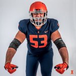
Does the pant stripe look abnormally large to anyone else?
So you were partial to the 04-05 era unis?
I kinda like it.Does the pant stripe look abnormally large to anyone else?
Was that really Beckman's reasoning? Not that I can't see Beckman pretending to explain that reason. Might want to tell Clemson, Georgia, and Oklahoma. Imagine how good they could be if they only knew to eliminate glare by losing the white facemasks....
My understanding with Beckman though was that we had already initiated the rebrand process and so Thomas gave Beckman & Co the green light to just start experimenting and do whatever they wanted until the new stuff came. So there were a lot of rinky-dink changes during that period.
To me the white facemask was only to match the white slant Illinois on the helmets. Since slant Illinois is the worst thing ever, white facemasks aren't too far behind.
No way a white facemask would work with the current helmets.
 on it and i think it'd work.
Can we take a minute to remember we let Mike Thomas, and Becks decide what our brand looked like. Coaches are so quick to change tradition. I like a coach that has a little reverence for what has existed before them.
Put the right
Syracuse is currently demonstrating why a W-O-O uni combo looks really bad
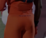
Last thing defenders see as Epstein goes into the endzoneHere's a detail that I missed initially but can not believe we've added. The tramp stamp "Fighting Illini". the utterly dumbest of additions and just looks so stupid.
Risky click of the dayHere's a detail that I missed initially but can not believe we've added. The tramp stamp "Fighting Illini". the utterly dumbest of additions and just looks so stupid.
I watched the Syracuse FSU game and thought, "WOW at least we don't have Syracuse's uniforms". Those numbers look TERRIBLE!Syracuse is currently demonstrating why a W-O-O uni combo looks really bad
I watched the Syracuse FSU game and thought, "WOW at least we don't have Syracuse's uniforms". Those numbers look TERRIBLE!
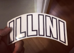
Someone mentioned it in the basketball uni thread but I thought it merited conversation here. The "ILLINI" helmets of the 70s be made so much better today if you just lifted them higher and not so low over the ear hole that they were back then. Someone, I think Willini (Sic?) had that as his mock ups before the last rebrand. He had the zigzags on the pants, shoulders, and center helmet stripe that I didn't care for, but the ILLINI on the helmet I still think could be made great if done right. Definitely better than a bland block I
No thank youOH YOU MEAN THESE!!!
Well we know that we take our cues from Syracuse unis.Syracuse is currently demonstrating why a W-O-O uni combo looks really bad
") )
)