DrewD007
- Woodridge, IL
Whoa. The 150 patch is way too large & obnoxious for every single team to have to wear it every single game.
They really should've done a color match like the B1G logo.
Whoa. The 150 patch is way too large & obnoxious for every single team to have to wear it every single game.
They really should've done a color match like the B1G logo.
I would like the greys if they had orange lettering...or orange trim...orange something.

vs. Northwestern - Blue/Blue/White or Blue/Orange/White and Blue/White/Blue on the road ... LOOK. LIKE. THE. BEARS. Never let those nerds forget our connection to the Bears and Chicago and just how many more alumni and fans we have in the area than they do, even when we've absolutely sucked for years.
Maybe they could make it into a helmet sticker... and then we could turn it on its side when we apply it.Whoa. The 150 patch is way too large & obnoxious for every single team to have to wear it every single game.
Maybe they could make it into a helmet sticker... and then we could turn it on its side when we apply it.
Someone correct me if I'm wrong, but didn't whitman say that 2019 there was going to be a football jersey overhaul? Maybe I didn't understand it or misremembered, but I'm curious if that's the case for this year.
Someone correct me if I'm wrong, but didn't whitman say that 2019 there was going to be a football jersey overhaul? Maybe I didn't understand it or misremembered, but I'm curious if that's the case for this year.
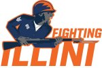
Illinois needs to adopt these logos. Its sad that a lot of "traditional" illini fans are turning away from the program due to their frustration of the whole chief thing. I think this would be a great compromise for a logo that doesnt culturally appropriate and pays respect to the men and women of illinois who fought for this country. Why have the nickname the "fighting illini" if our logo is just an orange I? we should just be the block I's

I'm sure there is zero chance that a logo would be accepted that has a gun it like the first logo. The second one, a casual observer is going to have no idea what it is.Illinois needs to adopt these logos. Its sad that a lot of "traditional" illini fans are turning away from the program due to their frustration of the whole chief thing. I think this would be a great compromise for a logo that doesnt culturally appropriate and pays respect to the men and women of illinois who fought for this country. Why have the nickname the "fighting illini" if our logo is just an orange I? we should just be the block I's
I'm sure there is zero chance that a logo would be accepted that has a gun it like the first logo. The second one, a casual observer is going to have no idea what it is.
We can only pray you remember correctly. I actually liked the “Cubit uniforms” (how I remember them), but I hate these. Be flashy or be traditional, ours are just ... blank, lol.
Not a huge fan of coaches getting to dictate a whole lot on the uniform side, to begin with. All's it takes is one PJ Fleck and all your uniform tradition goes out the window for his stop-over stepping-stone 3-year tenure as a coach and his latest nonsense saying.
 Edit: Well I did figure it out