TheFlyingIllini1317
- Chicago, IL
Also this year I'd like to see us go orange helmet, blue jersey, white pants. Think that could be our best look because it is most like the Butkus era unis.
Sorry I couldn't figure out how to make the image smaller. In my opinion, these are the best jerseys we have worn in a while. Did they have issues? Yes. The collar was too big, and it's annoying how the stripe on the orange pants didn't match the stripe on the orange helmet but they were close to perfect. You can instantly recognize who is playing, and they use the contrast between orange blue and white so well. I think our current set doesn't do both those things. Just had to vent a little haha.
View attachment 4656 Edit: Well I did figure it out
Also this year I'd like to see us go orange helmet, blue jersey, white pants. Think that could be our best look because it is most like the Butkus era unis.
Would be very Florida like. Didn't Zook do this a lot?
White pants are awful.

I like it.I have come to believe we really should have "simpler" uniforms to fit the brand we want, but for some reason I just don't like these. There is like nothing going on. I actually kind of liked the ones we had before this, TBH. It shouldn't be that hard to screw it up, haha. What I think is more important is how we USE the jerseys we have (once they have been designed to at least be competent). I think the random mixing and matching is awful. I put forth a suggestion template kind of like this in the past, using next year's games:
vs. Akron - Orange/Blue/Orange (default home)
at UConn - Orange/White/Orange (default road)
vs. Eastern Michigan - Orange/Blue/Orange (default home)
vs. Nebraska - Orange/Blue/Orange (default home)
at Minnesota - Orange/White/Orange (default road)
vs. Michigan - All Blue/all Orange/whatever ... use a random big game as your gimmick game
vs. Wisconsin - Gray Ghost uniforms for Homecoming IF you're going to keep them ... I kind of like the idea, and my friends think it's really cool, but I see the argument that we should be wearing O/B/O on Homecoming, too...
at Purdue - Orange/White/Orange (default road)
vs. Rutgers - Orange/Blue/Orange (default home)
at Michigan State - Orange/White/Orange (default road)
at Iowa - Orange/White/Orange (default road)
vs. Northwestern - Blue/Blue/White or Blue/Orange/White and Blue/White/Blue on the road ... LOOK. LIKE. THE. BEARS. Never let those nerds forget our connection to the Bears and Chicago and just how many more alumni and fans we have in the area than they do, even when we've absolutely sucked for years.
Basic formula? Wear your regular jerseys except for special occasions. If we are to keep the Gray Ghost uniforms, wear them on homecoming. Pick one random "big game" (preferably a night game vs. a name opponent) to wear all Orange or all Blue. Against Northwestern, pick a Bears-style lineup. As much as I used to defend the all white look (it honestly does look pretty sharp), it just doesn't look like US. I have come around to believe that I would rather be less stylish but more definitive; someone shouldn't wonder who's playing without looking at the scoreline, they should think "oh, that's Illinois."
As with all things related to athletics aesthetics, this is a sweeping - and wrong - generalization. White pants look great in some instances:
And bad in others:


Have to think that is only because of the tradition associated with the uni. If you introduced that combo to my team today I would be very disappointed with any money spent to do so.Penn State also wears white pants often, and they have some of the best looking uniforms in college football, nay maybe in all of professional sports.
https://onwardstate.com/2013/11/26/ncaa-says-penn-state-has-second-most-iconic-uniforms/
Some don’t like the gray ghost.
Have to think that is only because of the tradition associated with the uni.


To a certain extent, but there are also some pretty basic tenets that reliably work for a football uniform. For example, here are two teams that lost a lot in their old uniforms, and have won a ton in their new ones, but I'm willing to bet most of their fans (and most on here) would, in a vacuum, prefer the old style.
The new ones above are bad, but the old ones are comical. Denver's looks like a toy helmet logo thought up by Hasbro, and we all know about those epic pickeup games at Valley Forge.
a dark jersey is always going to look better with white pants. The reverse is obviously also true - look at how much better this UCF combo looks
To a certain extent, but there are also some pretty basic tenets that reliably work for a football uniform. For example, here are two teams that lost a lot in their old uniforms, and have won a ton in their new ones, but I'm willing to bet most of their fans (and most on here) would, in a vacuum, prefer the old style.
late 90's Broncos are timeless, iconic looks of those respective eras.
You're falling into the "Slant Illinois Fallacy" - a football uniform is much more than the helmet.* Look at everything else and notice the way the colors themselves do the work - you don't need jersey piping, the unnecessary scourge of modern uniform design, or gimmicky disappearing stripes (on the helmet or anywhere else).
*I personally really enjoy the old Denver D and Pat Patriot. They're helpful reminders that helmet logos don't need to have weird forward motion incorporated and that they could even be *gasp* hand-drawn (or at least look like they could be).
The Buccaneers also drastically overhauled their look that year, and these look old school in comparison:
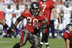
(pouring one out for this look btw; can't believe what the Bucs have done since, it is funhouse mirror-level atrocious)
That's something that many have tried and almost all have failed: a genuinely novel color scheme.
Would love to see these return at some pointView attachment 4668
Would love to see these return at some pointView attachment 4668
I hate the grays.