You are using an out of date browser. It may not display this or other websites correctly.
You should upgrade or use an alternative browser.
You should upgrade or use an alternative browser.
Illinois Football Uniforms
- Status
- Not open for further replies.
redwingillini11
White and Sixth
- North Aurora
The helmets look good, but unlike any helmet I've ever seen, it looks like someone put stickers on it. The decals have always looked more seamless on every other helmet I've ever seen. The strip looks good in the front where it is notched out over the gap in the octagon piece. But in the back, you can see a gap under the stripe where the helmet contour changes. The Block I looks ok in this video, but in other recent photos and posts some of the I decals have had air bubbles in them.
The Galloping Ghost
- Washington, DC
I think that's a fair assessment. I'm extremely pro-orange, but our away uniforms are screaming out for a hint of blue. Much like our home uniforms need a hint of white, especially after we reincorporated white into the helmets. Honestly, we can't get new uniforms soon enough. Nike, please don't mess it up next year. We desperately need good football uniforms.
Homecoming 2019
- Chicago
Michigan's helmet is really the only iconic looking uniform on the list, OSU in first strictly because well it's Ohio State. The rest of the uniforms are pretty much a crapshoot as most are pretty generic. Iowa and MSU get the great Logo bump.
Ransom Stoddard
Ordained Dudeist Priest
- Bloomington, IL
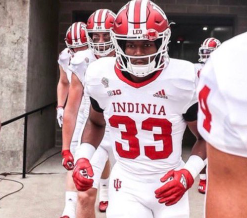
I would have preferred this photo for IU's section.

Agree with going with blue rather tan orange pants.
Fighter of the Nightman
- Chicago, IL
I'm such a broken record with this, but I think the objective should be to "have a consistent look." Blue pants could be great on the road, I just hate that under Lovie we seemed to mix and match at random. Wearing variations of our "standard" uniforms should be a special occasion, not a weekly vote by the players. Lol.Agree with going with blue rather tan orange pants.
Who is our very talented graphic design friend, again?? I think it's time to see a mock-up (home-away-alternate) based on these 2008 throwbacks with our current script "Illinois" on the helmet and some touched up striping!

altgeld88
- Arlington, Virginia
That will become an evergreen classic up there with "MIZNOZ." Not sure which is more ridiculous: that no one in the football program caught the error, or that none of the IU player(s) wearing the jerseys apparently noticed either.I would have preferred this photo for IU's section.
View attachment 19103
The uniform failure is orders of magnitude worse than a perfectly timed picture of some fans holding a sign upside down. But… Miznoz makes me smile involuntarily every single time I see it, no matter how often I’ve seen it. Every single time. I’m chuckling while I type this. Indiana will never become Indinia, but that other school will be Miznoz for the rest of my life.That will become an evergreen classic up there with "MIZNOZ." Not sure which is more ridiculous: that no one in the football program caught the error, or that none of the IU player(s) wearing the jerseys apparently noticed either.
I think the best part of it is the REAL ENTHUSIASM of the two girls holding up the signs.The uniform failure is orders of magnitude worse than a perfectly timed picture of some fans holding a sign upside down. But… Miznoz makes me smile involuntarily every single time I see it, no matter how often I’ve seen it. Every single time. I’m chuckling while I type this. Indiana will never become Indinia, but that other school will be Miznoz for the rest of my life.
It’s either a collective blunder of epic proportions or it’s a genius diversion.That will become an evergreen classic up there with "MIZNOZ." Not sure which is more ridiculous: that no one in the football program caught the error, or that none of the IU player(s) wearing the jerseys apparently noticed either.
(Maybe both somehow?) Lol
It’s terribly distracting. You’re saying: “wait a second!” Next thing ya know they’re in the end zone.

Last edited:
These are my favorite. Classic look and they can use helmet decals, script ILLINI or the numeric.I'm such a broken record with this, but I think the objective should be to "have a consistent look." Blue pants could be great on the road, I just hate that under Lovie we seemed to mix and match at random. Wearing variations of our "standard" uniforms should be a special occasion, not a weekly vote by the players. Lol.
Who is our very talented graphic design friend, again?? I think it's time to see a mock-up (home-away-alternate) based on these 2008 throwbacks with our current script "Illinois" on the helmet and some touched up striping!

I think the best part is that the three upturned letters make three perfectly good letters. zou / noz.I think the best part of it is the REAL ENTHUSIASM of the two girls holding up the signs.
I mean, isn't ignorance from Indiana expected?
My favorite combo.I'm such a broken record with this, but I think the objective should be to "have a consistent look." Blue pants could be great on the road, I just hate that under Lovie we seemed to mix and match at random. Wearing variations of our "standard" uniforms should be a special occasion, not a weekly vote by the players. Lol.
Who is our very talented graphic design friend, again?? I think it's time to see a mock-up (home-away-alternate) based on these 2008 throwbacks with our current script "Illinois" on the helmet and some touched up striping!

altgeld88
- Arlington, Virginia
That made me lol. Well done.It’s either a collective blunder of epic proportions or it’s a genius diversion.
(Maybe both somehow?) Lol
It’s terribly distracting. You’re saying: “wait a second!” Next thing ya know they’re in the end zone.

i think im the only one who likes the metallic orange helmets from 4 or 5 years ago.
or course, i will always turn on and Oregon game to see what they've come up with next.
altgeld88
- Arlington, Virginia
Inevitably a new permutation that will distract fans from the miserable fall weather in Eugene.or course, i will always turn on and Oregon game to see what they've come up with next.
redwingillini11
White and Sixth
- North Aurora
Are you talking about the 2014-2017 era helmets? I did like those in a vacuum. I don't think they were really sustainable in the long run because the orange didn't match. But I did like them as a fresh look at the time.i think im the only one who likes the metallic orange helmets from 4 or 5 years ago.
Mr. Tibbs
- southeast DuPage
the metallic finish thing was more of a flavor of the day than something long term. To pull that off you need to be Oregon or a program with more "flash and flair" than we have/are
Im more than fine with our new orange, as long as the color matches across all areas . An alternative helmet is fine, in blue or white, but the orange lid should be at least 10 of the 12 games per year.
We simply arent Oregon or Okla St and cant pull that weekly change thing off very well.
Im more than fine with our new orange, as long as the color matches across all areas . An alternative helmet is fine, in blue or white, but the orange lid should be at least 10 of the 12 games per year.
We simply arent Oregon or Okla St and cant pull that weekly change thing off very well.
InDaAZ
- Eugene, Oregon
Hey, now…Inevitably a new permutation that will distract fans from the miserable fall weather in Eugene.
altgeld88
- Arlington, Virginia
Hey, now…
Summer's gorgeous in Eugene, however. I've enjoyed it several times.
- Status
- Not open for further replies.


