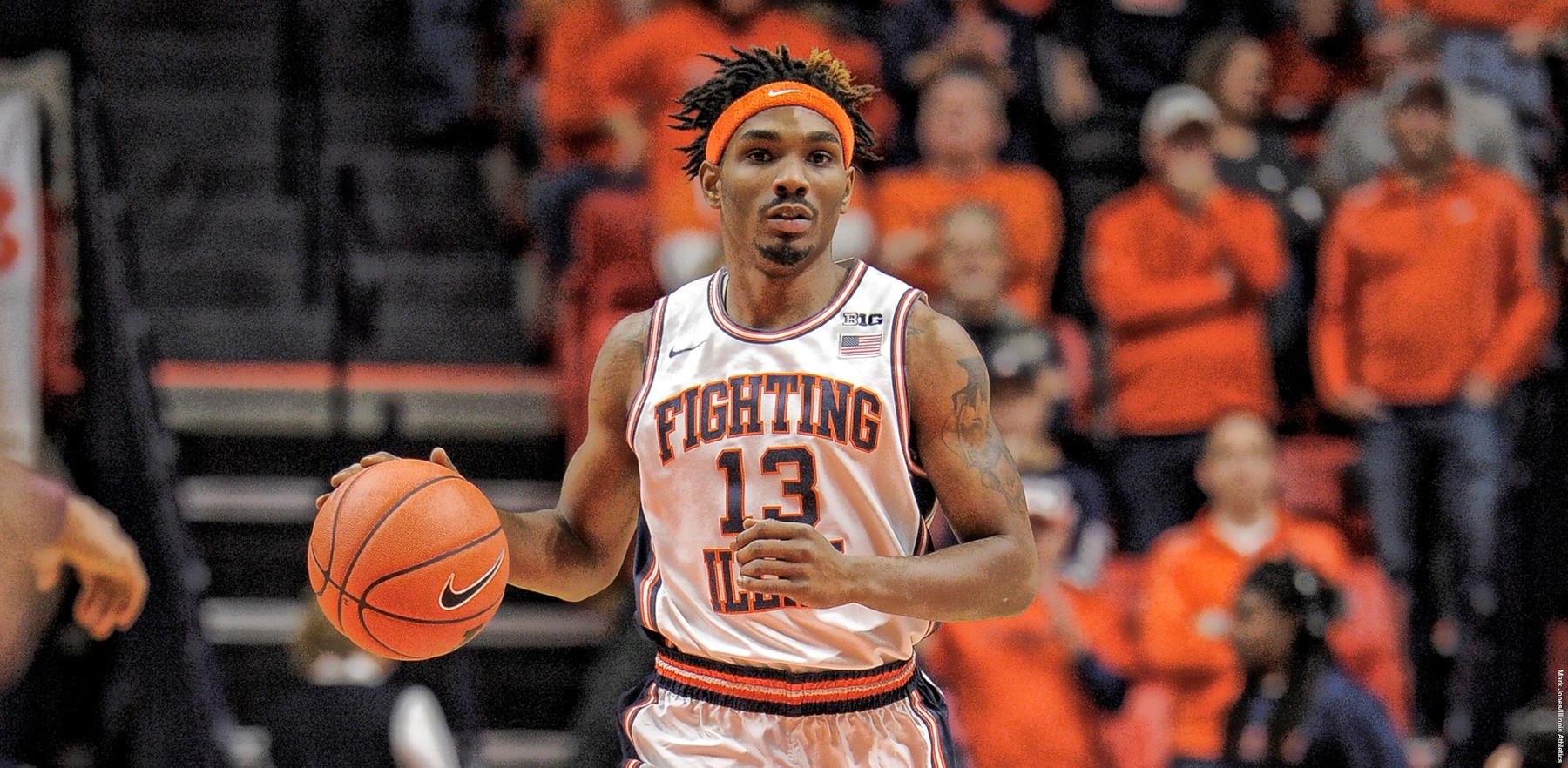
Homecoming 2019
- Chicago
@TeamShield...thoughts? Pulled from a ticket email for the 100th anniversary of Memorial Stadium.
I was all aboard the Shield bandwagon when we first got it, and I have since soured to a relative apathy where I don't mind it but I certainly don't think it's that great of a logo. However, if we are going to use the Shield in some way, this is a MUCH better iteration, IMO. I have always thought we should try to incorporate the columns/architecture of Memorial Stadium into a second logo. For a while, I was very supportive of trying to come up with a "less academic" iteration of this logo:View attachment 32084
@TeamShield...thoughts? Pulled from a ticket email for the 100th anniversary of Memorial Stadium.

I like the stipes on the 100th anniversary shield much better. The columns are a bit too much detail at the top but lots to like. Move the I up and enlarge and I think it would look really good. Shoot could even get rid of the block I all together.I was all aboard the Shield bandwagon when we first got it, and I have since soured to a relative apathy where I don't mind it but I certainly don't think it's that great of a logo. However, if we are going to use the Shield in some way, this is a MUCH better iteration, IMO. I have always thought we should try to incorporate the columns/architecture of Memorial Stadium into a second logo. For a while, I was very supportive of trying to come up with a "less academic" iteration of this logo:

Me too. Evocative of the columns, the Grange era jerseys, and the yardage lines on the field. I always appreciate when a logo can convey a lot with a little.I like the stipes on the 100th anniversary shield much better. The columns are a bit too much detail at the top but lots to like. Move the I up and enlarge and I think it would look really good. Shoot could even get rid of the block I all together.
And yes I did kind of like that logo, I don't see an issue with separating academics and athletics with logos.
Add the stripes to the jerseys too for consistency and we're cookin with gas.Me too. Evocative of the columns, the Grange era jerseys, and the yardage lines on the field. I always appreciate when a logo can convey a lot with a little.
Somewhat OT, but the mix of Big Ten logos is comically boring, and then there are a couple that are legit/objectively great.
Really Simple Block Letters
Illinois
Michigan
Nebraska
Rutgers
Relatively Boring But Slightly Altered Block Letters
Indiana
Maryland
Minnesota
Ohio State
Purdue
Wisconsin
Genuinely Unique Logos
Iowa
Michigan State
Penn State
Hurts my heart to say it, but MSU and Iowa easily have the best logos in the conference, and PSU's is pretty good, too.
EDIT: I have literally zero desire to open up this can of worms, but I do feel compelled to say that I would have ranked the Chief logo as the best of all 14 of these and easily in that last tier.
I said this is in the other thread but I think that's what the shield was trying to do but got too muddled. This 100 year logo is basically the shield but they figured out something to do with the top of the logo (the stadium) instead of making up some explanation that the the top of the logo is two Fs. They've also made the bottom cleaner, which was probably originally supposed to be Grange stripes but they changed the official explanation to be the stadium columns since the top of the logo doesn't match the columns of the stadium. If the shield could have used the stripes in the 100 year Anniversary logo with the actual Memorial column style or maybe the academic "I" at the top I think it could have been simple and way more effective.Me too. Evocative of the columns, the Grange era jerseys, and the yardage lines on the field. I always appreciate when a logo can convey a lot with a little.
Relevant:Somewhat OT, but the mix of Big Ten logos is comically boring, and then there are a couple that are legit/objectively great.
Really Simple Block Letters
Illinois
Michigan
Nebraska
Rutgers
Relatively Boring But Slightly Altered Block Letters
Indiana
Maryland
Minnesota
Ohio State
Purdue
Wisconsin
Genuinely Unique Logos
Iowa
Michigan State
Penn State
Hurts my heart to say it, but MSU and Iowa easily have the best logos in the conference, and PSU's is pretty good, too.
EDIT: I have literally zero desire to open up this can of worms, but I do feel compelled to say that I would have ranked the Chief logo as the best of all 14 of these and easily in that last tier.
Lol, this is great. It's bizarre, too, because only really Illinois and Indiana are currently "stuck" with a block letter due to no other imagery ... that's the main appeal of the Shield to me, to the extent I like it at all. How is Purdue not rocking a cooler logo?? Wisconsin with a Badger/Michigan with a Wolverine?? OSU's O with the Buckeye Nut is at least cooler. As the video stated, Rutgers having a literal KNIGHT and going with possibly the most boring block letter in the conference is just bewildering.
While I am not holding out hope for this, it really would be so awesome to bust out a surprise set of throwbacks this March ... preferably the white Flyin' Illini throwbacks I posted earlier or these bad boys!
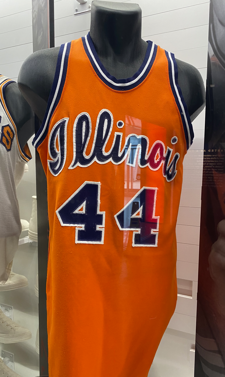
Nike would be wise to just roll with one of them in all three colors and call it a day ... but I imagine they are either too prideful, too stupid or both to do that.
That photo was my contribution to this thread after my trip to Champaign in July '22 and talking my way into the HOF exhibit at AH late one afternoon as they were closing the arena after a convention. I'd recalled these jerseys but had never found color photos of them, just grainy footage of a game at IU in the late '70s when we were wearing them. Was elated to see Holcomb's orange jersey in the case.We need a uniform set like this added into the rotation. Would be an awesome drop for a big game
Would love your idea, my biggest fear is that they’ll want to stick to the “brand identity” and keep the 7LL7NO7S font. Although, I have noticed in a lot of the branding recently we’ve been doing a lot more of the script font so I’m hoping Nike will notice this trend and realize we all hate our modern font.^ My optimistic prediction, based on some ideas your post gave me - "touched up" Flyin' Illini look for our defaults (white, orange and navy sets) and two throwbacks (keep the white Script jersey and an orange 2005 throwback for the anniversary). I have a feeling Nike will want to put their "stamp" on the Flyin' Illini jerseys and will probably screw them up, but I'll retain hope that they barely edit them. Hopefully the only changes would be something minor, like orange font with a navy outline on the white jerseys rather than the traditional navy font and orange outline? Even though they are perfect the way they are.
Our Flyin' Illini and Script jerseys are the literal embodiment of the sentiment behind "if it ain't broke, don't fix it." Nike would be wise to just roll with one of them in all three colors and call it a day ... but I imagine they are either too prideful, too stupid or both to do that.
"We all" is likely an extreme minority. Most of us, including this typeface nerd right here, barely notice.Would love your idea, my biggest fear is that they’ll want to stick to the “brand identity” and keep the 7LL7NO7S font. Although, I have noticed in a lot of the branding recently we’ve been doing a lot more of the script font so I’m hoping Nike will notice this trend and realize we all hate our modern font.
While I agree that most Illini fans barely register our 7LL7NO7S font (let alone hate it, like I and many others do!), I do NOT think that apathy/indifference extends to our jerseys. I regularly see Average Joe fans on social media commenting that our two throwbacks are awesome and our regular jerseys are absolute crap, haha. Also, random social media accounts devoted to college basketball coverage (e.g., CBK Alert or March Madness Analysis) that have tens of thousands of followers fill the slower periods with posts like "Best alternate jerseys in college basketball," and the Illini ALWAYS get a lot of love - Flyin' Illini and Script."We all" is likely an extreme minority. Most of us, including this typeface nerd right here, barely notice.
Having said that, I'm all in on full time throwbacks. Although, I think the script should remain an alt jersey.
This is where I've stood for a lot of uniform talk (here and elsewhere) about the script. The script is cool and special, and everyone in the country loves script jerseys. We're already seeing it be overdone as a concept by so many schools overusing it that it's starting to lose a lot of what makes it so special and appealing. We happen to have one of the cooler script concepts (we all probably think it's the best but we're biased), and we should keep using it, but keep it as an alternate jersey concept. Don't try to put it everywhere. Don't put it on the baseline if we get a new court anytime soon, we were smart to keep it off the football helmets IMO, don't try and redo the endzone with script of the (still relatively new) turf. The list could go on for "easy" ways to implement the script everywhere, but 90% of them we shouldn't do. Keep it as a second or third type font for graphics and merch, and use it for alternate uniforms (a script helmet would be sick in football).Having said that, I'm all in on full time throwbacks. Although, I think the script should remain an alt jersey.
Academic I was the best the II was all aboard the Shield bandwagon when we first got it, and I have since soured to a relative apathy where I don't mind it but I certainly don't think it's that great of a logo. However, if we are going to use the Shield in some way, this is a MUCH better iteration, IMO. I have always thought we should try to incorporate the columns/architecture of Memorial Stadium into a second logo. For a while, I was very supportive of trying to come up with a "less academic" iteration of this logo:

IMO our script from the '70s, Purdue's from the '60s through mid-'70s, and OSU's from the late '70s through early '80s are far superior to what Iowa, Minnesota and MSU have done over the years (No one else, IIRC, has done it in conference that I can recall.) Script and the old block designs have made a comeback for a good reason: they're classic. I noted last month that Eric Musselman's Razorbacks were wearing circular block lettering reminiscent of his dad's early '70s Minnesota teams, which Jim Dutcher continued (see Kevin McHale below v. Magic and the Gopher throwbacks worn this year).This is where I've stood for a lot of uniform talk (here and elsewhere) about the script. The script is cool and special, and everyone in the country loves script jerseys. We're already seeing it be overdone as a concept by so many schools overusing it that it's starting to lose a lot of what makes it so special and appealing. We happen to have one of the cooler script concepts (we all probably think it's the best but we're biased), and we should keep using it, but keep it as an alternate jersey concept. Don't try to put it everywhere. Don't put it on the baseline if we get a new court anytime soon, we were smart to keep it off the football helmets IMO, don't try and redo the endzone with script of the (still relatively new) turf. The list could go on for "easy" ways to implement the script everywhere, but 90% of them we shouldn't do. Keep it as a second or third type font for graphics and merch, and use it for alternate uniforms (a script helmet would be sick in football).

Love those, but now is not the time to get cute with uniform karma. We gotta wear what got us here.I would have to believe we go throwback from here on out. My prediction is we roll with the Script when possible (it won us the BTT, after all!) and only wear the Flyin' Illini jerseys if we are the lower seeded team and the other team elects to wear white. So, if we keep winning, I predict the first time we see anything other than the Script jerseys is the Sweet Sixteen. And if any higher seeded team than us elects to wear their color jerseys, we will opt for the Script.
There is of course the dream scenario that we bust out these first game...
