Illinois Football Uniforms

#26      
I was in a setting this weekend where the top of the athletic department was asked about the status of the Shield logo, and I wanted to pass along what I heard.

The main idea is that the DIA acknowledges that while the Shield is still officially a part of the brand, its' phase out is a result of discipline in maintaining brand consistency waining as the years go by since the 2014 rebrand, which is a natural cycle. This is due to two factors: 1) the DIA's gradual deference to the coaches' branding preferences within their programs (tennis / soccer love using the Shield; Bielema just wants a Block I); and 2) the hugely-positive response to the cursive "Illinois" "logo." As far as a department-wide decision, the Shield has not been given a vote of non-confidence.

There was also an acknowledgement that the department has been very lax in other branding instances, with the example being that the basketball team wore black team-issued sweatsuits to the Tennessee game, while black is of course not an official color. Moving forward we can expect that not to happen.

The takeaway is that both consistency and flexibility have their merits, but to balance things out, we can probably expect a "branding reset" in the next few years to bring us back to the other end of the cycle where we establish a core branding identity. Now, what this means for the fate of the Shield is unclear. It was not implied whether the Shield will be kept, eliminated, or replaced, although it seems safe to say the Shield will not be used anymore in football or basketball as long as BB and BU are in charge.

If I had to guess, because there is now an open acknowledgement that football and basketball are the necessary priority, maybe the Shield will be removed from the official brand department wide because it isn't being used in revenue sports. Although, who knows, maybe they maintain the status quo and keep it as a secondary logo and leave it up to the respective teams. I am certainly someone who prefers "brand flexibility" over "brand consistency." But it does sound like a "light reset" is coming, so some changes are likely on the horizon.
I’m honestly fine with the Shield being a second logo that coaches can use if they want … but the Nike font is just not great. I’d love to see a “small” rebrand where we utilize the script font on jerseys (specifically basketball and baseball), effectively as a logo, and use the block lettering from the Flyin’ Illini throwback uniforms as the default “A through Z font” used in all generic situations.
 
#27      
I was in a setting this weekend where the top of the athletic department was asked about the status of the Shield logo, and I wanted to pass along what I heard.

The main idea is that the DIA acknowledges that while the Shield is still officially a part of the brand, its' phase out is a result of discipline in maintaining brand consistency waining as the years go by since the 2014 rebrand, which is a natural cycle. This is due to two factors: 1) the DIA's gradual deference to the coaches' branding preferences within their programs (tennis / soccer love using the Shield; Bielema just wants a Block I); and 2) the hugely-positive response to the cursive "Illinois" "logo." As far as a department-wide decision, the Shield has not been given a vote of non-confidence.

There was also an acknowledgement that the department has been very lax in other branding instances, with the example being that the basketball team wore black team-issued sweatsuits to the Tennessee game, while black is of course not an official color. Moving forward we can expect that not to happen.

The takeaway is that both consistency and flexibility have their merits, but to balance things out, we can probably expect a "branding reset" in the next few years to bring us back to the other end of the cycle where we establish a core branding identity. Now, what this means for the fate of the Shield is unclear. It was not implied whether the Shield will be kept, eliminated, or replaced, although it seems safe to say the Shield will not be used anymore in football or basketball as long as BB and BU are in charge.

If I had to guess, because there is now an open acknowledgement that football and basketball are the necessary priority, maybe the Shield will be removed from the official brand department wide because it isn't being used in revenue sports. Although, who knows, maybe they maintain the status quo and keep it as a secondary logo and leave it up to the respective teams. I am certainly someone who prefers "brand flexibility" over "brand consistency." But it does sound like a "light reset" is coming, so some changes are likely on the horizon.
IMO, the idea of a shield was a good one. The problem with the Illini Shield is that it tried to incorporate too many elements intended to represent various aspects of our "identity". A simplified shape, using orange and blue and graphics (such as a Block I in the center) would make a much stronger and likeable representation on our great University.
 
#28      
IMO, the idea of a shield was a good one. The problem with the Illini Shield is that it tried to incorporate too many elements intended to represent various aspects of our "identity". A simplified shape, using orange and blue and graphics (such as a Block I in the center) would make a much stronger and likeable representation on our great University.
The shield, and perhaps even the way forward period, is to use the stripes only imo. The column top that they said is actually two Fs because they knew the columns aren't like that is what makes it kind of clunky and silly. But the Grange stripes (which in the official description is actually the Memorial columns) are a cool bit.
 
#30      

mattcoldagelli

The Transfer Portal
DIA: [shines Team Shield signal into the winter air]

Me:
stephen colbert GIF by The Late Show With Stephen Colbert


100th Anniversary of Memorial Stadium logo is very Shield-y (and nicely done, I might add)
1704921839527.png
 
#34      
This makes so much more sense than what the actual shield design turned out to be. Stadium on top, grange stripes on the bottom. Instead we got some last minute change of narrative about two Fs on the top and the bottom stripes being the columns because our stadium columns don't stick out like the ones in the logo.
 
#35      
This makes so much more sense than what the actual shield design turned out to be. Stadium on top, grange stripes on the bottom. Instead we got some last minute change of narrative about two Fs on the top and the bottom stripes being the columns because our stadium columns don't stick out like the ones in the logo.
I have always maintained that the bottom of the original shield looks like a cowcatcher and makes me think of PU's train. Instant dislike. Grange stripes look much better.
 
#37      

TentakilRex

Land O Insects between Quincy-Macomb-Jacksonville
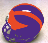
On this April 1, I just go a leak of the new Illini football helmets that was co-designed by Fanatics

New Illini Helmet.png

(yeah this joke was so done at the last minute)
 
#39      
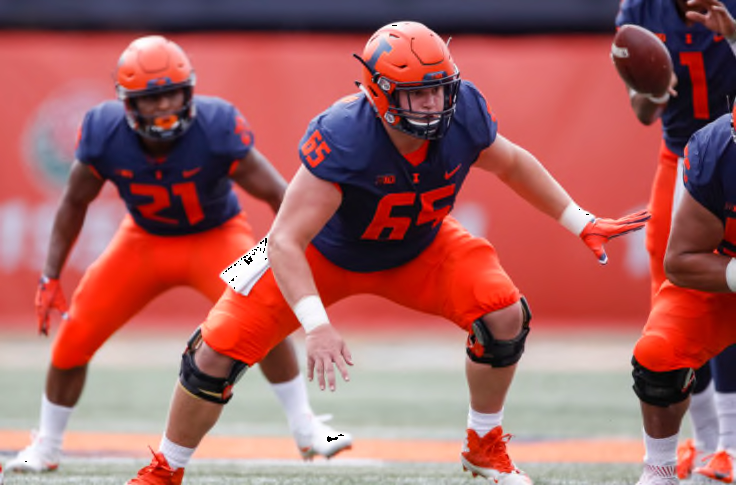
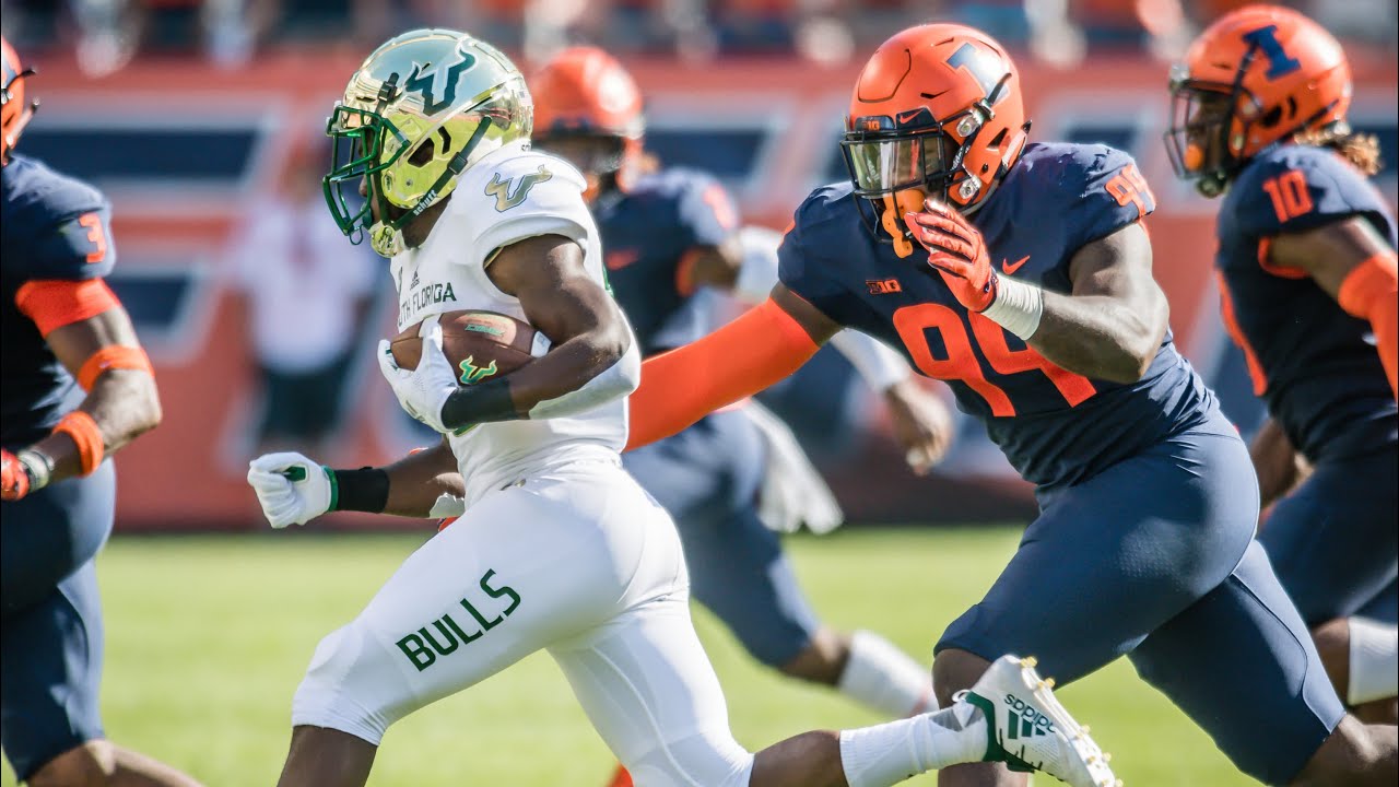
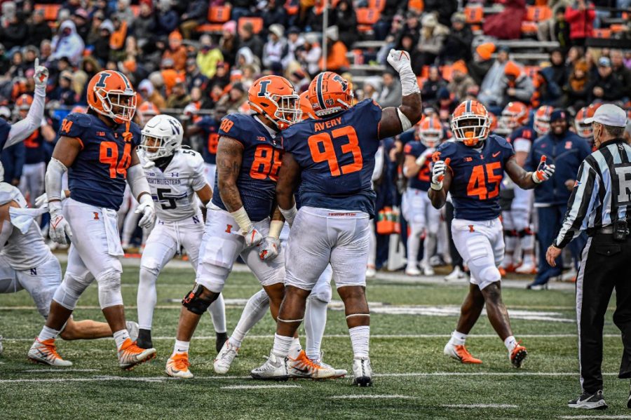
Any chance we ever do anything outside of the Block I on helmets? I know the jersey won't be changed for 5 years (or however long the Nike rule is on jersey changes), but I'm hoping in the near future we see some different iterations of helmets. I just find the Block I personally boring.
 
#41      

mattcoldagelli

The Transfer Portal
Any chance we ever do anything outside of the Block I on helmets? I know the jersey won't be changed for 5 years (or however long the Nike rule is on jersey changes), but I'm hoping in the near future we see some different iterations of helmets. I just find the Block I personally boring.
You’re among (Scripto) friends
 
#42      
I know the script Illinois has been discussed on here as a helmet logo, but I wonder if they would consider the other script Illini, which seems to be more prominent on football gear/ sideline wear than it is with basketball (I think BB wears it from time to time)
 
#43      
I know the script Illinois has been discussed on here as a helmet logo, but I wonder if they would consider the other script Illini, which seems to be more prominent on football gear/ sideline wear than it is with basketball (I think BB wears it from time to time)
That script font looks REALLY bad, IMO. Haha. Now, if you were to take THIS script font...

MBB1920_WhiteThrowbacks_6965.jpg


... and shorten it to "Illini," we'd cooking with gas! Although I am also perfectly fine with the Block I on the helmets. I don't think we can go wrong there, as I think our current helmets look good and there are plenty of examples of helmets out there that look great with script font (e.g., UCLA, Florida, Ole Miss, etc.).
 
#44      

GrayGhost77

Centennial, CO
That script font looks REALLY bad, IMO. Haha. Now, if you were to take THIS script font...

MBB1920_WhiteThrowbacks_6965.jpg


... and shorten it to "Illini," we'd cooking with gas! Although I am also perfectly fine with the Block I on the helmets. I don't think we can go wrong there, as I think our current helmets look good and there are plenty of examples of helmets out there that look great with script font (e.g., UCLA, Florida, Ole Miss, etc.).
Yeah. I for one am perfectly happy with our block I helmet design. SOOO much better than the old Giants logo ILLINOIS that we dealt with for so long.
 
#45      

Mr. Tibbs

southeast DuPage
Any chance we ever do anything outside of the Block I on helmets? I know the jersey won't be changed for 5 years (or however long the Nike rule is on jersey changes), but I'm hoping in the near future we see some different iterations of helmets. I just find the Block I personally boring.
don’t count on it

we have nothing else - script Illini is hardly unique and certainly not better
 
#46      

redwingillini11

White and Sixth
North Aurora

Auburn leaving Under Armour, after being one of the flagship schools for UA for the past 18 years. They really probably aren't an option for us in the future unless their finances take a dramatic turn.

It seems likely that the only options for us when the deal is up in a few years are Nike and Adidas. For better or for worse, I imagine we will likely stay with Nike. I just don't think we are an Adidas school, but that being said I think Adidas has really turned things around the last few years, to the point I bought my first Adidas shoes ever this past week. But as much as we the fans have issues with what Nike has done in recent years, it seems like the University is very comfortable with that relationship, and has probably even turned down more money to stay with the company it knows. We will see though. But Under Armour's reach appears to be contracting rather than expanding.
 
#47      

OrangeBlue98

Des Moines, IA
The shield, and perhaps even the way forward period, is to use the stripes only imo. The column top that they said is actually two Fs because they knew the columns aren't like that is what makes it kind of clunky and silly. But the Grange stripes (which in the official description is actually the Memorial columns) are a cool bit.
Iowa State has done something similar with their “five bar” logo honoring Jack Trice. I feel like there is a place for the “Grange Lines” and/or a reference to the stadium columns as a secondary branding mark.

 
#48      
Iowa State has done something similar with their “five bar” logo honoring Jack Trice. I feel like there is a place for the “Grange Lines” and/or a reference to the stadium columns as a secondary branding mark.

I completely agree. And when you are around a lot of Iowa State fans (like in Omaha), you see a ton of them wearing a shirt with that logo. We could even separate the stripes by two so it's both the columns and the grange stripes, and I bet it would sell very well.
 
#49      
I was in a setting this weekend where the top of the athletic department was asked about the status of the Shield logo, and I wanted to pass along what I heard.

...

The takeaway is that both consistency and flexibility have their merits, but to balance things out, we can probably expect a "branding reset" in the next few years to bring us back to the other end of the cycle where we establish a core branding identity. Now, what this means for the fate of the Shield is unclear. It was not implied whether the Shield will be kept, eliminated, or replaced, although it seems safe to say the Shield will not be used anymore in football or basketball as long as BB and BU are in charge.

...
The above comment is from December, but is the bolded/underlined true?

I thought this was the year that we're getting our new, more permanent unis and branding, i.e., not just added shoulder stripes like in 2023, but an entire new look. Is that not the case?