You are using an out of date browser. It may not display this or other websites correctly.
You should upgrade or use an alternative browser.
You should upgrade or use an alternative browser.
Basketball Uniforms
- Status
- Not open for further replies.
Underwood on the radio this morning.. sounds elated about new uni's. When asked if they were coming this year he said "yes, yes, and yes". He seems to hate the zig zag as much as the fanbase does, if not more. He said the Fighting Illini whites will stay.
Something like this design:
Last edited:
Or this?:
Underwood on the radio this morning.. sounds elated about new uni's. When asked if they were coming this year he said "yes, yes, and yes".
So it's officially official :thumb:
Or this? A new beginning with a nod toward traditional.

Dren1
- Glenview, IL
You are not, it looks extremely dated to me.I can't be the only person who thinks that looks terrible.
SampsonRelpenk
- Edwardsville, IL
Like the offbrand jerseys you see at Gordmans.
haasi
- New York
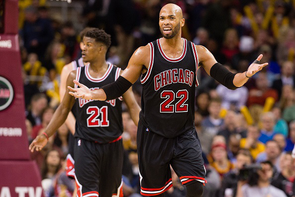
Big fan of Michigan's, but they're Jordan brand.
+1.

Should not be hard to make something simple and relatively along the same lines in O&B for Illini.
The jersey people need to stop trying so hard and find something classic that works.
Sent from my iPhone using Tapatalk
+1.
Should not be hard to make something simple and relatively along the same lines in O&B for Illini.
The jersey people need to stop trying so hard and find something classic that works.
Sent from my iPhone using Tapatalk
Fit is just as important as design. The baggy mid 2000s era is behind us.
haasi
- New York
Fit is just as important as design. The baggy mid 2000s era is behind us.
Agree again
Sent from my iPhone using Tapatalk
Should not be hard to make something simple and relatively along the same lines in O&B for Illini.
The jersey people need to stop trying so hard and find something classic that works.
That Michigan jersey looks better there than it does on the court IMO where the little singlet shape of it makes the lettering real small.
But to your point, I will keep begging for the free labor our resident photoshoppers to mock up jerseys that have the lettering and numbers in the same color. I think that might tone it all down a notch and make the font fit in better.
kaptain80
- STL
That Michigan jersey looks better there than it does on the court IMO where the little singlet shape of it makes the lettering real small.
But to your point, I will keep begging for the free labor our resident photoshoppers to mock up jerseys that have the lettering and numbers in the same color. I think that might tone it all down a notch and make the font fit in better.
Nailed it.
Attachments
I lolled. Thank you
Sent from my iPhone using Tapatalk
+1
Dren1
- Glenview, IL
Awesome!Nailed it.

You are not, it looks extremely dated to me.
Don't necessarily mean a duplicate of that uniform, lose the stripes on the side of uni and shorts, a cleaner look.
TownieMatt
CU Expat
- Chicago
Via @IlliniCreative on twitter:

Dren1
- Glenview, IL
Okay, got it. The lettering still would look a bit blocky to me.Don't necessarily mean a duplicate of that uniform, lose the stripes on the side of uni and shorts, a cleaner look.
Via @IlliniCreative on twitter:
About 3 seasons late on the shoes, but otherwise not bad.
haasi
- New York
Via @IlliniCreative on twitter:
I give it a B.
too much going on, don’t love font (I recognize that the brand requires certain fonts), fit looks a bit baggy still, and like s&c I’d be interested in seeing what it looks like with same color number and letters.
Sent from my iPhone using Tapatalk
Deleted member 11196
D
Guest
Or this?:
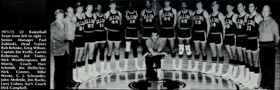
Harv Schmidt throw-backs ? ? ? Noooooooooooooooooooooooooooooo
My response to those people whose reactions to anything involving the rebrand is a reflexive, disgusted "kids these days with their rap 'n roll and eating their tide pods" is this:

Not only sharp, simple, and classic, but also so much stronger for incorporating branding which is ours and consistent across campus as opposed to generic, could-be-anybody create-a-jerseys.
Not only sharp, simple, and classic, but also so much stronger for incorporating branding which is ours and consistent across campus as opposed to generic, could-be-anybody create-a-jerseys.
redwingillini11
White and Sixth
- North Aurora
Yaaaas I've been sayin BU hates the zig zags since last June. Confirmation is great to hear. #ScoopCity
- Status
- Not open for further replies.