Illinois Football Uniforms

Status
Not open for further replies.
#326      
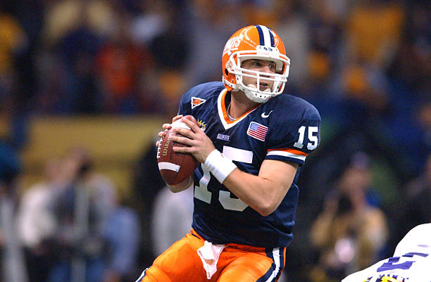
The uniforms really aren't bad. They might actually be cool. The problem is that Syracuse did it first. It's their uniform. Flat out. That's what bothers me.

Fair enough, but that's not remotely a new problem

jan-2002-quarterback-kurt-kittner-of-illinois-looks-to-throw-a-pass-picture-id72361871
large_mcnabb+su+photo.jpg
 
#329      

wILL-INI

Charlotte, NC
I'll wait to see the other combos, but so far im fine with them as a whole.

The Block-I is unforgivable though. It's such an easy fix that im floored that it hasnt been changed.
 
#330      
I'll wait to see the other combos, but so far im fine with them as a whole.

The Block-I is unforgivable though. It's such an easy fix that im floored that it hasnt been changed.

Penny for your thoughts on my hot take: just get rid of the helmet logo entirely. Modern helmets have too much going on in too many different brands and styles for there to be a consistently available blank space of any size.
 
#331      

wILL-INI

Charlotte, NC
Penny for your thoughts on my hot take: just get rid of the helmet logo entirely. Modern helmets have too much going on in too many different brands and styles for there to be a consistently available blank space of any size.

I mean you have a point there. It is definitely an issue and Case A would be Kent State helmets, with the styles and the logo and everything on their helmets, while consistent, were a mess.

For me though, I don't like effects on helmets. Any design that is reliant on an effect, doesn't look like it would be able to stand the test of time. And that is the most important thing IMO. If a design doesn't become a "classic", it fails. So while i like the intent and reason, i don't think would actually like the helmet. Plus im a stripe a guy. I wanna see shoulder stripes, helmet stripes, pant stripes. I want them all to match, and I want them unique. I fully believe that your helmet is your second most important logo. After the block-I, an image of the helmet is brand value 1A. And with out it being recognizable you lose brand value.

Take that all for what its worth haha. I have a TON of thoughts of how a football team should look and more often than not, they are unpopular opinions and very rigid. And I have to avoid turning every post into a thesis.
 
#334      
Fair enough, but that's not remotely a new problem

jan-2002-quarterback-kurt-kittner-of-illinois-looks-to-throw-a-pass-picture-id72361871
large_mcnabb+su+photo.jpg

Oh boy. Come on Nike. A little creativity please. I swear they just give us Syracuse's old uniforms. Cuse just got some new ones with some tweaks. So I figure they just repurposed the Cuse old ones and sent them to us.
 
#335      

TyinLex

Kentucky
Are you even an Illini fan? #OrangeIsLife

The hashtag was in reference to the amount of variation between the orange color value, not my hate for orange. It is my opinion that the brand revitalization plan the university and athletics adopted has not been successful overall, and done more harm for the brand. I say that not because I dislike the new marks or branding, but the fact that the continual tinkering (orange/blue color value), removing (e.g. shield on FB jersey) and changes (upcoming Men's bball uniforms) over the years has created an inconsistent brand.

The casual fans do not think twice about this stuff, but subconsciously people do remember the details. People who work daily in this particular field (a few on this forum) are the ones that make sure the details matter, and know the importance of brand consistency. Change is good, but change should not be forced. Forced change brings with it rushed decisions, poor research and inconsistency.

The university is steeped in rich history, and there is nothing wrong with tapping into that history to revitalize your brand. Please don't think I am referring to the Chief...the university had a brand before/after him. I understand Nike used the history-methodology to create the new marks, but forcing a new identity through the disguise of history is not the same. There are many talented people at the university within their own walls (or columns) that were/are qualified to take on this important task.

For what it is worth, I actually like the FB uniforms this season, but is that our true orange/blue identity? And what about when the basketball team takes the floor, are they going to match the color values the football team is wearing? And is it the same brand?

I appreciate your question, and hope my response has deemed me worthy in your eyes of being an Illini fan.
 
#337      
The university is steeped in rich history, and there is nothing wrong with tapping into that history to revitalize your brand. Please don't think I am referring to the Chief...the university had a brand before/after him. I understand Nike used the history-methodology to create the new marks, but forcing a new identity through the disguise of history is not the same. There are many talented people at the university within their own walls (or columns) that were/are qualified to take on this important task.

I wish the DIA would use these people to at least have a strong, unique template for what we'd like our own uniforms to look like and give a lot more direction to the people at nike. Otherwise, we will continue to risk having our uni's continue to mimic Syracuse or just copy some other dumb new fad .
 
#344      

DrewD007

Woodridge, IL
That's the same hue in a different finish and I will engage in an old-timey bare knuckle boxing match with all who dare disagree. Have at you!

While that may technically be true, the fact it can appear to be different is reason enough to hate those helmets. I don't know why they didn't go with the matte orange back then to begin with. Regardless, aside from the helmet I'd say they've done well being consistent across all sports.
 
#345      
Doesn't matter. It's different... in nearly every circumstance and every angle... Argue if you want, I know that's what you do. But it's still different. Cut the helmet out of that photo cut the jersey out of the photo, take them to Home Depot (they should know orange, right?) and I guarantee your wife will be pissed when you paint adjacent walls with each can of paint..... :eek:

yeah yeah yeah, hold it just right, take a shot (or three) of whiskey, squint your eyes just this way, and MAYBE you can convince the other guy doing shots with you, that they match..... :unsure:

1025926030-e1535841097973.jpg


Also different, in the same way IMO.

Plastic and fabric are not the same thing, some of this is just inherent.
 
#346      

wILL-INI

Charlotte, NC
1025926030-e1535841097973.jpg


Also different, in the same way IMO.

Plastic and fabric are not the same thing, some of this is just inherent.

Youre right, youre never going to match them 100%. But these are a lot closer. They wont come close to our old shells though. For how bad these unis were, the oranges were ON POINT!

c55c4e0d6c9ff512da0e6a70670047f7-thumb-590x504-60058.jpg
 
Last edited:
#347      
Youre right, youre never going to match them 100%. But these are a lot closer. They wont come close to our old shells though. For how bad these unis were, they oranges were ON POINT!

c55c4e0d6c9ff512da0e6a70670047f7-thumb-590x504-60058.jpg

I like those uniforms... I know the 5th grader emphasis ILLINOIS isn't everyone's cup of tea, and I like just the block I better, but I think those are clean and crisp and as you pointed out, the orange was on point. Piping was cool, half stripe on pants. It really came together well. It's a good midway point between stripes and piping on everything and what we have now (essentially a uniform with iron on numbers and names). 
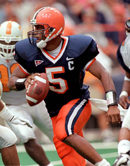
It looks like such a late 2000's uniform, but it fits well in that time period. Also... why when I quoted you did the image change from Ferguson to Scheelhaase, kinda weird.
 
#349      

DrewD007

Woodridge, IL
I think I'll always be a little partial to OBW, because I'm pretty sure we wore those every home game in 2007, which besides being the Rose Bowl season, was also my freshmen year.
 
#350      
I am consistently amazed at the quantity of discourse devoted to the uniforms.

I like the grey ghost uniforms once/year. I think they're a cool exception to whatever rule is currently in place.

Otherwise, win the game in whatever uniform!
 
Status
Not open for further replies.