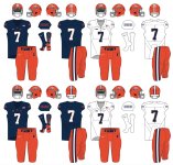
I'm no graphic designer by any stretch but I think if we go with a primarily Orange lid (which it seems most of us seem to think is the best way to go) then the triple stripe should be blue/white/blue not the reverse we had last year, and in the above picture. I think having the darkest color break up the two lighter colors looks so much better than having the orange and white side by side. But that's just me (someone who spends way too much time thinking about the uniform of one of the worst college football teams in the country)
You are using an out of date browser. It may not display this or other websites correctly.
You should upgrade or use an alternative browser.
You should upgrade or use an alternative browser.
Illinois Football Uniforms
- Status
- Not open for further replies.
TheFlyingIllini1317
- Chicago, IL
redwingillini11
White and Sixth
- Batavia
9 out of 10 would eatA month to go until the season seems like a good time to spam my concepts in the chat again. Also gut instinct, I think they go back to slant Illinois on the helmet.
Btw, I am a much bigger fan of blue numbers on white rather than orange numbers on white.
Ransom Stoddard
Ordained Dudeist Priest
- Bloomington, IL
I was in school and then a season ticket holder when ILLINOIS was a thing, so I don't mind it as much. Still way better than 1LL1NO1S in my eyes.A month to go until the season seems like a good time to spam my concepts in the chat again. Also gut instinct, I think they go back to slant Illinois on the helmet.
The Galloping Ghost
- Washington, DC
If we go back to Illinois when the script font is right there and could easily unify the look of our football and basketball programs, I'm going to be so depressed...A month to go until the season seems like a good time to spam my concepts in the chat again. Also gut instinct, I think they go back to slant Illinois on the helmet.
It would be a huge step in the wrong direction if that New York Giants slanted ILLINOIS came back.a curved script Illini is much better than a Illinois
If we want or need "Illinois" on the helmet, PLEASE, PLEASE go with the script.
Unpopular opinion: I think the slant Illinois is fine. Maybe not ideal, but fine. If that's the price of burying 1LL1NO1S I'll take it. Sometimes I find myself prefering the slant Illinois to the Block I, probably because I my time in Champaign corresponded with that look. I would prefer a script "Illini" on the helmet, I think that would look great.
I like the Script a lot, I wouldn't prefer it as our main helmet, but if we sprinkled it in every once in a while it'd be nice. Almost like what we did with the State shape on the helmet about 5-6 years ago.
At the end of the day, the student-athletes input will go much further than any of our opinions. I don't see us going back to old schemes. The kids and Nike will come up with something new and fresh.
At the end of the day, the student-athletes input will go much further than any of our opinions. I don't see us going back to old schemes. The kids and Nike will come up with something new and fresh.
I really have little faith in Nike doing anything "fresh " for us.I like the Script a lot, I wouldn't prefer it as our main helmet, but if we sprinkled it in every once in a while it'd be nice. Almost like what we did with the State shape on the helmet about 5-6 years ago.
At the end of the day, the student-athletes input will go much further than any of our opinions. I don't see us going back to old schemes. The kids and Nike will come up with something new and fresh.
We just arent a high profile school for them .
We get hind tit whilst the sexy schools get front and center
@IlliniCaboose was right the helmet and pants stripe should match. The helmet should be base Orange with 2 blue thinner striped dividing the white center stripe instead of how it is. The other option is to change the stripe on the pants.A month to go until the season seems like a good time to spam my concepts in the chat again. Also gut instinct, I think they go back to slant Illinois on the helmet.
ChiefGritty
- Chicago, IL
The history of slant Illinois is it just being used as a throwaway placeholder in the absence of any effort being given to our branding, and even worse as the de facto replacement for the chief logo. It never had a chance.Unpopular opinion: I think the slant Illinois is fine.
Nike performed a design miracle with the shield and we proved the impossibility of their task by turning our noses up at it.I really have little faith in Nike doing anything "fresh " for us.
We just arent a high profile school for them .
We get hind tit whilst the sexy schools get front and center
Unpopular opinion #2: the shield is meh. It looks ok but to me it's honestly the most generic option. The shield-type logo is so common it takes a lot to stand out and ours doesn't do it. It's honestly kinda lazy compared to the best shields and crests out there (check out Euro soccer clubs). Take the block I out and superimpose any other logo onto it and it would be just as good/bad.Nike performed a design miracle with the shield and we proved the impossibility of their task by turning our noses up at it.
ChiefGritty
- Chicago, IL
Well that's the design miracle of it.Unpopular opinion #2: the shield is meh. It looks ok but to me it's honestly the most generic option. The shield-type logo is so common it takes a lot to stand out and ours doesn't do it. It's honestly kinda lazy compared to the best shields and crests out there (check out Euro soccer clubs). Take the block I out and superimpose any other logo onto it and it would be just as good/bad.
The University of Illinois went to Nike and said "we have no iconography whatsoever you're allowed to use, and we are incredibly hidebound and backward looking and scared of anything new, please make us a brand new logo from scratch"
An impossible task, and somehow they did it. Unique (a soccer crest is a different thing), instantly recognizable, consistent and reproducible in all the ways you need it to be, and it both makes the letter I into something with visual interest while being largely non-threatening to people who would reflexively reject anything "modern". The mission was to create meh, rather than ridiculous or just re-introducing what was there before.
But then the way it was launched with the shield coded as the "new" thing and the reworked Block I being the "old, classic" thing, the nature of college sports and its fan and coach demographic means that's only ever going one way, and with the Thomas and Beckman stink on the shield it was dead before it started.
Launch the shield as the singular new block I logo (which is what it is. It's just an I) for the athletic department in 2019 with Ayo and Kofi and we'd be expressing sheer astonishment at this gift from the heavens Nike had given us.


Last edited:
See there's nothing unique about it. It is so un-unique you can find shutterstock corporate logo templates online that look very similar:Well that's the design miracle of it.
The University of Illinois went to Nike and said "we have no iconography whatsoever you're allowed to use, and we are incredibly hidebound and backward looking and scared of anything new, please make us a brand new logo from scratch"
An impossible task, and somehow they did it. Unique (a soccer crest is a different thing), instantly recognizable, consistent and reproducible in all the ways you need it to be, and it both makes the letter I into something with visual interest while being largely non-threatening to people who would reflexively reject anything "modern". The mission was to create meh, rather than ridiculous or just re-introducing what was there before.
But then the way it was launched with the shield coded as the "new" thing and the reworked Block I being the "old, classic" thing, the nature of college sports and its fan and coach demographic means that's only ever going one way, and with the Thomas and Beckman stink on the shield it was dead before it started.
Launch the shield as the singular new block I logo (which is what it is. It's just an I) for the athletic department in 2019 with Ayo and Kofi and we'd be expressing sheer astonishment at this gift from the heavens Nike had given us.
I like the generic one better.See there's nothing unique about it. It is so un-unique you can find shutterstock corporate logo templates online that look very similar:
View attachment 18984
The slant Illinois is just a lousy rip off of the old Giants logo. Bringing it back now would be especially disappointing given the fact that the Giants announced they are bringing it back for a few games this year as well
ChiefGritty
- Chicago, IL
You don't have to like it, I'm done arguing for it. But it's objective fact that it accomplished a difficult design feat with remarkable elegance.


Coulda gone one way, but we went the other.
Coulda gone one way, but we went the other.
I think the shield concept isn't a bad one but just really don't like the execution. I think it was a missed opportunity and I found this old shield looking around online that would have been a much better way to go:

This shield has a classic simplicity to it that I like. I'd update it by swapping out the old logo for the Block I. Then I'd add a flourish you see in European soccer leagues - add stars to signify championships. Since this is the logo for the entire athletic department, I'd add a star for every five national championships in all sports. As of right now that would give us four stars (23 nattys). Most European shields/crests do this by adding the stars above the shield, which is a fine way to go. But given the simplicity of this design, I'd add them to the background. Start at the top left corner and work your way down and across the shield. Maybe one day (in like 1000 years) it can look something like this:
.jpg")
(Boca Juniors - 1 star for each championship)
This shield has a classic simplicity to it that I like. I'd update it by swapping out the old logo for the Block I. Then I'd add a flourish you see in European soccer leagues - add stars to signify championships. Since this is the logo for the entire athletic department, I'd add a star for every five national championships in all sports. As of right now that would give us four stars (23 nattys). Most European shields/crests do this by adding the stars above the shield, which is a fine way to go. But given the simplicity of this design, I'd add them to the background. Start at the top left corner and work your way down and across the shield. Maybe one day (in like 1000 years) it can look something like this:
(Boca Juniors - 1 star for each championship)
mattcoldagelli
- Script Illinois Enthusiast
I guess I don't really understand the "it isn't unique enough" criticism on the Shield. Set aside for a minute the fact that we have, for all intents and purposes, an empty visual toolbox. You're not looking for something that stops traffic - you're trying to land on something that is both easily and quickly recognizable and would work in a variety of settings (helmets, polo shirts, stationary, business cards, etc.) - with the latter point being really important for us because we don't really have anything else (before the rebrand, this where the "column I" came in).
This is an old video that's probably been shared before, but check out Aaron Draplin building a logo expressly out of existing, familiar things. This is a good approach for anyone, but especially for us - we're an old Midwestern institution, not an NBA expansion team. I'm convinced that one of the reasons the 70s script feels so right for everyone is that Illinois is a brand/team that FEELS like it should have a classic iconography that you've seen before, even though we all know that we do not.
This is an old video that's probably been shared before, but check out Aaron Draplin building a logo expressly out of existing, familiar things. This is a good approach for anyone, but especially for us - we're an old Midwestern institution, not an NBA expansion team. I'm convinced that one of the reasons the 70s script feels so right for everyone is that Illinois is a brand/team that FEELS like it should have a classic iconography that you've seen before, even though we all know that we do not.
The Galloping Ghost
- Washington, DC
You're not looking for something that stops traffic - you're trying to land on something that is both easily and quickly recognizable and would work in a variety of settings (helmets, polo shirts, stationary, business cards, etc.) - with the latter point being really important for us because we don't really have anything else (before the rebrand, this where the "column I" came in).
Speaking of, I'm sure I'm in the minority, but this will forever be my favorite Illinois "I". To me, it just screams "university" in the best possible way and transforms a simple letter into something far more visually appealing. I understand why we dropped it. Having a different "I" for the academic and athletic departments isn't ideal, but I miss it.
It's not just that it's not unique. It's that it is overly complicated in the most non-unique way. If you can't create something unique, create something simple/classic and make it your own. You touch on this when you talk about the 70s script. That feels traditional even if it's not strictly within the university's tradition. I don't think the shield feels traditional. I think a shield that is unique to Illinois in some way could. Or a shield that is a little more simple in design could. But to me this just feels like the kinda thing you'd see designed by a travel soccer team. It looks like a failed modern attempt to look traditional, if that makes sense.I guess I don't really understand the "it isn't unique enough" criticism on the Shield. Set aside for a minute the fact that we have, for all intents and purposes, an empty visual toolbox. You're not looking for something that stops traffic - you're trying to land on something that is both easily and quickly recognizable and would work in a variety of settings (helmets, polo shirts, stationary, business cards, etc.) - with the latter point being really important for us because we don't really have anything else (before the rebrand, this where the "column I" came in).
This is an old video that's probably been shared before, but check out Aaron Draplin building a logo expressly out of existing, familiar things. This is a good approach for anyone, but especially for us - we're an old Midwestern institution, not an NBA expansion team. I'm convinced that one of the reasons the 70s script feels so right for everyone is that Illinois is a brand/team that FEELS like it should have a classic iconography that you've seen before, even though we all know that we do not.
Think of the most recognizable logos in college sports. Either they are unique (Arkansas, Texas, USC, FSU) or they are simple (Miami, Alabama, Oklahoma, UCLA). And they are all aesthetically pleasing. I think the shield accomplishes none of these (I do think it looks fine on a t-shirt, just can't see it looking good on a helmet, or painted onto the 50 yard line).
This is all just my personal opinion of course and as I recognized above, it's unlikely to be a popular one.
ChiefGritty
- Chicago, IL
I know its annoying to get psychoanalyzed by some joker on a message board, I apologize for that, but this is just inextricable from when and how and by whom the shield was introduced. It was put in a context to be perceived that way.I don't think the shield feels traditional. It looks like a failed modern attempt to look traditional
Enter the multiverse and head to a century from now when the aesthetically perfect, beloved icon of an Illinois logo, whatever you're imagining, is on every t-shirt in the state, take that image back and have it be released in 2014 by Mike Thomas and Tim Beckman next to a reworked Block I and it suffers the exact same fate on the exact same timeline with everyone having the exact same opinion.
And that's not even necessarily wrong or irrational! Context matters.
It wasn’t executed as well as you’re insisting. The negative “I” itself, the central component to the shield, was wrong. Nike’s rebrand introduced a new block I with softer interior corners. That was a subtle, but major, part of the symbology rebrand. The shield Block I has hard corners. How is it possible for a professional design team to f#*% up something so central to the design? At least it’s the right vowel.I know its annoying to get psychoanalyzed by some joker on a message board, I apologize for that, but this is just inextricable from when and how and by whom the shield was introduced. It was put in a context to be perceived that way.
Enter the multiverse and head to a century from now when the aesthetically perfect, beloved icon of an Illinois logo, whatever you're imagining, is on every t-shirt in the state, take that image back and have it be released in 2014 by Mike Thomas and Tim Beckman next to a reworked Block I and it suffers the exact same fate on the exact same timeline with everyone having the exact same opinion.
And that's not even necessarily wrong or irrational! Context matters.
I’ve never developed the strong feelings about it that the “team shield” or the “team anti-shield” did. I feel ambivalent about it. There you go. A team symbol that generates ambivalence in the heart of its most ardent fans. Great work everyone.
Those of you who keep pushing this bland shield design are like the person who restates the punch line of a lame joke, waiting for laughter. We heard you the first time.
The Galloping Ghost
- Washington, DC
It wasn’t executed as well as you’re insisting. The negative “I” itself, the central component to the shield, was wrong. Nike’s rebrand introduced a new block I with softer interior corners. That was a subtle, but major, part of the symbology rebrand. The shield Block I has hard corners. How is it possible for a professional design team to f#*% up something so central to the design? At least it’s the right vowel.
I’ve never developed the strong feelings about it that the “team shield” or the “team anti-shield” did. I feel ambivalent about it. There you go. A team symbol that generates ambivalence in the heart of its most ardent fans. Great work everyone.
Those of you who keep pushing this bland shield design are like the person who restates the punch line of a lame joke, waiting for laughter. We heard you the first time.
So, this is wrong. The shield uses the proper silhouette. The official silhouette of the "I" is the one with right angles (you can see it in the picture). The curved corners are only ever used inside the "I" with right angles. The official style guide with the rebrand stated that the "I" would never simply be the curved angle "I." It has to have the full right-angled "I" behind it (in the link I provided, it's why the "I" in the limited-use section all have right angles. It's also why I like the shield. It emphasizes that the right angles are a key component of our letter.
Edit: just gonna throw this in here https://marketing.illinois.edu/design/logo
Last edited:
- Status
- Not open for further replies.