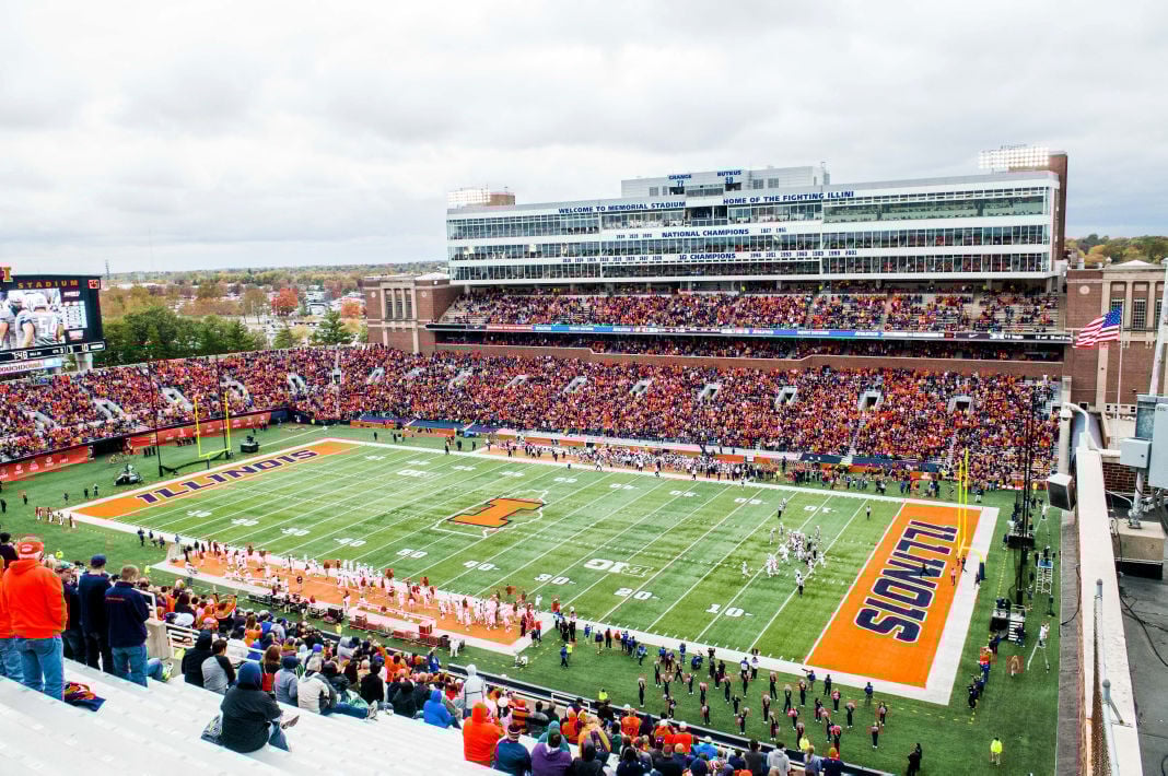
Curious to hear from those who’ve attended most of the home games about the evolution (or lack thereof) of concessions, music, admission to the stadium, tailgating, etc. Of course bigger crowds and an exciting team are a huge part of making it fun, but are we seeing incremental progress in other areas?
For me it's a mixed bag. The first game had a lot of SNAFUs all the way around, from getting in to the stadium, time getting through concessions, availability of concessions, and the like. They ran out of bottled water at half-time in 85 degree weather, for crying out loud. Much of that has mostly improved from game to game, although concession time is still a problem, and I couldn't find coffee or hot chocolate before the game started last weekend. I love me a 10:30 AM beer, but a coffee would have been even better.
")
I've only been through Grange Grove once, and that was after the Minny game, but it was still hopping about 45 minutes after the final gun, and some of those folks looked like they were in for the long haul. I've talked to other people who set up their tailgates there and it sounds like things run pretty smoothly and no real problems. Tailgating in general seems very good and I see more and more on my walk down Florida/Kirby toward MS each week.
They play a very broad range of music during the game, which probably leaves everyone with something they like and something they don't. I wish I had the rights for AC/DC's catalog though--I'd guess that every sporting event I've been to since 1984 has had at least 1 AC/DC tune played, and MS uses at least 3 (Hell's Bells, Thunderstruck, and I think FTATR)
I respond to the DIA's survey requests after every game, and give some of the same responses almost every time, so in no particular order (and with the requisite commentary), my criticisms/concerns are:
1. Wait time at concessions. It has improved somewhat, but last week's 11am start seemed to catch everyone off guard. There wasn't enough food ready to go at the BBQ place (literally took 30 minutes from order to pickup), and as mentioned above I was unable to locate a hot beverage in the 1st half. The prices are also a bit on the high side, especially for bottled water (I think I paid $6 each).
2. AT&T cell coverage is very very bad. I haven't tried making a call during a game, but my internet signal is non-existent. This is kind of silly in light of the "Light Show" that they've done at the night games. No coverage, no participation. No coverage, no posting to IL or tweeting my innermost thoughts about Lunney's play-calling.
3. Parking. I'm in lot 46, and it's scary how poorly the parking is coordinated. I know the folks working the lots are volunteers (at least I'm assuming they are), but there should be some reasonable standards of how close they put the rows and where they put tailgaters. I was blocked by cars in front and back last week, although it was a short wait for someone to move so I could get out, harder yet not to run over tailgaters as they'd spread tents out into the main "drives".
4. Traffic control. So far in 5 games I've seen exactly 1 LEO coordinating traffic coming out of any parking lot, or at an intersection that wasn't 4th and Kirby. I know that's more on the individual police departments than the DIA, but there's a legit safety issue there. I guess all the cops prefer to be out in front of the stadium on Kirby in their SWAT gear rather than directing traffic.
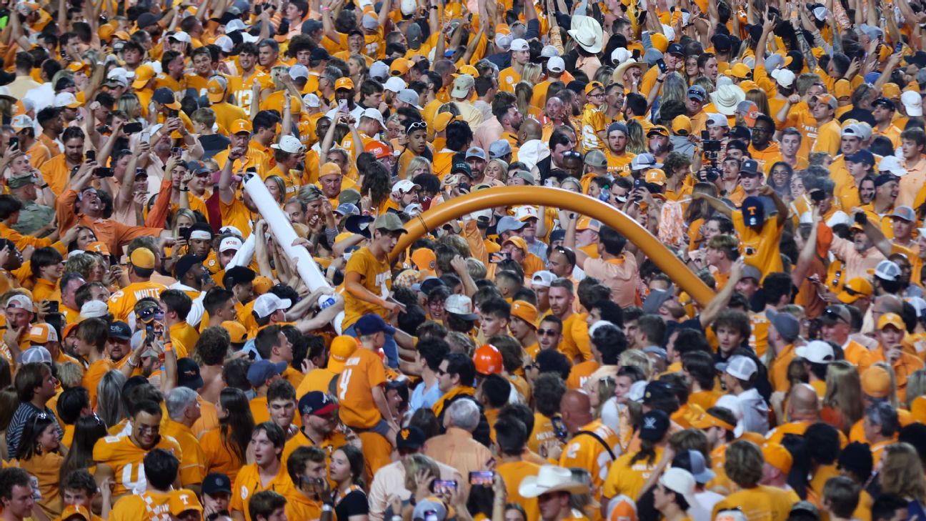
5. Crowd control in the portals. The Minny game was the worst, but people congregate in the front of the portals, whether it's watching the game, chatting, checking their phones, etc. and it slows down the ability to get to/from the restrooms and concessions. That would get you a stern rebuke back in the 80s and 90s when Guenther's Fun Police roamed MS making sure no one was out of their section.
6. Much more minor point--I've never thought so, but apparently section numbers and row numbers could be better marked. I witnessed 3 different groups (2 of them Goofers) try to sit in the wrong section on Saturday, and one of them started in the wrong row, and then ultimately found they were in the wrong section.
But to be fair, I've praised the DIA for the following:
1. Reaching out to the fans after every game for feedback. They obviously want to improve and I've seen that improvement in a lot of areas.
2. Improving the stadium entry process. It's been smooth as glass at the SE entrance for me.
3. Adding water containers outside the stadium for water bottle refills. Unfortunately that only seemed to be for a game or 2 when it was warmer.
4. Player introductions and the way the team comes onto the field. It was very, very cool at the night games and still great in the daylight.
5. Stadium cleanliness. It's something you don't even notice unless you think about it. The restrooms are clean, garbage cans get emptied, spills get cleaned up in the concourses and on the ramps. It wasn't always this way, especially the restrooms.
6. Entertainment/videos during timeouts. This is stuff no one sees who only watch the games on TV. Sometimes it's intros of VIPs/honorees, sometimes it's the obligatory crowd shots, sometimes it's the drum line. Given how many and how long the timeouts/commercials are these days, it's good that there's an attempt to keep the crowd engaged.
7. Gene Honda. A freaking treasure.
How in the world is this not a more frequent topic of discussion on this board, of all places? I'm not even trying to take a side here. I'll confess that I think the font is 100% retro-cool and I love the work that the athletic department is doing on that campaign, though I'm not sure I'd want it on a uniform. But this board has discussed every single facet of the program at length: which gloves high schoolers wore last weekend, walking distances from various parking lots, wireless service in the upper East balcony, how fast they hand out hot dogs on game day, but that unique new font barely gets a mention. Did I miss a conversation along the way?
There was a fair bit of discussion in a thread a few weeks back. My recollection was that the font wasn't well received, but personally I like it. Like you, I don't want it on a uniform, but it stands out on marketing stuff.


:format(jpeg)/cdn.vox-cdn.com/uploads/chorus_image/image/56268023/usa_today_9655363.0.jpg)