That sure seems like a workable compromise to me!To this end, I know people hate the Kingfisher. I get it. I'd like us to move on from the Chief and find a workable mascot but I'm not fully sold on the Kingfisher either. But if we adopted the Kingfisher, that would allow us to use bird feathers in ways that evoke the Chief. Such as this helmet mock up (source: https://www.thechampaignroom.com/2013/2/23/4019504/illinois-helmet-mockups):
View attachment 41832
Is that a headdress? Why no, those are Kingfisher feathers.
You are using an out of date browser. It may not display this or other websites correctly.
You should upgrade or use an alternative browser.
You should upgrade or use an alternative browser.
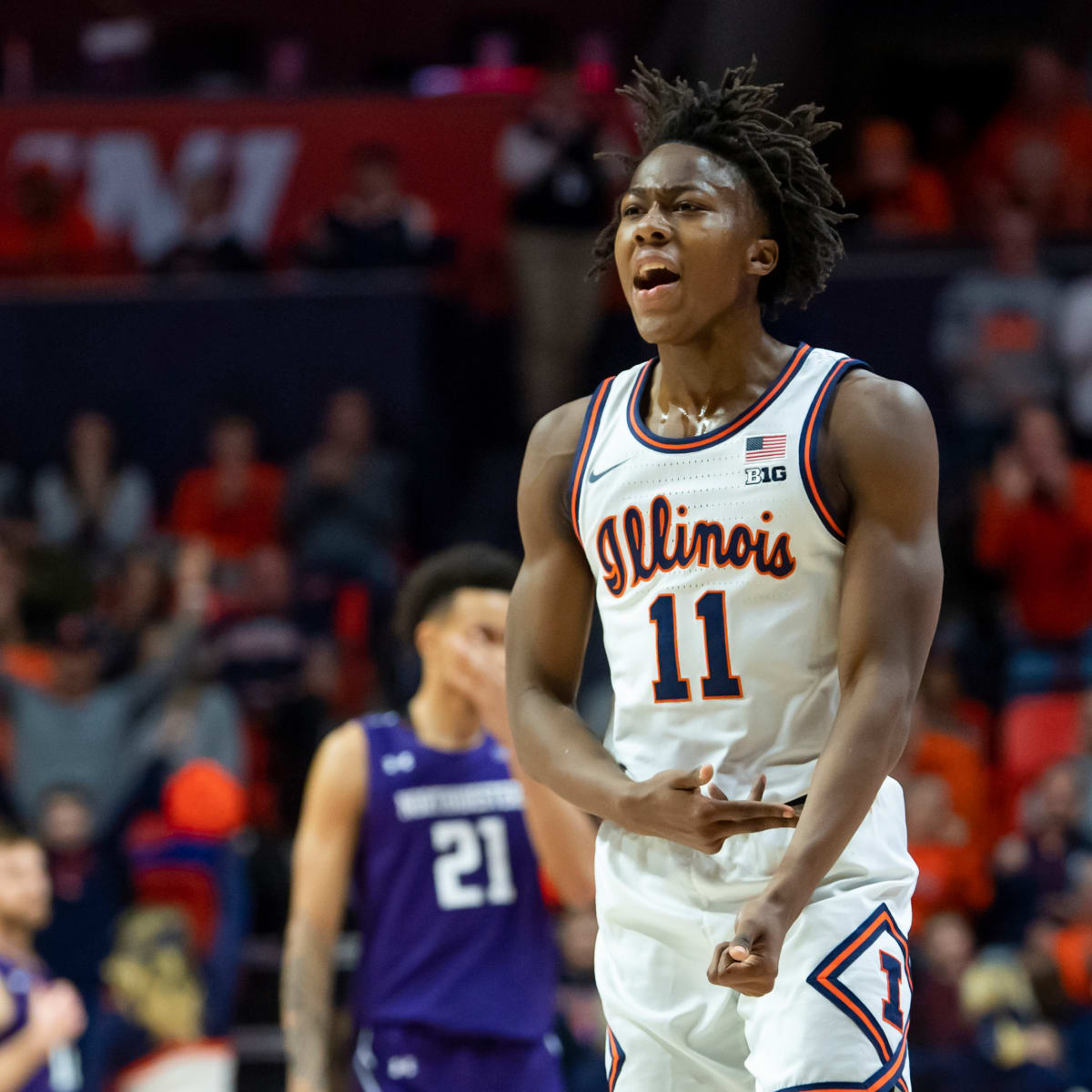
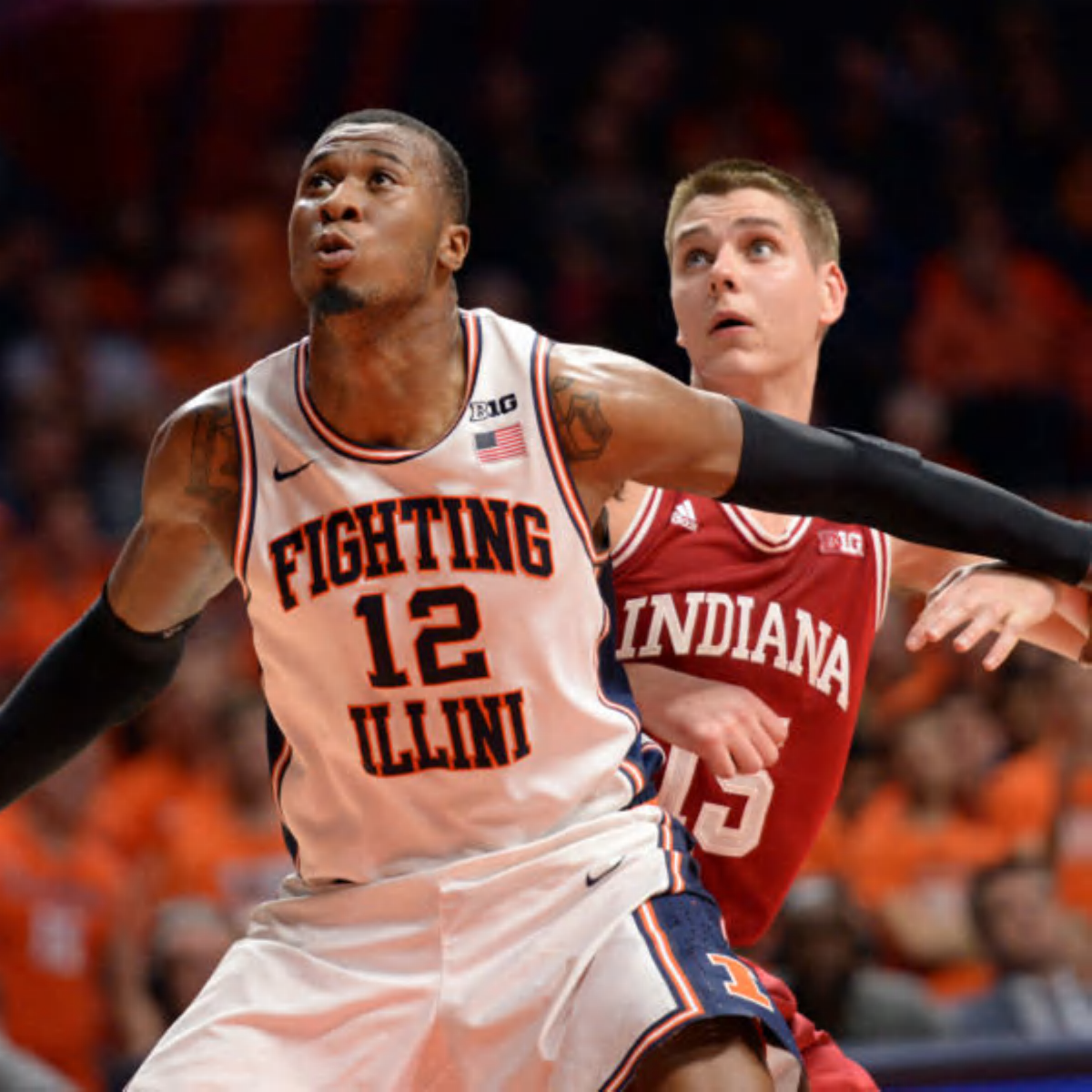
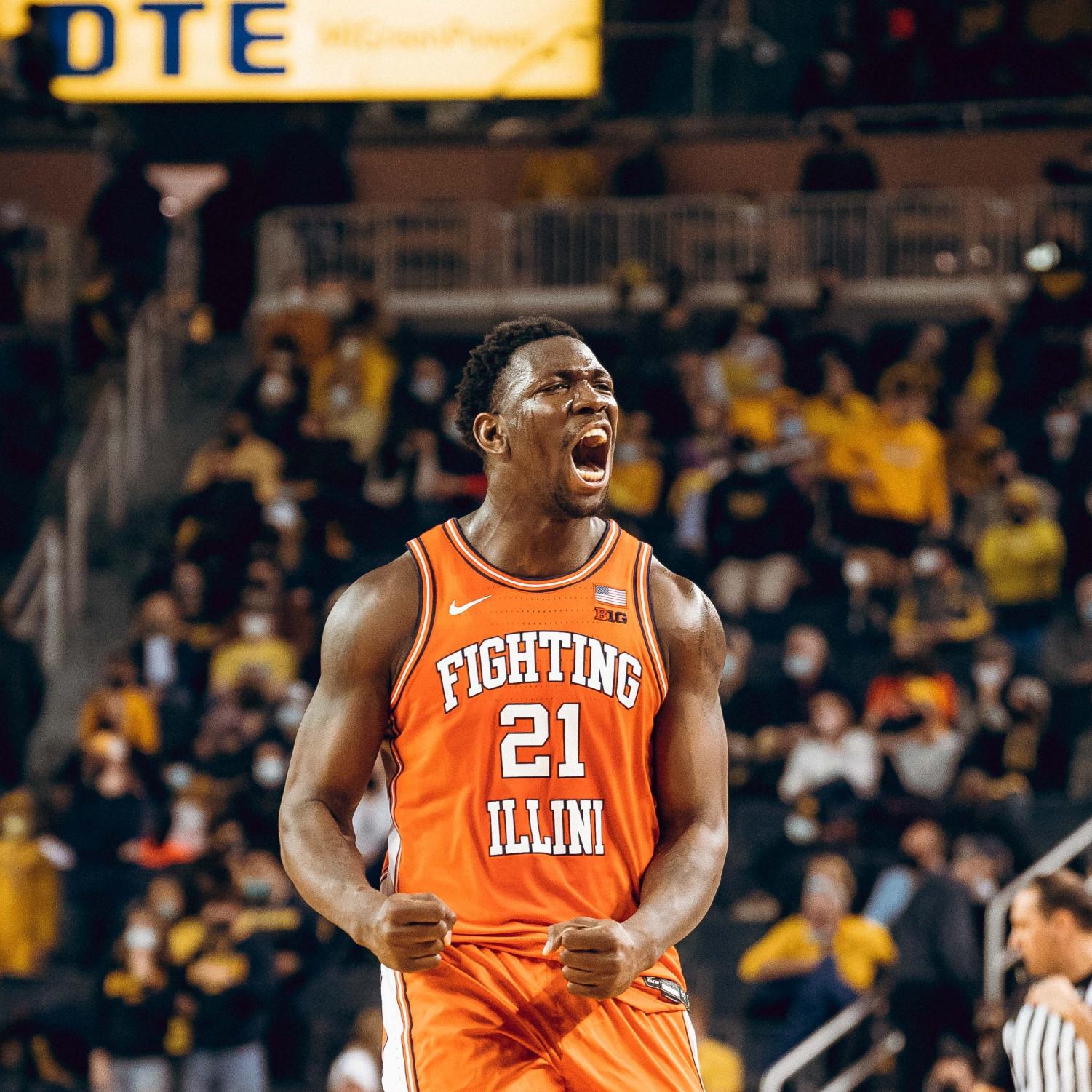
Illini Basketball Uniforms
- Status
- Not open for further replies.
Fighter of the Nightman
- Chicago, IL
I am in no way convinced by the idea that we need some type of mascot-related imagery, much less a new actual "mascot." After all, there are schools with successful brands in at least one sport such as Michigan, Indiana, Texas A&M, etc. that really don't lean into that type of imagery at all. However, I am also not COMPLETELY opposed to an idea like this.To this end, I know people hate the Kingfisher. I get it. I'd like us to move on from the Chief and find a workable mascot but I'm not fully sold on the Kingfisher either. But if we adopted the Kingfisher, that would allow us to use bird feathers in ways that evoke the Chief. Such as this helmet mock up (source: https://www.thechampaignroom.com/2013/2/23/4019504/illinois-helmet-mockups):
View attachment 41832
Is that a headdress? Why no, those are Kingfisher feathers.
I think any new mascot imagery needs to not come across as "moving past" our Fighting Illini identity, even if it "moves past" the Chief ... flipping a switch tomorrow and making us the Bulldogs and plastering Bulldog imagery everywhere could reasonably be seen as a bit of a betrayal to our history by many fans. Something like you're suggesting where we have very subtle feather imagery that could theoretically reference the Kingfisher or the Chief seems like a very creative and workable solution, IMO. I have long proposed that if we MUST go down this route, I myself would have preferred a respectful nod to our World War I connection or Abe Lincoln-related imagery for the state pride angle. However, people for some reason seem to have issues with those and want something completely ahistorical in nature. I think of the next set of options, yours is the only remotely appealing idea I have heard, haha.
PizzaHutParkingLot
- Vodice, Croatia
But I think we can all agree that there might be rare examples on each extreme of this "debate." For example, Penn State's football uniforms are objectively boring, and the only reason they are "ownable" is because of their history of success and because they have worn them for so long. On the other extreme, a lot of people online were talking about TCU having one of the best football uniforms a few years ago, and it was not because they have this decades-long history of winning. The vast majority of "good uniforms," at least IMO, combine those two elements.
Either way, I think a lot of this is indeed subjective and often leads to fellow Illini fans talking past each other. However, I would allege that the following statements are damn near objective truths:
1. Our current uniforms have a "cookie cutter" or default feel to them in a way that our past uniforms did not, at least not anywhere close to this degree. If the picture posted of Clemson's uniforms didn't prove it for you, just look up images of the Nike jersey for Creighton or Vanderbilt or several other schools ... we very clearly got the default Nike template in a way that we had not for previous iterations. Even pretty unpopular uniform designs like the zig zags showed an effort to create something somewhat unique.
2. Our throwback uniforms are incredibly popular, both among our own fan base and the casual college hoops fan. Read the comments in this thread. Look at which style of jersey (i.e., Script/Flyin' Illini vs. one of the default jerseys) you see fans wearing at our games. Go look at any college hoops social media page that ranks throwback uniforms, and you will find ours near the top the majority of the time. While this last argument is more subjective, I would argue that both are VERY clearly identifiable with Illinois, both because they are both unique looks that incorporate our colors in aesthetically pleasing ways and (especially for the Flyin' Illini ones) because they evoke memories of past Illini teams. They have been an unambiguous success.
Thus, it seems entirely reasonable to me that the "burden of proof" here HAS to lie with those who do not want to simply create one or both of our throwbacks in white, navy and orange. We already HAVE great uniforms that our fans and others like, and the incremental effort would be laughably minimal. If someone wants anything other than the absolutely awesome options we have staring us in the face, he or she must articulate a better option. It really doesn't seem reasonable right now to argue WHETHER we need new uniforms after 6+ seasons with a set that most don't really like ... the question is what comes next. And the path of least resistance for literally everyone involved are the two throwbacks staring Nike and the DIA right in the face. I feel like some people assume it's this foregone conclusion that we have to come up with something new and then just have two random throwbacks in our pockets ... WHY?!?! Lol.
The other uniform ideas from that KJ rendering to the Southern Illinois examples are great ... but I can't see how either is in any way equal to the Script or Flyin' Illini options, much less superior to either one. Get your head out of your a$$, Nike, and do the move that is so damn obvious that it hurts!
View attachment 41829
View attachment 41830
Woohoo, call it a day and we all move on as winners!!
The Chief was retired in 2007, so you have to let at least the Boomers and Gen Xers die out before it's really just the Millennials that remember him even participating in one of the games they attended.
Using the Kingfisher allows you to move forward and still use feathers in the branding that calls back to Chief Illiniwek as we move on. I really don't care to see a mascot, but we could use it as a vehicle to bring the Chief back, even if only as a distant memory.
Using the Kingfisher allows you to move forward and still use feathers in the branding that calls back to Chief Illiniwek as we move on. I really don't care to see a mascot, but we could use it as a vehicle to bring the Chief back, even if only as a distant memory.
A mascot is just supposed to be something fun, not an "identity." University of Utah is the Utes. What is a Ute? An Indian tribe for whom the state was named. What is their mascot? An eagle named Swoop. UNC Tar Heels. What is a Tar Heel? It's a term that refers to residents of North Carolina, where the state was at one time a leading producer of tar, pitch, and turpentine for the naval industry. What is their mascot? A ram named Ramses. Western Kentucky are the Hilltoppers, because their university is on the top of a hill. Their mascot? A furry red blob named Big Red. The Tennessee Volunteers are named for the state's tradition of offering up large numbers of volunteers to the military. Their mascot is a dog named Smokey.I am in no way convinced by the idea that we need some type of mascot-related imagery, much less a new actual "mascot." After all, there are schools with successful brands in at least one sport such as Michigan, Indiana, Texas A&M, etc. that really don't lean into that type of imagery at all. However, I am also not COMPLETELY opposed to an idea like this.
I think any new mascot imagery needs to not come across as "moving past" our Fighting Illini identity, even if it "moves past" the Chief ... flipping a switch tomorrow and making us the Bulldogs and plastering Bulldog imagery everywhere could reasonably be seen as a bit of a betrayal to our history by many fans. Something like you're suggesting where we have very subtle feather imagery that could theoretically reference the Kingfisher or the Chief seems like a very creative and workable solution, IMO. I have long proposed that if we MUST go down this route, I myself would have preferred a respectful nod to our World War I connection or Abe Lincoln-related imagery for the state pride angle. However, people for some reason seem to have issues with those and want something completely ahistorical in nature. I think of the next set of options, yours is the only remotely appealing idea I have heard, haha.
Edit just to add that Texas A&M (Aggies) does have a mascot, who is a very good dog. I love live-animal mascots, particularly dogs, so while it doesn't make sense entirely for us, if we want to get a very good dog I am down. https://en.wikipedia.org/wiki/Reveille_(dog)
Last edited:
Agree there is too much conflating of the desire for a potential mascot with the team name: Fighting Illini. I am not bothered that we don't have a mascot, but if we do end up with one it should happen more or less organically.A mascot is just supposed to be something fun, not an "identity." University of Utah is the Utes. What is a Ute? An Indian tribe for whom the state was named. What is their mascot? An eagle named Swoop. UNC Tar Heels. What is a Tar Heel? It's a term that refers to residents of North Carolina, where the state was at one time a leading producer of tar, pitch, and turpentine for the naval industry. What is their mascot? A ram named Ramses. Western Kentucky are the Hilltoppers, because their university is on the top of a hill. Their mascot? A furry red blog named Big Red. The Tennessee Volunteers are named for the state's tradition of offering up large numbers of volunteers to the military. Their mascot is a dog named Smokey.
Edit just to add that Texas A&M (Aggies) does have a mascot, who is a very good dog. I love live-animal mascots, particularly dogs, so while it doesn't make sense entirely for us, if we want to get a very good dog I am down. https://en.wikipedia.org/wiki/Reveille_(dog)
You don't think the Charlotte Hornets, who have never finished higher than 4th in the east, had an immediately identifiable jersey in the 90s? You can't close your eyes and picture their jersey? You don't recall how kids throughout the country who had absolutely no ties to North Carolina wore Hornets jerseys, windbreakers, and hats in the 90s?Got it, yes. I agree our current uniforms are not aesthetically pleasing to me at all. Agree with you on that and would love an improvement.
My comments were more addressed at the idea of a uniform that is immediately identifiable as a brand. I don't think any design, purely in-and-of itself and independent of success on the field/court, can achieve that.
They didn't win - at least not to the existent that you're claiming teams need to in order for their jerseys to be recognized - but their jerseys still built equity for their brand on a scale that wouldn't have been possible with a more generic design.
Fighter of the Nightman
- Chicago, IL
Okay, fair points ... but why not both?? A goofy lookin' Abe Lincoln running around is both fun/light-hearted and somewhat relevant!A mascot is just supposed to be something fun, not an "identity." University of Utah is the Utes. What is a Ute? An Indian tribe for whom the state was named. What is their mascot? An eagle named Swoop. UNC Tar Heels. What is a Tar Heel? It's a term that refers to residents of North Carolina, where the state was at one time a leading producer of tar, pitch, and turpentine for the naval industry. What is their mascot? A ram named Ramses. Western Kentucky are the Hilltoppers, because their university is on the top of a hill. Their mascot? A furry red blob named Big Red. The Tennessee Volunteers are named for the state's tradition of offering up large numbers of volunteers to the military. Their mascot is a dog named Smokey.
Edit just to add that Texas A&M (Aggies) does have a mascot, who is a very good dog. I love live-animal mascots, particularly dogs, so while it doesn't make sense entirely for us, if we want to get a very good dog I am down. https://en.wikipedia.org/wiki/Reveille_(dog)
I'm not opposed to what you said, and one example is the Peoria Chiefs mascot morphing into a dog that is the "Fire Chief," so it is a creative and not totally random tangent. I just find it odd that something like Abe is a non-starter for some folks seemingly precisely BECAUSE it's not random, lol.
Tophe
- Middle TN
The absence of a mascot really limits the design elements that make some schools look pop. Without one, you are just sitting around discussing piping and fonts...
Uniforms back in the day were cooler. They could use the Chief, and he was awesome! No matter where you land on that debate, the reality is, he isn't coming back.
Will we ever be able to move on to something other than the letter "I"?
A little dated (from 2018) but on this Sports Illustrated top 10 list of college basketball uniforms, I only see 2 mascots used
(I don't have the sharpest eyes, did I miss any?)
The Block I works for me...
Yeah, fair, that jersey is pretty identifiable, even today, owing largely to its unique color scheme, I'll give you that. But NBA jerseys generally are going to be more identifiable because they are essentially the 30 most popular and well-known basketball teams in the world. To that end, most of us can probably very clearly picture the jersey of teams like the Clippers or the Grizzlies or the Thunder, all historically unsuccessful franchises with pretty unremarkable jerseys. So ok, I suppose in the NBA winning is not necessary to establish brand identity. Just being in the NBA is probably enough. Then if you adopt a unique color scheme, you're a step ahead. Even still, I think jerseys like the Lakers, Bulls, and Warriors are probably far more identifiable around the world due to the success of those teams.You don't think the Charlotte Hornets, who have never finished higher than 4th in the east, had an immediately identifiable jersey in the 90s? You can't close your eyes and picture their jersey? You don't recall how kids throughout the country who had absolutely no ties to North Carolina wore Hornets jerseys, windbreakers, and hats in the 90s?
They didn't win - at least not to the existent that you're claiming teams need to in order for their jerseys to be recognized - but their jerseys still built equity for their brand on a scale that wouldn't have been possible with a more generic design.
More to the point, I don't see how you go about re-creating what the Hornets did in the NCAA. Would you want us to ditch our colors and do something more unique to try and re-capture that? Incorporate a funny cartoonish animal mascot into the jersey design (like a lot of 90s NBA teams, including the Hornets, did)?
We're kind of boxed in, in ways the Hornets of the 90s were not. We have our colors. Those aren't changing. We have historical templates to go off. Those aren't changing and we probably don't want to stray too far from them, because we've already built those up and its easier to build on an existing brand than start from scratch. We can make changes around the edges, to certain details, but those aren't going to have a huge impact. Honestly, the best we can do is pick a template, be it script, Flying Illini-era, '05-era, current jerseys (I hope not, btw), or something else, stick with it for decades, and win lots of ballgames and hang lots of banners.
Oh, I have no problem with those suggestions. The only issue I have with Abe is that I personally find most people-based mascots to be weird and creepy, but I can live with it if that's the idea that brings Illini-nation together on this divisive issue.Okay, fair points ... but why not both?? A goofy lookin' Abe Lincoln running around is both fun/light-hearted and somewhat relevant!

I'm not opposed to what you said, and one example is the Peoria Chiefs mascot morphing into a dog that is the "Fire Chief," so it is a creative and not totally random tangent. I just find it odd that something like Abe is a non-starter for some folks seemingly precisely BECAUSE it's not random, lol.
OrangeBlue98
Iowa is not in a great spot right now (LvilleILL1)
- Des Moines, IA
I get what you're saying. It's probably fair to say that the Celtics (to use my previous example) probably don't have as iconic of a brand with their green and white if they haven't won 18 or something championships, including a bunch in the 1960s.Got it, yes. I agree our current uniforms are not aesthetically pleasing to me at all. Agree with you on that and would love an improvement.
My comments were more addressed at the idea of a uniform that is immediately identifiable as a brand. I don't think any design, purely in-and-of itself and independent of success on the field/court, can achieve that.
But as a counterpoint, here is the Houston Astros' record from 1975 to 1986, when they wore their rainbow jerseys. I would say the iconic nature of the rainbow wasn't helped a lot by the Astros being wildly successful.
LadyLoyalty
- Indian Wells, CA
We don’t need another “official“ mascot, but a secondary sideline mascot, something like a “fighting/wrestling Abe” guy (akin to to Notre Dame’s Leprechaun guy) or a pig named Abra-Ham would be a riot.Okay, fair points ... but why not both?? A goofy lookin' Abe Lincoln running around is both fun/light-hearted and somewhat relevant!
I'm not opposed to what you said, and one example is the Peoria Chiefs mascot morphing into a dog that is the "Fire Chief," so it is a creative and not totally random tangent. I just find it odd that something like Abe is a non-starter for some folks seemingly precisely BECAUSE it's not random, lol.
For those who say we need a mascot image for our uniforms, there are plenty of schools who don’t use their own mascot for imagery, like Michigan.
mattcoldagelli
- Script Illinois Enthusiast
Unlike in football, where there have been some hits in new/innovative uniform design to go along with a cavalcade of misses, for basketball pretty much the only winning move has been not to play. @21ChampaignSt is of course correct that, despite winning nothing, ever, the Hornets took over the world in the '90s, but they weren't doing anything special with their uniforms per se*, they were just the first team to use teal and purple.
In terms of being recognizable, we are fine. Orange is distinctive enough, except for the tiny percentage of pedants who get upset that we look like Syracuse sometimes.
*they did have pinstripes, as did the Magic
In terms of being recognizable, we are fine. Orange is distinctive enough, except for the tiny percentage of pedants who get upset that we look like Syracuse sometimes.
*they did have pinstripes, as did the Magic
I can only accept Abe if he's in a wrestling singlet.Oh, I have no problem with those suggestions. The only issue I have with Abe is that I personally find most people-based mascots to be weird and creepy, but I can live with it if that's the idea that brings Illini-nation together on this divisive issue.
Fighter of the Nightman
- Chicago, IL
I thought it would be interesting to look at our (pre-West Coast expansion) Big Ten peers. To keep it simple and try to make it as apples to apples as possible, I looked at every team's "default/regular" home white uniform, excluding throwbacks.
Illinois
Indiana

Iowa

Maryland
Michigan

Michigan State

Minnesota
Nebraska

Northwestern

Ohio State
Penn State

Purdue

Rutgers

Wisconsin
Again, just my subjective opinion ... but we seem to combine the worst of both worlds as far as (A) playing it safe and having a "simple" design yet (B) not looking traditional/classic at all.
Illinois
Indiana
Iowa
Maryland
Michigan
Michigan State
Minnesota
Nebraska
Northwestern
Ohio State
Penn State
Purdue
Rutgers
Wisconsin
Again, just my subjective opinion ... but we seem to combine the worst of both worlds as far as (A) playing it safe and having a "simple" design yet (B) not looking traditional/classic at all.
splitter
- and not Nebraska
FIGHTING ILLINIBut I think we can all agree that there might be rare examples on each extreme of this "debate." For example, Penn State's football uniforms are objectively boring, and the only reason they are "ownable" is because of their history of success and because they have worn them for so long. On the other extreme, a lot of people online were talking about TCU having one of the best football uniforms a few years ago, and it was not because they have this decades-long history of winning. The vast majority of "good uniforms," at least IMO, combine those two elements.
Either way, I think a lot of this is indeed subjective and often leads to fellow Illini fans talking past each other. However, I would allege that the following statements are damn near objective truths:
1. Our current uniforms have a "cookie cutter" or default feel to them in a way that our past uniforms did not, at least not anywhere close to this degree. If the picture posted of Clemson's uniforms didn't prove it for you, just look up images of the Nike jersey for Creighton or Vanderbilt or several other schools ... we very clearly got the default Nike template in a way that we had not for previous iterations. Even pretty unpopular uniform designs like the zig zags showed an effort to create something somewhat unique.
2. Our throwback uniforms are incredibly popular, both among our own fan base and the casual college hoops fan. Read the comments in this thread. Look at which style of jersey (i.e., Script/Flyin' Illini vs. one of the default jerseys) you see fans wearing at our games. Go look at any college hoops social media page that ranks throwback uniforms, and you will find ours near the top the majority of the time. While this last argument is more subjective, I would argue that both are VERY clearly identifiable with Illinois, both because they are both unique looks that incorporate our colors in aesthetically pleasing ways and (especially for the Flyin' Illini ones) because they evoke memories of past Illini teams. They have been an unambiguous success.
Thus, it seems entirely reasonable to me that the "burden of proof" here HAS to lie with those who do not want to simply create one or both of our throwbacks in white, navy and orange. We already HAVE great uniforms that our fans and others like, and the incremental effort would be laughably minimal. If someone wants anything other than the absolutely awesome options we have staring us in the face, he or she must articulate a better option. It really doesn't seem reasonable right now to argue WHETHER we need new uniforms after 6+ seasons with a set that most don't really like ... the question is what comes next. And the path of least resistance for literally everyone involved are the two throwbacks staring Nike and the DIA right in the face. I feel like some people assume it's this foregone conclusion that we have to come up with something new and then just have two random throwbacks in our pockets ... WHY?!?! Lol.
The other uniform ideas from that KJ rendering to the Southern Illinois examples are great ... but I can't see how either is in any way equal to the Script or Flyin' Illini options, much less superior to either one. Get your head out of your a$$, Nike, and do the move that is so damn obvious that it hurts!
View attachment 41829
View attachment 41830
Woohoo, call it a day and we all move on as winners!!
is my favorite, maybe because there are 5 blocks I in it.
The cursed cursive I always looks like a g. Still love the script uniforms. At least they are not like I in gowa.
Fighter of the Nightman
- Chicago, IL
^ Further thoughts on those uniforms, I would say these are the only ones I would consider to "work," all things considered.
Michigan: Other than the fact they chose to make the font way too small, this is a solid uniform. It's simple and traditional, but it avoids annoying minimalist mistakes like abandoning a more complex three-striping pattern or having names/numbers with no font outline color.
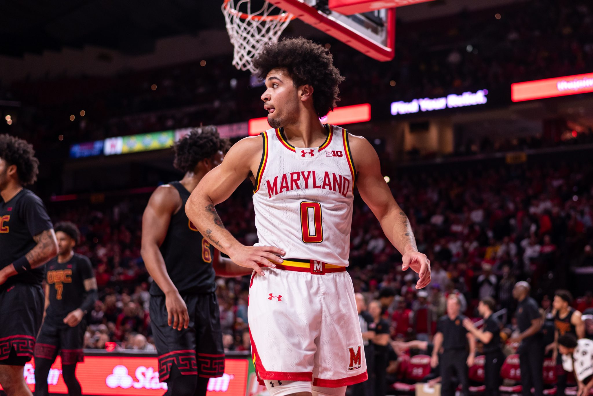
Maryland: This is a pretty good example of how a team can maintain a "vibe" of a past uniform design that was associated with success (e.g., Maryland basketball in the early 2000s) while actually updating and changing quite a few minor things.
Indiana: Do I like them? No, but it's difficult to tell how much of that is due to hating Indiana, haha. However, it accomplishes the goal of maintaining their "timeless look," even if certain minor things get updated every few years.
Northwestern: Trying to look past not liking purple and knowing how little success this program has had, but I think the uniform accomplishes what it is trying to do - a relatively traditional look that isn't TOO boring.
Wisconsin: See Northwestern ... it's pretty much the same thing from Under Armour, haha. Say what you want about their design capabilities compared to Nike, but I think this basic UA template looks like more thought and care was put into it than the one we share with Clemson, Creighton, Vandy, etc.
Michigan State: I don't particularly like this uniform, but (A) it's not terrible and (B) it incorporates things unique to MSU (e.g., the Greek Key trim and MSU's fairly unique font that they've used for a while) unapologetically yet not in an over-the-top way.
I see all of the others as very flawed in some way. Iowa, Minnesota and Purdue manage to combine a simple/understated look with ridiculous striping patterns that do not work at all for me, haha. Nebraska and Penn State just look too undercooked and boring. Conversely, OSU's looks overcooked and has too much going on with those side stripes. We all know my thoughts on Illinois', but we really do seem to accomplish the unthinkable of being both boring and looking like we are chasing trends font-wise.
I will try to do a comparison of throwbacks at a later time, and the complete opposite will be true ... Illinois' is objectively awesome.
Michigan: Other than the fact they chose to make the font way too small, this is a solid uniform. It's simple and traditional, but it avoids annoying minimalist mistakes like abandoning a more complex three-striping pattern or having names/numbers with no font outline color.
Maryland: This is a pretty good example of how a team can maintain a "vibe" of a past uniform design that was associated with success (e.g., Maryland basketball in the early 2000s) while actually updating and changing quite a few minor things.
Indiana: Do I like them? No, but it's difficult to tell how much of that is due to hating Indiana, haha. However, it accomplishes the goal of maintaining their "timeless look," even if certain minor things get updated every few years.
Northwestern: Trying to look past not liking purple and knowing how little success this program has had, but I think the uniform accomplishes what it is trying to do - a relatively traditional look that isn't TOO boring.
Wisconsin: See Northwestern ... it's pretty much the same thing from Under Armour, haha. Say what you want about their design capabilities compared to Nike, but I think this basic UA template looks like more thought and care was put into it than the one we share with Clemson, Creighton, Vandy, etc.
Michigan State: I don't particularly like this uniform, but (A) it's not terrible and (B) it incorporates things unique to MSU (e.g., the Greek Key trim and MSU's fairly unique font that they've used for a while) unapologetically yet not in an over-the-top way.
I see all of the others as very flawed in some way. Iowa, Minnesota and Purdue manage to combine a simple/understated look with ridiculous striping patterns that do not work at all for me, haha. Nebraska and Penn State just look too undercooked and boring. Conversely, OSU's looks overcooked and has too much going on with those side stripes. We all know my thoughts on Illinois', but we really do seem to accomplish the unthinkable of being both boring and looking like we are chasing trends font-wise.
I will try to do a comparison of throwbacks at a later time, and the complete opposite will be true ... Illinois' is objectively awesome.
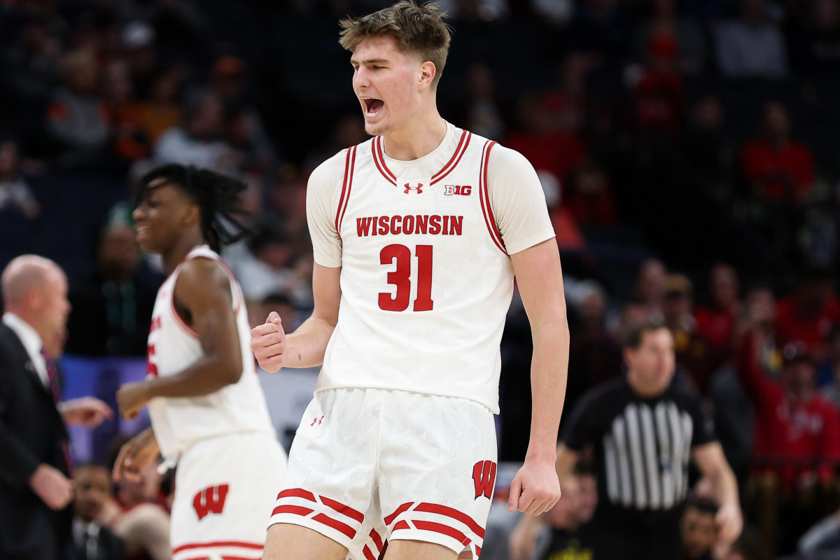
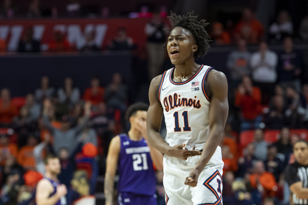
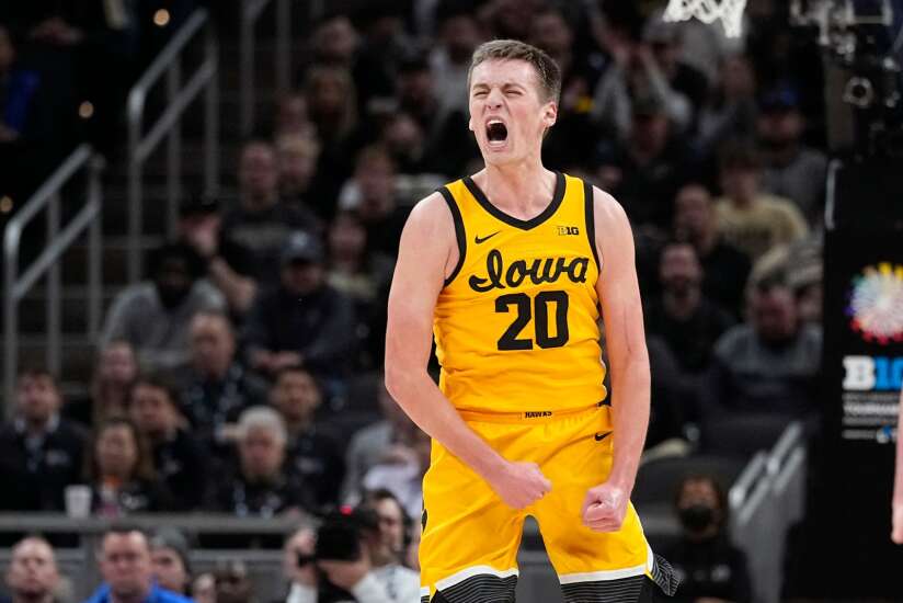
I thought it would be interesting to look at our (pre-West Coast expansion) Big Ten peers. To keep it simple and try to make it as apples to apples as possible, I looked at every team's "default/regular" home white uniform, excluding throwbacks.
Illinois
Indiana
Iowa
Maryland
Michigan
Michigan State
Minnesota
Nebraska
Northwestern
Ohio State
Penn State
Purdue
Rutgers
Wisconsin
Again, just my subjective opinion ... but we seem to combine the worst of both worlds as far as (A) playing it safe and having a "simple" design yet (B) not looking traditional/classic at all.
JMO..
| Good | Neutral | Bad | |
|---|---|---|---|
| Classic | Michigan Purdue | IU Rutgers | |
| Generic | Northwestern | Illinois Minnesota Nebraska Penn St Wisconsin | Iowa |
| Unique | MSU | MD | OSU |
Largely agree, though would move Wisconsin to bad, the horizontal stripes on the shorts are not good, and I've always hated that UA logo that cuts off the collar striping. For the same reason I'd move NW to neutral. Same with the jerseys where Adidas does that too. Just a pet peeve of mine. I'll never consider a jersey that does that as "good." Now, if you did the same thing on the Penn St. jersey that does not have any collar striping, then I'd be ok with it.JMO..
Good Neutral Bad Classic Michigan
PurdueIU
RutgersGeneric Northwestern Illinois
Minnesota
Nebraska
Penn St
WisconsinIowa Unique MSU MD OSU
mattcoldagelli
- Script Illinois Enthusiast
@Fighter of the Nightman doing the picture posting yeoman’s work, much appreciated.
Look at that sea of mostly sameness! Be thankful we do not have the obnoxious collar logo.
I do appreciate Purdue’s attempt to basically channel Jimmy Chitwood, kinda works for them.
Look at that sea of mostly sameness! Be thankful we do not have the obnoxious collar logo.
I do appreciate Purdue’s attempt to basically channel Jimmy Chitwood, kinda works for them.
I don't know if it's the lighting of the pic but not only does our font and lettering look terrible but the fabric looks cheap and terrible in comparison.I thought it would be interesting to look at our (pre-West Coast expansion) Big Ten peers. To keep it simple and try to make it as apples to apples as possible, I looked at every team's "default/regular" home white uniform, excluding throwbacks.
Illinois
Indiana
Iowa
Maryland
Michigan
Michigan State
Minnesota
Nebraska
Northwestern
Ohio State
Penn State
Purdue
Rutgers
Wisconsin
Again, just my subjective opinion ... but we seem to combine the worst of both worlds as far as (A) playing it safe and having a "simple" design yet (B) not looking traditional/classic at all.
Most of the jerseys are pretty basic but still look better than ours. It pains me to say this but I think Michigan has the nicest white uni here.
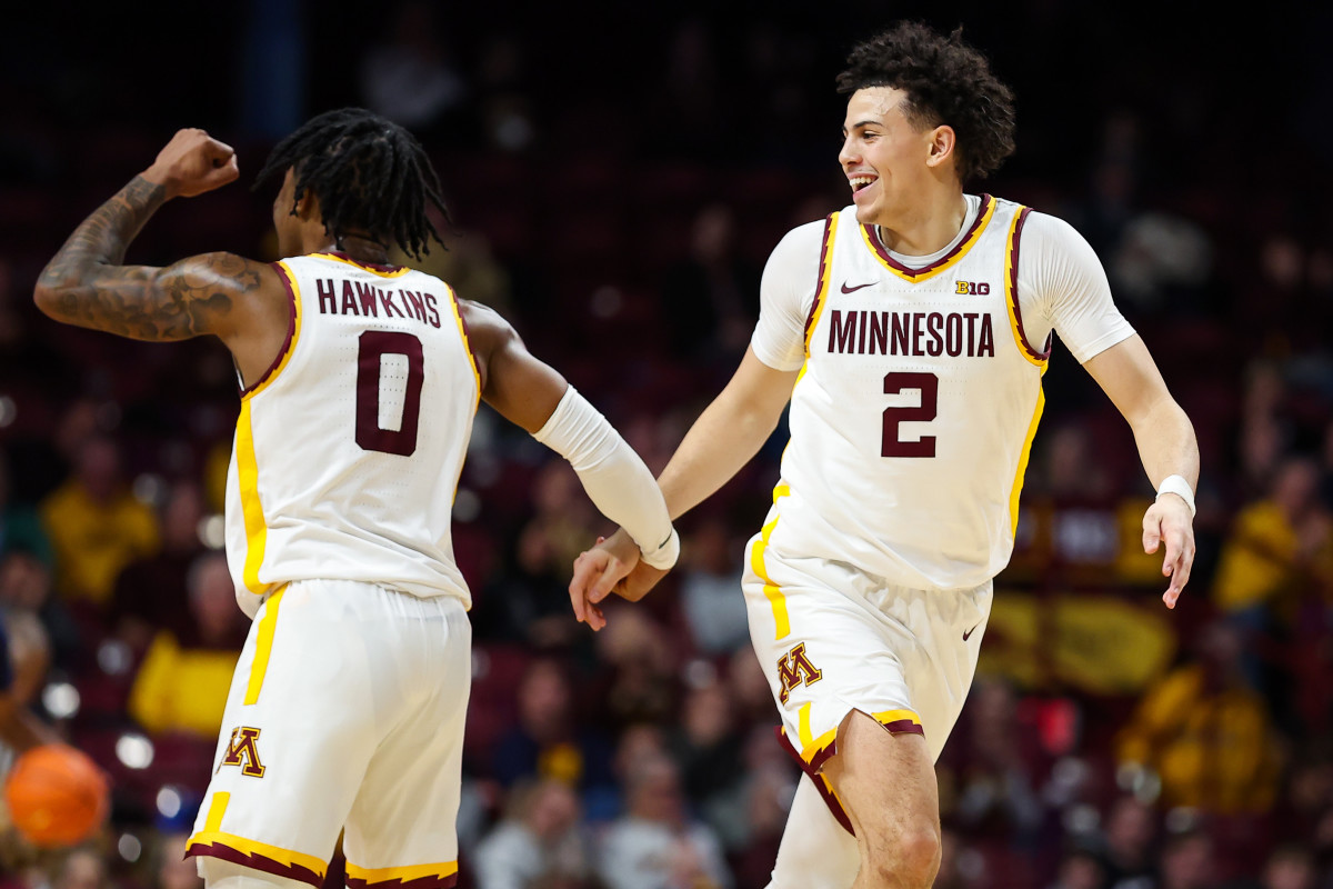
I don't like Minnesota's jerseys but there is something working with the collar and sleeve imo but it doesn't translate to the rest of the jersey. I think they could have a really good one with some tweaks.
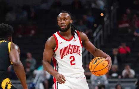
I think Wisconsins lettering and number kill it. Ohio State would be better off without the underline.
Last edited:
Fighter of the Nightman
- Chicago, IL
^ At least we can probably all agree that Iowa's are the worst??  As promised, while possibly not comprehensive due to less time to look into this one, here are a few of the current Big Ten throwbacks:
Illinois

Iowa
Michigan State

Minnesota

Nebraska

Northwestern*


Ohio State


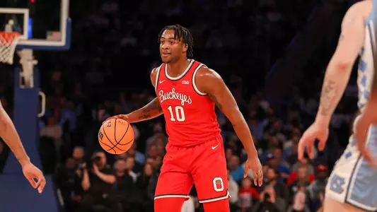
Purdue

Rutgers**
It doesn't look like Maryland is wearing a script uniform right now, but I know they used to have a decent one. Anyway, I am biased and all ... but Illinois is head and shoulders better than these. Ohio State's script uniforms are the only ones I would consider in our stratosphere.
* I am not actually sure if NU's gothic uniforms are technically "throwbacks," but they are certainly vintage in style.
** I messed up earlier, as this is actually Rutgers' throwback. Their regular uniform is below:

As promised, while possibly not comprehensive due to less time to look into this one, here are a few of the current Big Ten throwbacks:Illinois
Iowa
Michigan State
Minnesota
Nebraska
Northwestern*
Ohio State
Purdue
Rutgers**
It doesn't look like Maryland is wearing a script uniform right now, but I know they used to have a decent one. Anyway, I am biased and all ... but Illinois is head and shoulders better than these. Ohio State's script uniforms are the only ones I would consider in our stratosphere.
* I am not actually sure if NU's gothic uniforms are technically "throwbacks," but they are certainly vintage in style.
** I messed up earlier, as this is actually Rutgers' throwback. Their regular uniform is below:
Never noticed that before and now will never be able to unsee it. I do think Nike / Jordan is a clear cut above the others.Largely agree, though would move Wisconsin to bad, the horizontal stripes on the shorts are not good, and I've always hated that UA logo that cuts off the collar striping. For the same reason I'd move NW to neutral. Same with the jerseys where Adidas does that too. Just a pet peeve of mine. I'll never consider a jersey that does that as "good." Now, if you did the same thing on the Penn St. jersey that does not have any collar striping, then I'd be ok with it.
New uniforms or we riot. (Keep our good ones or we riot longer).
- Status
- Not open for further replies.