Yeah, this logo gives me branding PTSD from my early years as a fan, haha. With the extra outlines and stuff, it doesn't even really have any retro/nostalgic appeal ... it's just kind of Word Arty, and the font of
ILLINOIS over the Block I is totally unnecessary. As a fellow former Slant
ILLINOIS hater who was SO happy when we finally ditched it during the Zook years, I have to say that another poster once hit the nail on the head about what is different for me with this current throwback iteration and why it works so much better.
If you're going to go with the Slant
ILLINOIS look, you HAVE to achieve a retro look. Our current one does this well, but the Slant
ILLINOIS I ACTUALLY grew up with was subtly different, and the navy outline causes it to lose all of its retro look and just looks like crap in comparison:
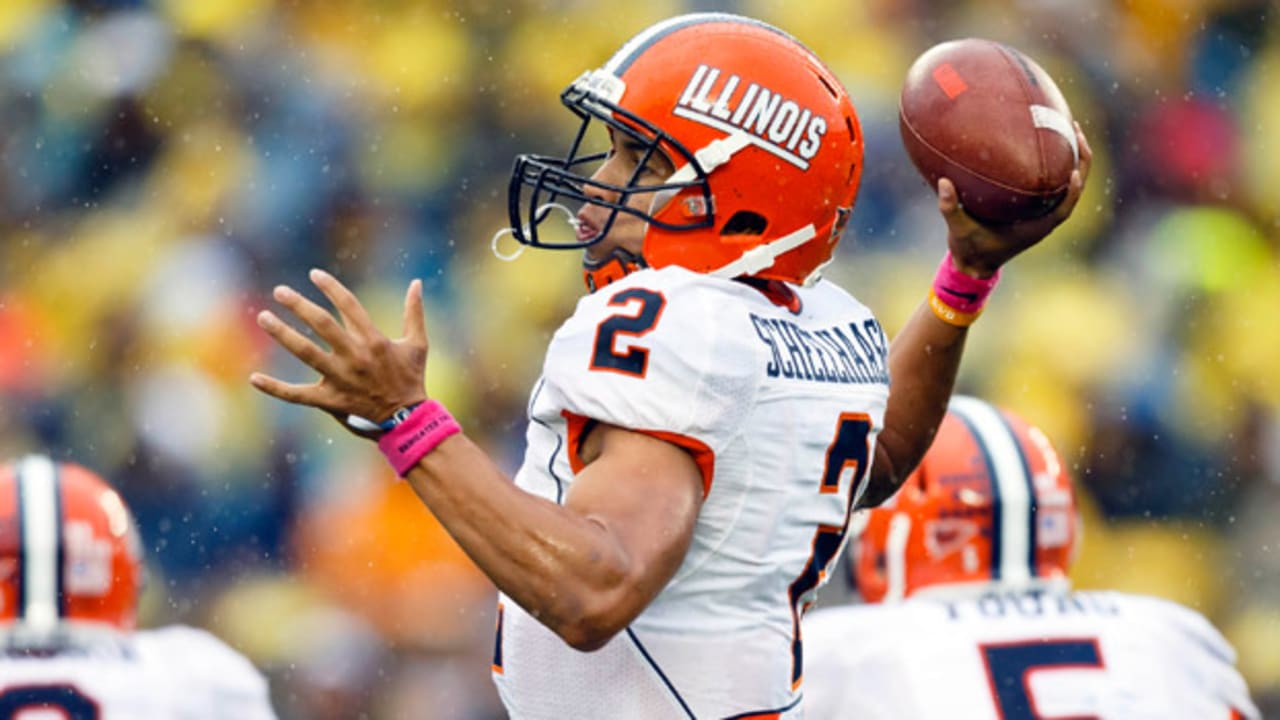
Current Slant ILLINOIS - Honoring our 1989-2004 look
Zook Era Slant ILLINOIS - What we wore from 2005 until it was retired in 2012 or so
Something about the navy outline just pushes it out of the realm of retro but not quite into the realm of objectively stylish ... so it's just boring and weird looking, haha. SUCH a good decision to bring it back with just the plain white font.