
Illinois Football Uniforms

#51      
I mean, while I find it pointless to ever deride our own "brand," I can at least understand our fans having some type of inferiority complex toward a Jordan Brand school like Michigan, but...

Marquette?? Cincinnati?? Houston?? Good LORD, we have a confidence problem as a fan base if we think our "brand" is inferior to those schools. The only one that has anywhere close to our level of success over the past five years is Houston, and they have a notoriously small and fickle fan base (based on reading their boards last year), mostly restricted to alumni. We're a state flagship school for a massive state, we have relatively little instate competition for fans, a MASSIVE alumni base, as much exposure as anyone being in the Big Ten and (finally, most importantly) the recent success and status to back it up. Hard disagree from me on your assertion there.
EDIT: Just to add on to this point, I saw after this past season ended that this was the most watched NCAA Tournament since 1993, with an average of 10.9 million viewers. A great season for us to finally break through and play in front of 14.2 million viewers at the Final Four, as well as high-profile victories against Iowa and Houston along the way!

FWIW, we ended 2026 as the fifth most watched team in the nation, with an average viewership across the entire season of 2.4 million per game.
 
#52      
I mean, while I find it pointless to ever deride our own "brand," I can at least understand our fans having some type of inferiority complex toward a Jordan Brand school like Michigan, but...

Marquette?? Cincinnati?? Houston?? Good LORD, we have a confidence problem as a fan base if we think our "brand" is inferior to those schools. The only one that has anywhere close to our level of success over the past five years is Houston, and they have a notoriously small and fickle fan base (based on reading their boards last year), mostly restricted to alumni. We're a state flagship school for a massive state, we have relatively little instate competition for fans, a MASSIVE alumni base, as much exposure as anyone being in the Big Ten and (finally, most importantly) the recent success and status to back it up. Hard disagree from me on your assertion there.
Wasn’t aware of Cincinnati or Marquette, I was going off the Nike website’s “Jordan Schools” page or whatever and it’s all schools (outside of Howard) that have won a major sport national championship within the past 50 years. And have a good deal of brand recognition. Bro I wear Illinois merch damn near everyday. You are preaching to the wrong choir, trust me lmao. All I’m saying is based on the listing of schools I saw from Nike’s “Jordan College Teams” it’s Michigan, Oklahoma, Florida, North Carolina, UCLA, etc. I think we’re big but still clawing back from Post-2005 era, and years of futility in football. Hell, an “alumni” just donated a fat stack of cash to a conference rival so they could get a top QB, and they just took our big QB recruit this year for after him.
 
#56      
IMO less is more.
Not always. 🫤

IMG_6176.jpeg
 
#58      

didn't see a sponsorship thread, so think this belongs here
Guess this answers my questions. Also, it also excludes Nike which already includes the Swoosh symbol on the uniforms.

"The subsection on jersey patches specifically extends that exclusivity to all companies, not just financial services firms, meaning Busey will be the only brand with patches on these jerseys.

However, there’s an exception for a conference-wide jersey patch deal that the Big Ten strikes, suggesting how schools may handle league-wide deals in the future."
 
#61      
I like these. For a Mardi Gras inspired uni, you need a little bit of crazy.
Each to his own. I'm with @Mr. Tibbs above. And apparently I'm a grumpy, 60-year-old, kill-joy purist in such matters. :p

Don't get me wrong, it's a good look for the Green Wave drill team (the "Wavettes"??) But not for young men bent on gridiron mayhem.

I'm not going to die on this hill but I will lie down on it and take a long nap so no one else can enjoy it.
 
#62      
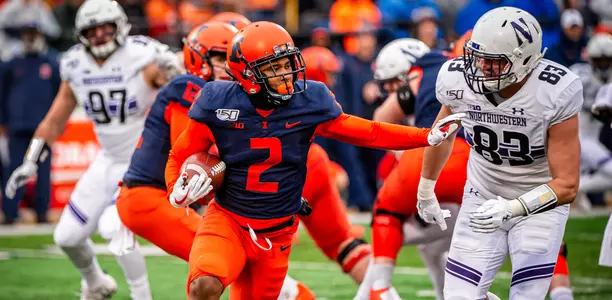
It still amazes me how our Lovie Era uniforms were able to simultaneously lack any "classic" look whatsoever and yet look completely and totally boring / incomplete. :ROFLMAO:

These are undoubtably "simple," but they look clean and classic, and the latter part is the test by which everyone will judge them.
4I2BOAPRQVCIFHU2Y3Y4HUUQB4.JPG


These have absolutely zero history for Purdue (as far as I know) and you can definitely argue whether or not they are good (a bit too much going on for my taste, lol...), but they're at least committing to the striping pattern and the uniform (again, hate it or love it) looks complete and like they had a design in mind and achieved it.
imagn-27022752.jpg


These somehow manage to just look ... weird? Unfinished? Almost laughably plain and yet also like we were trend chasing? :ROFLMAO:
XZXPQI27RZE3DNZNHNR7MRIO6I.jpg

82331d53-f2a5-48d3-adc9-fbefc0e6877d-USATSI_13645690.jpg

resize

resize


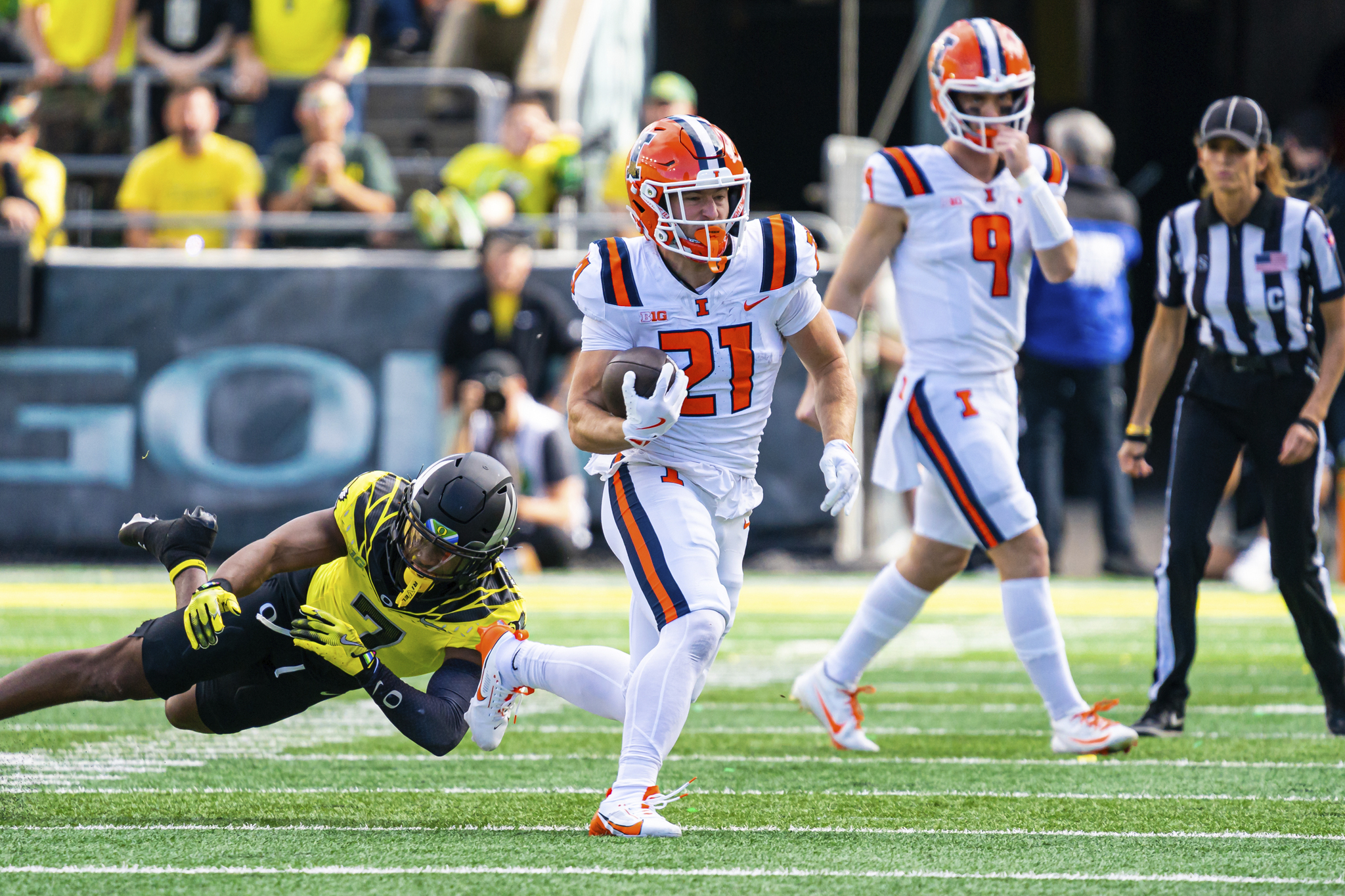
Crazy how much we've improved when you compare the same four color combos with our new uniforms (especially the orange ... good LORD!).
Aidan-Laughery-vs-Oregon-2024.jpg

USATSI_24835105-1024x683.jpg

resize

DJP_0084.jpg
 
#64      
It still amazes me how our Lovie Era uniforms were able to simultaneously lack any "classic" look whatsoever and yet look completely and totally boring / incomplete. :ROFLMAO:

These are undoubtably "simple," but they look clean and classic, and the latter part is the test by which everyone will judge them.
4I2BOAPRQVCIFHU2Y3Y4HUUQB4.JPG


These have absolutely zero history for Purdue (as far as I know) and you can definitely argue whether or not they are good (a bit too much going on for my taste, lol...), but they're at least committing to the striping pattern and the uniform (again, hate it or love it) looks complete and like they had a design in mind and achieved it.
imagn-27022752.jpg


These somehow manage to just look ... weird? Unfinished? Almost laughably plain and yet also like we were trend chasing? :ROFLMAO:
XZXPQI27RZE3DNZNHNR7MRIO6I.jpg

82331d53-f2a5-48d3-adc9-fbefc0e6877d-USATSI_13645690.jpg

resize

resize


Crazy how much we've improved when you compare the same four color combos with our new uniforms (especially the orange ... good LORD!).
Aidan-Laughery-vs-Oregon-2024.jpg

USATSI_24835105-1024x683.jpg

resize

DJP_0084.jpg
I’m still team:

Orange lids
Orange pants
Blue jersey at home
White jersey on the road
Orange jersey once a year for the orange out.
 
#67      
These somehow manage to just look ... weird? Unfinished? Almost laughably plain and yet also like we were trend chasing? :ROFLMAO:
I think the word you are looking for is "amateurish" which is really driven home by the helmet decals being 1) consistently crooked and 2) having an orange outline that didn't totally match the helmet shell (also - that's the one outline included on any uniform element at all on those, so it looked extra awkward)
 
#68      
I think the word you are looking for is "amateurish" which is really driven home by the helmet decals being 1) consistently crooked and 2) having an orange outline that didn't totally match the helmet shell (also - that's the one outline included on any uniform element at all on those, so it looked extra awkward)
I'm usually a fan of not having a numeral outline on football uniforms (most of the ones we consider timeless and classic don't have one). But that only works if you consider the color contrast. You need white numbers on a colored top. And with the white top you need the darker color, in our case navy, to create enough contrast to make it legible from a distance. I think that small tweak would have done wonders for this set. Albeit it would have still been abysmal compared to what we have now, and what we had in the 90s - early 2000s.
 
#69      
I'm usually a fan of not having a numeral outline on football uniforms (most of the ones we consider timeless and classic don't have one). But that only works if you consider the color contrast. You need white numbers on a colored top. And with the white top you need the darker color, in our case navy, to create enough contrast to make it legible from a distance. I think that small tweak would have done wonders for this set. Albeit it would have still been abysmal compared to what we have now, and what we had in the 90s - early 2000s.
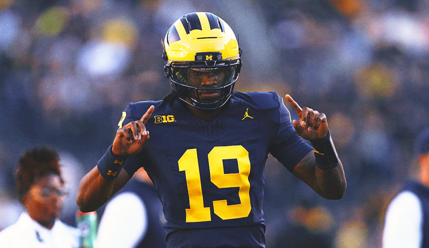
I agree with everything you said, and I will add another thing. No outline is an inherently traditional look IMO, and thus there is one thing that can transform it from classic to (as Matt said) amateurish ... and that's not using traditional block letters. These uniforms are very similar on top, all things considered ... but Michigan's works great, and ours looks blech, in no small part because of the number fonts. :ROFLMAO:

7d9632cd-bryce_underwood_horizontal.jpg

resize
 
#70      
I agree with everything you said, and I will add another thing. No outline is an inherently traditional look IMO, and thus there is one thing that can transform it from classic to (as Matt said) amateurish ... and that's not using traditional block letters. These uniforms are very similar on top, all things considered ... but Michigan's works great, and ours looks blech, in no small part because of the number fonts. :ROFLMAO:

7d9632cd-bryce_underwood_horizontal.jpg

resize
All I ask is that our 6s and 9s match! If the 6 has a top the 9 needs a bottom!
But yes, that font is overall terrible.
 
#71      
All of you guys are way better at this stuff than I am so maybe I’m missing it, but the eye test w/our unis is lacking for me. The stripes on the top of the shoulders absolutely kills me.

We have the best color combo going (of course I’m Illini, Bears, and Broncos so I’m just a tad biased) with orange and blue. I think we can do better… although I do like some of the combinations we have, minus the shoulder stripes.
 
Back