altgeld88

- Arlington, Virginia
I'll forego a longer endorsement of this spectacular announcement because I'm presently busy injecting it directly into a vein.


I'll forego a longer endorsement of this spectacular announcement because I'm presently busy injecting it directly into a vein.

Arch Illini helmets paired with these uniforms I think is the perfect comboYeah this is what I meant. The originals are the best. As I've said before, I'd make the Rose Bowl uniforms the default and keep it that way.

Wait, am I just now learning that players didn't wear cleats on turf in the 90s?Arch Illini helmets paired with these uniforms I think is the perfect comboView attachment 52102
That turf wasn't anything like grass. I played soccer in the winter under the bubble a couple of times and it wouldn't have made sense to wear cleats on it. It was more like industrial carpet.Wait, am I just now learning that players didn't wear cleats on turf in the 90s?

I'd be thrilled with these as our permanent veteran day lids. Clearly the best military themed helmet we have. Yes, BPAH with the arch.
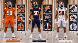
Against Michigan in '83. Warmed up in O/O/B. Came back out in O/B/B. Fans went nuts. Still get chills thinking about it.I've said it once, and I'll say it again ... the Arched ILLINI helmet begs for us to rock the navy pants at home! I wasn't around for these years, but that O/B/B look just screams 1980s Illini Football to me. Courtesy of Chat GPT:
View attachment 52101
Here's to hoping for Saturday!


Yep. My bad.I was there. Wasn’t it O/B/O though?
Pardon me; I need to spend a few moments alone.I've said it once, and I'll say it again ... the Arched ILLINI helmet begs for us to rock the navy pants at home! I wasn't around for these years, but that O/B/B look just screams 1980s Illini Football to me. Courtesy of Chat GPT:
View attachment 52101
Here's to hoping for Saturday!
Michigan 1983 was O/B/B. Very grainy video but if you pull up the highlights you can obviously see it better. Those unis with the Arch Illini/Chief Headdress looked awesome.Yep. My bad.
Could we maybe incorporate some elements of this logo on our helmet? Maybe put the ‘I’ in the front of the star?Michigan 1983 was O/B/B. Very grainy video but if you pull up the highlights you can obviously see it better. Those unis with the Arch Illini/Chief Headdress looked awesome.
View attachment 52117

Could we maybe incorporate some elements of this logo on our helmet? Maybe put the ‘I’ in the front of the star?


The arch is a unique look; everyone uses script (I like ours), and the arch isn't the old NYG underline logo (which I don't hate anymore). I wish we'd use the arch as our primary, along with the underline, and then use the block I sparingly.Really wish we made the arched Illini our default helmet. Use the Giants underlined "Illinois" a few times a year with certain orange combos that look good, and throw in the script for bowls if you want.
Just anything but the block I
Serious question - what’s the argument to use the Block I ever? Do you think it ever crosses Michigan’s mind to rotate in a Block M helmet instead of wearing their cooler one every game?The arch is a unique look; everyone uses script (I like ours), and the arch isn't the old NYG underline logo (which I don't hate anymore). I wish we'd use the arch as our primary, along with the underline, and then use the block I sparingly.


Love these Ill-ini helmets and full color uni setsMy 2 cents for a fresh uni…