Stevegarbs
- Mokena, IL
Those refs are still screwing us!
It's not the refs' fault.
Those refs are still screwing us!
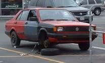
Alex Golesh @CoachGolesh 8m
Ironically this is what @CoachBellamy was recruiting in today. #AntiSwag Hopefully Nike brings him a new car! pic.twitter.com/bPIlcfhmdq
You were sayingCan't believe the empty seats in A section!eace:
It's almost time #Illini #NikeRebrand http://pic.twitter.com/SWJTTq4kV8

http://twitter.com/JVainisi005
You were saying
There are times when I just get a smile from reading IL. This is one of them.
Those of you complaining about the shield/crest/banner/cow catcher design, would this have been a better alternative. It's the only other thing that made sense in my mind.
View attachment 1928
 with a moustache?
 Or perhaps this man View attachment 1929with a moustache?

RT @theNakumaster7
There is a fog machine running and the ceiling is purple. This is serious business. #Illini

Sorry but Syracuse's are awful. Much prefer ours.
Sorry but Syracuse's are awful. Much prefer ours.