The 2014 Illini Nike Uniforms and Rebrand

Status
Not open for further replies.
#976      

illini1

Springfield, IL
When the Nike guy explained the Victory Badge, he showed a photo from the Captain America movie. The comic book version is below. Obviously the VB resembles his shield, but look at the little wings on his head, like Mercury -- is that why the VB has those odd protrusions at the top? :shield:

Captain_America%27s_first_shield.jpg


How many times does this have to be explained? The protusions at the top of the VB are the tops of the columns.
 
#977      

DaytonIllini

D
Guest
attachment.php


Holy crap that is awesome. I've been warming up to the VB but your version is way better.

Agreed. No contest. I predict the Nike version is modified within a couple years.
 
#978      

Groundhogday

G
Guest
Count me in for Team Shield too, but I feel like they may have tried to cram too much imagery/meaning into this shield design. I'm definitely not sold on the two "Fs" facing each other, and simply let the orange stripes symbolize the columns at Memorial Stadium - the two abacuses or "wings" as people have called them seem extraneous and make it look more like a banner.

That being said, I'm being completely critical for the sake of being critical. I love this shield as our secondary logo, but if I had a say, I'd modify it as seen below. Would look just as awesome on jerseys, t-shirts, but especially helmets. Thoughts?

View attachment 1959

That does look much better, but you still have the functional problem of the bottom part vanishing into a white or orange jersey. Try that logo, but with all blue instead of blue/orange for the foreground, then use orange for the negative space (including the block I). Basically the logo you see with the women's soccer jersey top (I think) with blue on orange and no white.
 
#979      

pizzaman

Northwoods of Wisconsin
Does anyone know how the business side of this transpires? Does the University pay for the "rebranding" design services or just buy uniforms from Nike? Does Nike provide the design work without compensation to get the profits from the sale of uniforms, shirts, caps etc? Basically, how does Nike and the UI make money on the deal.
 
#980      

Groundhogday

G
Guest
Does anyone know how the business side of this transpires? Does the University pay for the "rebranding" design services or just buy uniforms from Nike? Does Nike provide the design work without compensation to get the profits from the sale of uniforms, shirts, caps etc? Basically, how does Nike and the UI make money on the deal.
We didn't pay for the rebrand. Nike and the DIA make money from the sale of licensed merchandise, as part of a long term contract.
 
#981      

FinalFour88

Charlotte, NC
How many times does this have to be explained? The protusions at the top of the VB are the tops of the columns.
Thank you. I thought that was obvious to everyone, but apparently not. Regarding the stripes, though, I believe Nike said they represent the columns at Memorial Stadium, but it's also been said that they represent the stripes on Grange's uniform. Which is it? Both?
 
#982      

FinalFour88

Charlotte, NC
We didn't pay for the rebrand. Nike and the DIA make money from the sale of licensed merchandise, as part of a long term contract.
Yeah, that sounds right. It would seem like a very expensive rebrand, but let's be honest, Nike obviously didn't spend two full years on this. They agreed on a rebrand two years ago, but probably put a good solid couple months into it.
 
#983      

FinalFour88

Charlotte, NC
Agreed. No contest. I predict the Nike version is modified within a couple years.
I think the Nike shield logo is better than this version. It needs to the column caps at the top to reference Memorial Stadium. As I've said before, I think the VS logo looks great as a small accent on the uniforms. When it serves as the focal point of a uniform (ie, the soccer jersey) or piece of apparel (ie, some of the hats and shirts we've seen online), it's a very flawed, weak logo. The hats with the VS logo look like golf hats, similar to the Tiger Woods logo golf hat he used to wear a lot.
 
#984      

Groundhogday

G
Guest
Thank you. I thought that was obvious to everyone, but apparently not. Regarding the stripes, though, I believe Nike said they represent the columns at Memorial Stadium, but it's also been said that they represent the stripes on Grange's uniform. Which is it? Both?
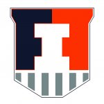
There is nothing in the official description about columns on the top part of the logo. It is pretty clear that from anyone following the unfolding of this rebrand, that the top was originally supposed to represent a pair of double columns (e.g. Hallene Gateway) and the bottom was supposed to capture the Grange stripes, but sometime after this baby went into production they had to come up with a new rationalization. Hence the confusion. The whole "Victory Badge inspired by modern superheroes" thing wasn't even in the original FightingIllini.com description.

The Victory Badge is inspired by modern superheroes. The primary ... logo is at the center, encased by two facing F's to symbolize the fight the Fighting Illini encounter on the field of play. It is grounded by vertical stripes, referencing the columns at Memorial Stadium that pay tribute to the original Fighting Illini who gave their lives for their country. The mark ends in a powerful V shape, standing for victory.

http://www.fightingillini.com/identity/html/orange/
 
#985      

Groundhogday

G
Guest
attachment.php

A huge advantage of this form is that the logo actually looks like a "V" for Victory instead of a stonehenge superimposed on a down arrow. The whole logo has a V shape. And it looks MUCH more like a shield.

Drop the silly "two F" and columns things, focus on the aspect that resonates - a Victory Shield.
 
#986      

FinalFour88

Charlotte, NC
There is nothing in the official description about columns on the top part of the logo. It is pretty clear that from anyone following the unfolding of this rebrand, that the top was originally supposed to represent a pair of double columns (e.g. Hallene Gateway) and the bottom was supposed to capture the Grange stripes, but sometime after this baby went into production they had to come up with a new rationalization. Hence the confusion. The whole "Victory Badge inspired by modern superheroes" thing wasn't even in the original FightingIllini.com description.
I think you're right. Which is partly why I think this logo works well when it's small and not the focal point. When you blow it up on a tshirt or hat and make it the focal point, people start to ask questions about it that don't have clear answers. (I still firmly believe the top signifies columns.) The overall shape of it is odd. Again, it works well on a jersey collar because it mimics the shape of the collar. But look at the wordmarks; they're "leaning forward" to show speed, action. Then the shield logo points down, which is not consistent with the wordmarks at all. Maybe Nike's intention was to create a very traditional looking, collegiate logo, which I think the shield is.

As a sidenote, I think the "superhero" reference is ridiculous and juvenile. I wish Nike would have never mentioned the word "superhero." If Illini athletes really were superheros they would win way more games. When I think of the Illini football and basketball teams, superheros don't come to mind.
 
#987      

DaytonIllini

D
Guest
I think the Nike shield logo is better than this version. It needs to the column caps at the top to reference Memorial Stadium. As I've said before, I think the VS logo looks great as a small accent on the uniforms. When it serves as the focal point of a uniform (ie, the soccer jersey) or piece of apparel (ie, some of the hats and shirts we've seen online), it's a very flawed, weak logo. The hats with the VS logo look like golf hats, similar to the Tiger Woods logo golf hat he used to wear a lot.

I respect your opinion but I don't think 1:1,000,000 observers would see the relationship to columns without having it explained to them. A logo that needs a whole lot of explanation is probably not working all that well with the general public. I don't really care if they ever change it but I suspect that a focus group of the general public would prefer the non-column shield. Since this is mostly about selling jerseys and such, I think what the Joe-average fan thinks will be the deciding factor.
 
#988      

JSpence

Evansville, IN
How many times does this have to be explained? The protusions at the top of the VB are the tops of the columns.

I agree, but they should look like the tops of columns, with inside radii like they did with the block I (except starting from the edge). At some sizes, the [shield] does have the look of a banner.

Sketch it yourself to see. As others say, it will probably come around in a couple of years. When they tweak it, I hope it's not overdone. It's close as-is.
 
Last edited:
#989      

illinimandan

I
Guest
attachment.php


That is an improvement and it still looks more like two "F"s than the Nike version IMO. I kind of like having the "F"s in there to emphasize "Fighting" with Illini. That's why I designed this one earlier:

shield 2.2a.jpg

Mine does lose the victory shape though. But I was also inspired by GHD pointing out that the current one on shorts appears to point to everyone's crotch. Now I can't escape noticing that. :)
 
#990      

AZillini

A
Guest
There is nothing in the official description about columns on the top part of the logo. It is pretty clear that from anyone following the unfolding of this rebrand, that the top was originally supposed to represent a pair of double columns (e.g. Hallene Gateway) and the bottom was supposed to capture the Grange stripes, but sometime after this baby went into production they had to come up with a new rationalization. Hence the confusion. The whole "Victory Badge inspired by modern superheroes" thing wasn't even in the original FightingIllini.com description.

Neither the description on the website nor the one given by the Nike guy at the rollout included any explanation of the odd protrusions at the top of the VB. They can't represent the tops of the columns, because there are no similar protrusions representing the bottom of the columns. The columns have frustums (?) on both the top and bottom.

columns.jpg


thumb.jpg
 
#991      

FinalFour88

Charlotte, NC
A logo that needs a whole lot of explanation is probably not working all that well with the general public.

I agree completely with this statement. That's what makes the shield flawed.

I was just thinking... if you were designing this logo, why not just find out what types of shields or badges were used in WWI; pick the one you like best and use that as the shape of the logo; put a block I in the middle of that badge; and maybe put some stripes in the background of the I, inside the shield, to signify the columns? Done. It's a WWI badge, it's a block I for Illinois, it's stripes for the columns. Simple, clean, iconic, great military meaning. And "Fighting Illini" is implied through it all, since it's a WWI badge.
 
#992      

ivwilsoniv

Aurora, IL
attachment.php


That is an improvement and it still looks more like two "F"s than the Nike version IMO. I kind of like having the "F"s in there to emphasize "Fighting" with Illini. That's why I designed this one earlier:

View attachment 1960

Mine does lose the victory shape though. But I was also inspired by GHD pointing out that the current one on shorts appears to point to everyone's crotch. Now I can't escape noticing that. :)

You can't include gray on something like this. It's not one of our colors... It's listed as a secondary palette simply so that Nike can create alternative jerseys. The logos have to be composed of the primary colors, in my opinion.
 
#993      

Symmooth

S
Guest
attachment.php

A huge advantage of this form is that the logo actually looks like a "V" for Victory instead of a stonehenge superimposed on a down arrow. The whole logo has a V shape. And it looks MUCH more like a shield.

Drop the silly "two F" and columns things, focus on the aspect that resonates - a Victory Shield.
Still looks like ugly briefs to me. :eek:
 
#994      

AZillini

A
Guest
attachment.php


That is an improvement and it still looks more like two "F"s than the Nike version IMO. I kind of like having the "F"s in there to emphasize "Fighting" with Illini. That's why I designed this one earlier:

View attachment 1960

Mine does lose the victory shape though. But I was also inspired by GHD pointing out that the current one on shorts appears to point to everyone's crotch. Now I can't escape noticing that. :)

Mandan's half-orange half-blue around the Block I is great because it reveals the otherwise hidden Fs.

Wilson, if you revise your v-shaped version to incorporate that, I'll buy you a beer when I'm in Austin next week.
 
#995      

Groundhogday

G
Guest
I agree completely with this statement. That's what makes the shield flawed.
But that is why dropping all of the rationalizations and turning it into a "V" shaped Orange-and-Blue-Block-I shield works. Then it is just a Victory shield.
 
#996      

JSpence

Evansville, IN
Fine. If we're doing this, we're doing this.

imgur put it through compression, but you get the idea. I'm still against parading all of these work-in-progress shields, but whatever. Click IF you want to see it. We seem to be committed now.

http://i.imgur.com/euUFtN0.png

edit: I also contend that the badge will look like a bullet or banner or down arrow to some folks no matter what is done. It will be a matter of gauging how strong the negative reactions are.
 
Last edited:
#997      

Groundhogday

G
Guest
Mandan's half-orange half-blue around the Block I is great because it reveals the otherwise hidden Fs.

Wilson, if you revise your v-shaped version to incorporate that, I'll buy you a beer when I'm in Austin next week.
Yes, you need the two colors or negative space at the top to reveal the F's. But why do we want to reveal the F's? We are the F-Fighting Illini with a speech impediment?
 
#998      

Groundhogday

G
Guest
Fine. If we're doing this, we're doing this.

imgur put it through compression, but you get the idea. I'm still against parading all of these work-in-progress shields, but whatever. We seem to be committed now.

http://i.imgur.com/euUFtN0.png

euUFtN0.png


That gives the top a look of a column, but unfortunately gives the entire badge the look of a falling WWII bomb. And now the whole badge is clearly pointing down.
 
#999      

JSpence

Evansville, IN
That gives the top a look of a column, but unfortunately gives the entire badge the look of a falling WWII bomb. And now the whole badge is clearly pointing down.

I agree. I was just noting that, actually.

Still looks like ugly briefs to me. :eek:

Yeah, I was thinking the same thing. I'm surprised anybody else thought so!
 
Status
Not open for further replies.