You are using an out of date browser. It may not display this or other websites correctly.
You should upgrade or use an alternative browser.
You should upgrade or use an alternative browser.
Basketball Uniforms
- Status
- Not open for further replies.
JFGsCoffeeMug
BU:1 Trash cans:0
- Chicago
Side "feathers" were killed too. That's an improvement. Overall, it looks a lot cleaner, but also kind of...generic?
ChiefGritty
- Chicago, IL
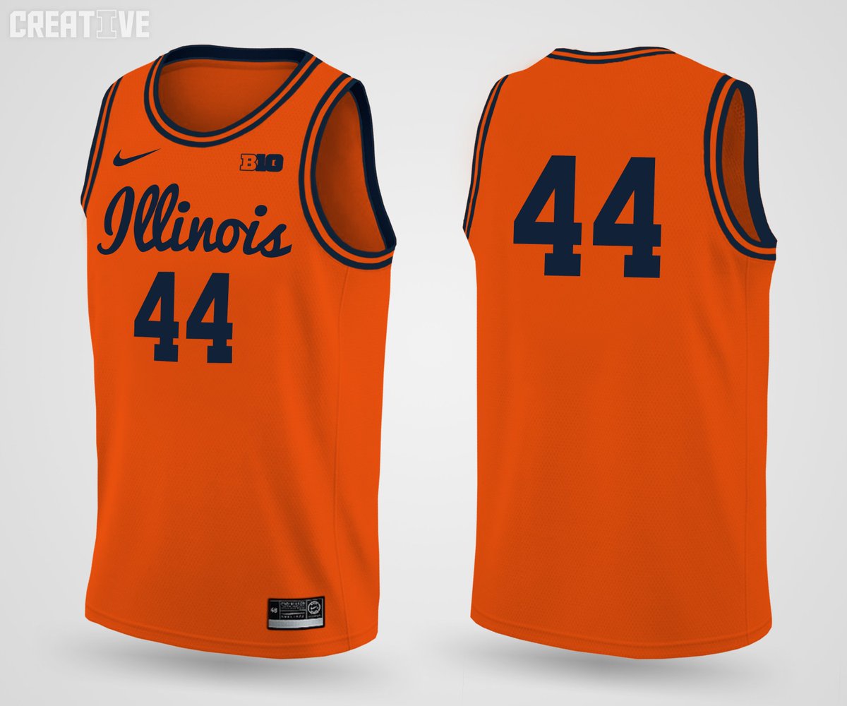
Interested to see the (presumably) orange and blue versions, but this one is completely brand consistent with the equivalent football version, very much speaking the same visual language, and that's a welcome new thing for us

Thankfully these basketball uniforms aren't allergic to stripes the way the football uniforms are. We have a stripe design in the brand, put it on the pants for goodness sakes!
But we've got a theory of the case here, and a good enough one as far as it goes. Let's hope future updates iterate and build on what we've got here, rather than always starting new with something different and inevitably half-baked.
redwingillini11
White and Sixth
- Batavia
These look like the set that I saw a year ago. https://www.illinoisloyalty.com/Forum/threads/basketball-uniforms.24441/page-9
Based on that I have the following predictions:
Road blues should be just about the same as the whites, no accents around the orange numbers and letters. Reminds me a lot of our football uniforms.
However, the orange set will be be slightly different, particularly the shorts.
New throwbacks from a different era of Illini basketball will make an appearance this season.
But I love this white set. Best non-throwback white uniforms since 2005 team, imo.
When I first saw these, I didn't really like them all that much, but now that I've looked at them more, they've grown on me a lot. Pretty solid set, reminds me of the football uniforms. One knock I do have is that there isn't enough blue. Wish they would've added a blue stroke around the numbers and "ILLINOIS" but overall, I really like the look. Excited to see the Orange and Blue Versions!
The Galloping Ghost
- Washington, DC
The fact that there's nothing obviously awful about them feels like a massive win, tbh.
Interested to see the (presumably) orange and blue versions, but this one is completely brand consistent with the equivalent football version, very much speaking the same visual language, and that's a welcome new thing for us
Thankfully these basketball uniforms aren't allergic to stripes the way the football uniforms are. We have a stripe design in the brand, put it on the pants for goodness sakes!
But we've got a theory of the case here, and a good enough one as far as it goes. Let's hope future updates iterate and build on what we've got here, rather than always starting new with something different and inevitably half-baked.
Team Shield should be pretty happy too.
BananaShampoo
Captain 'Paign
- Phoenix, AZ
I like these a lot. Very clean. Like the stripes to add a bit more color. Best bball unis we've had in a long long time.
I can't remember, did we put names on unis last year?These look like the set that I saw a year ago. https://www.illinoisloyalty.com/Forum/threads/basketball-uniforms.24441/page-9
Based on that I have the following predictions:
Road blues should be just about the same as the whites, no accents around the orange numbers and letters. Reminds me a lot of our football uniforms.
However, the orange set will be be slightly different, particularly the shorts.
New throwbacks from a different era of Illini basketball will make an appearance this season.
But I love this white set. Best non-throwback white uniforms since 2005 team, imo.
Deleted member 29907
D
Guest
I can't remember, did we put names on unis last year?
ivwilsoniv
- Aurora, IL
These look like the set that I saw a year ago. https://www.illinoisloyalty.com/Forum/threads/basketball-uniforms.24441/page-9
Based on that I have the following predictions:
Road blues should be just about the same as the whites, no accents around the orange numbers and letters. Reminds me a lot of our football uniforms.
However, the orange set will be be slightly different, particularly the shorts.
New throwbacks from a different era of Illini basketball will make an appearance this season.
But I love this white set. Best non-throwback white uniforms since 2005 team, imo.
New throwbacks? Something more like this?
peace davids
- Colorado
That I on the shorts kill me. They need to remove that from the brand guide immediately.
Is it possible to get a player to autograph one of these? Would pay good money! (Payed after they graduate in case the NCAA is listening in...)
Oskee67
- Champaign
I may be in the minority, but I always liked the o/b Illinois font. Oh well. 2 thoughts: The appears to fall on the back half of the shorts (which looks rather odd in the brief clip and pics I've seen) and it doesn't look like it's the new, redesigned block I. I don't understand the logic with using an old logo on the updated branding...
appears to fall on the back half of the shorts (which looks rather odd in the brief clip and pics I've seen) and it doesn't look like it's the new, redesigned block I. I don't understand the logic with using an old logo on the updated branding...wILL-INI
- Charlotte, NC
I may be in the minority, but I always liked the o/b Illinois font. Oh well. 2 thoughts: The
It's the new one, just the one color version. Why you would use the one-color logo when you have both colors available is beyond me...
wILL-INI
- Charlotte, NC
I'm not sure I like or know why we covered the back in stripes, but it's a thing I noticed...
Also the Block I on the BACK of the shorts is the dumbest thing Nike keeps giving us. Had them in the initial rebrand, we got rid of them after we got rid of the zags. Brought them back on this set? I don't get it...
Last edited:
ChiefGritty
- Chicago, IL
It's the new one, just the one color version. Why you would use the one-color logo when you have both colors available is beyond me...
Because that's the version that works when you're trying to eliminate the white outline from the orange and blue versions.
That's the version we should be using on our football helmet.
As for the subtle piping on the jersey, that's the case with our football uniforms as well. Meant to be the "columns" or whatever. Unnoticeable from afar, but gives it a bit of visual interest up close, they do that all the time.
APS iMBA
- Urbana, IL
It's not even the right "I" anymore. See my avatar for the current one...That I on the shorts kill me. They need to remove that from the brand guide immediately.
mattcoldagelli
- Script Illinois Enthusiast
With the two-tone lettering and the zigzags vanquished, I can live with a slightly weird placement of the Block I on the shorts. For now.
- Status
- Not open for further replies.