Basketball Uniforms

#26      

peace davids

Colorado
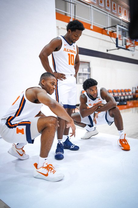
It's not even the right "I" anymore. See my avatar for the current one...

The problem is, it is the right I according to the official brand guide. When using a one color version, this is “correct”.

Football is cheating with their helmets and they are using a modified one color version in many places around the Smith center. It’s technically wrong, but it looks way better. The curves make it identifiable And unique to Illinois.

The brand guide needs to be corrected and this version (as used on these basketball shorts) needs to be thrown in the garbage.
 
#27      

ILL in IA

Iowa City
With how kids are wearing shorts these days (feel old saying that) I am.pretty sure Nike has a small cut out on the side where a lot of people want the logo to be. I think the location of the "I" is more about how the short is made.

I haven't seen a good front facing pic of the Illinois unis, but the new iowa set shows what I mean. I assume Illinois shorts will be the same type of cut.
 

Attachments

  • Screenshot_20190912-011533_GroupMe.jpg
    Screenshot_20190912-011533_GroupMe.jpg
    406.9 KB · Views: 328
Last edited:
#29      
The only thing I don’t like about this rebrand is the tilted lettering and numbers. Wish we change it just a bit.
 
#30      

ivwilsoniv

Aurora, IL
The problem is, it is the right I according to the official brand guide. When using a one color version, this is “correct”.

Football is cheating with their helmets and they are using a modified one color version in many places around the Smith center. It’s technically wrong, but it looks way better. The curves make it identifiable And unique to Illinois.

The brand guide needs to be corrected and this version (as used on these basketball shorts) needs to be thrown in the garbage.
Can someone show me an example of what these curves are?
 
#31      
Can someone show me an example of what these curves are?
illini-block-i-logo-before-after.jpg


The new Block I has a curve on the inner orange part while the outline is square. The old I was square on both lines.

block.i.orange.png


Here is a better pic of the solid color I. Technically it has a white border but you can't see that here.
 
#33      

wILL-INI

Charlotte, NC
Because that's the version that works when you're trying to eliminate the white outline from the orange and blue versions.

That's the version we should be using on our football helmet.

As for the subtle piping on the jersey, that's the case with our football uniforms as well. Meant to be the "columns" or whatever. Unnoticeable from afar, but gives it a bit of visual interest up close, they do that all the time.

Why not have the two color mark? Your not limited by colors here, why are we making our I less identifiable by using an alternate version?

You're not wrong here.
 
Last edited:
#34      

ChiefGritty

Chicago, IL
Why not have the two color mark? Your not limited by colors here, why are we making our I less identifiable by using an alternate version?

Consistency across the different color uniforms.

And if the problem is that the one-color Block I just totally lacks visual interest, wouldn't it be great if we had access to some other logo, renderable in a one-color format, that didn't have that problem? :shield::shield::shield::shield:
 
#36      

ChiefGritty

Chicago, IL
Random thing I noticed: the stripe on the side is just slightly different. The orange bit in the middle is a tad wider, and tough to tell but the blue on the sides might be a tad narrower as well.

The wide-thin-wide effect isn't as dramatic as the previous version:

1568248170845-png.4783
 
#37      
Can someone show me an example of what these curves are?

It's an "I" geez how many thimes can it be reinvented? So wish we had our Chief logo still, even if we can't have the symbol of the halftime show etc, wish we could have at least kept that. The "I" is uninviting, boring, simplistic in terms of advertising/branding, and quite simply stale.
 
#38      
I once went to Racine, Wisconsin for a seminar on industrial lighting. I was surrounded by people who were passionate about illumination. Lighting engineers, stage hands, even a doctor who needed the proper wavelength of light to be able to perform remote surgeries.

I came away from that day amazed that people knew so much about something that I considered so irrelevant. This thread leaves me feeling the same way :)
 
#44      
EETGdQaWwAAKLqE


I dig it man. I feel like we're barking up the right tree here.

Compared to last year, the blue collar and blue stripe at the bottom of the shorts are awesome IMO. Really brings the whole uniform together and makes it clean/sharp instead of blah. And no more two tone of course. I'd say 8/10. I think it'd be 10/10 if the numbers and letters were outlined in blue.
 
#46      
Compared to last year, the blue collar and blue stripe at the bottom of the shorts are awesome IMO. Really brings the whole uniform together and makes it clean/sharp instead of blah. And no more two tone of course. I'd say 8/10. I think it'd be 10/10 if the numbers and letters were outlined in blue.
The orange lettering and numbers REALLY makes it pop, with the blue/orange stripe, it’s a really really clean uniform.
 
#47      
I once went to Racine, Wisconsin for a seminar on industrial lighting. I was surrounded by people who were passionate about illumination. Lighting engineers, stage hands, even a doctor who needed the proper wavelength of light to be able to perform remote surgeries.

I came away from that day amazed that people knew so much about something that I considered so irrelevant. This thread leaves me feeling the same way :)
This, and so much so.
 
#49      
The no outline numbers/names are great on white, and these basketball jerseys are probably top 5 ever for the program, but I'm worried about the orange and blue jersey sets.

I'm not nearly as big a fan of the no outline number/names on the blue and oranges for football--I assume similar changes will happen in basketball.

I think it would be awesome to have the new throwbacks be an (almost) full time home jersey, while the whites be an (almost) full time away. Also hoping they use the fighting illini orange and white throwbacks still.

Either way, I think they really nailed the redesign for both sports. Considering how it's impossible to please everyone, I think the minimalistic design is something that can stick. Add a little flair with the shield or strips and it makes them unique. Not perfect by any means, but about as close as you can get all things considered.
 
#50      
Blues have traditionally been my least favorite basketball set but the way this is shaping up may be my favorite of the bunch