If this has been addressed, sorry. But how come(tonight vs Alabama) Riley is wearing what looks like a "7" Doesn't look like the "1" in this font. Don't all numerals have to be five or less in college?
You are using an out of date browser. It may not display this or other websites correctly.
You should upgrade or use an alternative browser.
You should upgrade or use an alternative browser.
Illini Basketball Uniforms
- Status
- Not open for further replies.
No there was a rule change last year. We didn’t have anyone wear a number like “7” last year but other teams did.If this has been addressed, sorry. But how come(tonight vs Alabama) Riley is wearing what looks like a "7" Doesn't look like the "1" in this font. Don't all numerals have to be five or less in college?
Fighter of the Nightman
- Chicago, IL
Just FTR, our last two performances vs. Power Five competition in every jersey...
Script Throwback
W 93-87 vs. Wisconsin to win a BTT championship
W 98-87 vs. Nebraska to advance to the BTT championship game
Flyin' Illini Throwback
W 95-85 vs. Iowa (have not worn them since this win on February 24th of last year...)
L 80-88 at Michigan State
Default White
W 77-74 vs. Ohio State in BTT quarterfinal game
W 73-61 at Iowa (not sure why we wore white, lol, but I was there and we did...)
Default Orange
L 87-100 vs. Alabama (Birmingham, AL)
L 52-77 vs. UConn (NCAAT Elite Eight) ... including giving up a 30-0 run
Default Navy
L 89-90 at Penn State (in spectacular choke fashion)
L 60-72 at Ohio State (back in 2023)
And the last time we wore any of the jerseys was...
Regular Orange - 11/20/2024 (L 87-100 vs. Alabama in Birmingham, AL)
Regular White - 11/8/2024 (W 90-58 vs. SIU-Edwardsville)
Script Throwback - 3/17/2024 (W 93-87 vs. Wisconsin in BTT championship)
Flyin' Illini Throwback - 2/24/2024 (W 95-85 vs. Iowa)
Regular Navy - 2/21/2024 (L 89-90 at Penn State)
So, the current group's pretty clear preference for the regular/default jerseys (or at least a preference for wearing the throwbacks sparingly) is pretty clearly not a superstition thing. We beat a rival at home in the Flyin' Illini Throwbacks and won a Big Ten championship in the Script Throwbacks and haven't worn either since, lol.
Good to see the scripts last night. Was getting worried we wouldn’t see our throwbacks this season haha. Hopeful but doubtful for a ‘05 throwback this year.
Fighter of the Nightman
- Chicago, IL
^ I am surprised football is getting so much more attention from Nike, honestly. I mean, if the situations were equal, we would have gotten new basketball uniforms last season and a 2005 throwback for this year.
It really does seem like a massive level of lazy incompetence and negligence to not have one color of the 2005 uniforms this year. It’s not a new uniform, Nike, you HAVE THE DESIGN!
It really does seem like a massive level of lazy incompetence and negligence to not have one color of the 2005 uniforms this year. It’s not a new uniform, Nike, you HAVE THE DESIGN!
Hold out hope! We didn’t have any idea we had the white script jerseys until literally the day of the game when we played Maryland at home in February 2020.^ I am surprised football is getting so much more attention from Nike, honestly. I mean, if the situations were equal, we would have gotten new basketball uniforms last season and a 2005 throwback for this year.
It really does seem like a massive level of lazy incompetence and negligence to not have one color of the 2005 uniforms this year. It’s not a new uniform, Nike, you HAVE THE DESIGN!
Just one correction. We randomly them at home in the game against Valpo last year. People joked that it was to get us a win to kill their bad voodoo which very obviously didn't work as we saw vs Penn State. I think the only times we've won in them were that Valpo game and a couple of times in Madison.Just FTR, our last two performances vs. Power Five competition in every jersey...
Script Throwback
W 93-87 vs. Wisconsin to win a BTT championship
W 98-87 vs. Nebraska to advance to the BTT championship game
Flyin' Illini Throwback
W 95-85 vs. Iowa (have not worn them since this win on February 24th of last year...)
L 80-88 at Michigan State
Default White
W 77-74 vs. Ohio State in BTT quarterfinal game
W 73-61 at Iowa (not sure why we wore white, lol, but I was there and we did...)
Default Orange
L 87-100 vs. Alabama (Birmingham, AL)
L 52-77 vs. UConn (NCAAT Elite Eight) ... including giving up a 30-0 run
Default Navy
L 89-90 at Penn State (in spectacular choke fashion)
L 60-72 at Ohio State (back in 2023)
And the last time we wore any of the jerseys was...
Regular Orange - 11/20/2024 (L 87-100 vs. Alabama in Birmingham, AL)
Regular White - 11/8/2024 (W 90-58 vs. SIU-Edwardsville)
Script Throwback - 3/17/2024 (W 93-87 vs. Wisconsin in BTT championship)
Flyin' Illini Throwback - 2/24/2024 (W 95-85 vs. Iowa)
Regular Navy - 2/21/2024 (L 89-90 at Penn State)
So, the current group's pretty clear preference for the regular/default jerseys (or at least a preference for wearing the throwbacks sparingly) is pretty clearly not a superstition thing. We beat a rival at home in the Flyin' Illini Throwbacks and won a Big Ten championship in the Script Throwbacks and haven't worn either since, lol.
Fighter of the Nightman
- Chicago, IL
I limited my list just to Power Five opponents to omit the easier wins, but I remember that! Very odd, haha.Just one correction. We randomly them at home in the game against Valpo last year. People joked that it was to get us a win to kill their bad voodoo which very obviously didn't work as we saw vs Penn State. I think the only times we've won in them were that Valpo game and a couple of times in Madison.
Fighter of the Nightman
- Chicago, IL
Just want to drop in to say that our Flyin' Illini throwbacks looked absolutely awesome as we systematically beat a ranked team in front of the second largest regular season college hoops TV audience in over a decade.  PLEASE just retire the defaults ... there is zero reason to wear them. Ever.
PLEASE just retire the defaults ... there is zero reason to wear them. Ever.OrangeBlue98
Iowa is not in a great spot right now (LvilleILL1)
- Des Moines, IA
Agreed. This year, just wear the white script and the orange Flying Illini (and hopefully a 04-05 throwback to surprise us). Next year, add the other four uniforms. As I've said before, go with this primary/lettering/trim combinations for the six uniforms.Just want to drop in to say that our Flyin' Illini throwbacks looked absolutely awesome as we systematically beat a ranked team in front of the second largest regular season college hoops TV audience in over a decade.
Script:
White/Blue/Orange (In other words, current)
Blue/White/Orange
Orange/Blue/White
Flying Illini:
White/Blue/Orange
Orange/White/Blue (current)
Blue/Orange/White (Derek Harper/Bruce Douglas era color inspiration)
Fighter of the Nightman
- Chicago, IL
^ PREACH! I cannot remember the poster who gave us some of the Illinois football uniform mockups, but they were great ... would love to see someone try to take a stab at what the "missing" uniforms listed above (i.e., navy Script and navy Flyin' Illini) would look like! We already have seen some form of the following, in order of your list.
SCRIPT
----- Missing a modern take on the navy version (if one ever existed back then) -----
FLYIN' ILLINI
----- Missing a modern take on the navy version -----

I will say it would be cool if we could get that white Flyin' Illini version (that Rice is wearing) in the slightly thinner letters that we have on the orange set (that Shannon is wearing).
SCRIPT
----- Missing a modern take on the navy version (if one ever existed back then) -----
FLYIN' ILLINI
----- Missing a modern take on the navy version -----
I will say it would be cool if we could get that white Flyin' Illini version (that Rice is wearing) in the slightly thinner letters that we have on the orange set (that Shannon is wearing).
^ PREACH! I cannot remember the poster who gave us some of the Illinois football uniform mockups, but they were great ... would love to see someone try to take a stab at what the "missing" uniforms listed above (i.e., navy Script and navy Flyin' Illini) would look like! We already have seen some form of the following, in order of your list.
SCRIPT
----- Missing a modern take on the navy version (if one ever existed back then) -----
FLYIN' ILLINI
----- Missing a modern take on the navy version -----
I will say it would be cool if we could get that white Flyin' Illini version (that Rice is wearing) in the slightly thinner letters that we have on the orange set (that Shannon is wearing).
Obviously a hoodie and not a jersey but you can still see how the design would be.
Fighter of the Nightman
- Chicago, IL
^ I actually have this hoodie and frickin' love it. However, I think @OrangeBlue98 floated the idea of actually inverting the orange and the white for the Flyin' Illini jersey ... and I think I actually kind of like that idea. Something like this but with a number instead of a Block I:

However, I think @OrangeBlue98 floated the idea of actually inverting the orange and the white for the Flyin' Illini jersey ... and I think I actually kind of like that idea. Something like this but with a number instead of a Block I:
OrangeBlue98
Iowa is not in a great spot right now (LvilleILL1)
- Des Moines, IA
This is a good representation of what I'd like to see on the navy Flying Illini uniform. The uniform would essentially look like this with a number instead of the I and the lettering and trim looking like that on the current orange uniforms.^ I actually have this hoodie and frickin' love it.
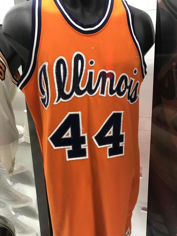
I would invert the trim and the lettering for the navy script uniform so the lettering is white and the trim is orange. For the orange script uniforms, I'd have navy lettering and white trim like in that museum uniform photo and keep the white lettering and blue trim on the Flying Illini orange uniforms like we've done ever since 1989. It's a subtle, but important, difference on the non-white uniforms.
For the white uniforms, I would use navy lettering and orange trim on both the script and the Flying Illini uniforms to provide a classic and consistent look for the two white uniforms.
EDIT - this sweatshirt shows what I'd like the orange scripts to look like.
This is what I'd want the navy scripts to look like.
Last edited:
mattcoldagelli
- Script Illinois Enthusiast

me watching Scripto conversions in real time
I get way too excited when I pull up the site and see that either uniform thread has new posts
me watching Scripto conversions in real time
Fighter of the Nightman
- Chicago, IL
Lol ... guilty as charged here, as well!I get way too excited when I pull up the site and see that either uniform thread has new posts
I think part of the reason I love discussions about our uniforms, how to fix up Memorial Stadium, crowd makeups at neutral sites, etc. is that it's just all in Illinois' control. At the end of the day, we all love the Illini but some of our more devastating losses hit hard and can sometimes even ruin an afternoon for some of us. Sports can be a lot emotionally, so having something to discuss about our favorite team that can never be "ruined" by a disappointing loss is a nice fallback.While I would love that, I also think that is what's great about our two throwbacks ... you literally cannot go wrong with either design in any of the three colors. They're just awesome uniforms. They both have this really cool balance of non-boring designs and yet they're classic/simple ... as if they are not trying to do too much and yet they show clear artistic care like someone really wanted them to have real quality! In comparison, so many modern uniforms Nike puts out seem to either just look totally overdone or simple/minimalist to the point that it looks like nobody tried and they're just cheap throwaway designs. Since I am a fellow lover of the Scripts, though, they're an even better example of this than the Flyin' Illini ones:The white script should be our default home jersey forever and I’ll fight to the death on that hill.


I get that style is subjective, but literally every little thing about that throwback gives off so much more of a "real deal" vibe, whereas the modern one looks like it was 3D printed in comparison, lol. A neck collar with a B/O/B striping pattern vs. a plain navy one. A matching B/O/B striping pattern on the sleeves/armpits vs. nothing at all. A navy outline on the team name and numbers to make it pop vs. plain font with no outline. A quirky-yet-not-obnoxious design on the shorts vs. a standard stripe and our logo. Again, whether one happens to like the new ones or not ... they just don't seem like as much thought was put into them. And that alone is damning, IMO.
We are all preaching to the choir here, but it is just so frustrating that this is NOT like the football side of things, where we all demanded brand new uniforms last year for a program that hasn't showed even a blip of sustained success until this year. This isn't even asking that our nationally successful basketball program get new uniforms for the first time in like SIX YEARS!!!! It's asking for the incredibly low bar of just producing uniforms WE ALREADY HAVE in other colors and throwing the current defaults in the trash.
It's so easy and so in the DIA/Nike's collective face that there simply HAS to be some contractual holdup. I refuse to believe that those who'd make this decision (A) are too unimaginative to have thought of this or (B) actually think the defaults are better. Then again, maybe I shouldn't overestimate Nike, lol.You've made me realize that the actual script is only about 50% of what I like about those jerseys. If we (the team, Nike, whoever) is set on having a contemporary jersey in addition to the throwbacks, they could use the collar, short piping, number and letter color scheme of the script jersey with a modern font and it might actually look pretty good. Of course that would also cannibalize some of the uniqueness of the script.Lol ... guilty as charged here, as well!
While I would love that, I also think that is what's great about our two throwbacks ... you literally cannot go wrong with either design in any of the three colors. They're just awesome uniforms. They both have this really cool balance of non-boring designs and yet they're classic/simple ... as if they are not trying to do too much and yet they show clear artistic care like someone really wanted them to have real quality! In comparison, so many modern uniforms Nike puts out seem to either just look totally overdone or simple/minimalist to the point that it looks like nobody tried and they're just cheap throwaway designs. Since I am a fellow lover of the Scripts, though, they're an even better example of this than the Flyin' Illini ones:
I get that style is subjective, but literally every little thing about that throwback gives off so much more of a "real deal" vibe, whereas the modern one looks like it was 3D printed in comparison, lol. A neck collar with a B/O/B striping pattern vs. a plain navy one. A matching B/O/B striping pattern on the sleeves/armpits vs. nothing at all. A navy outline on the team name and numbers to make it pop vs. plain font with no outline. A quirky-yet-not-obnoxious design on the shorts vs. a standard stripe and our logo. Again, whether one happens to like the new ones or not ... they just don't seem like as much thought was put into them. And that alone is damning, IMO.
We are all preaching to the choir here, but it is just so frustrating that this is NOT like the football side of things, where we all demanded brand new uniforms last year for a program that hasn't showed even a blip of sustained success until this year. This isn't even asking that our nationally successful basketball program get new uniforms for the first time in like SIX YEARS!!!! It's asking for the incredibly low bar of just producing uniforms WE ALREADY HAVE in other colors and throwing the current defaults in the trash.
Something like thisYou've made me realize that the actual script is only about 50% of what I like about those jerseys. If we (the team, Nike, whoever) is set on having a contemporary jersey in addition to the throwbacks, they could use the collar, short piping, number and letter color scheme of the script jersey with a modern font and it might actually look pretty good. Of course that would also cannibalize some of the uniqueness of the script.
You've made me realize that the actual script is only about 50% of what I like about those jerseys. If we (the team, Nike, whoever) is set on having a contemporary jersey in addition to the throwbacks, they could use the collar, short piping, number and letter color scheme of the script jersey with a modern font and it might actually look pretty good. Of course that would also cannibalize some of the uniqueness of the script.
I think it looks better if the collar and piping match the lettering on the jersey (even if not in color at least in style). That's why the script jerseys look so good. You'd want an outline for the lettering, which I'm not sure would lend itself well to the 1LL1NO1S font. I think the lack of an outline is part of what kills the current modern jerseys anyway. It is fine for a darker color, but I think orange on white with no outline looks bad. (for example, Tennessee has a much better font than us but I don't think their white jerseys look very good either). For a "modern" white jersey, I'd love to see us go back to something like the 04-05 era, and just park it there. Keep that as the "modern" jersey, and liberally mix in the script and Flyin' Illini throwbacks.
EDIT: By the time my post when through you posted a mock up with an outlined font. Not sure I'd pick it in a vacuum, but definitely is better than what we currently have.
OrangeBlue98
Iowa is not in a great spot right now (LvilleILL1)
- Des Moines, IA
I thought this was kind of interesting. Now that the basketball program is back where it's been and the football team seems to be improving, Illinois could look more at these types of deals. I'd certainly buy a high-quality half-zip with the script Illinois on it.
I mean, if these people think Iowa State, North Dakota State, and James Madison will sell some merchandise, Illinois sure would.

 collarsandco.com
I mean, if these people think Iowa State, North Dakota State, and James Madison will sell some merchandise, Illinois sure would.
The Officially Licensed Collegiate Collection
Shop Collars & Co.'s Collegiate Collection for premium polos, sweaters & pullovers featuring your favorite universities. Show your school spirit in style!
collarsandco.com
Last edited:
OrangeBlue98
Iowa is not in a great spot right now (LvilleILL1)
- Des Moines, IA
That does look better than the current minimal uniforms, but admittedly I'm still not a fan of the "1LL1NO1S" font. This is probably as good as you can make that font look, but it still looks dated and boring in my opinion.Something like this
View attachment 37824
I do completely agree on having the uniform trim around the shoulders matching the trim on the letters and numbers. It ties everything in together so well. That's why I'd like to at least see someone mockup the football team's shoulder stripes to be Blue/Orange/White/Orange/Blue. That way, no matter what shirt/pant color combination the football team wears, they would always at least have the inner three stripes be consistent across all colors. But I do realize that may look too busy.
- Status
- Not open for further replies.