Illini Basketball Uniforms

Status
Not open for further replies.
#101      
So we need an “ownable” design element to a basketball uniform that isn’t colors (because we need to be distinguishable from another orange and blue school) and isn’t words.

What, exactly, are you hoping for here? High socks?
Typography, layout, striping motif, etc.

Viewing uniform design as a simple function of a team's name and colors is what got us into this mess.

Your comment also raises an important point - even though we are talking about something very accessible like a sports jersey, it is still an art form and not everyone has a good eye for it.
 
#102      
So we need an “ownable” design element to a basketball uniform that isn’t colors (because we need to be distinguishable from another orange and blue school) and isn’t words.

What, exactly, are you hoping for here? High socks?
I won't answer for Champaign Street, but I would argue how "ownable" the uniform is a CULMINATION of all of the factors, not some stand-out factor. Our script font isn't totally unique (thought it is easily the best of the script fonts I have seen, JMO). The B/O/B striping on that uniform is not overly unique. The diamond isn't even entirely novel as far as basketball shorts go. However, when you put all three together, it is a decidedly unique look that is easily identifiable with us in a way our default uniforms just simply are not, and that feeling doesn't rely on any of those attributes by themselves to be "ownable." Same thing with the Flyin' Illini uniforms.
 
#103      
All art is derivative. Nothing wrong with that at all. Derivative does not mean unoriginal.

This does mean however that no basketball jersey can be truly unique without essentially abandoning its underpinning as a basketball jersey. To be unique, it would have to stop being a basketball jersey.

This is my main problem with people who, on the football side, object to the ILLINOIS helmets solely on the basis of being derivative of the Giants helmets. Every single other helmet we have is also derivative. And that is ok too.

As for the "ownable" piece, I'm not even really sure what that means. If you think of the most readily identifiable sports jersey designs, what you're talking about is a combination of longevity and success, not specific design elements. Would the Chicago Bulls jersey be as identifiable as it is today if they hadn't drafted Michael Jordan and kept the same basic design over the years since? As much as we all hate the 1LL1NO1S jerseys, if we keep them for the next 20 years, dominate the Big Ten and win 5 national championships in that time, that's going to be an "ownable" design.
 
#104      
All art is derivative. Nothing wrong with that at all. Derivative does not mean unoriginal.

This does mean however that no basketball jersey can be truly unique without essentially abandoning its underpinning as a basketball jersey. To be unique, it would have to stop being a basketball jersey.

This is my main problem with people who, on the football side, object to the ILLINOIS helmets solely on the basis of being derivative of the Giants helmets. Every single other helmet we have is also derivative. And that is ok too.

As for the "ownable" piece, I'm not even really sure what that means. If you think of the most readily identifiable sports jersey designs, what you're talking about is a combination of longevity and success, not specific design elements. Would the Chicago Bulls jersey be as identifiable as it is today if they hadn't drafted Michael Jordan and kept the same basic design over the years since? As much as we all hate the 1LL1NO1S jerseys, if we keep them for the next 20 years, dominate the Big Ten and win 5 national championships in that time, that's going to be an "ownable" design.
I've worked in branding / advertising / design for over a decade. Maybe "ownable" is industry jargon that I should've avoided. I figured it was a more ubiquitous term. It doesn't mean unique or original. To your point, it comes down to share of voice - how much real estate are you occupying in a person's mind relative to competition? Is it enough to make people associate your brand asset (logo, slogan, uniform, etc.) with your brand first and foremost above all other brands? The less distinct your asset is, the harder it will be to "own" it because you have more competition also vying for people's mental real estate.

It's the same thing with uniforms. If ours follows the same / similar template as several others, we're really going to have to try hard (stick with it for 20+ years and win 5 natties) to get people to associate it with our team.

It needs something or a combination of things to make it somewhat distinct among its competitive set. Michigan's football helmet is probably the holy grail in this conversation. No words, no logos, and you could see that helmet in black and white and know which team it belongs to.

I can't fathom what we could do that could approach that level of ownability. But that's the idea.

Also, I've unintentionally distracted us from the main point. Having an "ownable" design is not the end goal. We could change our colors to brown and lime green and have an ownable design if that's all that were important. It first has to be good. And that's the main issue with ours. What's the point in having a distinct design if no one likes it? In that case, your ownable design becomes a liability rather than an asset that creates brand equity.
 
#107      
It needs something or a combination of things to make it somewhat distinct among its competitive set. Michigan's football helmet is probably the holy grail in this conversation. No words, no logos, and you could see that helmet in black and white and know which team it belongs to.

I can't fathom what we could do that could approach that level of ownability. But that's the idea.
I think much of what you’re saying is applicable to football (and has been hashed out in the Football Uniforms Thread), but I’m not sure it is to basketball.

Who has achieved what you are describing in basketball? There’s only one team that comes to mind for me - UNC - and it’s because they have their own color.

Otherwise, be honest - if Duke and Kentucky are playing and you’re watching from a slight distance….you won’t know who is who until you know who is home and away.

This is all fine, because it makes your final point - make it good - even more the be all, end all.
 
#108      
So we need an “ownable” design element to a basketball uniform that isn’t colors (because we need to be distinguishable from another orange and blue school) and isn’t words.

What, exactly, are you hoping for here? High socks?
Personally, I want to see a small patch on the shorts, maybe even the jersey of the orange Kool-Ade man, right side up of course! Okay, okay, put Kool-Ade man on the socks if you must....
 
Last edited:
#109      
I think much of what you’re saying is applicable to football (and has been hashed out in the Football Uniforms Thread), but I’m not sure it is to basketball.

Who has achieved what you are describing in basketball? There’s only one team that comes to mind for me - UNC - and it’s because they have their own color.

Otherwise, be honest - if Duke and Kentucky are playing and you’re watching from a slight distance….you won’t know who is who until you know who is home and away.

This is all fine, because it makes your final point - make it good - even more the be all, end all.
Being completely honest - I probably could tell them apart because Duke has a pretty identifiable font with their serif and their arching.

But, I'll give you that if Kentucky and Creighton were playing, I probably wouldn't be able to tell them apart.

You're probably right that there aren't many examples in cbb of what I'm describing. But there are a handful who do a great job although not to the Michigan football helmet extreme. For example, I bet you know whose uniforms these are:

1000007993.jpg


1000007995.jpg


This is a really good one that gets kind of over looked...
1000007997.jpg


Anyway, I'll concede that I may have an unrealistically high bar for our jerseys. Although, on the other hand, all it would take to make me happy is a FI set in all 3 colors.
 
Last edited:
#116      
It's time for a serious upgrade to our uniforms. Most fans can agree that we made a significant leap forward in football with a more classic and timeless design, along with a fantastic selection of throwback helmets. When it comes to basketball, it feels almost offensive that we're still wearing uniforms from the mid-2010s—the nadir of sports design. Our basketball program has so much history and potential, and it's disappointing to see us stuck in outdated garbage while everyone else has moved passed this era
 
#117      
Seems like a big “if”

Illinois warrants uniforms becoming of the top 15 program we’ve been this decade.
Sure but uniform aesthetics and uniform identifiability are separate things. I was just looking at a list the Athletic put out like 5 years ago of the best 25 college basketball uniforms of all time. On that list is Long Beach State's jersey. Can most of you describe that jersey without looking it up? Can anyone?

To become identifiable a jersey needs to be worn consistently by a consistently successful team so it can invade the collective consciousness. There is absolutely nothing unique or defining about Kentucky's jersey. But we all know what it looks like. It's seared into our minds. Because Kentucky has been consistently successful wearing them.

All this to say that if the goal is to have a better looking jersey, yeah, we should do that. If the goal is to have a jersey that is immediately recognizable, we need to figure out what the jersey is going to be, stick to it, and win, big and often. We can do both things, but they are not the same thing.
 
#118      
Sure but uniform aesthetics and uniform identifiability are separate things. I was just looking at a list the Athletic put out like 5 years ago of the best 25 college basketball uniforms of all time. On that list is Long Beach State's jersey. Can most of you describe that jersey without looking it up? Can anyone?

To become identifiable a jersey needs to be worn consistently by a consistently successful team so it can invade the collective consciousness. There is absolutely nothing unique or defining about Kentucky's jersey. But we all know what it looks like. It's seared into our minds. Because Kentucky has been consistently successful wearing them.

All this to say that if the goal is to have a better looking jersey, yeah, we should do that. If the goal is to have a jersey that is immediately recognizable, we need to figure out what the jersey is going to be, stick to it, and win, big and often. We can do both things, but they are not the same thing.
But I think we can all agree that there might be rare examples on each extreme of this "debate." For example, Penn State's football uniforms are objectively boring, and the only reason they are "ownable" is because of their history of success and because they have worn them for so long. On the other extreme, a lot of people online were talking about TCU having one of the best football uniforms a few years ago, and it was not because they have this decades-long history of winning. The vast majority of "good uniforms," at least IMO, combine those two elements.

Either way, I think a lot of this is indeed subjective and often leads to fellow Illini fans talking past each other. However, I would allege that the following statements are damn near objective truths:

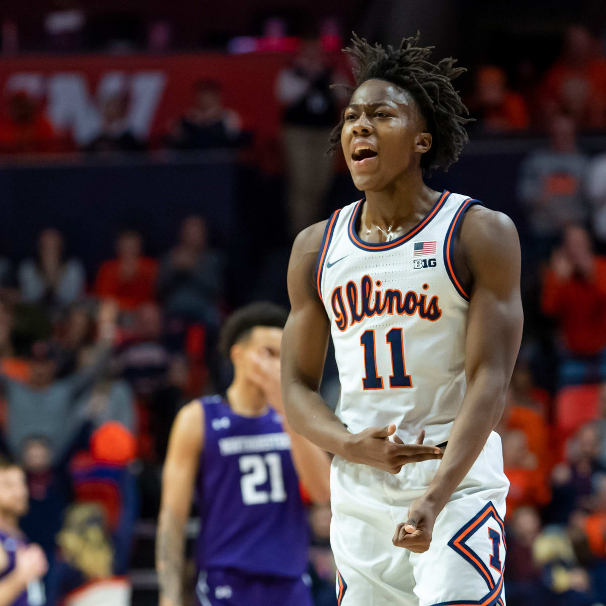
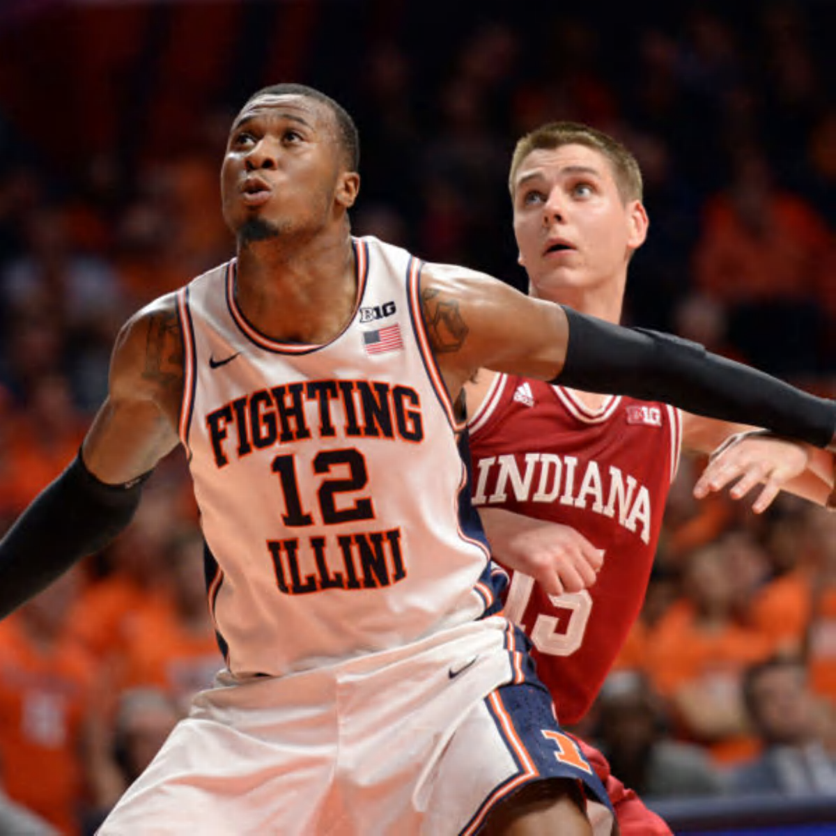
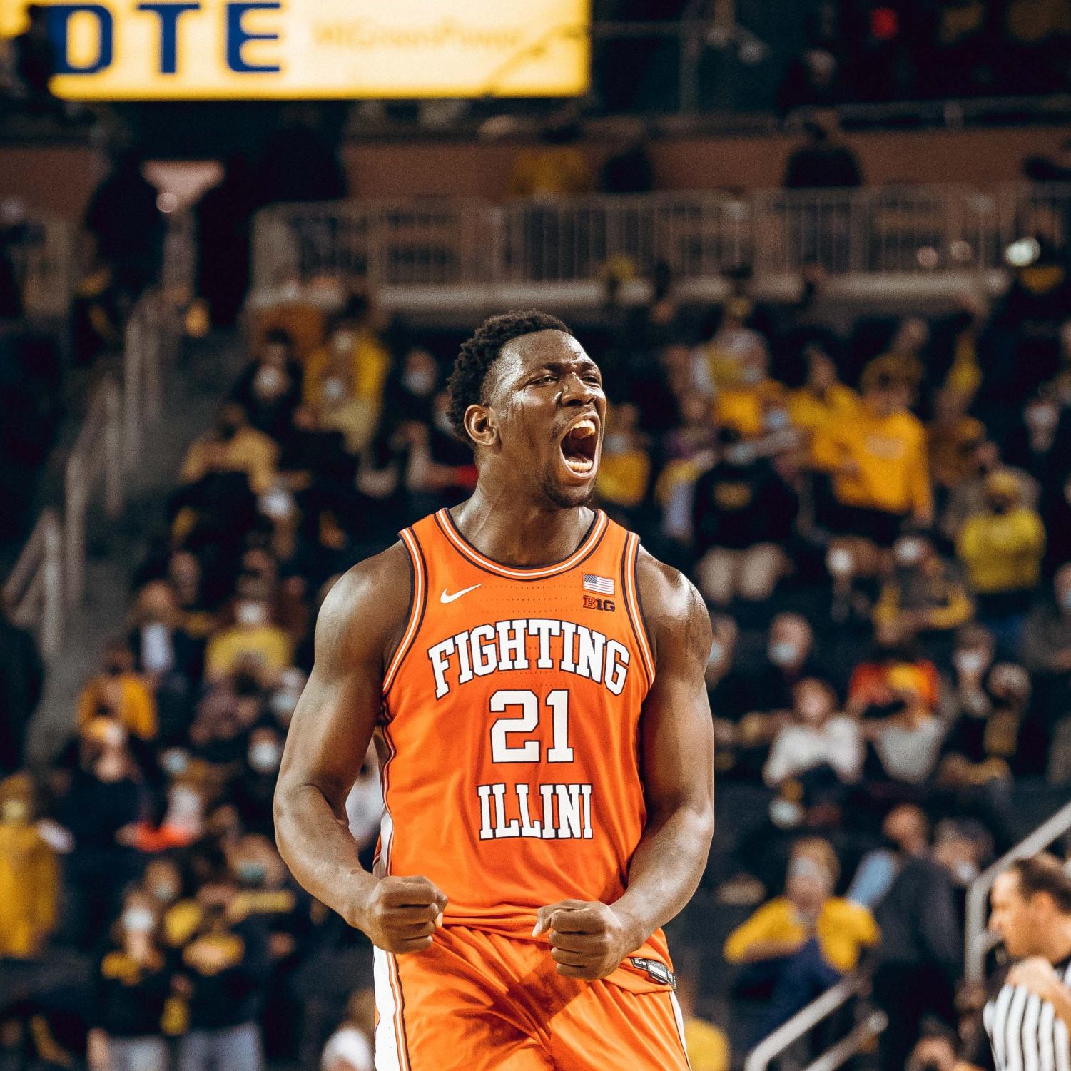
1. Our current uniforms have a "cookie cutter" or default feel to them in a way that our past uniforms did not, at least not anywhere close to this degree. If the picture posted of Clemson's uniforms didn't prove it for you, just look up images of the Nike jersey for Creighton or Vanderbilt or several other schools ... we very clearly got the default Nike template in a way that we had not for previous iterations. Even pretty unpopular uniform designs like the zig zags showed an effort to create something somewhat unique.

2. Our throwback uniforms are incredibly popular, both among our own fan base and the casual college hoops fan. Read the comments in this thread. Look at which style of jersey (i.e., Script/Flyin' Illini vs. one of the default jerseys) you see fans wearing at our games. Go look at any college hoops social media page that ranks throwback uniforms, and you will find ours near the top the majority of the time. While this last argument is more subjective, I would argue that both are VERY clearly identifiable with Illinois, both because they are both unique looks that incorporate our colors in aesthetically pleasing ways and (especially for the Flyin' Illini ones) because they evoke memories of past Illini teams. They have been an unambiguous success.

Thus, it seems entirely reasonable to me that the "burden of proof" here HAS to lie with those who do not want to simply create one or both of our throwbacks in white, navy and orange. We already HAVE great uniforms that our fans and others like, and the incremental effort would be laughably minimal. If someone wants anything other than the absolutely awesome options we have staring us in the face, he or she must articulate a better option. It really doesn't seem reasonable right now to argue WHETHER we need new uniforms after 6+ seasons with a set that most don't really like ... the question is what comes next. And the path of least resistance for literally everyone involved are the two throwbacks staring Nike and the DIA right in the face. I feel like some people assume it's this foregone conclusion that we have to come up with something new and then just have two random throwbacks in our pockets ... WHY?!?! Lol.

The other uniform ideas from that KJ rendering to the Southern Illinois examples are great ... but I can't see how either is in any way equal to the Script or Flyin' Illini options, much less superior to either one. Get your head out of your a$$, Nike, and do the move that is so damn obvious that it hurts!

usatsi_13928749.jpg

1227-picture-jpg.34463

Script Navy.png

a77d5b9de7a009c9d6938640ccab5b827644a46672185a808fa52b00265531d0.jpg

FMootPZWQAIWbko.jpeg

Flyin' Illini Navy v1.png


Woohoo, call it a day and we all move on as winners!!
 
Last edited:
#119      
But I think we can all agree that there might be rare examples on each extreme of this "debate." For example, Penn State's football uniforms are objectively boring, and the only reason they are "ownable" is because of their history of success and because they have worn them for so long. On the other extreme, a lot of people online were talking about TCU having one of the best football uniforms a few years ago, and it was not because they have this decades-long history of winning. The vast majority of "good uniforms," at least IMO, combine those two elements.
OK, I'm sure this was happening, but other than being purple, what is immediately identifying about those uniforms? I honestly couldn't conjure up a mental image of them other than being purple, so I googled it. Apparently there were major redesigns of the TCU football jerseys and helmets in 2015, 2019, and 2024. So which of these jersey is the iconic and immediately recognizable TCU jersey? I'm guessing 2019 based on your comment of "a few years ago." I like them, but I think this is an instance where the design is nice and has some unique elements, but the jersey has not had the lasting brand impact we've been talking about (if it had, why would they scrap it?). Maybe if they had won back to back championships, and stuck with this design for an extended period of time it would have become that iconic image we're talking about. But as it is, it really hasn't.
 
#120      
I've worked in branding / advertising / design for over a decade. Maybe "ownable" is industry jargon that I should've avoided. I figured it was a more ubiquitous term. It doesn't mean unique or original. To your point, it comes down to share of voice - how much real estate are you occupying in a person's mind relative to competition? Is it enough to make people associate your brand asset (logo, slogan, uniform, etc.) with your brand first and foremost above all other brands? The less distinct your asset is, the harder it will be to "own" it because you have more competition also vying for people's mental real estate.

It's the same thing with uniforms. If ours follows the same / similar template as several others, we're really going to have to try hard (stick with it for 20+ years and win 5 natties) to get people to associate it with our team.

It needs something or a combination of things to make it somewhat distinct among its competitive set. Michigan's football helmet is probably the holy grail in this conversation. No words, no logos, and you could see that helmet in black and white and know which team it belongs to.

I can't fathom what we could do that could approach that level of ownability. But that's the idea.

Also, I've unintentionally distracted us from the main point. Having an "ownable" design is not the end goal. We could change our colors to brown and lime green and have an ownable design if that's all that were important. It first has to be good. And that's the main issue with ours. What's the point in having a distinct design if no one likes it? In that case, your ownable design becomes a liability rather than an asset that creates brand equity.
As a layman/non-expert in this realm, I'd define "ownable" as something that when you see it, you almost automatically think of that organization alone.

In my opinion, the best basketball examples of this are the Celtics uniforms (at least their classic uniforms and not the black/neon green abomination that Nike is attempting to foist upon Celtics fans :) ). Nothing at all about the Celtics' uniforms is overly unique. Pretty basic lettering and numbering. Two colors, white and green. But when you see that uniform, you instantly think "Boston Celtics".

I feel like the Flying Illini uniforms would be the best "ownable" design we have. For any Big Ten fan of a certain age, you see those uniforms whether today or in 1980s photos and you instantly recognize that as "Illinois basketball". The script uniforms are now awfully close. And to your last point in the post to which I've replied, I'll continue to say we have two great templates in the scripts and the Flying Illinis. Not good - great. The solution to this is staring everyone in the face. All that has to happen is for the decision-makers to recognize it and act upon it.
 
#121      
OK, I'm sure this was happening, but other than being purple, what is immediately identifying about those uniforms? I honestly couldn't conjure up a mental image of them other than being purple, so I googled it. Apparently there were major redesigns of the TCU football jerseys and helmets in 2015, 2019, and 2024. So which of these jersey is the iconic and immediately recognizable TCU jersey? I'm guessing 2019 based on your comment of "a few years ago." I like them, but I think this is an instance where the design is nice and has some unique elements, but the jersey has not had the lasting brand impact we've been talking about (if it had, why would they scrap it?). Maybe if they had won back to back championships, and stuck with this design for an extended period of time it would have become that iconic image we're talking about. But as it is, it really hasn't.
Apologies if I was not clear, but that was kind of my point - nothing, other than they are aesthetically pleasing to the masses! PSU was my opposite point - a boring uniform that is now inseparable from the "brand" of winning football at Penn State. The point I was trying to make is that while some uniforms are thought of fondly pretty much ONLY because of a history of winning (PSU) and some are thought of fondly pretty much ONLY due to a trendy aesthetic (TCU), the vast majority of uniforms thought of as "good" combine both of those things. I was more trying to make the point that I don't think your average fan just forces himself to love any uniform that has seen enough on-field victories, as in I do not think the current basketball defaults we have would obtain some iconic status had we won it all in 2021 or 2024 ... people would like them BETTER maybe, but they have issues WAY beyond what wins/losses they are associated with (after all, they have been the defaults during what is objectively a very good stretch from 2020 to now).
 
#122      
Apologies if I was not clear, but that was kind of my point - nothing, other than they are aesthetically pleasing to the masses! PSU was my opposite point - a boring uniform that is now inseparable from the "brand" of winning football at Penn State. The point I was trying to make is that while some uniforms are thought of fondly pretty much ONLY because of a history of winning (PSU) and some are thought of fondly pretty much ONLY due to a trendy aesthetic (TCU), the vast majority of uniforms thought of as "good" combine both of those things. I was more trying to make the point that I don't think your average fan just forces himself to love any uniform that has seen enough on-field victories, as in I do not think the current basketball defaults we have would obtain some iconic status had we won it all in 2021 or 2024 ... people would like them BETTER maybe, but they have issues WAY beyond what wins/losses they are associated with (after all, they have been the defaults during what is objectively a very good stretch from 2020 to now).
Got it, yes. I agree our current uniforms are not aesthetically pleasing to me at all. Agree with you on that and would love an improvement.

My comments were more addressed at the idea of a uniform that is immediately identifiable as a brand. I don't think any design, purely in-and-of itself and independent of success on the field/court, can achieve that.
 
#123      
The absence of a mascot really limits the design elements that make some schools look pop. Without one, you are just sitting around discussing piping and fonts...

Uniforms back in the day were cooler. They could use the Chief, and he was awesome! No matter where you land on that debate, the reality is, he isn't coming back.

Will we ever be able to move on to something other than the letter "I"?
 
#124      
The absence of a mascot really limits the design elements that make some schools look pop. Without one, you are just sitting around discussing piping and fonts...

Uniforms back in the day were cooler. They could use the Chief, and he was awesome! No matter where you land on that debate, the reality is, he isn't coming back.

Will we ever be able to move on to something other than the letter "I"?
A counter point to this is the atrocious use of Bucky on the Wisconsin shorts.
 
#125      
The absence of a mascot really limits the design elements that make some schools look pop. Without one, you are just sitting around discussing piping and fonts...

Uniforms back in the day were cooler. They could use the Chief, and he was awesome! No matter where you land on that debate, the reality is, he isn't coming back.

Will we ever be able to move on to something other than the letter "I"?
To this end, I know people hate the Kingfisher. I get it. I'd like us to move on from the Chief and find a workable mascot but I'm not fully sold on the Kingfisher either. But if we adopted the Kingfisher, that would allow us to use bird feathers in ways that evoke the Chief. Such as this helmet mock up (source: https://www.thechampaignroom.com/2013/2/23/4019504/illinois-helmet-mockups):

illinimock1.jpg


Is that a headdress? Why no, those are Kingfisher feathers.
 
Status
Not open for further replies.
Back