PART 2
(Can only upload 20 images in a post, lol...)
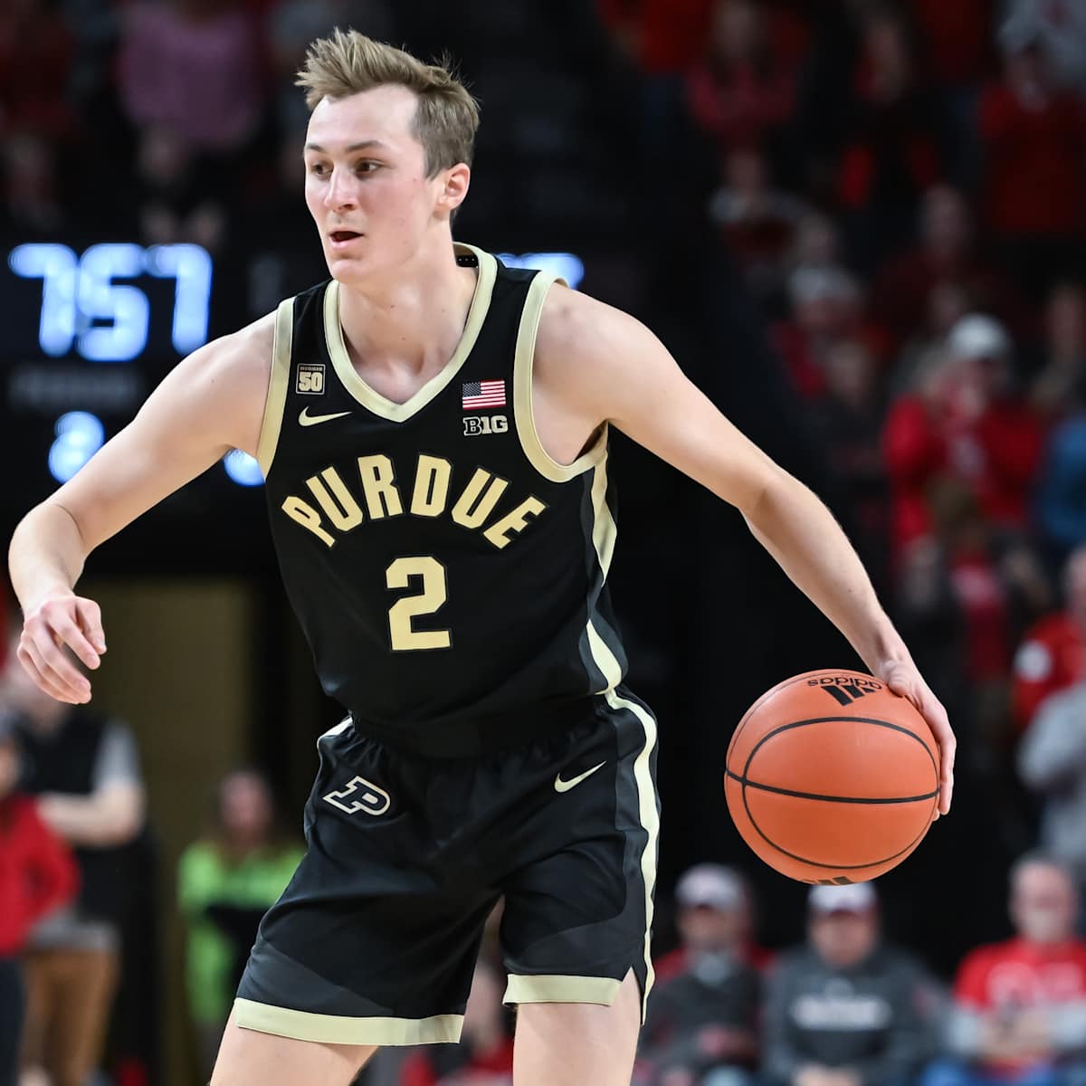
Purdue
Rutgers
Wisconsin
A couple things seem very clear:
1. As if Adidas uniforms weren't bad enough, I am shocked any school EVER lets them create a "special" uniform ... holy moly, they are always bad!! I have seen other awful special uniforms they have put out, but those practice jerseys they touted as uniforms for Indiana, Nebraska and Rutgers ones are comically awful, haha.
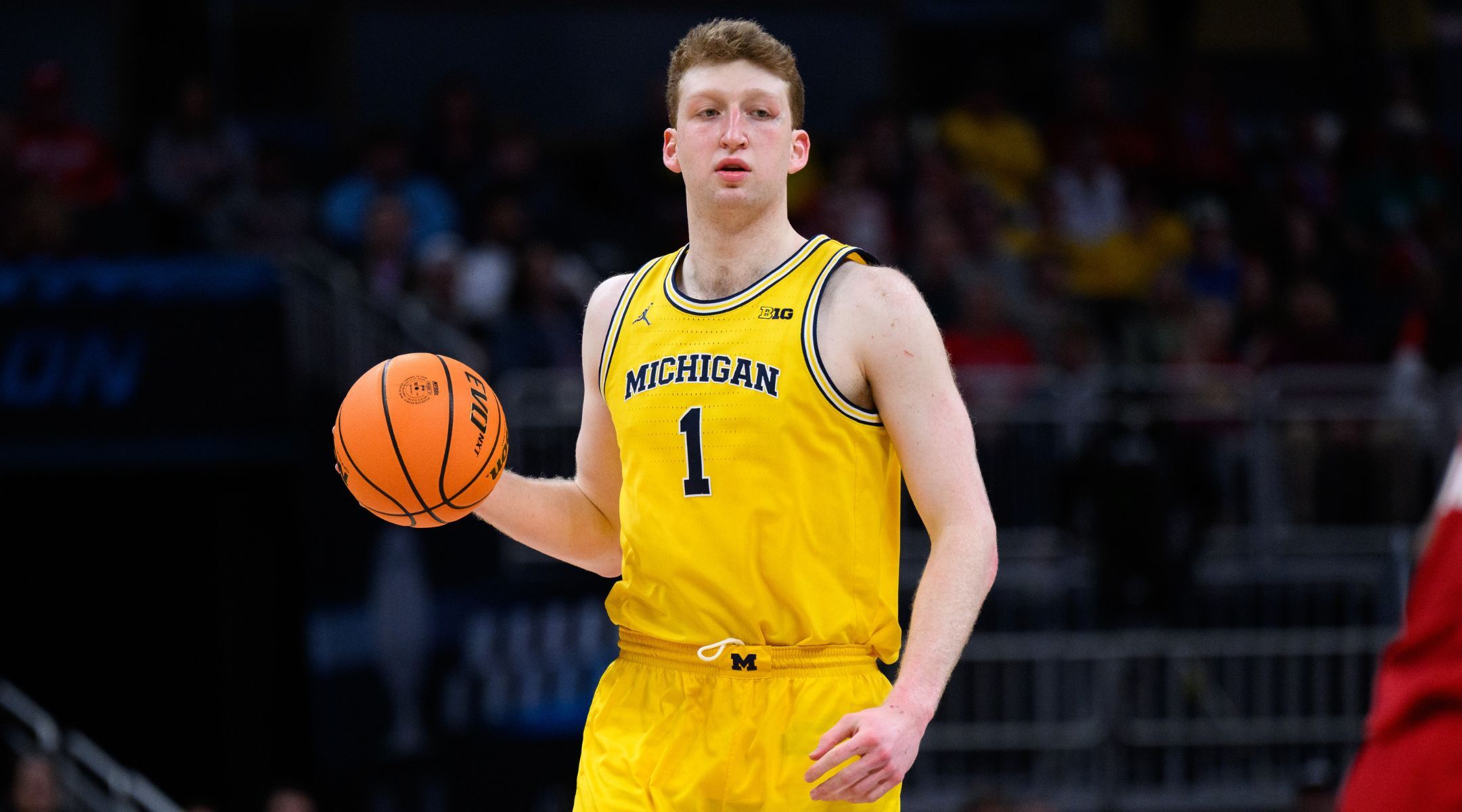
2. You really have to judge schools in two different groups - those that have one primary color and white (e.g., Nebraska and Wisconsin) vs. those who have two clear/bold primary colors (e.g., Illinois, Iowa or Michigan). For that second category, the uniforms that properly incorporate BOTH colors look so much better. Michigan. Part of what bothers me SO much about our orange default is that we just have plain white font with no navy outline on an orange uniform, making us look like Tennessee or something, and the navy is way too understated on the rest of the jersey. To compare to an actually good uniform like Michigan's, the analogy would be for Michigan's yellow uniform to just have plain white font on it with no navy to be seen except for a generically bland and awkward neck collar, haha.
So yeah, of these I would go with...
Great
Michigan Navy (currently the best non-throwback uniform in the Big Ten by quite a lot...)
Michigan Yellow
Good Given Its Goals
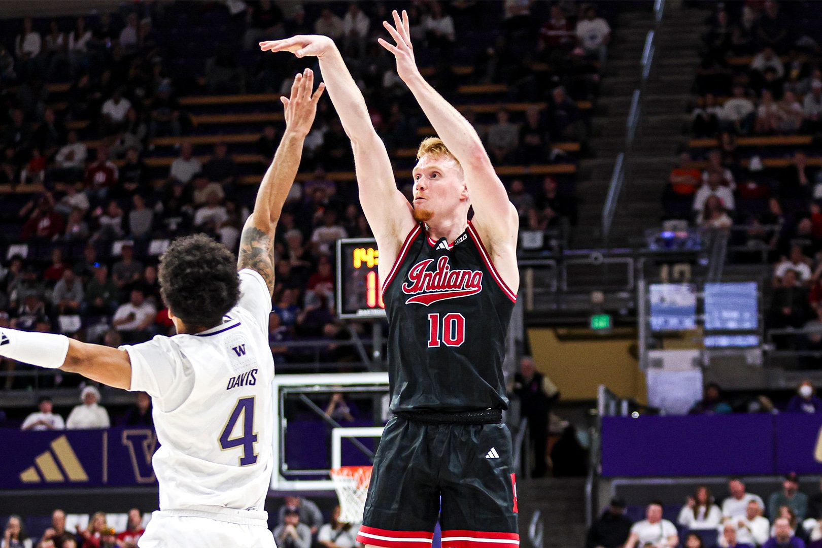
Indiana Red
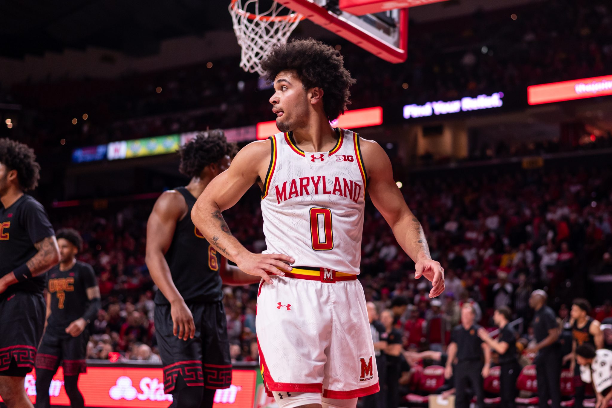
Maryland Red (if you can tolerate the "vibe" Maryland has always kind of had, this is a very solid jersey)
Michigan State Green (never loved their font, myself, but they're rollin' with it)
Solid
Purdue Black
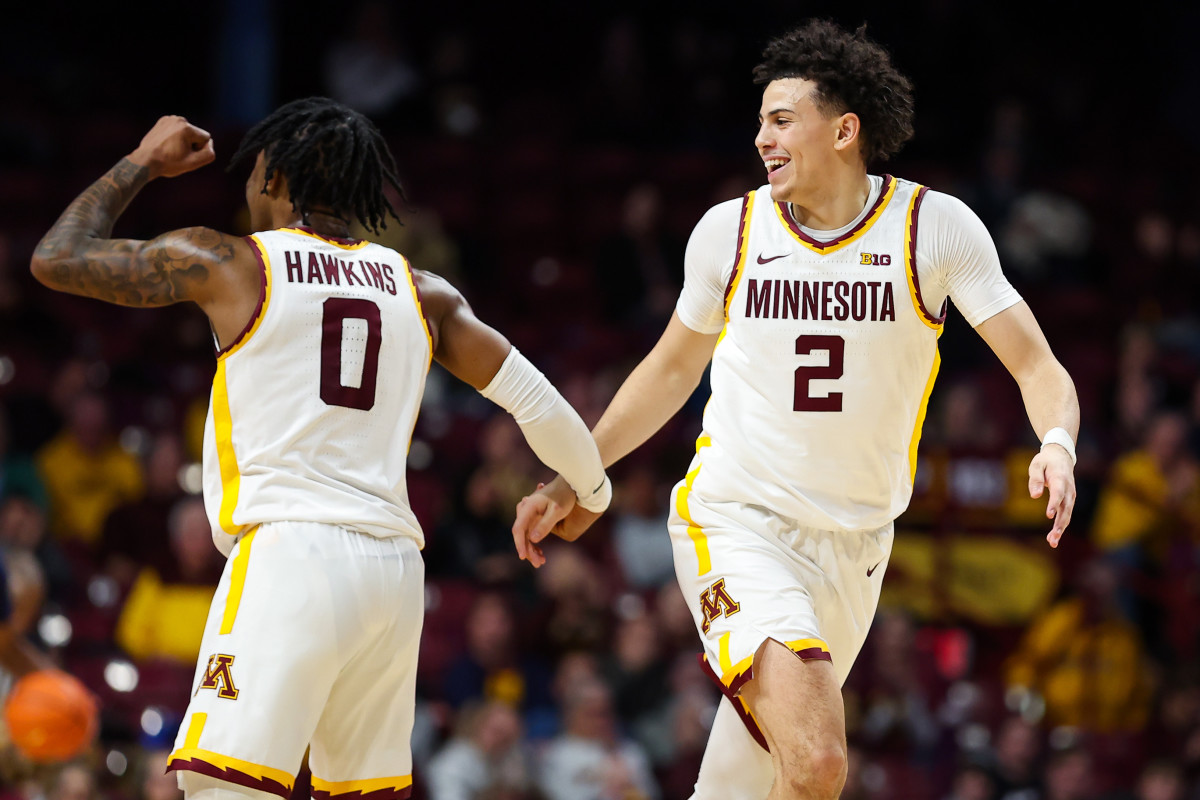
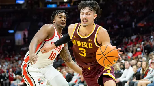
Minnesota Yellow (for some reason, if you can learn to love their colors, this one actually works kind of well)
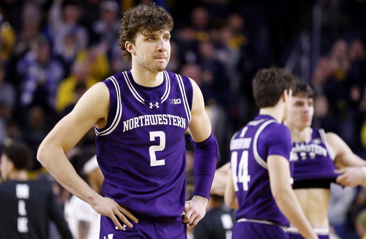
Northwestern Purple
Okay But Boring (i.e., Nothin' Special, Nothin' Terrible)
Rutgers Red
Truly Average
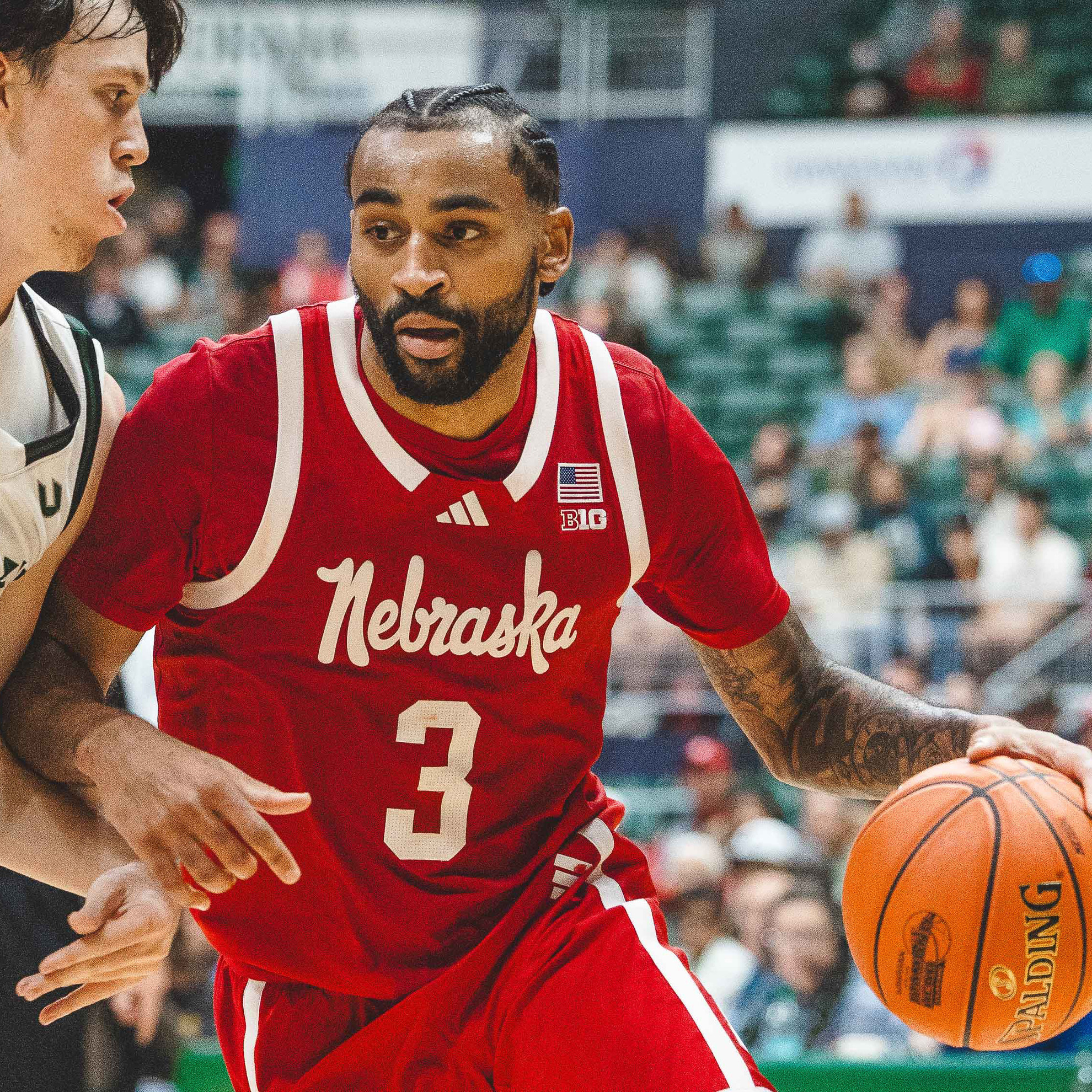
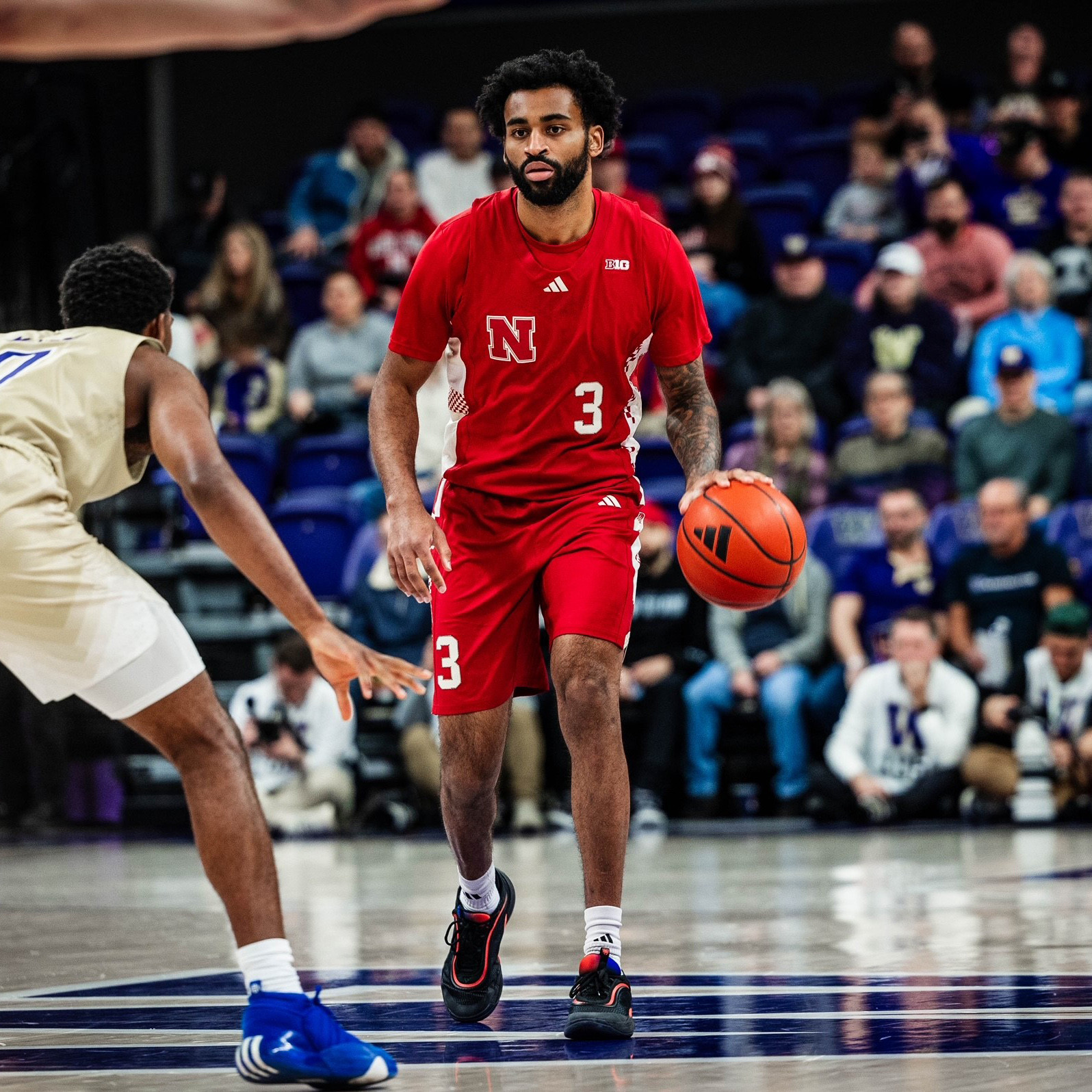
Nebraska Red (would be in the "Solid" category with a striping pattern that looked like they actually tried)
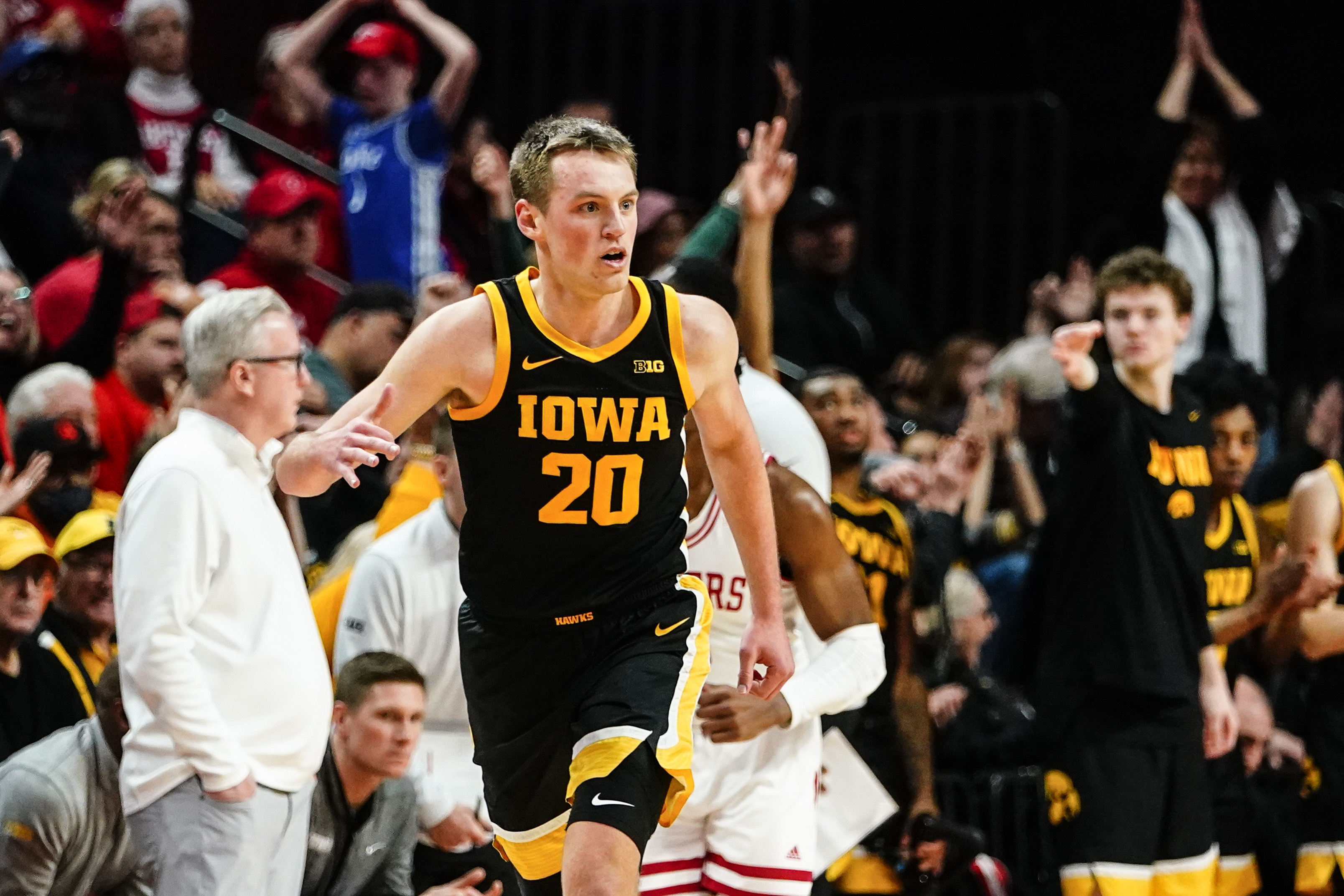
Iowa Black (would be higher without weird stripes and a font outline)
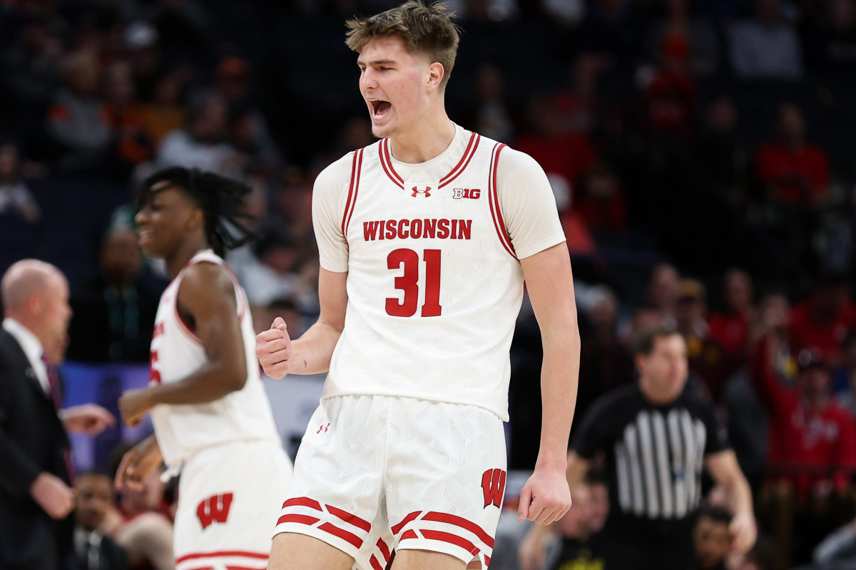
Wisconsin Red
Purdue Gold (would be higher without weird/huge striping pattern)
Minnesota Maroon (striping works less here than with the yellow one, IMO)
Michigan State Black (not terrible or anything, but I hate putting a logo rather than words on a basketball jersey ... and again, enough with the black!)
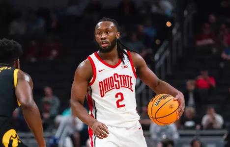
Ohio State Red
Sub-Par
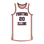
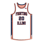
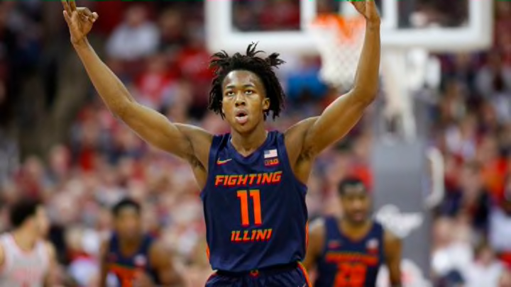
Illinois Navy (the
1LL1NO1S font really carries a lot of weight...)
Indiana Black (just a weird color combo for them...)
Maryland Yellow (this could have been done better, needs more white to soften things)
Penn State Navy (this is TOO boring to get into the "Okay But Boring" category)
Maryland Black (too much, and schools should stop trying to incorporate black unnaturally into their color schemes)
Bad
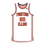
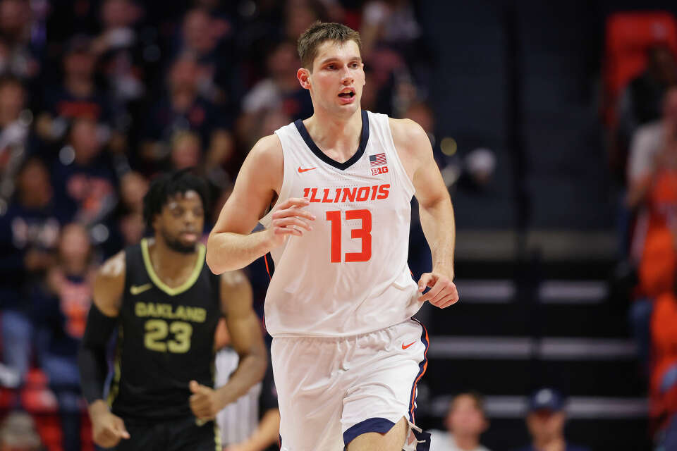
Illinois Orange
Rutgers Practice Jersey
Laughably Cringe
Indiana Practice Jersey
Nebraska Practice Jersey
It is
ASTONISHING how awful we would make nearly everyone in the conference look in comparison if we simply adopted an ounce of competence and had the two throwbacks as our uniforms to compare to the rest of these scrubs...


 I get that would be way down their list of priorities for which to obtain insider information, but man ... they could give us some really interesting insight into whether this is at least on anyone else's radar or if Brad and Josh wake up every day under the delusion that our 1LL1NO1S uniforms are cool.
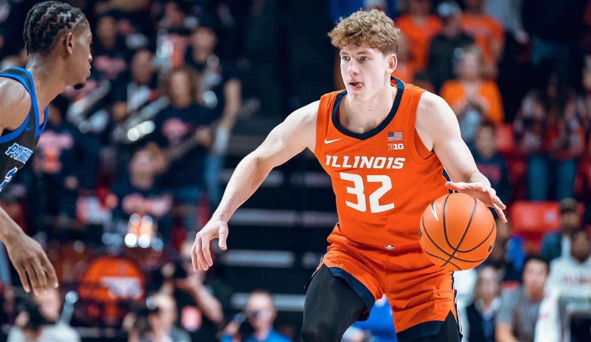


/cdn.vox-cdn.com/uploads/chorus_image/image/73824455/20250102_IC_MBB_Washington_035.0.jpg)
/cdn.vox-cdn.com/uploads/chorus_image/image/73869195/_46A8545.0.jpg)

/cdn.vox-cdn.com/uploads/chorus_asset/file/23075137/usa_today_17323329.jpg)


/cdn.vox-cdn.com/uploads/chorus_asset/file/23178077/usa_today_17510491.jpg)