Illini Basketball Uniforms

Status
Not open for further replies.
#202      
IMG_8988.jpeg

We’re going to need to add a script logo to our court now too.
 
#205      
I always feel like those home whites (and orange for to some degree) look like practice jerseys, they're just so plain. I've seen middle school jerseys that look better than these.
Yeah, they just look cheap as hell, haha. I personally think the orange defaults are the worst of the three, as the whites at LEAST have an appropriately visible mix of orange and navy ... ya know, our two colors! For some reason even if it is the inverse design and the same in principle, in practice the orange defaults make it look like our colors are orange and white, like Tennessee or Texas:

2206441604.0.jpg

12679591.jpg


Both look bad, but the orange somehow looks a lot more plain to me. I don't think you should have too many clear, hard-and-fast rules that are never broken with uniforms (after all, a good uniform can come in different styles!), but one thing I personally feel strongly about is that a team with two "real" colors (e.g., Illinois has orange and blue, whereas Wisconsin only really has red, with white as an accent) should use both colors with every uniform prominently. Even just throwing navy outlines on the text and numbers of both of those uniforms would go a long way to making them look better ... though getting past the 1LL1NO1S font will always be an uphill climb, haha.
 
#208      
Posted today on a very popular college basketball Instagram account recently. It's not just Illini fans that recognize our Script uniforms as elite:

Script.jpeg


For those who bring up that "everyone has a script jersey," I mean ... yeah, this proves that. However, I could easily see this trend going away soon, us sticking with the Script (since ours is the best of the bunch) and in 10-20 years, "Script Basketball Jersey" is almost as tied to Illini basketball as circus font is to Kansas.
 
#209      
Posted today on a very popular college basketball Instagram account recently. It's not just Illini fans that recognize our Script uniforms as elite:

View attachment 42834

For those who bring up that "everyone has a script jersey," I mean ... yeah, this proves that. However, I could easily see this trend going away soon, us sticking with the Script (since ours is the best of the bunch) and in 10-20 years, "Script Basketball Jersey" is almost as tied to Illini basketball as circus font is to Kansas.
I forgot just how great those light blue Marquette script uniforms are. If I'm being 100% objective, I think those are the best uniforms in college basketball.
 
#210      
I forgot just how great those light blue Marquette script uniforms are. If I'm being 100% objective, I think those are the best uniforms in college basketball.
I think they're good, but I would say I am slightly less of a fan. My general thoughts on that tier list are below, while acknowledging I am not touching on each school:

Insanely Heat
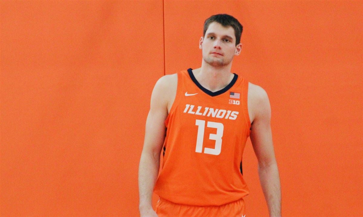
- I know I am biased, but Illinois really does stand out ... it's a damn near perfect script uniform.
- My next best here is probably Ohio State; that one is really good.
- Kansas State is pretty overrated and belongs down at least a tier.

Solid Unis
- Syracuse stands out as the clear winner here for me ... they likely belong up a tier.
- Texas and Tennessee are arguably just here because they've often been relevant ... I think both are mid.
- For having a pretty good script logo, the Ole Miss script JERSEY is surprisingly underwhelming ... I would knock them down a tier.

Not Too Shabby
- Bradley is CRIMINALLY underrated here! I'm no I'm biased as a native Peorian, but their script jersey is awesome.
- For some reason, Iowa State just personifies the "trying too hard and it still isn't working" vibe for me when it comes to uniforms, logos, brands, etc. They seem like the ultimate trend chasers, and they never do it as well as the best, lol.

Whole Lotta Mid
- Pitt likely got the shaft here ... at least belong up one tier.
- Was the guy who made Drake's drunk?? :ROFLMAO:
- I can't quite place why Iowa's script font just DOESN'T work as well as other schools ... but it doesn't, lol.
 
#211      
- I can't quite place why Iowa's script font just DOESN'T work as well as other schools ... but it doesn't, lol.
It's because of the letters involved and the length of the word "Iowa"!

I know I beat a dead horse on this stuff, but these design choices can never exist in a vacuum. There's no font magic that exists that can take the word "Iowa" and make it look better in script letters than it does in block letters.
 
#212      
Whole Lotta Mid
- Pitt likely got the shaft here ... at least belong up one tier.
- Was the guy who made Drake's drunk?? :ROFLMAO:
- I can't quite place why Iowa's script font just DOESN'T work as well as other schools ... but it doesn't, lol.
:ROFLMAO: I didn't notice it until you mentioned it, but you're right, that Drake script is brutal!

I think one of the main keys to the script formula is that it's fewer letters or in the case of Illinois, you have mostly vertical letters and with the I's, L's and N you have kind of an up and down, loopy design that keeps it compact but still legible. Iowa is kind of an example of the opposite; O,W and A kind of spread it out too much. They use as much jersey with four letters as Illinois uses with eight. Same thing with Vols and State.

Pitt has the more vertical, compact letters that seem to make a cleaner design.
 
Last edited:
#213      
Solid Unis
- Syracuse stands out as the clear winner here for me ... they likely belong up a tier.
- Texas and Tennessee are arguably just here because they've often been relevant ... I think both are mid.
I think the Texas unis are great. There's something about the script, burnt orange, and off-white working together that just feels perfectly Austin. Like a brown suede jacket.
 
#214      
I think the Texas unis are great. There's something about the script, burnt orange, and off-white working together that just feels perfectly Austin. Like a brown suede jacket.
I'll pull a @WyattEarp and add...

I also have a soft spot for Loyola's. They were on this trend earlier than most. (A couple years before us, I think). The retro thing works for them..probably because it calls back to a time when they were more relevant and script lettering wasn't vintage but avant-garde. I'm also a one time tuition payer to them so perhaps I'm biased. But I think whatever good will they had with me was used up in 2021.
 
#215      
I like the Loyola jersey too.

The Houston jersey looks more like one of those "handwriting" fonts than script to me.

What is going on with the letter h in the UCF Knights jersey?
 
#219      
To switch things up, what about Arched Illini on blue? 👀

I bet it would also look super clean on white, but our script whites are great already.
 
#220      
To switch things up, what about Arched Illini on blue? 👀

I bet it would also look super clean on white, but our script whites are great already.
My opinion is that the larger the surface area, the less appealing the arched Illini looks.

I think it looks fantastic on football helmets and as a smaller logo on the chest of golf shirts and half-zips. When it’s on a full surface like a sweatshirt, I think it looks less good. But that’s strictly my opinion.
 
#221      
View attachment 42974
Did my best with ChatGPT to make these. If we don’t get new uniforms that look like a variation of these we riot.View attachment 42975View attachment 42976
Great idea! FTR, if we actually "resurrected" the navy Flyin' Illini uniform, the white/orange pattern would look like this:

FI Away v2.png

Or if we went with orange letters (which I have come around to supporting!)...
FI Away v1.png

I really like the slightly more complex striping patterns and the white on the side. I am very ignorant of AI usage, but can we give it some pointers?? :ROFLMAO:
 
#222      
I was thinking today that whereas we can read all of these tea leaves in our football social media posts about using the Slant ILLINOIS, Script or even Arched ILLINI helmets more this year - both wildly popular among fans - we can unfortunately do no such thing on the basketball side. I fear we will get yet another year of the DIA, Nike or both being negligently asleep at the wheel, because we are still prominently featuring the 1LL1NO1S uniforms in all kinds of posts.

We have been a good and stable program. We have a large following that has flocked to buy our throwback jerseys, as evidenced by being at ANY Illini game and looking around at what people are wearing. We are WAY overdue for new uniforms, now going on our longest streak with one set in at least the past 30+ years. And we have two throwbacks that are universally adored by the fans and that would be extremely easy to replicate in the other two colors.

I simply do not get it.
 
#223      
Great idea! FTR, if we actually "resurrected" the navy Flyin' Illini uniform, the white/orange pattern would look like this:

View attachment 43016
Or if we went with orange letters (which I have come around to supporting!)...
View attachment 43017
I really like the slightly more complex striping patterns and the white on the side. I am very ignorant of AI usage, but can we give it some pointers?? :ROFLMAO:
The bottom uniform should be our main navy uniform. Full stop.
 
#224      
Great idea! FTR, if we actually "resurrected" the navy Flyin' Illini uniform, the white/orange pattern would look like this:

View attachment 43016
Or if we went with orange letters (which I have come around to supporting!)...
View attachment 43017
I really like the slightly more complex striping patterns and the white on the side. I am very ignorant of AI usage, but can we give it some pointers?? :ROFLMAO:
This is a ChatGPT modified version of an image that @dcenters33 shared earlier this year.

navy FI jersey.png
 
Status
Not open for further replies.
Back