RE: The
1LL1NO1S uniforms, I really do just think they're really, really bad ... and there is no point in me trying to explain why I personally don't like them to someone who does like them, haha. With that said, there are a few main things that really cause them to lose points with me, and I mean these to be a bit less subjective than solely my personal taste:
1. This is the biggest and most obvious for me ... we have two spectacular throwback designs that are very popular with fans, and - most importantly here - we do NOT reserve these for special occasions! We wear Script and Flyin' Illini all the time, sometimes with literally no pattern whatsoever. So, I don't think the
1LL1NO1S jerseys are a necessity in the first place ... we literally have something better that has a way more meaningful connection to our history than a font designed during the Mike Thomas Era while we were wandering the desert. If we had never introduced a Flyin' Illini or Script throwback, let alone wore them constantly, I don't think fans would find the fact that the
1LL1NO1S uniforms just keep clinging to life so annoying, haha. Like, this font and general vibe is a holdover from a failed AD who we fired more than a decade ago ... nobody owes anything to this era, and I'm frankly shocked Whitman doesn't throw up a little every time he still sees it, haha.
2. Related to that, these aren't some new or fresh alternative to go alongside a set of throwbacks ... we've had these for like NINE YEARS, lol. No uniform set has lasted that long during the last 3+ decades - including the 2005 era ones! - with many cycling through in 2-3 years for something new. What about THESE is good enough to stick around this long? Even if we allow that they are decent uniforms, they're not so much better than all of our past iterations that they deserve a useful life that's three times as long!

If their purpose is to be a modern twist on our branding ... then update them, like ever. Because of this, they manage to be simultaneously not classic/nostalgic and yet stale and outdated at the same time.
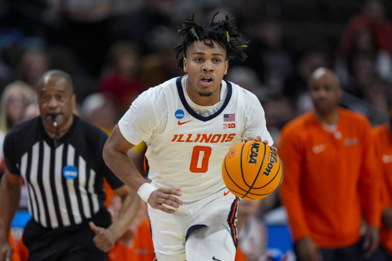
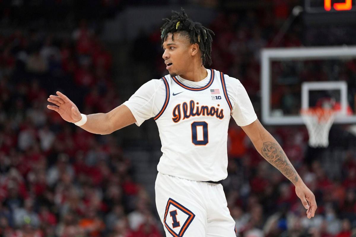
3. The lack of an outline on the font just looks cheap, ESPECIALLY because these aren't some classic/retro-looking design ... the font is MEANT to look trendy. We have literally never had a uniform before this where the school name and number are not outlined ... at least not that I can find going back to World War II and before! There is a reason for that, and it's because as a school that has TWO main colors, a huge part of our "look" is using both. Again, if we take it on faith that there is nothing wrong with the
1LL1NO1S font, I think the women's uniforms look infinitely better simply because they utilize our colors and don't look half-baked like the men's:
Plain orange-on-white or white-on-orange font just looks like crap and more importantly not like "us" ... JMO, of course, but let's leave that to the Wisconsins, Alabamas, Tennessees, etc. of the world who don't have two bold colors to show off. For a men's side comparison, the Script and Flyin' Illini more appropriately utilize both navy and orange in a much, much better way: