You are using an out of date browser. It may not display this or other websites correctly.
You should upgrade or use an alternative browser.
You should upgrade or use an alternative browser.
Illini Basketball Uniforms
- Status
- Not open for further replies.

RabidDawgClassic
- Los Angeles, CA
1LL1NO1S
hooraybeer
- Peoria, IL
our default basketball uniforms are the worst in the country and a disservice to the program and fans that support the program
skyIdub
"I can't tell you. Secret."
our default basketball uniforms are the worst in the country and a disservice to the program and fans that support the program
lol hold on now, I hate our base unis as much as any of us, but this is just completely ignoring some absolute uniform horror shows out there!
hooraybeer
- Peoria, IL
i hear you but i stand by my post without editslol hold on now, I hate our base unis as much as any of us, but this is just completely ignoring some absolute uniform horror shows out there!
skyIdub
"I can't tell you. Secret."
i hear you but i stand by my post without edits
 I applaud your resoluteness

Fighter of the Nightman
- Chicago, IL
I'm not going to pretend there might not be worse ones out there ... but it seems a damn-near objective fact that they're the worst in the Big Ten. I'd be curious to hear fans try to argue for one of the other 17 default sets being worse, and I would feel pretty confident rebutting them, haha. You can at least make an argument that the navy default 1LL1NO1S uniform is okay, but the orange and white sets are really, really bad and just look cheap.i hear you but i stand by my post without edits
On that topic, I would like to kick off this new thread by pointing out one of my biggest issues with the 1LL1NO1S uniforms, among many ... they don't properly incorporate both orange and navy. Looking at the rest of the Big Ten, you can roughly divide the teams like this:
Only ONE True Color: These teams have one "bold" color, and the other color is just white.
- Indiana (Red & White)
- Michigan State (Green & White)
- Nebraska (Red & White)
- Northwestern (Purple & White)
- Penn State (Navy & White)
- Rutgers (Red & White)
- Wisconsin - Red & White)
Middle Area: These teams technically have an "accent" color as one of their two main colors, but either (A) they use it in such a way where it feels less like an accent than the teams in the first category or (B) the way it combines with the other color just gives it less of an "accent" feel.
- Iowa (Black & Yellow)
- Ohio State (Red & Gray)
- Purdue (Black & Gold)
TWO Bold Colors: These teams have two bold, actual colors.
- Illinois (Navy & Orange)
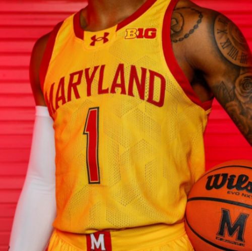
- Maryland (Red & Yellow)
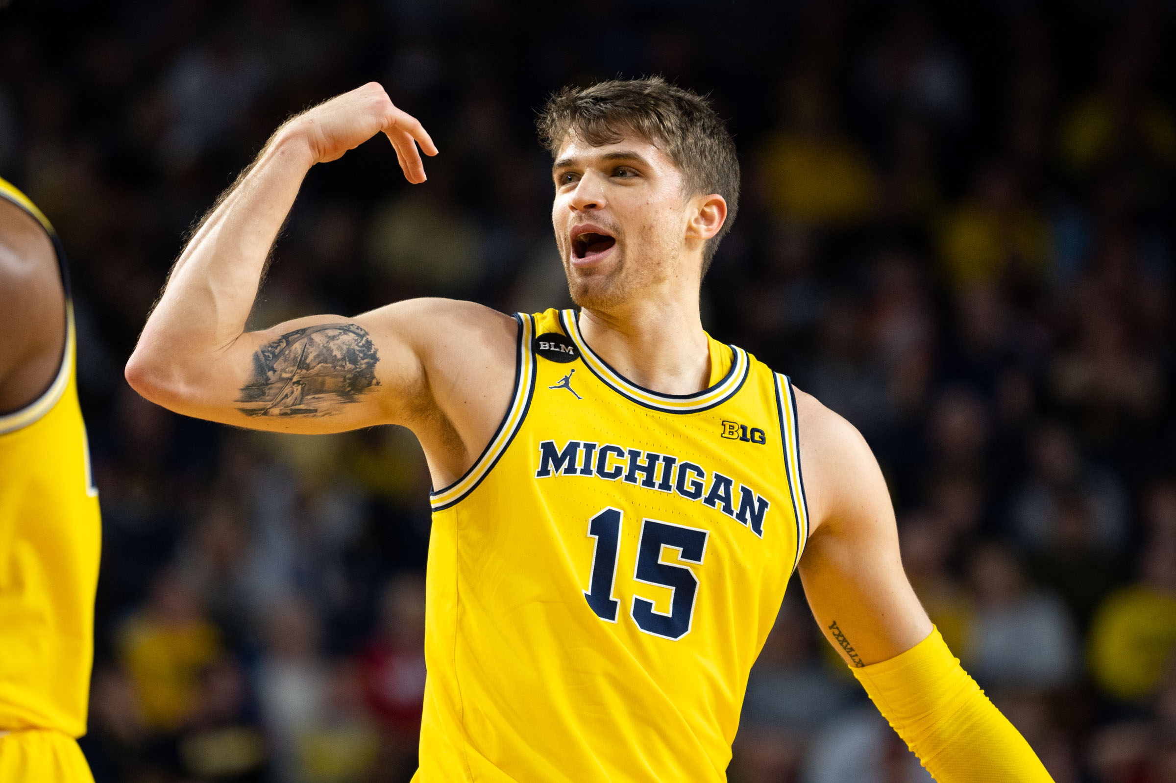
- Michigan (Navy & Yellow)
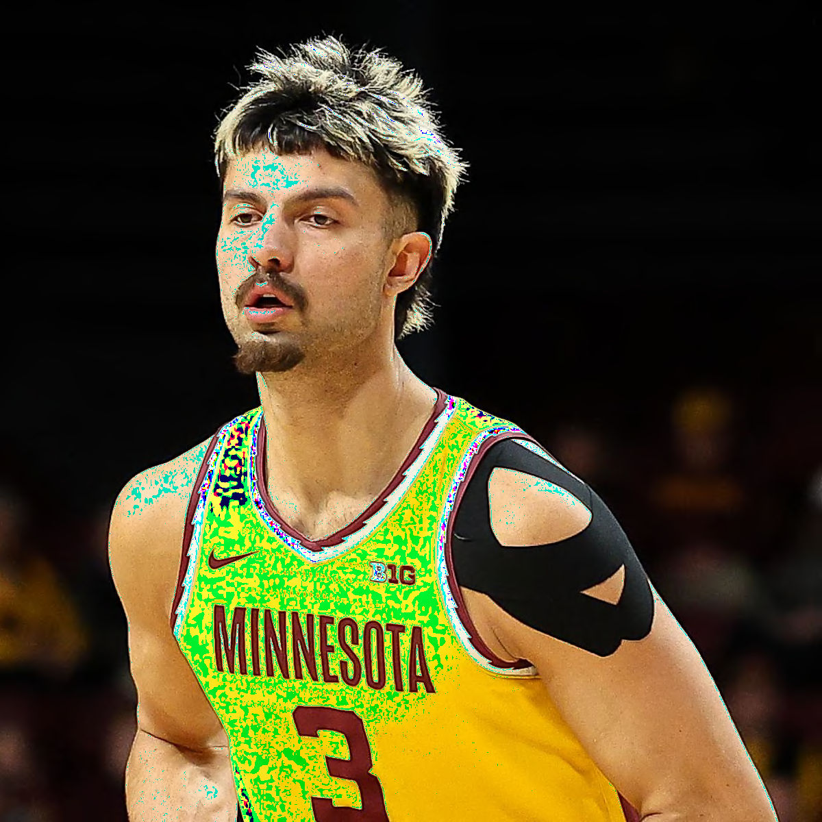
- Minnesota (Maroon & Yellow)
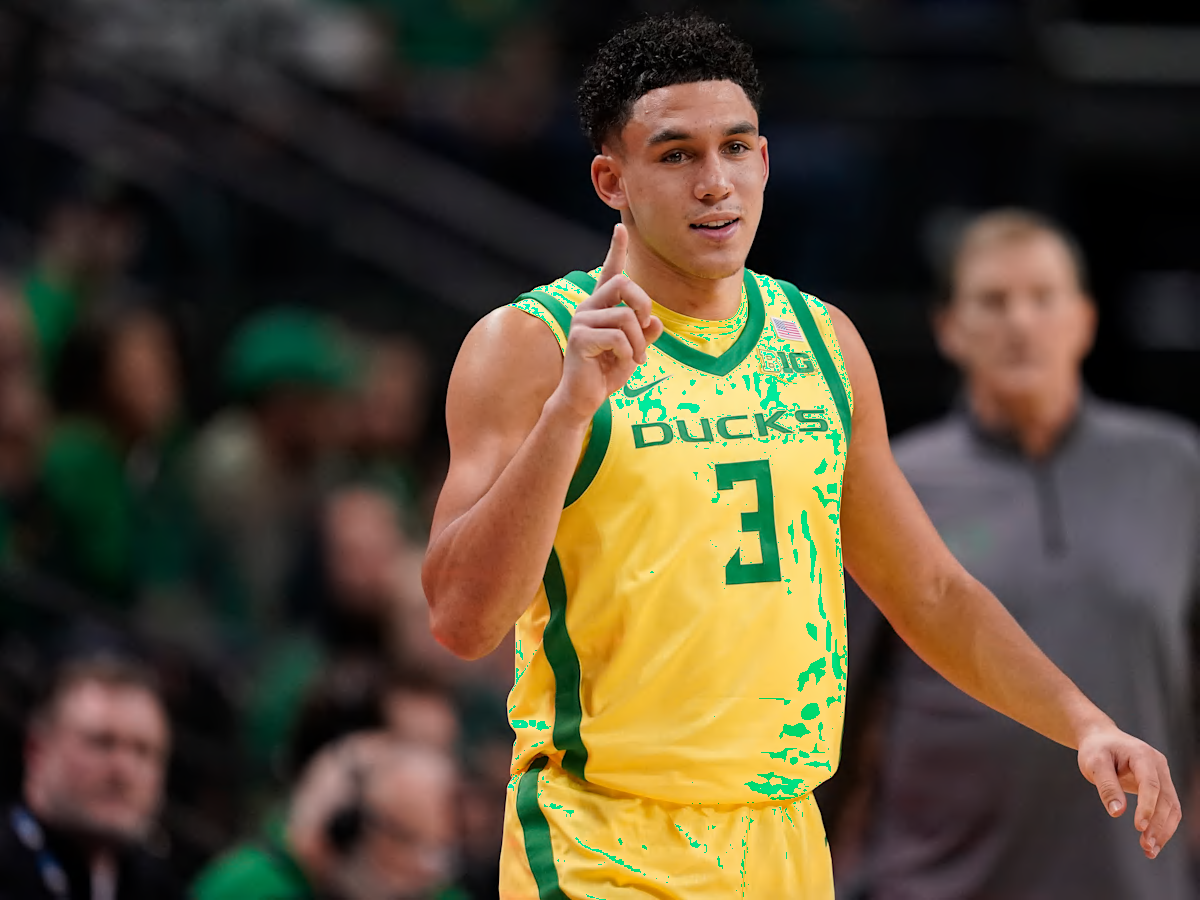
- Oregon (Green & Yellow)
- UCLA (Blue & Yellow)
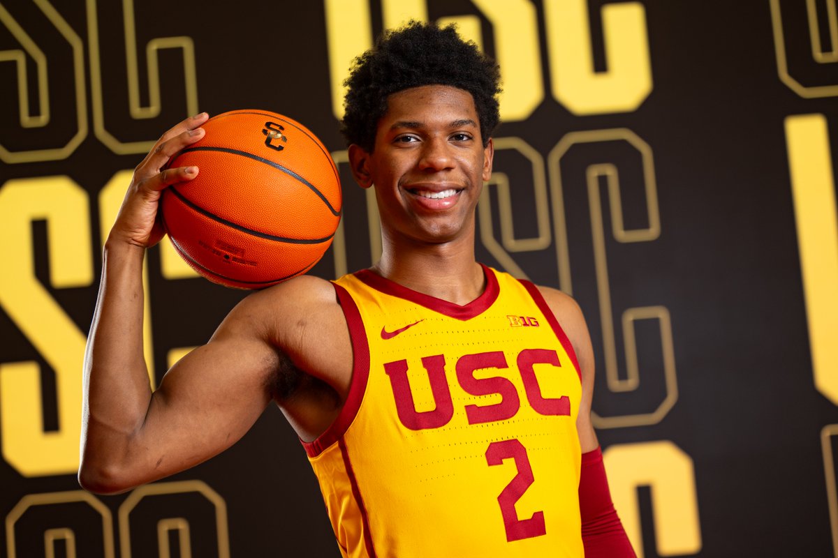
- USC (Red & Yellow)
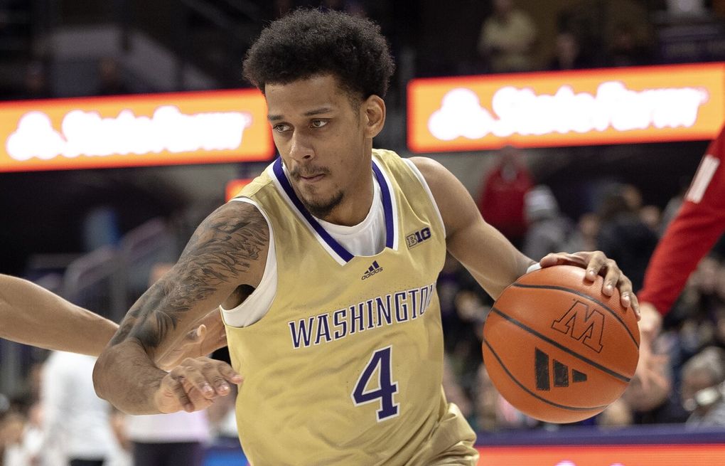
- Washington (Purple & Gold)
With 7 teams in the conference only having one color besides white and another 3 teams only really having black or gray, I think we should always be emphasizing both of our colors - navy and orange - with any uniform we have. Using those examples in that third category, if you are Michigan, your yellow jersey should (A) have navy font or (B) have white font and a navy outline ... white font on the yellow will look ridiculous. To match what we do with our orange 1LL1NO1S jersey, this would be those schools' uniforms, and you can imagine how awful they'd look. For sake of an apples-to-apples comparison, I will use that school's lighter color to better match our use of an orange (rather than navy) jersey here.
- Maryland: Yellow uniform with plain white font and no red outline.
- Michigan: Yellow uniform with plain white font and no navy outline.
- Minnesota: Yellow uniform with white font and no maroon outline.
- Oregon: Yellow uniform with white font and no green outline.
- UCLA: N/A (they only have a blue jersey).
- USC: Yellow uniform with white font and no red outline.
- Washington: Gold uniform with white font and no purple outline.
Instead, we see each school do this...
... and then us:

There's only so much you can do with our tired 1LL1NO1S font, but there's a reason none of those other schools went with plain white font and no outline in this situation ... because it looks bad and incomplete. It needs a navy outline so badly, and that couldn't be more clear when you see how much better and cleaner its far superior older brother is:

Fighter of the Nightman
- Chicago, IL
I'll also use a fresh thread to BEG for the most obvious solution that has been slapping us in the face for years now. Brad, Josh, Nike, insiders, whoever is listening and literally gives ONE passing thought to the basketball uniforms of a storied program like ours, PLEASE give us the two throwbacks in all three colors. It's so obvious that it hurts my brain to consider nobody in charge has considered this, much less thinks it's an inferior option to keeping the 1LL1NO1S rags. I think an ideal scenario would be to have the Flyin' Illini function as our "regular" uniforms and the Script be the "throwback" or special occasion ones. Thus, I think this is the ideal situation:
Home: White Flyin' Illini throwback that we wore during the Groce years and replaced with the current orange one.

Away: Navy Flyin' Illini uniform used in the early 1980s rather than the mid- to late 1980s (i.e., orange font instead of the white that the Flyin' Illini team wore)

Alternate: Current orange Flyin' Illini throwback

Throwback Home: Current white Script throwback.

Throwback Away: Navy version of the Script throwback ... not sure if we ever had this or not, but I like the white font and orange outline for this specific style to match the striping like it does on the other colors.

Throwback Alternate: Orange version of the Script throwback. An actual picture of these jerseys exists and has been posted here before.

In this scenario, with all six uniforms being absolute gems in their own ways, you can actually start to reserve the Script ones for ACTUAL special occasions, rather than the totally random usage we get from our uniforms today. A general pattern I would like might look something like this:
White Flyin' Illini - Worn for a majority of home games and early-round postseason games where we are a heavy favorite (e.g., our first BTT game or the First Round of the NCAAT).
Navy Flyin' Illini - Worn for road games however often we choose but probably utilized more for opponents with red as their colors (e.g., at Indiana or Wisconsin).
Orange Flyin' Illini - Worn for road games however often we choose and probably utilized more for opponents with colors that contrast well with orange (e.g., at Michigan or Iowa). Also worn for home games on certain occasions, including our Hail to the Orange Out game.
White Script - Worn for "big home games" or neutral site postseason games where we are the higher seed.
Navy Script - Worn for 1-2 "big road games" per year, maybe our go-to uniform for these big "away neutral" games like UConn at MSG or Tennessee in Nashville.
Orange Script - Worn for a few "big games" at home or away per year, no set pattern. HOWEVER, this should be our Braggin' Rights uniform every single year with no exceptions, and Missouri should always wear gold to create a "color rush" setup like UCLA/USC!
For fun, an example of my personal usage for this year's schedule might be:
White Flyin' Illini vs. Jackson State
White Flyin' Illini vs. FGCU
White Script vs. #10 Texas Tech ... First big home game.
White Flyin' Illini vs. Colgate
White Flyin' Illini vs. #15 Alabama in Chicago, IL ... Emphasizing that it is OUR home game.
White Flyin' Illini vs. LIU
White Flyin' Illini vs. UTRGV
Navy Script vs. #4 UConn in New York, NY ... "Big 'road' game"
Navy Script vs. #18 Tennessee in Nashville, TN ... Same as UConn game, plus navy contrasts well with Tennessee.
Navy Flyin' Illini at Ohio State
White Flyin' Illini vs. Nebraska
Orange Script vs. Missouri in St. Louis, MO ... Braggin' Rights tradition.
White Flyin' Illini vs. Southern
Orange Flyin' Illini vs. Penn State in Philadelphia, PA
White Flyin' Illini vs. Rutgers
Orange Script at Iowa ... We should do way more as a program to promote this as our clear #1 rivalry rather than Northwestern, so bust out the "big game" jersey.
Orange Flyin' Illini at Northwestern
White Flyin' Illini vs. Minnesota
White Flyin' Illini vs. Maryland
Orange Flyin' Illini at #1 Purdue ... Big game, yes, but we're on a winning streak in the orange Flyin' Illini set!
White Flyin' Illini vs. Washington
Navy Flyin' Illini at Nebraska
Orange Script at #22 Michigan State
White Flyin' Illini vs. #24 Wisconsin
White Flyin' Illini vs. Indiana
Navy Flyin' Illini at USC
Orange Flyin' Illini at #12 UCLA
Orange Flyin' Illini vs. #7 Michigan ... Hail to the Orange Out game
White Flyin' Illini vs. Oregon
Navy Flyin' Illini at Maryland
Home: White Flyin' Illini throwback that we wore during the Groce years and replaced with the current orange one.
Away: Navy Flyin' Illini uniform used in the early 1980s rather than the mid- to late 1980s (i.e., orange font instead of the white that the Flyin' Illini team wore)
Alternate: Current orange Flyin' Illini throwback
Throwback Home: Current white Script throwback.
Throwback Away: Navy version of the Script throwback ... not sure if we ever had this or not, but I like the white font and orange outline for this specific style to match the striping like it does on the other colors.
Throwback Alternate: Orange version of the Script throwback. An actual picture of these jerseys exists and has been posted here before.
In this scenario, with all six uniforms being absolute gems in their own ways, you can actually start to reserve the Script ones for ACTUAL special occasions, rather than the totally random usage we get from our uniforms today. A general pattern I would like might look something like this:
White Flyin' Illini - Worn for a majority of home games and early-round postseason games where we are a heavy favorite (e.g., our first BTT game or the First Round of the NCAAT).
Navy Flyin' Illini - Worn for road games however often we choose but probably utilized more for opponents with red as their colors (e.g., at Indiana or Wisconsin).
Orange Flyin' Illini - Worn for road games however often we choose and probably utilized more for opponents with colors that contrast well with orange (e.g., at Michigan or Iowa). Also worn for home games on certain occasions, including our Hail to the Orange Out game.
White Script - Worn for "big home games" or neutral site postseason games where we are the higher seed.
Navy Script - Worn for 1-2 "big road games" per year, maybe our go-to uniform for these big "away neutral" games like UConn at MSG or Tennessee in Nashville.
Orange Script - Worn for a few "big games" at home or away per year, no set pattern. HOWEVER, this should be our Braggin' Rights uniform every single year with no exceptions, and Missouri should always wear gold to create a "color rush" setup like UCLA/USC!
For fun, an example of my personal usage for this year's schedule might be:
White Flyin' Illini vs. Jackson State
White Flyin' Illini vs. FGCU
White Script vs. #10 Texas Tech ... First big home game.
White Flyin' Illini vs. Colgate
White Flyin' Illini vs. #15 Alabama in Chicago, IL ... Emphasizing that it is OUR home game.
White Flyin' Illini vs. LIU
White Flyin' Illini vs. UTRGV
Navy Script vs. #4 UConn in New York, NY ... "Big 'road' game"
Navy Script vs. #18 Tennessee in Nashville, TN ... Same as UConn game, plus navy contrasts well with Tennessee.
Navy Flyin' Illini at Ohio State
White Flyin' Illini vs. Nebraska
Orange Script vs. Missouri in St. Louis, MO ... Braggin' Rights tradition.
White Flyin' Illini vs. Southern
Orange Flyin' Illini vs. Penn State in Philadelphia, PA
White Flyin' Illini vs. Rutgers
Orange Script at Iowa ... We should do way more as a program to promote this as our clear #1 rivalry rather than Northwestern, so bust out the "big game" jersey.
Orange Flyin' Illini at Northwestern
White Flyin' Illini vs. Minnesota
White Flyin' Illini vs. Maryland
Orange Flyin' Illini at #1 Purdue ... Big game, yes, but we're on a winning streak in the orange Flyin' Illini set!
White Flyin' Illini vs. Washington
Navy Flyin' Illini at Nebraska
Orange Script at #22 Michigan State
White Flyin' Illini vs. #24 Wisconsin
White Flyin' Illini vs. Indiana
Navy Flyin' Illini at USC
Orange Flyin' Illini at #12 UCLA
Orange Flyin' Illini vs. #7 Michigan ... Hail to the Orange Out game
White Flyin' Illini vs. Oregon
Navy Flyin' Illini at Maryland
PizzaHutParkingLot
- Vodice, Croatia
My guess as to why we've stuck with 1LL1NO1S is that someone high up has a strong preference for them.
But I'm open to being proven wrong, Brad and Josh!
But I'm open to being proven wrong, Brad and Josh!
skyIdub
"I can't tell you. Secret."
My guess as to why we've stuck with 1LL1NO1S is that someone high up has a strong preference for them.
But I'm open to being proven wrong, Brad and Josh!
It reeks of old white dude that thinks it’s clever

“The “I” is a “1”! See? And we can do the back of the “L’s” too! It’ll work! It means we are #1! Get it?!”
What a great pitch.

Reminds me of…It reeks of old white dude that thinks it’s clever
“The “I” is a “1”! See? And we can do the back of the “L’s” too! It’ll work! It means we are #1! Get it?!”
What a great pitch.

This is my take on what our uniforms should look like. And it doesn't even involve designing a new jersey, literally all of our jerseys are perfect except for the 1LL1NO1S.
White Home:

Orange Away:

Alternate #1:

Alternate Throwback #2:

4 Jerseys are all we need. Keep it simple with no navy jerseys, as they've been unlucky recently, and orange suits our program much better. Additionally it's about time we get a throwback jersey to honor the '05 team. Shouldv'e came last year for the 20th anniversary, but would be a great jersey to have in the rotation nevertheless.
White Home:
Orange Away:
Alternate #1:
Alternate Throwback #2:
4 Jerseys are all we need. Keep it simple with no navy jerseys, as they've been unlucky recently, and orange suits our program much better. Additionally it's about time we get a throwback jersey to honor the '05 team. Shouldv'e came last year for the 20th anniversary, but would be a great jersey to have in the rotation nevertheless.
The Fonz
- Hinsdale, Illinois
Completely agree, except for the navy point. I don't know if I like the white/navy flyin illini jerseys if we already have the scripts. I like the idea of an '05 navy, and I don't think it'll be bad luck. I think the bad luck only comes because the jerseys look like !!!! and penn state wants to play in a high school gym, not cause of the colorThis is my take on what our uniforms should look like. And it doesn't even involve designing a new jersey, literally all of our jerseys are perfect except for the 1LL1NO1S.
White Home:
View attachment 44653
Orange Away:
View attachment 44654
Alternate #1:
View attachment 44655
Alternate Throwback #2:
View attachment 44656
4 Jerseys are all we need. Keep it simple with no navy jerseys, as they've been unlucky recently, and orange suits our program much better. Additionally it's about time we get a throwback jersey to honor the '05 team. Shouldv'e came last year for the 20th anniversary, but would be a great jersey to have in the rotation nevertheless.
Fighter of the Nightman
- Chicago, IL
I don’t think we’ve seen the Flyin’ Illini uniform at home since late in the 2024 season. I’ll be supremely disappointed if we rock an 1LL1NO1S jersey for this marquee game vs. Texas Tech, and I’d go with the Flyin’ Illini over the Script.
Ideally, we’d debut Orange Script or White Flyin’ Illini or even a 2005 throwback, but for some reason they refuse to give us these, lol.
Ideally, we’d debut Orange Script or White Flyin’ Illini or even a 2005 throwback, but for some reason they refuse to give us these, lol.
My thought exactlyIt reeks of old white dude that thinks it’s clever
“The “I” is a “1”! See? And we can do the back of the “L’s” too! It’ll work! It means we are #1! Get it?!”
What a great pitch.
Must be the same people that came up with the "B1G."
I am sure that I am in the minority on this, but I don’t get the love for these jerseys (understand the love for the team, but not the jerseys)!Alternate Throwback #2:
View attachment 44656
Give me Script in all 3 colors, and Fighting Illini in all 3 colors!
Fighter of the Nightman
- Chicago, IL
I actually totally agree overall, and I remember thinking during the 2001 to 2006 era that we actually didn't have great jerseys, haha. The Script and Flyin' Illini uniforms - both in their own ways - are the kinds of uniforms that even fans who hate Illini Basketball would admit are objectively great, at least from what I have seen online. With that said, I would stand firm on the following:I am sure that I am in the minority on this, but I don’t get the love for these jerseys (understand the love for the team, but not the jerseys)!
Give me Script in all 3 colors, and Fighting Illini in all 3 colors!
1. The passage of time and built-up nostalgia has certainly made the 2005 uniforms look better, IMO. As you alluded to, it's difficult to separate their inherent charm from the success of that era!
2. It was a massive, bordering on criminally negligent, miss by this program/Nike/the DIA/etc. to not have a 2005 throwback for the 20th anniversary last season ... and better late than never, so I would support busting one out.
On the broader topic...
And what is really starting to plss me off is this is pretty clearly just Brad not giving a crap, and that is very unfortunate. Uniforms are an important aspect of branding, and you're not "cool" if you feel you are above thinking about that, lol. Iowa is an objectively inferior basketball brand to us in just about every way I could think, and they got improved jerseys this year. Why? Probably because their coach realized their uniforms sucked and ASKED NIKE, lol. Get it together, Brad!! Again, we know it's not Nike if they are responding to requests from programs like Missouri or Iowa this quickly, and all signs point to Whitman leaving this stuff up to the coaches with how Bret clearly put his stamp on the football uniforms ... so that leaves Brad wanting to keep the current set and even possibly not really liking the throwbacks any better ... mind blowing, hahaha.
Last Year

This Year

If you even took our crappy 1LL1NO1S uniforms and added a 3-stripe striping pattern like Iowa did and threw a navy outline on the font so it looked less plain, it would be an incredible improvement ... and you can't tell me that's hard, lol. It's at the very least annoying as hell that someone with decision making power is actively avoiding any type of change, and the insiders' silence in this thread is deafening, if you ask me! You can try to talk all you want about how they have more important stuff to talk to coaches about, but that argument falls on its face when we remember that they were all over the football uniforms thread dropping hints before the new uniforms debuted for the 2023 season. I distinctly remember them referencing the Patriots color rush uniforms, talking about how our orange set wasn't ready for the 2023 PSU "Orange Out" game due to a supply chain issue, etc. We were one of 16 programs 2k deemed worthy of including in their video game, guys, we could have new uniforms if the decision makers gave one iota ... and I think until we hear otherwise from someone in the know, it is unreasonable to keep any blame on Nike (again, they're responding to requests from lesser-brand programs) or even Whitman (again, he seems to hand this issue over to the coaches).
altgeld88
- Arlington, Virginia
Damn you, @Fighter of the Nightman , for luring me down this rabbit hole!!I'll also use a fresh thread to BEG for the most obvious solution that has been slapping us in the face for years now. Brad, Josh, Nike, insiders, whoever is listening and literally gives ONE passing thought to the basketball uniforms of a storied program like ours, PLEASE give us the two throwbacks in all three colors. It's so obvious that it hurts my brain to consider nobody in charge has considered this, much less thinks it's an inferior option to keeping the 1LL1NO1S rags. I think an ideal scenario would be to have the Flyin' Illini function as our "regular" uniforms and the Script be the "throwback" or special occasion ones. Thus, I think this is the ideal situation:
Home: White Flyin' Illini throwback that we wore during the Groce years and replaced with the current orange one.
Away: Navy Flyin' Illini uniform used in the early 1980s rather than the mid- to late 1980s (i.e., orange font instead of the white that the Flyin' Illini team wore)
Alternate: Current orange Flyin' Illini throwback
Throwback Home: Current white Script throwback.
Throwback Away: Navy version of the Script throwback ... not sure if we ever had this or not, but I like the white font and orange outline for this specific style to match the striping like it does on the other colors.
Throwback Alternate: Orange version of the Script throwback. An actual picture of these jerseys exists and has been posted here before.
Gentle edits here:
(1) We wore the blue road jersey below with orange lettering from 1980 through '84. It and the white home version replaced the script jerseys we'd worn in the late '70s after Lou took the helm. Beginning in the '84-'85 season we replaced the orange letters/white outline with white letters/orange outline. The Flyin' Illini never wore these blues with the orange lettering. BTW, the home jerseys also changed from orange lettering/blue outline to blue lettering/orange outline in '84.
The orange version of this jersey, above, which we wear now as the '80s throwback, debuted during the '88-'89 Flyin' Illini season.
2. I believe I was the one who first posted here in '22 the photo of the script, late-'70s Derek Holcomb jersey in the SFC Illini Hall of Fame display. I still hold out hope that one day soon the boys will take the floor in these, at which point I can die a happy man.
altgeld88
- Arlington, Virginia
Yeah. A reminder that we must not tolerate tyranny anywhere.My guess as to why we've stuck with 1LL1NO1S is that someone high up has a strong preference for them.
But I'm open to being proven wrong, Brad and Josh!
The font is hideous and must be eradicated everywhere it appears.
Fighter of the Nightman
- Chicago, IL
Love when you join the conversation with this info! Also just FTR, I am just using "Flyin' Illini" is general slang in the same way I am using "Script" to cover the years of uniforms where we had "FIGHTING" above the number and "ILLINI" below the number. I think like you, I prefer the early 1980s version of the navy vs. the one the actual Flyin' Illini wore. It is indeed infuriating that we can see such a prominent example of how great the Script would look in another color, and a shot of that jersey was even actually featured as they transitioned to commercial during one of our games! Like, IT'S RIGHT THERE, Brad!!Damn you, @Fighter of the Nightman , for luring me down this rabbit hole!!
Gentle edits here:
(1) We wore the blue road jersey below with orange lettering from 1980 through '84. It and the white home version replaced the script jerseys we'd worn in the late '70s after Lou took the helm. Beginning in the '84-'85 season we replaced the orange letters/white outline with white letters/orange outline. The Flyin' Illini never wore these blues with the orange lettering. BTW, the home jerseys also changed from orange lettering/blue outline to blue lettering/orange outline in '84.
View attachment 44803View attachment 44806View attachment 44805
The orange version of this jersey, above, which we wear now as the '80s throwback, debuted during the '88-'89 Flyin' Illini season.
2. I believe I was the one who first posted here in '22 the photo of the script, late-'70s Derek Holcomb jersey in the SFC Illini Hall of Fame display. I still hold out hope that one day soon the boys will take the floor in these, at which point I can die a happy man.
View attachment 44804
P.S. I've asked this before, but does anyone know if we ever had a navy Script uniform?? It's nearly impossible to find videos and photos of that era, and I have only ever seen the white or orange. The closest thing I can find is this black and white photo, but I feel like it has to be navy because the font is clearly a lighter color than the jersey ... and that is obviously NOT the case with either the white or orange Script uniforms!
EDIT: Okay, I found this photo, and this simply has to be a navy jersey, right? Lol. I'm kind of surprised that the font is orange with a white outline, though ... I guess I always pictured a navy Script being white font/orange outline!

Wow, this is just making me even more angry that we could look this good literally every game, it would take an absolutely hilariously small amount of effort and we simply refuse to do it. Now with actual photos for each, I would go...
Home (But I would make the letters a tiny bit thinner like we seem to have with the orange one)
Away
Alternate
Big Game Home

Big Game Alternate
Big Game Away
Last edited:
altgeld88
- Arlington, Virginia
Always happy to contribute here! Yes, I've searched fruitlessly for a clear photo of the navy script road jersey from the '70s. The one you found is excellent; I've never seen it. Too bad it's not in color. And yes, it was orange lettering with a white outline on navy.Love when you join the conversation with this info! Also just FTR, I am just using "Flyin' Illini" is general slang in the same way I am using "Script" to cover the years of uniforms where we had "FIGHTING" above the number and "ILLINI" below the number. I think like you, I prefer the early 1980s version of the navy vs. the one the actual Flyin' Illini wore. It is indeed infuriating that we can see such a prominent example of how great the Script would look in another color, and a shot of that jersey was even actually featured as they transitioned to commercial during one of our games! Like, IT'S RIGHT THERE, Brad!!
P.S. I've asked this before, but does anyone know if we ever had a navy Script uniform?? It's nearly impossible to find videos and photos of that era, and I have only ever seen the white or orange. The closest thing I can find is this black and white photo, but I feel like it has to be navy because the font is clearly a lighter color than the jersey ... and that is obviously NOT the case with either the white or orange Script uniforms!
EDIT: Okay, I found this photo, and this simply has to be a navy jersey, right? Lol. I'm kind of surprised that the font is orange with a white outline, though ... I guess I always pictured a navy Script being white font/orange outline!
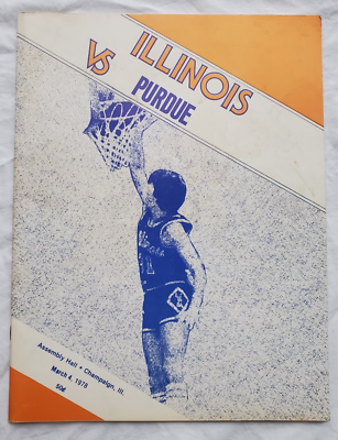
I found the one below on the left in an old Illio ('76) but it's basically a fever-dream rendering! The one on the right is @ Ohio State in 1977
FWIW here's a B&W of the orange road script unis. at Ohio State in 1978:
Last edited:
Can't remember what game it was, but pretty sure it was a tournament game with a zoom in on our shorts and the announcers talking about how it looked the I was misplaced and seemed like it was backwards. I think about that a lot....our default basketball uniforms are the worst in the country and a disservice to the program and fans that support the program
- Status
- Not open for further replies.