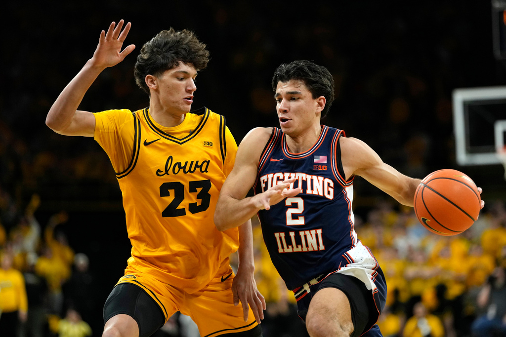
^ Call me crazy, but I really don't think we can go wrong with a color rush combo vs. Iowa, or Mizzou for that reason ... one of the little things I love about both rivalries. Everyone knows this one from January looked great...
... but even the orange / yellow combo - which a lot of people might assume wouldn't look good on paper - actually looks like a great contrast and has a lot of nostalgic appeal for me having gone to so many Illini games in Iowa City over the years:
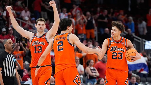
With that said, I am almost positive both teams will stick with the uniforms that won them their Sweet Sixteen matchups, and I think this will be a fantastic-looking combo on a huge national stage ... and probably objectively the coolest color contrast for these two long-time rivals.
Going to give some respect to our hated opponent for some good juju or whatever, but McCollum did a great job in incorporating small-but-noticeable improvements to Iowa's uniforms in year one. Their old ones sucked and looked like the epitome of trend chasing, stale Nike efforts. These ones are simple (and of course still saddled with what I consider to be somewhat gimmicky IOWA font), but they are solid basketball uniforms with subtle striping patterns that still don't look boring.
They of course don't come close to the Orange Script uniforms, because no program has a uniform that does besides us ... but two traditional rivals playing for a Final Four should also look good, and we both will! We'll just look a little better and hopefully play better enough to win, as well.