Yes, it would beI still prefer the main 3 scripts but busting this out once a year wouldnt be terrible.
View attachment 49567
You are using an out of date browser. It may not display this or other websites correctly.
You should upgrade or use an alternative browser.
You should upgrade or use an alternative browser.
Illini Basketball Uniforms
- Status
- Not open for further replies.
Lol oh come on. One here and there makes it cool. How about those football helmets they busted out. I wish they would bust out the 05 uniforms once in awhile. Im just glad they have the scripts and got rid of the god awful ones. Keep the scripts and do some fun things based on those and it could be cool.Yes, we make the jersey a darker grey, then we take that darker gray jersey and incinerate it, and then we sweep up the ashes and fire them out of a cannon into the middle of the ocean, and then we enter a blood pact to never talk about this again, and it's perfect.
Looks like the whites after having been washed with the blues.I still prefer the main 3 scripts but busting this out once a year wouldnt be terrible.
View attachment 49567

I liked them as a High Schooler, also I know this is a heinous crime on this forum but I actually loved the zig zag uniforms when they came out. Again, I was a high schooler who thought anything new was cool. I don't necessarily hate them now as an adult, but looking back they were definitely a bold choice.I agree. We have since elevated our jersey game. But for what we had back then they weren’t that bad.
I know someone asked for a navy blue script mock-up, this is the best I could get ChatGPT to generate.

Fighter of the Nightman
- Chicago, IL
Thanks! I can fill in the rest with my mind.I know someone asked for a navy blue script mock-up, this is the best I could get ChatGPT to generate.View attachment 49640
 Taking out the nostalgia other considerations and just trying to be objective for a moment in thinking about what non-Illini observers would think ... I have to imagine this might be our coolest looking option. Of course, this would be after fixing up the Chat GPT goofs to make it match the other ones (e.g., O/W/O trim instead of two stripes, the O/W/O trim also on the waste instead of mostly white, the area inside the diamond being navy rather than orange, etc.).
While both our Script and Flyin' Illini uniforms are incredibly popular across the college hoops world from what I have seen, I have noticed a trend where our fans seem to favor each about equally (with a possible tilt toward the Flyin' Illini?), whereas neutral observers pretty overwhelmingly see the Script as even more elite. I'm guessing a Navy Script would REALLY be a hit.
EDIT: This got me thinking that it is always SUCH a superior look to go with a 3-strip pattern compared to a 2-stripe pattern ... the former looks refined and complete, and the latter looks weird and unfinished. Just compare these incredibly similar-on-paper orange script uniforms for Syracuse and us, two teams who obviously have super similar looks.

I think you could make reasonable arguments for things like whether or not it should be white font/navy outline or navy font/white outline (though I prefer ours) or whether or not the diamond design we have is better than the large white stripe Syracuse has (although ,,, come on, lol). However, their shoulder and neck stripe pattern just looks a lot sloppier and less refined than ours without an extra navy stripe to "close it in."
Last edited:
This would be really cool. I think if I had to pick just one, between this and a navy Flyin Illini, I'd pick thisI know someone asked for a navy blue script mock-up, this is the best I could get ChatGPT to generate.View attachment 49640
Here's a repost of a navy mock-up with white lettering

Yeah…it was me…for one. Thank you. I like this. Come at me…I’m ready.I know someone asked for a navy blue script mock-up, this is the best I could get ChatGPT to generate.View attachment 49640

That is a more than a suitable once in a “blue” moon uni. Throw it in with 2004-05 throwbacks, ‘89 throwbacks that you trot out for rare, rare special occasions and stick with what we’re currently doing.
(Maybe slightly darker orange on the lettering.)
Last edited:
lstewart53x3
- Scottsdale, Arizona
Our perfect uniform plan is drop dead simple:
- Script in white, blue, orange
- FIGHTING ILLINI in white, blue, orange
- Introduce 05 throwbacks for special occasions
OrangeBlue98
Iowa is not in a great spot right now (LvilleILL1)
- Des Moines, IA
Our perfect uniform plan is drop dead simple:
- Script in white, blue, orange
- FIGHTING ILLINI in white, blue, orange
- Introduce 05 throwbacks for special occasions

Sometimes, the simple answer is the correct one.
Our perfect uniform plan is drop dead simple:
- Script in white, blue, orange
- FIGHTING ILLINI in white, blue, orange
- Introduce 05 throwbacks for special occasions

Nailed it. We can permentently lock the basketball uniform thread.Our perfect uniform plan is drop dead simple:
- Script in white, blue, orange
- FIGHTING ILLINI in white, blue, orange
- Introduce 05 throwbacks for special occasions
OrangeBlue98
Iowa is not in a great spot right now (LvilleILL1)
- Des Moines, IA
I just think there’s always some element of “grass could always be greener” elsewhere.I need somebody to square the circle for me on the weird Nike angst when we currently - with Nike - have arguably the best set of uniforms in the country.
The rebrand effort didn't hit the mark, obviously. But we ended up where we wanted to end up.
I’m with you. I don’t see the issue with Nike now. It appears they’ve righted a lot of wrongs with both football and men’s basketball uniforms. We still need to put 1LL1NO1S out to pasture and use either the arched ILLINI helmet font, the script, or the Fighting Illini basketball uniform font as the primary branding font (I’d support the latter option). But we have some of the best basketball uniforms in the country now, and I really like our football uniforms.
We have something really good to build on. Don’t mess with a good thing.
hooraybeer
- Peoria, IL
starting a new diet/exercise routine today with the goal of staying alive long enough to fight back when gen alpha/beta demand 1LL1NO1S throwbacks
starting a new diet/exercise routine today with the goal of staying alive long enough to fight back when gen alpha/beta demand 1LL1NO1S throwbacks
Thank you for your service!

RabidDawgClassic
- Los Angeles, CA
Stumbled upon this article. Man… we’ve had some really uniforms throughout the years. Glad we’re currently using primarily versions of FI and script.
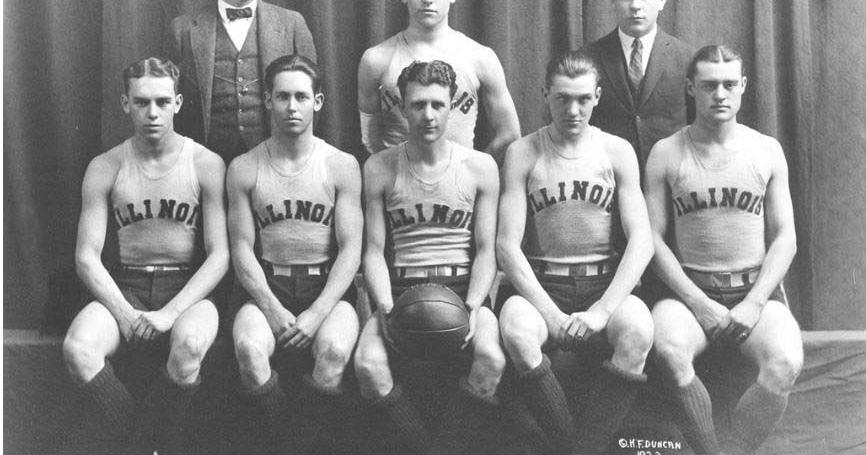
 thesouthern.com
uniforms throughout the years. Glad we’re currently using primarily versions of FI and script.
Illinois basketball uniforms through the years
The orange, blue and white have changed plenty of times over the years. A look at the Illini uniforms.
mattcoldagelli
- Script Illinois Enthusiast
Posts like this are why the Uniform Threads are just the absolute elite tier of Illinois Loyalty. Only bangers. Not for the faint of heart.starting a new diet/exercise routine today with the goal of staying alive long enough to fight back when gen alpha/beta demand 1LL1NO1S throwbacks
drsmitty74
- Rochester
Careful...........I'm good with 89 and 05....but..........we start asking for final four team throw backs, I sure as hell hope we NEVER, EVER, throw back to 1ILL1NO1S.Our perfect uniform plan is drop dead simple:
- Script in white, blue, orange
- FIGHTING ILLINI in white, blue, orange
- Introduce 05 throwbacks for special occasions
PizzaHutParkingLot
- Vodice, Croatia
- First time I’ve seen a recruit use the Navy Fighting Illini for a photo op.
- If/when Mirk announces he’s back, I’m grabbing his orange script jersey immediately.
Stumbled upon this article. Man… we’ve had some really
Illinois basketball uniforms through the years
The orange, blue and white have changed plenty of times over the years. A look at the Illini uniforms.
Just based on this article, circa 2014-2020 (minus the intro of throwbacks), are all just terrible, the worst, burn them all.
It will be telling how the athletic department feeling about the gross wordmark font when the new football scoreboard goes up. If they are actively phasing it out they probably won't put it on the backside facing Florida/Kirby like the old one had.
OrangeBlue98
Iowa is not in a great spot right now (LvilleILL1)
- Des Moines, IA
starting a new diet/exercise routine today with the goal of staying alive long enough to fight back when gen alpha/beta demand 1LL1NO1S throwbacks

What about those awesome grey alternates they wore with Groce?Our perfect uniform plan is drop dead simple:
- Script in white, blue, orange
- FIGHTING ILLINI in white, blue, orange
- Introduce 05 throwbacks for special occasions
Who didn't want to watch the Orange and Blue don all grey jerseys? That was a strange time when everyone wanted to be Oregon and was just throwing stuff at the wall.
- Status
- Not open for further replies.