You are using an out of date browser. It may not display this or other websites correctly.
You should upgrade or use an alternative browser.
You should upgrade or use an alternative browser.
Illinois Football Uniforms
- Status
- Not open for further replies.
GrayGhost77
- Centennial, CO
NO. Please no more slant Illinois helmets.
I’m with you. Anything but that.NO. Please no more slant Illinois helmets.
ChiefGritty
- Chicago, IL
White
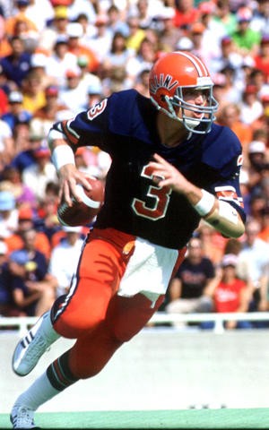
Mackovic
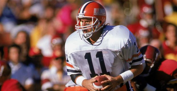
Tepper

Turner
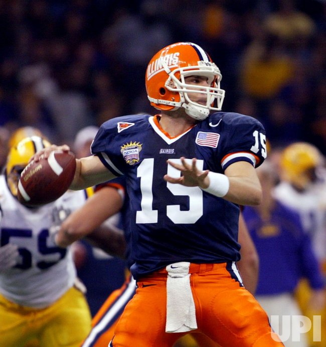
Zook

Beckman
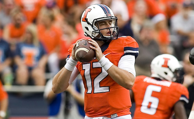
Lovie

You're up Bert!
Mackovic
Tepper
Turner
Zook
Beckman
Lovie
You're up Bert!
I'd be happy with the Turner look, but tweaked and twerked to fit the new logos/colors, etc.
Shief
- Champaign Area
I went to Illinois during the Zook era, so I may be swayed a bit there.
I'd like to see a cleaned up combo of the Zook helmet (text Illinois or Illini), Beckman jerseys, and pants TBD. I acknowledge that this is essentially Dre's original design. TBH, I like how the three colors being used as a main, secondary, and outline make a clean but eye catching look.
Btw, my mom does some sewing on the side and is a former family and consumer sciences (aka home ec) teacher and I may have picked up some minor design asterisk ideas from her.
I wouldn't mind the current jersey and pants with a tweaked helmet design/logo. Wouldn't mind having the numbers on the side.
Deleted member 29907
D
Guest
Kinda liked the Beckman years (perhaps he missed his calling). Didn't Lovie do away with the Shield too? Perhaps an omen.
Never liked the Syracuse retread unis - only one i am fond of in this group is the Grey Ghosts.
Never liked the Syracuse retread unis - only one i am fond of in this group is the Grey Ghosts.
Deleted member 654622
D
Guest
That is a cool touch.I'd also like to see something like Iowa State's helmet with the US and player's home state, or country if not from the US, flag on the back. I think that this is a nice touch.
View attachment 6894
Currently that space is taken up however. Not sure if that will carry over to next year
Last edited by a moderator:
BZuppke
- Plainfield
Slant Illinois. What is this 1990?? Ick
dgcrow
- Kelso, WA
Prefer conservative, traditional uniforms: Blue shirts with orange or white numbers (white on road with blue numbers), plain orange pants (forget the blue pants), orange helmet with no stripe. Block I on the helmet would be fine. If helmet is striped, pants should should have the same. Hope it's not too much to ask the Illini to just wear school colors (plus white).
All I ask is no more white pants, home, road, ever. White pants are for teams with only 1 primary color, and it doesn't make you "look faster". This is the hill I choose to die on.
I don’t remember if during Beckham’s years if there was a plate of lasagna sticker on the helmet. It doesn’t matter what combo of uniform just win. Amen!!!
illinifan4249
- Space Coast, FL
I just want the uniforms that willini mocked up a few years back.
JFGsCoffeeMug
BU:1 Trash cans:0
- Chicago
You wretched philistines don't understand the transcendent majesty of slanted letters:
[Link]

The oblique letterforms are inspired by the speed and elusive lateral movements synonymous with Red Grange, one of the most celebrated athletes in Illinois Athletics history.
[Link]
This is the hill I choose to die on.
I appreciate your honesty. Godspeed.
That IS a cool touch! Is it just me, though, or do those stickers look like they were slapped on at the last second and could fall off at a moment's notice?I'd also like to see something like Iowa State's helmet with the US and player's home state, or country if not from the US, flag on the back. I think that this is a nice touch.
Shief
- Champaign Area
@TheChief4Life, the flags and other stickers are placed a bit haphazardly but I hope that we could have a way to clean it up. Maybe have all graphics on one sticker, yes this means having a custom sticker for each player, or use/develop some kind of printer for non-flat surfaces.That IS a cool touch! Is it just me, though, or do those stickers look like they were slapped on at the last second and could fall off at a moment's notice?
 on the side of the helmet. I’d really like to see the block I on the back of the helmet. I think it makes sense with the symmetry of the letter. And let’s just go with the Butkus-era numbers/stars on the side. Any takers? (Excuse the amateur design)
VictoryIllinoisVarsity
- Chicago Suburbs
Replace the hideous underlined slant Illinois on the helmets with a block I, and you've got a winner for a classic design.
The current unis went too far with the blocky orange-on-blue and blue-on-orange design, with no white accents and no detail. And I really hate how the border of the block I on the orange and blue helmets is the same color as the helmet and disappears.
The current unis went too far with the blocky orange-on-blue and blue-on-orange design, with no white accents and no detail. And I really hate how the border of the block I on the orange and blue helmets is the same color as the helmet and disappears.
- Status
- Not open for further replies.