redwingillini11
White and Sixth
- Batavia
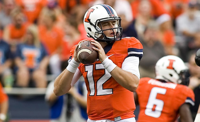
I have really enjoyed the current look. Its been a really clean nice look for us. But I am ready for a change, and maybe a look backward.
Those Butkus era mockups do look great, and should be used at least for throwback games once a year.
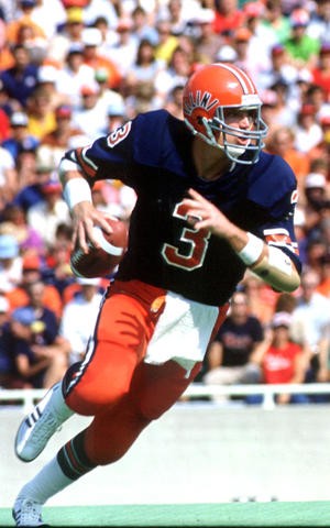
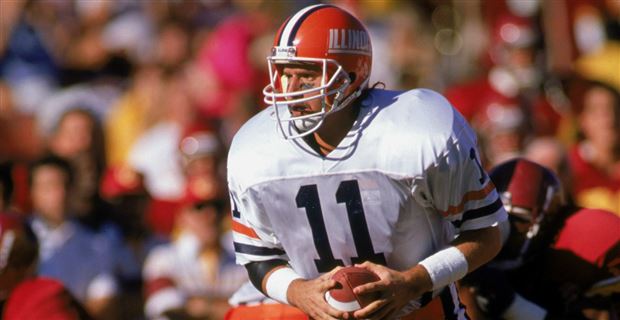
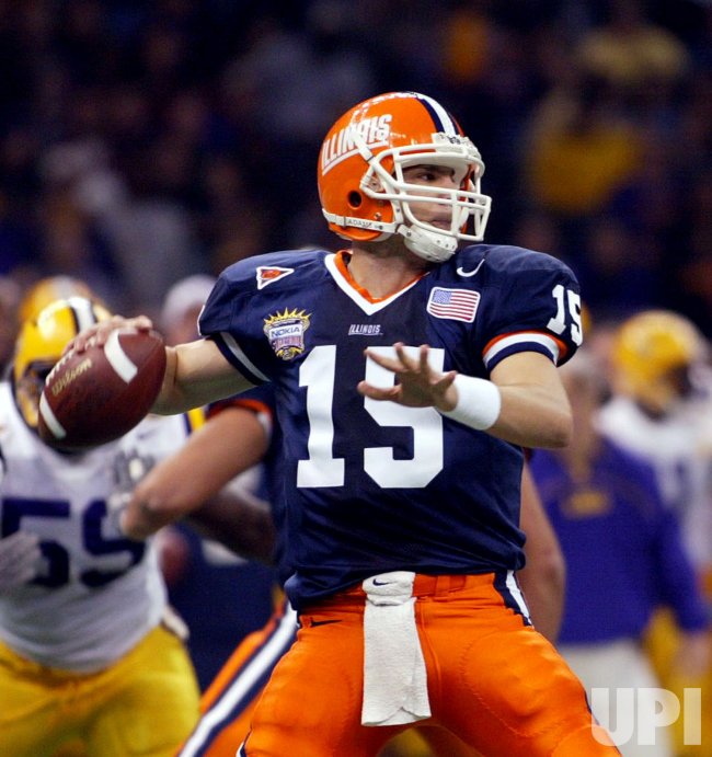
Contrary to the opinion of the majority, I am quite fond of the Illinois brand. I started watching Illini sports back in the early 2000s, so that is the first look I associate with the university. The urge for nostalgia within me, therefore, wants us to bring back a version of the Turner era uniforms. Not likely, but that is what I consider to be the quintessential look for Illinois football.
Those Butkus era mockups do look great, and should be used at least for throwback games once a year.
Contrary to the opinion of the majority, I am quite fond of the Illinois brand. I started watching Illini sports back in the early 2000s, so that is the first look I associate with the university. The urge for nostalgia within me, therefore, wants us to bring back a version of the Turner era uniforms. Not likely, but that is what I consider to be the quintessential look for Illinois football.
 on the side of the helmet. I’d really like to see the block I on the back of the helmet. I think it makes sense with the symmetry of the letter. And let’s just go with the Butkus-era numbers/stars on the side. Any takers? (Excuse the amateur design)