Illinois Football Uniforms

Status
Not open for further replies.
#51      
Honestly it would not be that bad if they just let the I pop with a white outline. The orange outline on the orange helmet just doesn't do it. Maybe even soften/stylize the arch to be the column and you have a winner with some touches of white in that navy I
Whenever I find myself entertaining the delusion that our opinions on this forum matter to our program, I remind myself of our football helmets. If we had any influence at all, the angle of the decal would have been corrected and there would be a white border around it.

I have no idea how anyone could look at the “I” and think, “Yep, that looks about perfect.”
 
#52      

ChiefGritty

Chicago, IL
Whenever I find myself entertaining the delusion that our opinions on this forum matter to our program, I remind myself of our football helmets. If we had any influence at all, the angle of the decal would have been corrected and there would be a white border around it.

I have no idea how anyone could look at the “I” and think, “Yep, that looks about perfect.”
On the flip side, the delusion I entertain is that making an utter, flatly unjustifiable mess of such a critical piece of branding real estate reflects the slapdash nature of everything happening with Illinois football, and thus the hope that the new administration will see what we all see and fix it.
 
#53      
In the old thread I posted my concepts, one with 80's helmet and this version I think was more popular.
#1 Would ya'll like to see a white & orange jersey version as well?
#2 How can I send to DIA/Whitman!
 

Attachments

  • ILLINI SPEED SCRIPT 2.png
    ILLINI SPEED SCRIPT 2.png
    3.4 MB · Views: 466
  • ILLINI SPEED SCRIPT.png
    ILLINI SPEED SCRIPT.png
    3.4 MB · Views: 344
#54      

Shief

Champaign Area
In the old thread I posted my concepts, one with 80's helmet and this version I think was more popular.
#1 Would ya'll like to see a white & orange jersey version as well?
#2 How can I send to DIA/Whitman!
FlyingIllini, please post the road and alternative (orange) versions. I am sure that the DIA has a general inquiry email address that you can send them to
 
#56      
Away Jerseys! Couldn't decide if I like the "I" on the jersey better in orange or blue, so there are two versions where the "I" matches the color of the pants just like the home set.
 

Attachments

  • ILLINI SPEED SCRIPT A1.png
    ILLINI SPEED SCRIPT A1.png
    3.1 MB · Views: 320
  • ILLINI SPEED SCRIPT A2.png
    ILLINI SPEED SCRIPT A2.png
    3.2 MB · Views: 245
#59      
Orange Alts: including an orange out which imo is quite hard to pull off, and a white pant too.
 

Attachments

  • ILLINI SPEED SCRIPT O.png
    ILLINI SPEED SCRIPT O.png
    3.7 MB · Views: 319
  • ILLINI SPEED SCRIPT OB.png
    ILLINI SPEED SCRIPT OB.png
    3.5 MB · Views: 324
  • ILLINI SPEED SCRIPT OW.png
    ILLINI SPEED SCRIPT OW.png
    3.4 MB · Views: 364
#60      

Shief

Champaign Area
Away Jerseys! Couldn't decide if I like the "I" on the jersey better in orange or blue, so there are two versions where the "I" matches the color of the pants just like the home set.
I like the orange I.

May be too much to ask but could you make a master file with all of the jersey, pants, and helmet combos? Maybe offer both orange and white helmet options, not sure if the text should be O or B on the white helmet. The master may help with your submission process.
 
#61      

ChiefGritty

Chicago, IL
New unis for Vandy out today, for some reason viewable only as this twitter video, my apologies:

Notably, it's two jerseys, two pants, and one helmet. Is the endless mix and match combinations schtick waning? I hope so, it was always a lame, unconvincing imitation of the whole Oregon thing, and has been utterly everywhere for more than a decade now.

And I quite like this uni set, it's simple, it uses the colors well, it's unmistakably Vanderbilt and it's neither trying too hard to be forward looking nor backward looking. Having the sleeve striping be a little bit more streamlined is a nice touch.
 
#62      

ChiefGritty

Chicago, IL
Is the endless mix and match combinations schtick waning? I hope so, it was always a lame, unconvincing imitation of the whole Oregon thing, and has been utterly everywhere for more than a decade now.
For whatever it's worth, Oregon itself has moved on from the endless combination thing, at least by their standards.

E71VUm9UcAIDoYE-750x422.jpeg


Also note the lack of stormtrooper all-whites in both the Oregon and Vandy cases. Nor unnecessary black or gray. All fads that have passed.
 
#63      

mattcoldagelli

The Transfer Portal
And I quite like this uni set, it's simple, it uses the colors well, it's unmistakably Vanderbilt and it's neither trying too hard to be forward looking nor backward looking. Having the sleeve striping be a little bit more streamlined is a nice touch.

Largely agree, although I don't know why they don't use the "Star V" on the helmet - that's such a good logo, and tailor-made for it (honestly, maybe that's the issue - is it a little too Dallas?)
 
#64      
I don’t have hugely strong feelings on our uniforms (at least as far as “styling” goes), but I do believe the most obvious PR move ever is to explicitly wear Bears combos only vs. Northwestern to throw that connection in their faces:

Home: Blue/Blue/White
Away: Blue/White/Blue
Alternate/Big Game: Blue/Orange/White

I am one of those warming up to the new uniforms, but I’ve also come to HATE the random mixing/matching of colors; as we hopefully get better and establish a more solid program identity, I’d like to see that go away. I want everyone to associate a “look” with Illinois, ala Wisconsin or Iowa. Say what you want about their uniforms, but they’re distinctly “them.”

Please no more O/W/O at Purdue but W/W/B at Iowa and W/W/W at Rutgers! I think we should pretty much stick to…

Home: O/B/O
Away: O/W/O
Homecoming: Grey Ghost uniforms
Northwestern: Bears combos

You can do stuff like all Blue for a big night game at home or something, but the random combos does it a disservice.
 
#65      

ChiefGritty

Chicago, IL
Largely agree, although I don't know why they don't use the "Star V" on the helmet - that's such a good logo, and tailor-made for it (honestly, maybe that's the issue - is it a little too Dallas?)
Consider the possibility that they ran into the same problem we have. Like our Block I, the star V is big in the corners, and thus it's hard to fit around the chinstrap buckles of today's helmets, especially that Riddell model with the hexagonal cutout in the front that's so popular among skill position players.

Vandy's star is really big, and they wound up putting it way to the back of the helmet to avoid that buckle.
usa_today_11637084.0.jpg

2019-2-vandy-front.png


The Cowboys star is a little bit smaller, which allows them to sort of smush it up toward the top of the helmet on the same model.

DallasCowboysSpeedFlex01_9398d6a3-76cb-48db-b999-e39e5ad9fba9_1200x1200.jpg


Faced with a similar issue we just kind of scoot it into the open space, which looks fine so long as the helmet is on a table and not someone's head!

bret-bielema-2.jpg


But as you see above, Vandy chose to change the helmet logo to suit the helmet, which I think is an entirely sensible thing to do. The big smooth round domes of the 90's aren't coming back, these helmets with all the weird facets to them lessen the impact to the brain, which is obviously essential.

One thing we could do is just make the Block I a little bit smaller. But the script Illinois would also fit quite nicely.
 
#67      

ChiefGritty

Chicago, IL
I actually was a big fan of the Beckman era unis. The white helmet, orange jersey, white pants were sharp.
Yeah that was our standard for most of that first rebrand year, my recollection is that it was because those were the only items Nike had actually shipped to us yet, so that was all we had.

It was a good look though, albeit not necessarily classically "Illinois"

Screen-Shot-2014-11-20-at-1.30.00-AM.png
 
#69      

ChiefGritty

Chicago, IL
Those are my nightmare. Way, way too much white. Unlike schools like Wisconsin and PSU we have 2 main colors not 1, so white should be an accent (in my humble, non-designer opinion.) Plus why would we ever want to be reminded of those teams?
A team with orange and blue school colors CAN look really good with a substantial amount of white.

DSC_9097_copy.jpg


But all in all I would agree that orange helmets and blue jerseys is a longstanding tradition that we should be proud of and stick with.
 
#70      
That's why I always referred to the white pants on teams with 2 colors the SEC look. It's fine if that's what you've traditionally worn but since we only really started doing it with Zook it just looks like we're ripping off that style.
I know I'm in the minority on the white pants topic but I just hate it and can't put my finger on why. I'm more okay with the white helmets but they're still not my favorite.
 
#71      
I don't have much to add other than being partial to the uniforms while I was in school in the early 90s, but I just have to say I'm impressed there's so many Illini fans out there who put so much thought and analysis and ideas into uniforms. Well done, keep it up
 
#72      
Let me ask a ?. Does the home team choose the color for the visiting team? Remember the basketball game years ago when we I think wore orange and Wisc wore their red color. Lot of talk about how it looked on TV. Nb is red and white. Either red pants white top or white top red pants. I would assume if we have new threads to wear they will be releasing the new unis shortly if they haven't already.
 
#73      

altgeld88

Arlington, Virginia
FWIW, I'd like to stick with a classic combo and that '70s/'80s curved "Illini" helmet logo. What I'd really like, of course, is completely ignoring our unis (as the top programs do) and instead simply put a winning product on the field regularly using classic unis. (Insert GIF of Abe Simpson raging at cloud here.)

I really liked the unis from '82 when the Illini finally began to climb back into relevance for the first time since the mid-'60s. Below are a couple clips from an SI article about the '82 OSU game (which we lost). I like the orange numerals with white outline, the classic pants, and my favorite Illini helmet design.

In '83 they went to white numerals with orange outline, which I didn't like as much, though I liked the slightly thicker blue helmet stripe. (And I could do without that blue-on-blue scheme.) Below the '82 photos I've included an SI photo of that uni from '83 featuring my former next-door neighbor in Snyder Hall, Craig Swoope (Mike Heaven was his bunk-mate; nice guys), drilling a Michigan RB in that glorious 1983 victory that fairly well cemented the BT title and RB trip for the Illini. Then I've added Thomas Rooks diving for a TD in that game. Just because. :cool:

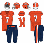
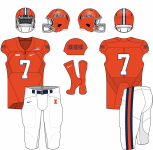
I liked the Mackovic-era redesign, tho' that NY Giants "Illinois" on the helmet bugged me because it was a derivative design (that's why I prefer that curved "Illini," which is original) As others have noted, those Zook-era unis were great, too. Orange helmet-blue jersey, orange or white pants. Stick with that at home and sub in an orange jersey occasionally and I'd be happy.

And then, please, win more often than not. :)

1628611902752.png
1628611972981.png


1628612060151.png
1628612813595.png
 
#74      

GrayGhost77

Centennial, CO
I don't have much to add other than being partial to the uniforms while I was in school in the early 90s, but I just have to say I'm impressed there's so many Illini fans out there who put so much thought and analysis and ideas into uniforms. Well done, keep it up
I'm with you. I've always felt too much white makes us look like Florida or Auburn a bit too much. Need a good mix of orange and blue (and not too much orange so as to avoid looking like Syracuse).
 
Status
Not open for further replies.