You are using an out of date browser. It may not display this or other websites correctly.
You should upgrade or use an alternative browser.
You should upgrade or use an alternative browser.
Illinois Football Uniforms
- Status
- Not open for further replies.
SuperMetroid
- Evanston
Everyone on twitter seems to think slant Illinois is back. I doubt that but I guess we'll see.

I would 100%, no joking around, rather see an otter on the helmet than the Giants-style word mark.
redwingillini11
White and Sixth
- Batavia
Team ILLINOIS!!!!!!
TheFlyingIllini1317
- Chicago, IL
If this is only a white facemask, it will look out of place with lack of white trim/stripes on the uniforms. I love the 01 jerseys but the helmet is a giants rip off, replace it with the 70's script if we go that route.
TheFlyingIllini1317
- Chicago, IL
Also, the DIA office thought my concepts were "clean and attractive", so thanks for your feedback on them before I sent them out.
I'd love the script, but the uniforms would need tweaking to make it work and look good.
I pray we are not doing anything like the old New York Giants "ILLINOIS" on the helmets, I always hated those due to the NYG.
But some more white and updates are needed, at first I loved the new uniforms, but the colors and style doesn't come together like I thought it would,and they are just missing something.
Given all of the hype that the football social media accounts are putting out there for the 20 year anniversary of the 2001 team I'm betting that the helmets will be very similar, if not the exact same.
Probably not the exact same, but outside possibility.
Probably not the exact same, but outside possibility.
I hope that's not the case, I can't see how they'd look decent with the current uniforms and orange on our new helmets. . . but if it's for one game only, it could be kinda cool assuming they tweaked it a bit to make it work.Given all of the hype that the football social media accounts are putting out there for the 20 year anniversary of the 2001 team I'm betting that the helmets will be very similar, if not the exact same.
Probably not the exact same, but outside possibility.
mattcoldagelli
- Script Illinois Enthusiast
Confused at the depth of antipathy so many of you have for the New York Giants.
ChiefGritty
- Chicago, IL
I believe the jersey stuff usually runs in four-year cycles with Nike, which would be next year.
Everybody seems to do uniform stuff on Thursdays, I bet they show us tomorrow.
ChiefGritty
- Chicago, IL
The Phil Simms-era Giants at that.Confused at the depth of antipathy so many of you have for the New York Giants.
Bill_Cole_SuperFan
The Insider's Insider
- Ubben Laundry Room
Haven't been good since slant Illinois, I say pull out all of the tricks!
Neidermeyer
- Faber College
It kind of looks as if the "I" is on the facemask in orange...
Fighter of the Nightman
- Chicago, IL
Haven't been good since slant Illinois, I say pull out all of the tricks!
Is this an insinuation that Slant Illinois wasn’t about the worst logo ever?? Lol.
I’ll agree that the jerseys/pants during that era were pretty classic and good. I think the key is either commit to having a classic look or commit to a “new” look. My main issue with what we’ve had lately - while not bad uniforms in and of themselves - is that we seem to be straddling that line and therefore end up lacking identity.
Fighter of the Nightman
- Chicago, IL
Can’t speak for everyone, but I think the Slant Illinois logo was about the biggest proclamation ever that we were a bland, vanilla, white bread athletic brand, haha … it’s like we ran 400 mph in the opposite conceptual direction of the Chief logo.I don't get it, when we had the slant Illinois and hired Beckman/Thomas I recall a good number of people seemed excited at new uniforms and acted like the slant Illinois was tired.
Have we come full circle without anything in between?
If you aren’t going to have a “mascot-based logo” like MSU or Iowa, you need your lettering or font to be at least somewhat iconic so as to give you some identity. Think the IU logo, Tennessee’s Block T, UCLA’s script, etc. I was pleasantly surprised when our rebrand at least threw those curves into the Block I so as to make it stand out, and it looks a lot sleeker now. Even Iowa State’s new font looks cool and is uniquely “them.”
I’m fine with changing things up, but it’d be a shame if we unlearned that lesson!
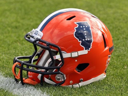
I keep forgetting about these, but this without the stars, and maybe a white faceguard, would be 10/10 for me:

Fighter of the Nightman
- Chicago, IL
^ ENDORSED. Those with the throwbacks we wore for the 2008 opener vs. like Eastern or someone would be epic.
I know there are a lot of people who did not like the Dartmouth two-stripe style, and I would not suggest bringing it back, but I personally always kinda liked it.The worst was when Bob Blackman brought the Dartmouth helmet design to Illinois and we had two stripes from front to back.
I would be happy with about anything as long as they APPLY THE HELMET DECAL SO THAT IT IS VERTICAL WHEN THE HELMET IS WORN, and not when it is sitting on a table. Please. Sorry for shouting.
The Galloping Ghost
- Washington, DC
Most of the country would have no idea what state that was at first glance. I can't reiterate enough how un-iconic the shape of the state of Illinois is.I keep forgetting about these, but this without the stars, and maybe a white faceguard, would be 10/10 for me:
View attachment 12037
I mean, have you seen the shapes of most of the states west of us?Most of the country would have no idea what state that was at first glance. I can't reiterate enough how un-iconic the shape of the state of Illinois is.
The Galloping Ghost
- Washington, DC
Yes, exactly. Also extremely hard to parse out on their own.I mean, have you seen the shapes of most of the states west of us?
- Status
- Not open for further replies.


