Illinois Football Uniforms

Status
Not open for further replies.
#51      
This is year 4 fwiw.

14-15-16-17 was the initial Nike rebrand unis and 18-19-20-21 has been the updated versions.
Like you mentioned, it's a stripe on the pants away from being a pretty solid jersey overall. But also I'll never understand the orange outline around the "I" on top of an orange helmet.
 
Last edited:
#52      

Illiniaaron

Geneseo, IL
At least it's some measure of progress according to my own rankings of helmet concepts:

1. Script "Illini"
2. State outline
3. Shield
4. NY Giants style "Illinois" 2001 style, white no outline
5. Later years NY Giants style, blue outline
6. Block I with outline
...
49. Getting hit by a bus
50. Block I, no outline
51. Plain orange helmet. I would love to see :chief: on the helmet but I know that's spittin' into the wind.
 
#53      

Illiniaaron

Geneseo, IL
Only one of the coolest logos ever in sports.
View attachment 12058
The Expos logo, often misinterpreted, is a combination of the team initials when spoken in French -- an "e" (in red on the left), an "M" (half in white, half in blue), and a "b" (in blue on the right) -- the eMb represnts "(les) Expos (de) Montréal Baseball".

For years and years I thought it was elb which made no sense to me, then I looked at it differently and thought "Oh, an M, that makes sense." Guess I was still wrong.
 
#57      
The orientation of the block I sticker is still not great but I think it’s better than it used to be. It has a slight lean toward the rear of the helmet when sitting on a table, which will make it closer to vertical when on a player.

The guy who used to put the stickers on was an elderly fella. The hands of the man in the video look much younger, so there may be hope!! 🤣
 
#59      

The Galloping Ghost

Washington, DC
giphy-1.gif
 
#64      

ChiefGritty

Chicago, IL
E9vcPMpWUAcrr5o.jpg


Options!

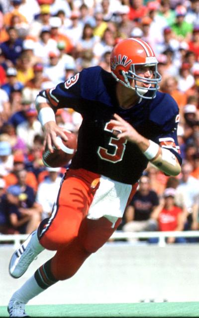
Sydney Brown is what I had proposed earlier, Chase Brown would be sort of the obvious look of what Nike's doing for everybody these days. I confess Chase looks better than I thought, but what that would mean, horror of horrors....
usa_today_15244864.jpg


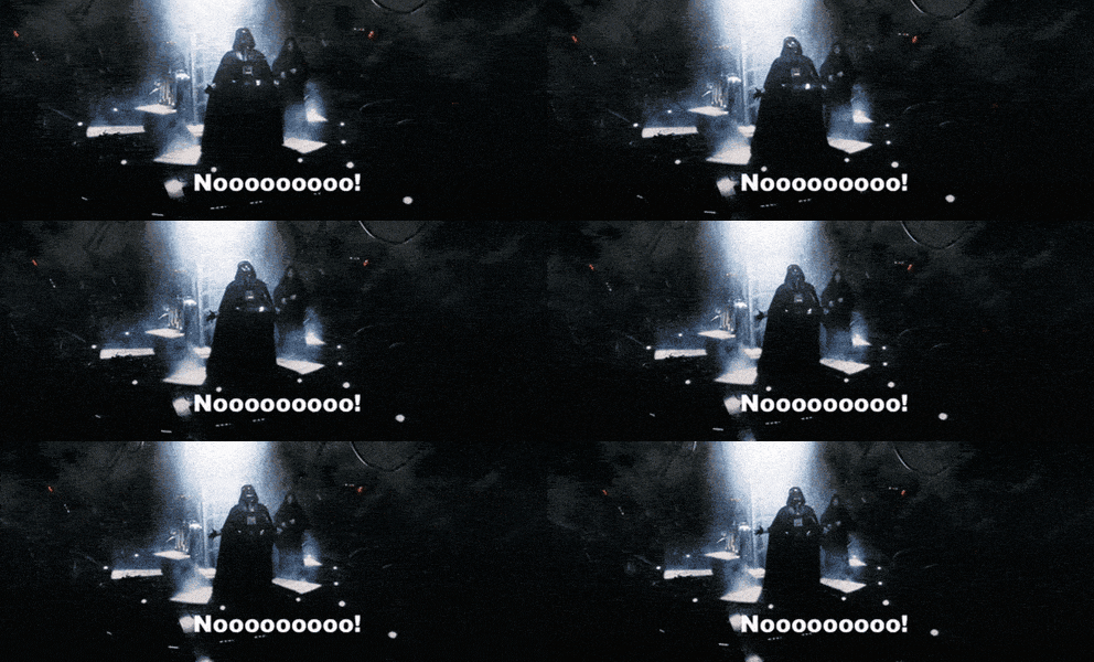
Star Wars Reaction GIF


(Anybody know how to resize pics in here? Forgive me for these being gigantic)
 
#66      

Cook

Richmond, VA
View attachment 12074

Options!

Sydney Brown is what I had proposed earlier, Chase Brown would be sort of the obvious look of what Nike's doing for everybody these days. I confess Chase looks better than I thought, but what that would mean, horror of horrors....
usa_today_15244864.jpg


Star Wars Reaction GIF


(Anybody know how to resize pics in here? Forgive me for these being gigantic)
#30 option is far superior to #2
 
#70      

Ransom Stoddard

Ordained Dudeist Priest
Bloomington, IL
I will say, in looking at Syracuse, Auburn, and our old helmets....the thin stripe we're using here is kind of unique and I think it works.
I was thinking the same. It's a callback to a classic element, but the thinness keeps it more subtle and modern.

You know what, they should just make that stripe into an "I" and it would never, ever be off-center or out of plumb. It would be a long freaking "I", but at least it would give us something different to kvetch about.
 
#72      

illini80

Forgottonia
View attachment 12074

Options!

Sydney Brown is what I had proposed earlier, Chase Brown would be sort of the obvious look of what Nike's doing for everybody these days. I confess Chase looks better than I thought, but what that would mean, horror of horrors....
usa_today_15244864.jpg


Star Wars Reaction GIF


(Anybody know how to resize pics in here? Forgive me for these being gigantic)

Someone hire this guy!

I like either, but Sydney Brown is the gold standard that should always be the baseline. So much better than what we have now, imo. Then again, I keep saying I don’t care about the uni’s as long as they win. So there’s that.
 
#73      

Stevegarbs

Mokena, IL
For years and years I thought it was elb which made no sense to me, then I looked at it differently and thought "Oh, an M, that makes sense." Guess I was still wrong.
The fact it needs a detailed explanation using a foreign language explains why it is still one of the worst logos ever.
 
Status
Not open for further replies.