Illinois Football Uniforms

#51      

redwingillini11

White and Sixth
North Aurora
The above comment is from December, but is the bolded/underlined true?

I thought this was the year that we're getting our new, more permanent unis and branding, i.e., not just added shoulder stripes like in 2023, but an entire new look. Is that not the case?
It may not seem like much, but I think the 2023 uniforms were our "entire new look" that was promised. Bielema wanted a simple classic look for his program, and this is the end result. Bielema had temporary adjustments fixing the helmet early in his tenure when we were still on the Lovie set, and 2023 is the "permanent" change that was talked about. I highly doubt we will be getting new football uniforms again until it is clear we are extending our contract with Nike in 2026 or we get a new outfitter at that time.

You can expect a throwback of some kind to make its debut this year though....

As far as the soft rebrand, I also expect there is nothing imminently going to drop. I also see this as perhaps something that gets taken care of when the new licensing deal comes around in 2026. Right now, there is a divide in what the visual identity of Illinois athletics should be. You have Team Shield, which is more of the olympic sports like tennis, track, and even baseball and softball. Then you have Team No-Shield, which is mainly football and basketball. Each of these programs / coaches have strong preferences, and while the athletic department has let each program do what suits them, it means that there is not a consistent look across all the programs. My guess based upon what I heard is that they will plan to do a soft rebrand (not as drastic as 2014) to find a way to have a consistent brand while trying to keep both ends of the spectrum happy. And like I said, I don't think they are rushing to do this, but know that it has to be done in the next few years before you can't recognize one Illinois team from another. (I tend to be on the side of more flexibility than consistency, but if you let things go too far you have the late 2000s era when there were different oranges being used across programs, which you just shouldn't have.)
 
#52      
If they end up introducing a Grange-style throwback (tbh not a ton of options and would make the most sense considering the anniversary) it could look really cool or really silly.
 
#53      
It may not seem like much, but I think the 2023 uniforms were our "entire new look" that was promised. Bielema wanted a simple classic look for his program, and this is the end result. Bielema had temporary adjustments fixing the helmet early in his tenure when we were still on the Lovie set, and 2023 is the "permanent" change that was talked about. I highly doubt we will be getting new football uniforms again until it is clear we are extending our contract with Nike in 2026 or we get a new outfitter at that time.

You can expect a throwback of some kind to make its debut this year though....

As far as the soft rebrand, I also expect there is nothing imminently going to drop. I also see this as perhaps something that gets taken care of when the new licensing deal comes around in 2026. Right now, there is a divide in what the visual identity of Illinois athletics should be. You have Team Shield, which is more of the olympic sports like tennis, track, and even baseball and softball. Then you have Team No-Shield, which is mainly football and basketball. Each of these programs / coaches have strong preferences, and while the athletic department has let each program do what suits them, it means that there is not a consistent look across all the programs. My guess based upon what I heard is that they will plan to do a soft rebrand (not as drastic as 2014) to find a way to have a consistent brand while trying to keep both ends of the spectrum happy. And like I said, I don't think they are rushing to do this, but know that it has to be done in the next few years before you can't recognize one Illinois team from another. (I tend to be on the side of more flexibility than consistency, but if you let things go too far you have the late 2000s era when there were different oranges being used across programs, which you just shouldn't have.)
Appreciate the detailed response, thank you. I am intrigued by potential football throwbacks.
 
#54      

redwingillini11

White and Sixth
North Aurora
If they end up introducing a Grange-style throwback (tbh not a ton of options and would make the most sense considering the anniversary) it could look really cool or really silly.
I do not know at all what the throwbacks would be, but my semi-educated guess is that we are probably more likely to see something like the 50s era throwbacks that Juice wore rather than some kooky 20s uniform that just looks bizarre 100 years later. But you never know. On the one hand we are celebrating 100 years of football at Memorial Stadium, and the throwbacks could be from any era during that time. Or it could be entirely about the rededication game...
 
#55      
If they end up introducing a Grange-style throwback (tbh not a ton of options and would make the most sense considering the anniversary) it could look really cool or really silly.
Relevant comparison on a much less extreme scale...

Actual Flyin' Illini Era Orange Jersey
9ee42738e9a2d914c030f3c4a711d34a.jpg


2005 Throwback Flyin' Illini Orange Jersey (Numbers get bigger in the middle)
images


Current Throwback Flyin' Illini Orange Jersey (Letters get much more evenly proportioned with number)
230104_mbb_northwestern_cb_043.jpg


Lesson? You often times need to touch up a throwback a little to make it look good today. For the Grange Era ones, we would need to touch them up a lot. As you said, if we take the best pieces of them and don't overdo it, it could be great!
 
#57      

OrangeBlue98

Des Moines, IA
#58      
Yeah the dirty little secret is that the Flyin' Illini throwbacks are a much better design than their source material actually were at the time.
Just now noticing how much better and more subtle the trim is in the third pic, too. Ugh, would love to see the whites redone (version from a few years ago doesn’t look quite as touched up as the orange) and the navy ones added.
 
#59      

lstewart53x3

Scottsdale, Arizona
Relevant comparison on a much less extreme scale...

Actual Flyin' Illini Era Orange Jersey
9ee42738e9a2d914c030f3c4a711d34a.jpg


2005 Throwback Flyin' Illini Orange Jersey (Numbers get bigger in the middle)
images


Current Throwback Flyin' Illini Orange Jersey (Letters get much more evenly proportioned with number)
230104_mbb_northwestern_cb_043.jpg


Lesson? You often times need to touch up a throwback a little to make it look good today. For the Grange Era ones, we would need to touch them up a lot. As you said, if we take the best pieces of them and don't overdo it, it could be great!
Those should’ve been the only orange we wore all season. One of the cleanest kits in college basketball.
 
#60      

mattcoldagelli

The Transfer Portal
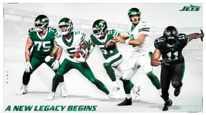
On this Draft Weekend, let's talk about some new NFL uniforms. Some definite upgrades/downgrades we can learn from as we continue our quest for aesthetic improvement.

JETS
yyyau0bxjfpavxhu5qbt.jpg

A huge improvement, but mostly because the set NYJ had stumble-bummed their way into as of last year was an unholy amalgam of logo and font mashups. The BFBS alternate sucks, but at least it acted as a holding pen for all the not-needed-at-all black and siphoned almost all of it off of all the other ones. Green-Green-White shows how good a simple, clean design can be. The '80s "Jets" logo is simple, recognizable, and unique (stylized wordmarks: they get the job done!)

TEXANS
houston-texans-new-uniforms-2024-sportslogosnet-feat.jpg

People seem to be hyped about these...I think they're terrible. Did you know the Texans hadn't changed their uniforms since coming into the league? And now we see just how valiant the work was of whoever in that org was standing athwart the trends and yelling "stop!". Here's another question: do these all look like the same team? Reader, they do not.

I salute the effort in taking the bull logo and turning it into a "horns" helmet, but you can't do that halfway, as they're doing here. Think of the Rams and the Vikings - that helmet design is the most distinctive thing about their entire brands, even more than their primary logos.

Finally. the Houston-specific stuff (the "H" secondary logo, the Oiler light blue) is fine in a vacuum, but if you really wanted to be more city-focused, that ship probably sailed when you named your team after the entire state.

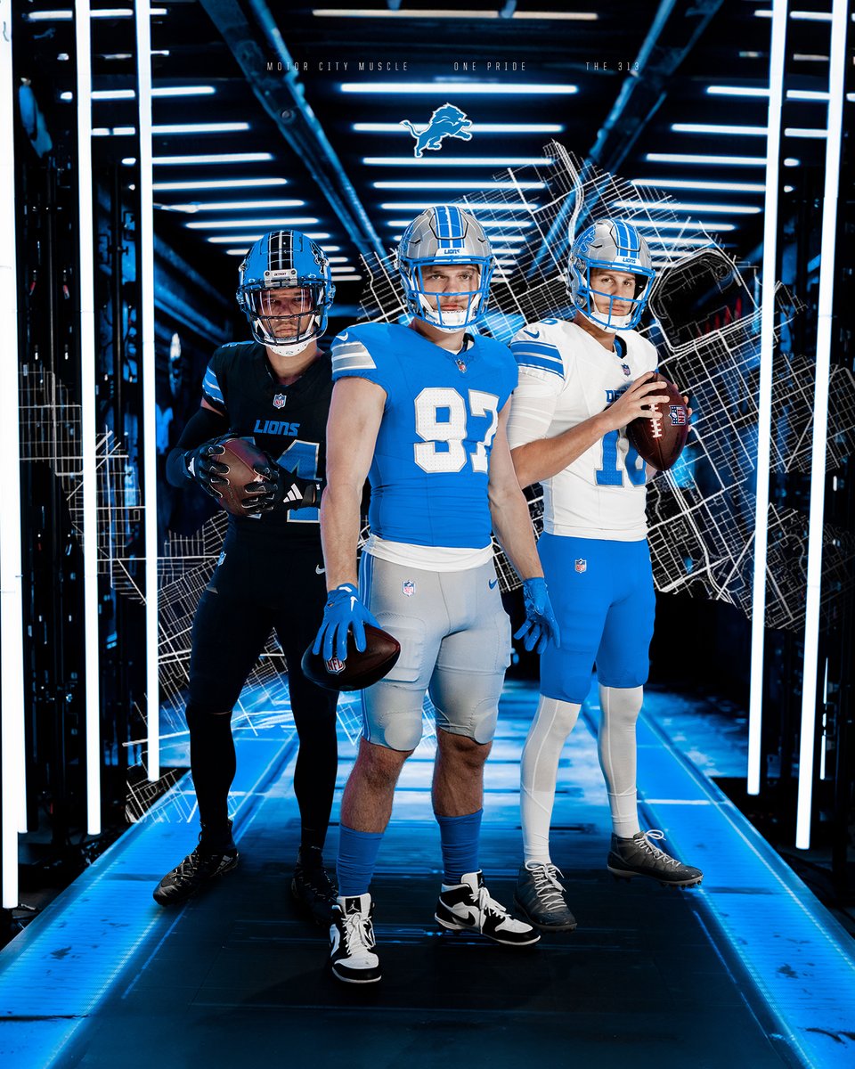
LIONS
GLfH97uXkAA6dh_

Look how much of a boost you can get by returning to a classic number font (especially on the Honolulu blue jersey). Not generally a fan of words on the front of the jersey, and I think the "Detroit" kind of muddles up an otherwise excellent white jersey. I appreciate that the Lions took all of their worst impulses and threw them into an alternate uniform. It looks like they are attempting a Panthers knock-off.

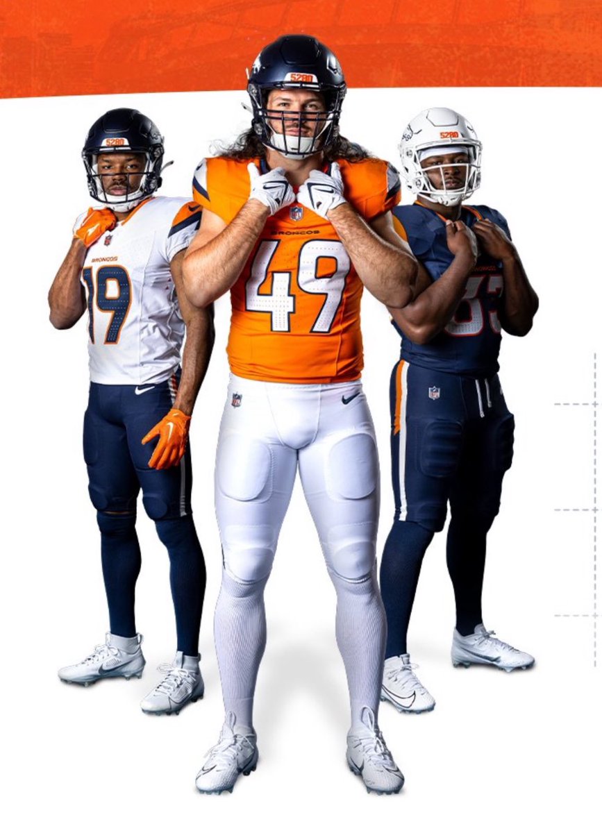
BRONCOS
GLxzCylW8AAQYTg

These kinda suck, man. The Broncos are caught in-between....they were the originators on uniform trends like piping on the side and the distinctive helmet stripe. YMMV on those, but they were definitely distinctive; now they've dropped those things while keeping the modern Bronco logo on this pretty pedestrian-looking set. The number font - again - kind of halfway between something traditional and their extra-wide recognizable '90s rebrand one. They also announced a '70s throwback set which is superior to these in every way, so...why not just go back to these?
 
#61      

TentakilRex

Land O Insects between Quincy-Macomb-Jacksonville
On this Draft Weekend, let's talk about some new NFL uniforms. Some definite upgrades/downgrades we can learn from as we continue our quest for aesthetic improvement.

JETS
yyyau0bxjfpavxhu5qbt.jpg

A huge improvement, but mostly because the set NYJ had stumble-bummed their way into as of last year was an unholy amalgam of logo and font mashups. The BFBS alternate sucks, but at least it acted as a holding pen for all the not-needed-at-all black and siphoned almost all of it off of all the other ones. Green-Green-White shows how good a simple, clean design can be. The '80s "Jets" logo is simple, recognizable, and unique (stylized wordmarks: they get the job done!)

TEXANS
houston-texans-new-uniforms-2024-sportslogosnet-feat.jpg

People seem to be hyped about these...I think they're terrible. Did you know the Texans hadn't changed their uniforms since coming into the league? And now we see just how valiant the work was of whoever in that org was standing athwart the trends and yelling "stop!". Here's another question: do these all look like the same team? Reader, they do not.

I salute the effort in taking the bull logo and turning it into a "horns" helmet, but you can't do that halfway, as they're doing here. Think of the Rams and the Vikings - that helmet design is the most distinctive thing about their entire brands, even more than their primary logos.

Finally. the Houston-specific stuff (the "H" secondary logo, the Oiler light blue) is fine in a vacuum, but if you really wanted to be more city-focused, that ship probably sailed when you named your team after the entire state.

LIONS
GLfH97uXkAA6dh_

Look how much of a boost you can get by returning to a classic number font (especially on the Honolulu blue jersey). Not generally a fan of words on the front of the jersey, and I think the "Detroit" kind of muddles up an otherwise excellent white jersey. I appreciate that the Lions took all of their worst impulses and threw them into an alternate uniform. It looks like they are attempting a Panthers knock-off.

BRONCOS
GLxzCylW8AAQYTg

These kinda suck, man. The Broncos are caught in-between....they were the originators on uniform trends like piping on the side and the distinctive helmet stripe. YMMV on those, but they were definitely distinctive; now they've dropped those things while keeping the modern Bronco logo on this pretty pedestrian-looking set. The number font - again - kind of halfway between something traditional and their extra-wide recognizable '90s rebrand one. They also announced a '70s throwback set which is superior to these in every way, so...why not just go back to these?
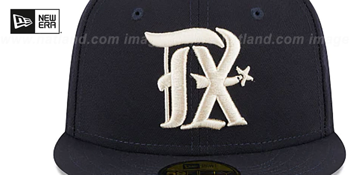
Typical Houston, copying DFW's homework

rangers-city-connect-onfield-new-era-3-47804.jpg
 
#62      
1st 4 Jets uni's look cool and not a huge variation from past ones. The last 2 Texans uni's are decent but the Red/Black ones are horrendous! The Lions 2 uni's on the right are great, the black is meh. The 2 left uni's on the Broncos are just okay, the blue one is yuk! Whatever/whomever the heck that hat is for sucks..... imho....
 
Last edited:
#63      

OrangeBlue98

Des Moines, IA
If there was ever a team that desperately needed to return to a freshened-up version of their classic uniforms, it's the Denver Broncos. They had a golden opportunity and completely missed the mark, IMHO.

And I just HATE black for black's sake. There is just zero reason for the Jets or Lions to have a black alternate.
 
#64      
Jets and Lions leaned into their classic looks and greatly benefitted from it. I actually do really like the Lions' black alternate, but I'm also just a sucker for that color combo. I love any blue-black combo, but I especially like it with a light blue like Detroit's Hawaiian blue. I think the Texans will always be in a limbo visually just because everyone except the Titans' owners and the NFL want them to embrace the Oilers color scheme and no one will be content with a Houston uniform set until they're allowed to do so. Similar situation with the Broncos except they have no legal blockades preventing them from embracing the classic look everyone wants from them.

The moral of the story, it's an era where classic is king to 90% of the population. It doesn't need to be a throwback but in the style of those older uniforms. It worked well for us IMO and if any formula can make our fanbase happy with uniforms without being an actual throwback, it's a good formula.
 
#65      
I can't quite figure out why, but there's something about the Broncos that makes it look so much more college, even though it's not really that different than other recent NFL redesigns.