You are using an out of date browser. It may not display this or other websites correctly.
You should upgrade or use an alternative browser.
You should upgrade or use an alternative browser.
Illinois Football Uniforms
- Status
- Not open for further replies.
I wouldn't mind the script in the endzone. I would love something like this old look though, even if they wanted to do orange instead of blue.
I'd take just about anything over the current font.

I'd take just about anything over the current font.
1m4tr
Cliffmas
That faux Gothic script matches their faux gothic buildings on campus.Do like Duke's variation of the script helmet

Ain't helping them today.
Fighter of the Nightman
- Chicago, IL
Personally, I think navy end zones would provide a visually pleasing aesthetic to contrast the giant orange Block I at midfield. A navy end zone with orange Script "Illinois" and a white outline?? That would look damn fine. Could also just live with exactly what is on the helmet, but I also echo some earlier concerns about not having enough navy and making it look like our colors are orange and white.I wouldn't mind the script in the endzone. I would love something like this old look though, even if they wanted to do orange instead of blue.
I'd take just about anything over the current font.
View attachment 38531
It's pretty fuzzy, but here is a nice visual of navy background and orange text in the end zone ... I love it:

P.S. As long as we are stuck with an ugly and unrenovated Horseshoe, those temporary stands actually did make it even the TINIEST bit more imposing. Wish we still had them. I know they were an eyesore from the outside, but they made the inside of the stadium better. For the life of me, I do not understand why we don't do the EXACT same temporary bleachers thing and simply put them in FRONT of the Horseshoe to bring the stands down to the field until a proper renovation...
EDIT: Found a better pic of that end zone design:

yeah I think navy would look better as well. BB has said multiple times that he has embraced our orange so I'm not sure if they'll go away from it in the endzone.Personally, I think navy end zones would provide a visually pleasing aesthetic to contrast the giant orange Block I at midfield. A navy end zone with orange Script "Illinois" and a white outline?? That would look damn fine. Could also just live with exactly what is on the helmet, but I also echo some earlier concerns about not having enough navy and making it look like our colors are orange and white.
It's pretty fuzzy, but here is a nice visual of navy background and orange text in the end zone ... I love it:
P.S. As long as we are stuck with an ugly and unrenovated Horseshoe, those temporary stands actually did make it even the TINIEST bit more imposing. Wish we still had them. I know they were an eyesore from the outside, but they made the inside of the stadium better. For the life of me, I do not understand why we don't do the EXACT same temporary bleachers thing and simply put them in FRONT of the Horseshoe to bring the stands down to the field until a proper renovation...
EDIT: Found a better pic of that end zone design:
I'm firmly on team navy blue. Don't have any orange Illini tee shirts. Just my preference.yeah I think navy would look better as well. BB has said multiple times that he has embraced our orange so I'm not sure if they'll go away from it in the endzone.
1m4tr
Cliffmas
You’re saying a Kingfisher on the side of our helmets would have been horrible had they pushed that through?Just turned on the Minnesota/Virginia Tech game. Minnesota has a goofy looking Gopher on the side of its helmet. Makes me thankful we don't have a mascot. Block I, script, I'm ok with either so long as we don't end up looking like Minnesota does tonight.
mattcoldagelli
- Script Illinois Enthusiast
Goldy f’ng rules, but that particular application (badly oversized as part of a non-symmetrical helmet) is comically bad.Just turned on the Minnesota/Virginia Tech game. Minnesota has a goofy looking Gopher on the side of its helmet. Makes me thankful we don't have a mascot. Block I, script, I'm ok with either so long as we don't end up looking like Minnesota does tonight.
Extremely PJ Fleck, though.
I'm just glad Bret hasn't forced Familly into the side of the helmet yet. I'm probably in the minority but that branding makes me cringe so hard my teeth shatter, hate seeing it painted on the sidelines. It reeks of trying too hard.Goldy f’ng rules, but that particular application (badly oversized as part of a non-symmetrical helmet) is comically bad.
Extremely PJ Fleck, though.
Cook
- Richmond, VA
I said this another post, but really wish we wouldn't forsake blue just for the love of orange. Some use of blue on the field and the court is a really good look. Everything doesn't have to be only orange all the time. Nor does it need to be either or, a good mix would be ideal. Idk if the DIA employs a professional visual designer, but if not, they should.Personally, I think navy end zones would provide a visually pleasing aesthetic to contrast the giant orange Block I at midfield. A navy end zone with orange Script "Illinois" and a white outline?? That would look damn fine. Could also just live with exactly what is on the helmet, but I also echo some earlier concerns about not having enough navy and making it look like our colors are orange and white.
It's pretty fuzzy, but here is a nice visual of navy background and orange text in the end zone ... I love it:
P.S. As long as we are stuck with an ugly and unrenovated Horseshoe, those temporary stands actually did make it even the TINIEST bit more imposing. Wish we still had them. I know they were an eyesore from the outside, but they made the inside of the stadium better. For the life of me, I do not understand why we don't do the EXACT same temporary bleachers thing and simply put them in FRONT of the Horseshoe to bring the stands down to the field until a proper renovation...
EDIT: Found a better pic of that end zone design:
Used to very much like and look forward to the re-style/re-paint of the bball court every year or two as well. What happened to that?
Fighter of the Nightman
- Chicago, IL
I don’t have too strong of feelings (as one fan said one time, it isn’t awful as far as cringe team-building cliches go), but it’s still a stark reminder of our current status of being trapped with the 1LL1NO1S font.I'm just glad Bret hasn't forced Familly into the side of the helmet yet. I'm probably in the minority but that branding makes me cringe so hard my teeth shatter, hate seeing it painted on the sidelines. It reeks of trying too hard.
skyIdub
"I can't tell you. Secret."
I don’t have too strong of feelings (as one fan said one time, it isn’t awful as far as cringe team-building cliches go), but it’s still a stark reminder of our current status of being trapped with the 1LL1NO1S font.
The script needs to replace this yesterday. It's so much more aesthetically pleasing it defies any attempt at debate.
also , MT was AD and more than partly responsible for that rebrand .The script needs to replace this yesterday. It's so much more aesthetically pleasing it defies any attempt at debate.
I hate it
skyIdub
"I can't tell you. Secret."
Something like this? LOL. Make sure you zoom into its eyes.
Apparently it's official....
AI Overview
Learn more
The belted kingfisher (Megaceryle alcyon) is a bird that is native to the United States and is the official mascot of the University of Illinois at Urbana-Champaign:
I'll keep going until I'm orange and blue in the face. If you're bound and determined to have a bird mascot, go with the Cassowary. It'll kill you without a second thought, and the colors are perfect.

RabidDawgClassic
- Los Angeles, CA
I’m with you. It’s not quite as bad as “TnT” from the Groce days, but yeah… it’s kinda cringe.I'm just glad Bret hasn't forced Familly into the side of the helmet yet. I'm probably in the minority but that branding makes me cringe so hard my teeth shatter, hate seeing it painted on the sidelines. It reeks of trying too hard.
Fighter of the Nightman
- Chicago, IL
Haha, my wife (RN) works all weekend, and I will be spending a lot of time in the play pen with our 1-year old ... so I am finally going to get a lot of hours playing this game again! And I JUST had this thought today!Gotta get the script helmet added to College Football 25, they added the 100 year unis
Fighter of the Nightman
- Chicago, IL
For any other uniform nerds here, I thought this would be interesting ... here is the first time we checked off any given combo of uniform colors and helmets that we could possibly do. with our new uniforms that we got beginning in 2023. I am excluding the Grange Era ones, as that was a special occasion:
2023
O/B/O and Block I helmet vs. Toledo
O/W/W and Block I helmet at Kansas
O/B/B and Block helmet vs. FAU
O/O/O and American flag Block I helmet vs. Indiana
2024
O/O/O and Slant ILLINOIS helmet vs. Kansas
O/B/O and Arched ILLINI helmet vs. Central Michigan
O/W/O and Slant ILLINOIS helmet at Nebraska
O/B/B and Butkus Era helmet vs. Purdue
O/O/O and veterans-themed Slant ILLINOIS helmet vs. Minnesota
O/W/O and ivy-themed Block I helmet vs. Northwestern (Wrigley Field)
O/B/O and Script helmet vs. South Carolina (Citrus Bowl)
ENTIRE COLOR COMBOS YET TO SEE
O/B/W
O/W/B
O/O/W
O/O/B
SPECIFIC HELMET COMBOS YET TO SEE
(But we have already seen the basic color combos)
O/B/O and Slant ILLINOIS helmet (surprised this never showed up ... see comment below)
O/B/O and Butkus Era helmet
O/B/B and Slant ILLINOIS helmet
O/B/B and Arched ILLINI helmet (this was a huge miss vs. CMU for me...)
O/B/B and Script helmet
O/W/O and Arched ILLINI helmet
O/W/O and Butkus Era helmet
O/W/O and Script helmet (quite sure we'll see this next year at least once)
O/W/W and Slant ILLINOIS helmet
O/W/W and Arched ILLINI helmet
O/W/W and Butkus Era helmet
O/W/W and Script helmet
O/O/O and Block I helmet (unless you count the American flag version)
O/O/O and Arched ILLINI helmet
O/O/O and Butkus Era helmet
O/O/O and Script helmet
One interesting pattern is that for as much as we seemed to love the Slant ILLINOIS helmet last year, we only ever wore it with white or orange jerseys. It would have been pretty nostalgic for me for the Zook days to see that Slant ILLINOIS helmet on top of our navy jerseys at home, not gonna lie.
OrangeBlue98
Iowa is not in a great spot right now (LvilleILL1)
- Des Moines, IA
I still think the ideal decal complements are to wear the blue decals (block I and arched Illini) with blue and the white decals (slant and script) with orange or white. I'm maybe nerding out a little too much on this, but to me it just looks like a better match. Obviously, reasonable minds can differ on this.One interesting pattern is that for as much as we seemed to love the Slant ILLINOIS helmet last year, we only ever wore it with white or orange jerseys. It would have been pretty nostalgic for me for the Zook days to see that Slant ILLINOIS helmet on top of our navy jerseys at home, not gonna lie.
If we are going Orange Out for USC (and I agree that if things progress as we think, then the USC game is a 6:30 NBC game), I'd lose it in a good way if Illinois came out in all orange with the scripts. I'd love to see O/O/W with the slant Illinois for Ohio State, but I could see us trying to recreate some 1983 magic and go O/B/O with the arched Illini for that game (I did go back to the archives and see we went O/B/O in 1983 at Memorial Stadium against OSU).
Fighter of the Nightman
- Chicago, IL
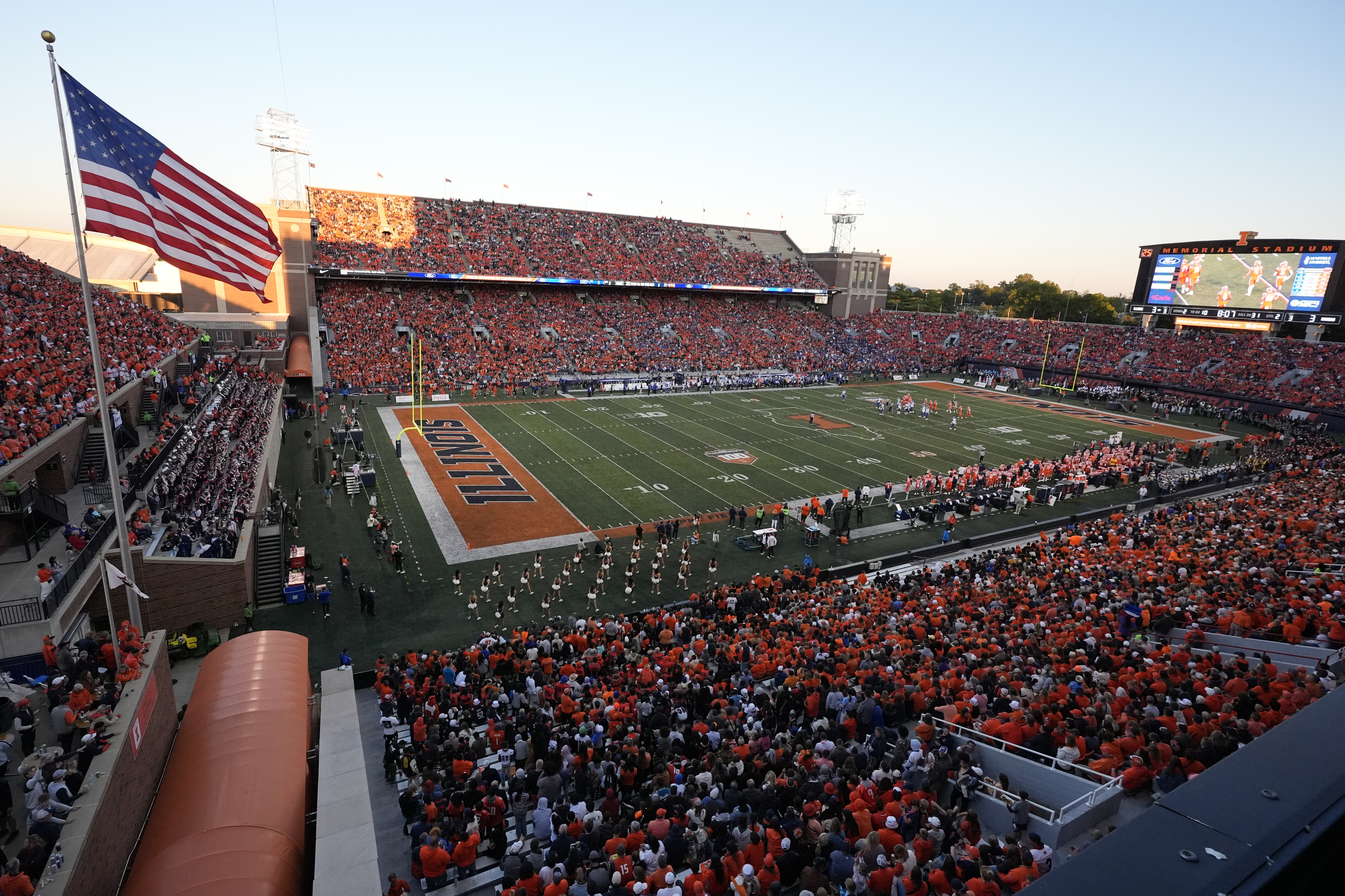
Yeah, I really don't see any other option for the Orange Out than USC. We always try to have that game in a warm weather month, as fans have no problem showing up in orange shirts, but once it gets cold, our crowd takes on a decidedly more navy hue once everyone has to bust out their true winter gear, haha. It's pretty easy to get a crowd to look like this in September (last year vs. Kansas)...I still think the ideal decal complements are to wear the blue decals (block I and arched Illini) with blue and the white decals (slant and script) with orange or white. I'm maybe nerding out a little too much on this, but to me it just looks like a better match. Obviously, reasonable minds can differ on this.
If we are going Orange Out for USC (and I agree that if things progress as we think, then the USC game is a 6:30 NBC game), I'd lose it in a good way if Illinois came out in all orange with the scripts. I'd love to see O/O/W with the slant Illinois for Ohio State, but I could see us trying to recreate some 1983 magic and go O/B/O with the arched Illini for that game (I did go back to the archives and see we went O/B/O in 1983 at Memorial Stadium against OSU).
... but here is a game in November (vs. Michigan State last year), lol:

So, you really have to get it in by mid-October at the latest. That leaves:
8/30 vs. Western Illinois ... highly doubt it'd ever be the home opener.
9/13 vs. Western Michigan ... really doubt it would not be vs. a major conference opponent.
9/27 vs. USC ... my guess for sure.
10/11 vs. Ohio State ... decent probability, but you are sort of playing with fire with the weather, and I think there would be so much hype around this game anyway that they'd rather spend the "Orange Out" on USC.
Then we don't play at home again until 11/1 vs. Rutgers, which is way too late. From what I could find, these were our "Orange Out" games the last couple of years:
2024: 9/7 vs. Kansas
2023: 9/16 vs. Penn State
2022: 10/8 vs. Iowa
Didn't get to wear the script for the bowl game but nice to see PB get to in the senior bowl
- Status
- Not open for further replies.