Illinois Football Uniforms

Status
Not open for further replies.
#126      
Regarding Uniform. would like to see a combo that looks like thd Chicago Bears home uniform

Dark blue helmet, mix in some black with orange I. Dark blue top and white pants with orange/blue stripe.

Bears adopted Illinois colors way back, no shame in copying their version
Earl_Bennett.jpg
 
Last edited:
#134      
Regarding Uniform. would like to see a combo that looks like thd Chicago Bears home uniform

Dark blue helmet, mix in some black with orange I. Dark blue top and white pants with orange/blue stripe. Bears adopted Illinois colors way back, no shame in copying their version.
1750016041115.png
it’s obvious Bret is not a fan
I'm not a fan either (of all blues), though I realize many among us here are. Never particularly liked them in the '80s the first time 'round.

BTW, regarding the Bears' scheme in the photo above... within the past several years I posted the photo below in the 1987 Illio of the 1986 team. When I ran across it I'd forgotten that we did white pants that season.

1750015974135.png
 
#140      
I know not many would agree but I prefer the Butkus style helmet. It says old school (emphasizing our roots in college football) and tough (emphasizing our nature when we play).
I WOULD consider this a contender for my favorite, but I absolutely hate that the stripe is W/B/W ... I think our B/W/B striping pattern in the third photo that we use on the other helmets just looks a lot better. The side is so great, but I do not like the front.

illinois-fighting-illini-2024-throwback-helmets-1-1000x563.jpg

75649289007-usatsi-24474093.jpg

77361352007-usatsi-25091591.jpg


Nothing more than a uniform pet peeve of mine, but I generally think you should always have your darker color as the outside stripe when you have a 3-striped pattern. I think UCLA generally has a great uniform, but the way they do their shoulder stripes just looks a lot more awkward (with the gold sandwiched between the white) than LSU's (which puts the white between the yellow) and ours (orange in the middle of the navy).

11389998.png

E1I2l-wXEAATcOU.jpg:large

e5f88c70-ee10-429e-b13f-2556bd0321bb-medium16x9_F1z_UFbXgAEHsMt.png


Also, RE: the helmet in general, I think you stick with orange and any deviation from that should be a very seldom-used white helmet ... mostly just because our B/O/B striping pattern on a white background just looks SO damn crisp! The first pic with the striping from the second pic:

1611342667100-jpeg.7123

35919


However, I mostly just think we should wear an orange helmet 99.9% of the time. This would be a helmet we busted out for maybe only the Mizzou game or something. If you go into three helmet color territory, I think you risk being like Minnesota, who just seems to throw paint at the wall to see what sticks.

Yes, by all means, let's try to look like one of the worst run professional sports franchises of the last 40 years.
Haha, I do think there is a ton of value in promoting our historical connection to the Bears (mostly to plant that connection in the minds of casual Chicago Area fans with no clear college sports team) ... but this made me LOL. :ROFLMAO:
 
#141      
It's just funny to me that on the one hand you have daily posts about not using the slant helmet with the primary objection being that it resembles a NY Giants helmet that isn't even used by that franchise anymore, and on the other hand you have people wanting to directly copy an NFL franchise's entire jersey, with the end result being something that is just completely unrecognizable as an Illinois uniform (whereas the slant will forever be part of the Illinois football brand whether you like it or not).

Also, as a funny parallel case, today I learned that the NY Giants wore a winged helmet design 8 years before Michigan first adopted it (as did the Chicago Bears). So the next time we wear slant helmets against Michigan, both teams on the field will be wearing helmet designs the NY Giants wore first.
 
#142      
Semi-OT, but I want to echo my support for the view that block letter logos should not have words over them ... at least in most cases. While there are some instances where it definitely works (e.g., Ohio State), I think that if you are going to rock a block letter logo, you should just let it stand on its own. In my humble opinion, this is the worst logo we have ever had, and I wince every time a recruit uses it in a post, haha.

298d3a4a-c602-4daf-b8e1-4a3496883f48_750x422.jpg


Part of it is definitely the timing ... regardless of what you think the right decision about the Chief was, it is pretty much a fact that our Chief logo was extremely popular with fans and non-fans alike, and it was undeniably unique to Illinois. The fact that this had to follow that up makes it even worse in comparison. However, I also just think it is a terrible logo ... it is pretty boring and dated looking, but it doesn't really have a classic or retro vibe, either. And while this phrase has maybe been overused in these discussions, I do genuinely think it looks kind of insecure to plaster our school name over the logo ... an orange and navy block I so clearly is an Illinois logo in a college sports context, lol, we don't need to quite literally spell it out for people.

I have totally warmed up to the Slant ILLINOIS helmets, so that font in and of itself is not an issue above ... it's font over the block I in general, and it's why I also wouldn't support Script font over our current Block I, even though I love the Script font. Our Block I logo is recognizable and does not need text over it ... the curved edges make it subtly unique, and as previously mentioned, the colors make it obvious that it belongs to us. I will say that the Block I helmet is easily my least favorite one, but that doesn't mean it's bad ... I just like the tradition rather unique to college football to not feel the need to always have your primary logo on your football helmet. Some of the most iconic ones like Michigan, Ohio State, Notre Dame, Alabama, etc. do not have the logo on it at all. It doesn't matter at all that the Slant ILLINOIS, Arched ILLINI or Script helmets don't match up with our main logo ... in fact, it's cool!
 
#143      
It's just funny to me that on the one hand you have daily posts about not using the slant helmet with the primary objection being that it resembles a NY Giants helmet that isn't even used by that franchise anymore, and on the other hand you have people wanting to directly copy an NFL franchise's entire jersey, with the end result being something that is just completely unrecognizable as an Illinois uniform (whereas the slant will forever be part of the Illinois football brand whether you like it or not).

Also, as a funny parallel case, today I learned that the NY Giants wore a winged helmet design 8 years before Michigan first adopted it (as did the Chicago Bears). So the next time we wear slant helmets against Michigan, both teams on the field will be wearing helmet designs the NY Giants wore first.

Lol wut??

"Completely unrecognizable"...... school colors? Block "I"? "B1G" logo? Memorial Stadium columns??

It's literally...and completely..... recognizable as Illinois football.

The NFL and CFB have been copying, sharing, and using elements of each others jersey designs since the beginning of the NFL. The template you are referring to is pretty obviously related to Nike more than an NFL franchise. Perhaps the fact that NFL franchise.... (i'm just assuming you mean the Patriots who are simply refreshing a 1970's design with the shoulder stripes, and who didn't adopt the current modern version until 2020 which was around 2 decades after after college teams such as LSU and UCLA wore the versions we see now)....has been plastered to our TV faces for the last 5 years makes it seem like a "direct copy" when it's actually way more of a college throwback design.
 
#144      
Lol wut??

"Completely unrecognizable"...... school colors? Block "I"? "B1G" logo? Memorial Stadium columns??

It's literally...and completely..... recognizable as Illinois football.

The NFL and CFB have been copying, sharing, and using elements of each others jersey designs since the beginning of the NFL. The template you are referring to is pretty obviously related to Nike more than an NFL franchise. Perhaps the fact that NFL franchise.... (i'm just assuming you mean the Patriots who are simply refreshing a 1970's design with the shoulder stripes, and who didn't adopt the current modern version until 2020 which was around 2 decades after after college teams such as LSU and UCLA wore the versions we see now)....has been plastered to our TV faces for the last 5 years makes it seem like a "direct copy" when it's actually way more of a college throwback design.
Think he's talking about the people who were saying we should have similarities to the Bears uniform, not our current actual uniform.
 
#147      
I glazed past the "IRLINOS" BearIlinois unis so fast because.....

afb9cd89-ac2f-4de1-9737-c980e3d88b86_text.gif
 
#148      
Ha sh#t! Ty....can't edit but that makes way more sense! I was so confused! Literally thought he meant the Pats shoulder stripe main uniform!\

sorry @the juiceman cometh !!
And you're right that Nike said the stripes represent the columns...even if that is mostly marketing speak with the two column artwork on every Nike jersey since the 2014 rebuild I imagine it was part of the initial discussion since we still have the 2014 Nike font on the football uniforms.
 
#149      
And you're right that Nike said the stripes represent the columns...even if that is mostly marketing speak with the two column artwork on every Nike jersey since the 2014 rebuild I imagine it was part of the initial discussion since we still have the 2014 Nike font on the football uniforms.

Oh I didn't even realize that?? I was referring to the V-neck surrounding the Block "I"?

Edit: well F me running....that's simply a Nike design feature on the collar of several schools!! I totally thought that was the column reference.

Good grief, I should probably just quit today.

See: Houston storms shutting down IAH all night last night and ending a 16 hour day in...McAllen TX.

I'm glad I didn't post anything even more dumb.
 
Last edited:
#150      
RE: Looking like the Bears, I used to be a proponent of always wearing a Bears combo when we play Northwestern to remind them that we are the school more tied to the Bears, Chicago and our state in general ... but that was with our old uniforms. These new ones have established a clear look for us that harkens back to pre-Zook Era uniforms, and I think we should almost always stick with the orange helmet (which the Bears usually don't have, obviously). During our era of uniform chaos that spanned from the later Zook years all the way to Lovie's final year, we did rock Bears color combos a few times:

ghows_image-LS-858df492-e167-4d57-b3b6-4033ac42b7c9.jpeg

Illinois-Sidebar-number-2-900x601.jpg

20121117_lbm_bl2_441.0.jpg


Put me down as very much not a fan of doing this with our new uniforms ... which pretty much just means I oppose the usage of a navy helmet, haha. If there is one thing that HAS been rather consistent about our uniforms historically, it has been wearing an orange helmet 99% of the time.

P.S. IMO, it is kind of telling which programs in our conference have just one helmet color and which ones have regularly mixed and matched:

Only One Color
Illinois
Indiana
Iowa
Michigan
Nebraska
Ohio State
Penn State
Rutgers
UCLA
USC
Washington

Two or More Colors
Maryland (all over the place)
Michigan State (green, white and black)
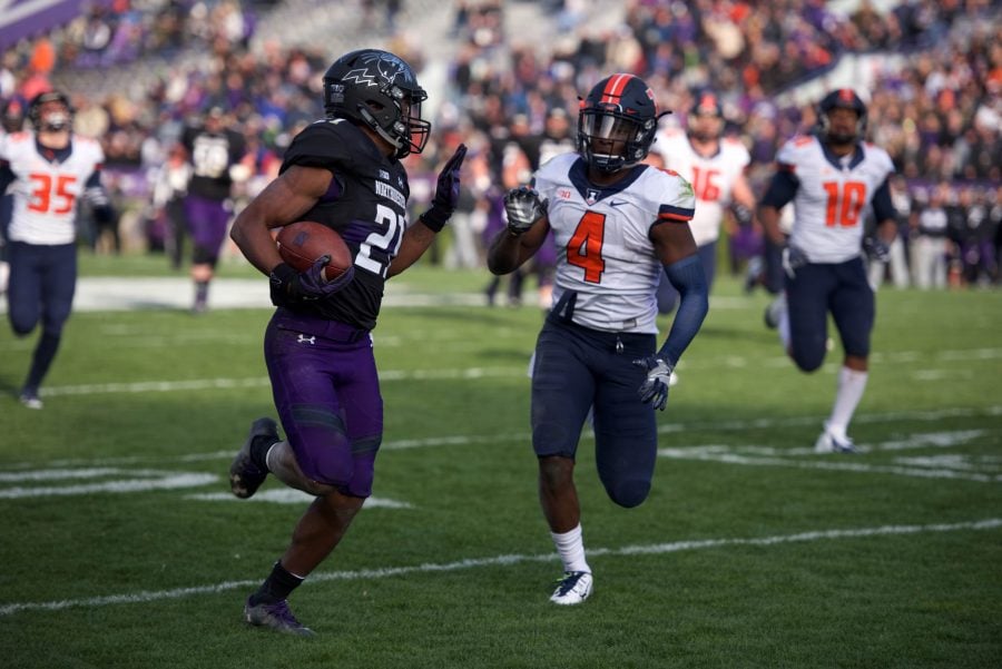
Northwestern (purple, white and black)
Oregon (all over the place)
Purdue (black, gold and white)
Wisconsin (red and white but almost always wear white)

There are obviously exceptions in both categories, but most of the iconic programs (Michigan, OSU, PSU, USC, etc.) stick with one helmet color, and many of the programs I view as desperately chasing trends with countless gimmicky combos to see what works (Minnesota, Maryland, Northwestern, etc.) are in that second category, haha. I want to stay in the first one.
 
Status
Not open for further replies.
Back