You are using an out of date browser. It may not display this or other websites correctly.
You should upgrade or use an alternative browser.
You should upgrade or use an alternative browser.
Illinois Football Uniforms
- Status
- Not open for further replies.
twice so farvoted
Can attach the link cannot access twitter from work
Early and oftenvoted
Don't need Twitter:THIS VOTE SHOULD NOT BE CLOSE.
(I would vote often, but I don't do twitter.)
Uniform of the Year Voting — UNISWAG
 www.uniswag.com

Thanks!
MoCoMdIllini
- Montgomery County, Maryland
Nothing there, but X has been all screwed up all day.
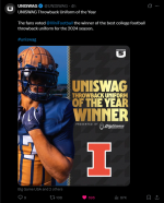
Linked tweet for those without twitter and can't see since embedded links aren't working today
Attachments
chiefini
- Rockford, Illinois
That Illini throwback uniform deserved to win! I voted a ton of times. I’m glad others agreed!Linked tweet for those without twitter and can't see since embedded links aren't working today


GrayGhost77
- Centennial, CO
I voted several times, too. Woohoo!That Illini throwback uniform deserved to win! I voted a ton of times. I’m glad others agreed!
OrangeBlue98
Iowa is not in a great spot right now (LvilleILL1)
- Des Moines, IA
I think I'm good with that, as I think it's a nice balance between a completely set uniform (Alabama, Penn State, Notre Dame) and a wildly divergent set of uniforms (Oregon). We have a lot of very good color combinations with our orange, blue, and white where we can make some good looks without having to break out a new uniform every week. It's kind of like how I only own a couple of suits, but I have enough shirts and ties where I can make enough different suit/tie/shirt combinations to not have a single suit look. Decals are not a major deal, and as a few of us have mentioned I think the white decals (script and slant) pair better with white and orange jerseys while the blue decals (block I and arched Illini) pair better with blue jerseys.Interesting detail from practice today. The offense wore the script Illinois helmets and the defense wore the slant Illinois helmets. Looks like multiple helmet styles might be here to stay.
All of that rambling to say I'm all good with multiple helmet decals.

Interesting detail from practice today. The offense wore the script Illinois helmets and the defense wore the slant Illinois helmets. Looks like multiple helmet styles might be here to stay.

Fighter of the Nightman
- Chicago, IL
I think those two will be here to stay, for sure. I would be very surprised if we saw the Butkus Era ones or (as much as it absolutely pains me) the Arched ILLINI ones again.Interesting detail from practice today. The offense wore the script Illinois helmets and the defense wore the slant Illinois helmets. Looks like multiple helmet styles might be here to stay.
I have become such a fan of the arched "Illini" look on the helmets. Its unique as opposed to the script "Illinois". I'd love if we made this our primary. I know it goes back to the 70's and early 80's, but I just really like it. This picture was in the Recruiting thread.

I know not everyone loves the slant ILLINOIS, but I thought they looked pretty awesome in the orange-out game last year. Would love a combo of the script, slant, and arch.I think those two will be here to stay, for sure. I would be very surprised if we saw the Butkus Era ones or (as much as it absolutely pains me) the Arched ILLINI ones again.
Fighter of the Nightman
- Chicago, IL
I definitely think each helmet looks better or worse with a given uniform combo, and the Slant ILLINOIS helmet is an infinitely better look for me with the orange jerseys. This is probably how I would rank the throwback/non-default helmets by which jersey they would look best with:I know not everyone loves the slant ILLINOIS, but I thought they looked pretty awesome in the orange-out game last year. Would love a combo of the script, slant, and arch.
Arched ILLINI
1. Navy ... just looks so clean and classic.
2. White ... I was shocked how good it actually looked in that recruit visit photo a couple posts up! Hell, if you can make ME think that the O/W/W combo actually doesn't look that bad for once, it's the helmet doing the heavy lifting!
3. Orange ... this helmet has a LOT more orange on it than our other combos due to the stripes, and I think it would look weakest with an orange jersey.
Slant ILLINOIS
1. Orange ... I never loved the Slant ILLINOIS, but even I must admit it really popped for our Orange Out look vs. Kansas last year.
2. White ... I think it actually looked better than the regular helmet with our white away jerseys.
3. Navy ... Just looking at old photos when it was our default, this helmet looked worse with a navy jersey than with our other two colors.
Butkus Era
1. Orange ... we haven't seen this look yet, but I think it would look best given the striping on the helmet would be an inverse of the striping on the jersey. Also, the helmet has a lot more navy overall than our other orange helmets, so it would provide some needed accent to our very orange uniform.
2. Navy ... this is what we saw vs. Purdue last year, and I thought it looked pretty good. I'll never fully support any 3-stripe pattern that has the lighter color for the two outside stripes, though ... always looks worse than the opposite.
3. White ... I feel like the big bold white stripe in the middle of this helmet would look slightly goofy with a white jersey, but who knows?
Script Illinois
1. Orange ... we have seen this in a few recent recruit pictures, and it looks awesome.
2. Navy ... the only reason I didn't go with this (i.e., our Citrus Bowl look) as #1 is I think a Script helmet with navy writing and a white outline would look better on our navy jersey ... in other words, take the Arched ILLINI font color pattern and apply it to the Script we have.
3. White ... I would be curious to see this one for sure, but the current Script helmet has so much more white than navy, so I put this look at #3.
I think our default Block I helmet looks about equal with any uniform combo, and I am glad we have never utilized a white Block I with a navy outline, as we did sometimes during the Beckman Era ... it looked a lot worse.
Fighter of the Nightman
- Chicago, IL
For fun, here are a few uniform combos worn in recent photos from recruiting visits that we have never seen on the field:
O/W/W with Arched ILLINI helmet
O/W/W with Script helmet

O/O/O with Script helmet

O/O/W with Script helmet

O/B/O with Slant ILLINOIS helmet

O/B/B with Script helmet

I do remember one recruit utilizing our long-awaited O/W/B combo to the delight of Team #BPOTR everywhere ... but I can't find it, lol.
O/W/W with Arched ILLINI helmet
O/W/W with Script helmet
O/O/O with Script helmet
O/O/W with Script helmet
O/B/O with Slant ILLINOIS helmet
O/B/B with Script helmet
I do remember one recruit utilizing our long-awaited O/W/B combo to the delight of Team #BPOTR everywhere ... but I can't find it, lol.
- Status
- Not open for further replies.