lstewart53x3
- Scottsdale, Arizona
You taking that or this:
You taking that or this:
Amazing work! I have no idea why Bret has something against the navy pants on the road, haha.Oh fine. View attachment 42287
... Are you talking about the Beckman Era ones? If so, hard disagree ... they were a totally different shade of orange than our jerseys, lol. I also think you would have more of a point if we had ~always~ had a Block I helmet (or even prominently displayed the Block I as a logo!!) over the years ... but that is just not the case. From what I can tell, this is our general helmet history:for the life of me, i don't understand the need for these new/old script or slanted illinois helmets. Block I's are always the best representation of our school at a scale to read from any difference. the metallic orange helmets with block I's were the best of these. im not sure why they went away. all blue or all orange with the orange metallic helmets were the best uni's of all hands down.
View attachment 42298
this is the metallic orange with the block I i'm talking about. at one time they were without the blue stripe.
i like these unis too but not my point. as long as we keep changing the helmet logo we will never have a
classic look. i don't like the illini on a hard arch at all. was that a early 80's look? the block I has a larger
image legible for a distance. the current ones look ok on tv but live and in person are barely legible.
like everybody else, just an opinion. i can write in CAPITALS too.
1988 - Blank orange... Are you talking about the Beckman Era ones? If so, hard disagree ... they were a totally different shade of orange than our jerseys, lol. I also think you would have more of a point if we had ~always~ had a Block I helmet (or even prominently displayed the Block I as a logo!!) over the years ... but that is just not the case. From what I can tell, this is our general helmet history:
Pre-1971: Blank helmet or just a number
1971 to 1989: Arched ILLINI designs
1989 to 2012: Slant ILLINOIS designs
2013 to Present: Block I designs
So not only is the Block I on the helmet incredibly new all things considered, but it has also easily been the "least stable" era of our helmets BY FAR. It has been applied to Zook Era, Beckman Era, Lovie Era and Bielema Era striping patterns, and it has been slapped on jarringly out-of-character navy, white and gray helmets in this timeframe.
Conversely, the Slant ILLINOIS design remained almost EXACTLY the same during its entire stint, with the B/W/B striping on an orange helmet. The only update was a blue outline to the font from 2005 to 2012. Similarly, the Arched ILLINI font remained exactly the same in those almost 20 years, with the only changes to the facemask color and one change to the striping pattern. None of this even touches on the fact that the Block I just simply wasn't used as a consistent primary logo until the Mike Thomas Era rebrand, with the university actually designating both the Chief and orange Slant ILLINOIS logos as primary logos before that...
TL;DR
It's totally fine to prefer the Block I helmet, but it's kind of disingenuous to act like it is inherently more "classic" or "prototypical" of Illini football than other options. If we are trying pick some classic design that had longevity in our history, Slant ILLINOIS and Arched ILLINI frankly have a lot better arguments. Also, people just like the Script because (A) it looks great and (B) precisely BECAUSE we don't have some mainstay helmet design like Michigan that has stood the test of time ... in other words, we don't have a "classic" to hang onto.
Yeah, I skipped over the very brief period of no design since the striping stayed the same and thus seemed to be consistent with the "Arched ILLINI Era," haha. For anyone interested, this website is cool:1988 - Blank orange
Should be the go to for any road game against a red teamView attachment 42294
This is hot
ArchedMy personal helmet logo ranking:
1. Arched Illini
2. Script Illinois
3. Slant Illinois
4. Block I
this is the metallic orange with the block I i'm talking about. at one time they were without the blue stripe.
i like these unis too but not my point. as long as we keep changing the helmet logo we will never have a
classic look. i don't like the illini on a hard arch at all. was that a early 80's look? the block I has a larger
image legible for a distance. the current ones look ok on tv but live and in person are barely legible.
like everybody else, just an opinion. i can write in CAPITALS too.
While your last point is fair ... it is also fair to point out that I think at a certain point, how unique something is doesn't matter THAT much if it is just also the best within its field! Lol, I'm biased, but ... our script is just light years better than what we have seen from other schools. Of those within the Big Ten, I honestly think only OSU comes close to competing with ours, and they literally never utilize it. These are just some Big Ten ones and others I could think of, roughly in my order of best to worst:Arched
Slant
Script - Block I
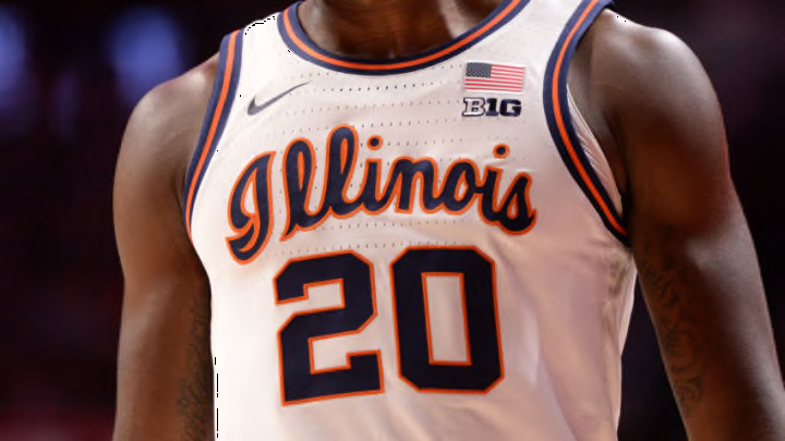
I just don't think the script is uniquely us even tho we had it on the basketball uniforms in the 70s. So many teams today have a faux script of some sorts.


 y’all come with the heat when it comes to uniforms
Great point Nightman, and you can see Wisconsin clearly jumping on the bandwagon without history and it's awful. That's also a consequence of having Under Armour.While your last point is fair ... it is also fair to point out that I think at a certain point, how unique something is doesn't matter THAT much if it is just also the best within its field! Lol, I'm biased, but ... our script is just light years better than what we have seen from other schools. Of those within the Big Ten, I honestly think only OSU comes close to competing with ours, and they literally never utilize it. These are just some Big Ten ones and others I could think of, roughly in my order of best to worst:
And FWIW, this type of sentiment is commonly echoed by non-Illini fans such as this post creating tiers of college hoops script uniforms (spoiler alert: we are in Tier 1!). Of the schools pictured above, we are actually the ONLY one who has adopted that script font in any way besides wearing the uniform randomly (i.e., we have put it on our football helmets and adopted it quite prominently in our social media branding). Other schools that weren't pictured but utilize script font either on their helmets or as a primary logo obviously include schools like Ole Miss, Florida and UCLA ... but I think ours is way better than theirs, too!
I honestly don't think this is as simple as jumping onto a trend like everyone else ... it's more like we HAD this gold mine as our own property and it sat in hibernation since the late 1970s, only to be rediscovered now. I would argue this is more like rediscovering a lost gem and making up for lost time by finally utilizing it correctly!!

It looks fine to me. Hard pass on a dual logo helmet.I never noticed it until today, but I’ve only really looked at script Illinois from the right side profile view. When seeing the other side of the helmet I actually kinda hate it.
When it faces this way, the larger portion of the word is all front loaded and it just looks…weird. Could we get a script Illinois on the right side and a Block I on this side? Just really get weird and fun.
View attachment 42395
Because their hearts were set on the Utah Yeti, but could not work it out with Yeti corporation.We got a from-scratch team name/logo drop the other day, so let's use the Utah Mammoth to address the notion that comes up a lot - whether a look/brand is "unique." First, here's what we're dealing with:
Primary logo:
View attachment 42394
Secondary logos:


"Is it unique?"
Technically, yeah! The only pro sports team named the Mammoth. So why did they veer so close to Predators territory with "extinct animal in motion to the right with a prominent tusk/fang"?
In terms of design, it feels very lazy. It's cartoonish but not in a vintage way (like the Penguins) or in a self-aware way (like the Ducks). I dunno, it seems like there was probably an opportunity to really synch up the most prominent feature of a Mammoth (a huge, curved tusk) with one of the most prominent things about Utah (starting with the letter "U"). They even kind of nod to this in the secondary logo, but just mush them on top of one another? Also - check out the Mammoth's neck/shoulder....there's an embedded outline of the state of Utah with "M" doubling as a mountain range. That's a nifty piece of work and they wasted it as an Easter egg on the periphery of the logo.
In terms of colors, black/Columbia blue/white is going to be the sports version of modern farmhouses, where you see it and think "oh yeah, late 2010s/early 2020s". And IMO, the Kraken somewhat beat them to the punch with the more distinctive "ice blue" they use as part of some truly excellent design.
Is it fit for purpose?
Honestly, not really. A hockey sweater is a huge canvas to work with - you have the luxury of doing intricate design (i.e. Red Wings, Blackhawks, Sharks), a crest-style (Rangers, Panthers), even do some playing with words (Capitals). The Mammoth logo looks like it should be on a football helmet.
Overall, it's....fine. But when the world is your oyster in terms of assets to work with (the opposite of where we find ourselves), feels like an underachievement. A good reminder that it's hard to get it right, and when you do (like we did with this year's helmets and the bball script!), you've gotta lock that in.
chatGTP came up with this for me in less than 60 seconds and i honestly like it much better:We got a from-scratch team name/logo drop the other day, so let's use the Utah Mammoth to address the notion that comes up a lot - whether a look/brand is "unique." First, here's what we're dealing with:
Primary logo:
View attachment 42394
Secondary logos:
"Is it unique?"
Technically, yeah! The only pro sports team named the Mammoth. So why did they veer so close to Predators territory with "extinct animal in motion to the right with a prominent tusk/fang"?
In terms of design, it feels very lazy. It's cartoonish but not in a vintage way (like the Penguins) or in a self-aware way (like the Ducks). I dunno, it seems like there was probably an opportunity to really synch up the most prominent feature of a Mammoth (a huge, curved tusk) with one of the most prominent things about Utah (starting with the letter "U"). They even kind of nod to this in the secondary logo, but just mush them on top of one another? Also - check out the Mammoth's neck/shoulder....there's an embedded outline of the state of Utah with "M" doubling as a mountain range. That's a nifty piece of work and they wasted it as an Easter egg on the periphery of the logo.
In terms of colors, black/Columbia blue/white is going to be the sports version of modern farmhouses, where you see it and think "oh yeah, late 2010s/early 2020s". And IMO, the Kraken somewhat beat them to the punch with the more distinctive "ice blue" they use as part of some truly excellent design.
Is it fit for purpose?
Honestly, not really. A hockey sweater is a huge canvas to work with - you have the luxury of doing intricate design (i.e. Red Wings, Blackhawks, Sharks), a crest-style (Rangers, Panthers), even do some playing with words (Capitals). The Mammoth logo looks like it should be on a football helmet.
Overall, it's....fine. But when the world is your oyster in terms of assets to work with (the opposite of where we find ourselves), feels like an underachievement. A good reminder that it's hard to get it right, and when you do (like we did with this year's helmets and the bball script!), you've gotta lock that in.