Illinois Football Uniforms

Status
Not open for further replies.
#76      
There is no right answer but here’s my uniform ideas:

Home - almost always orange pants and blue jerseys. Occasionally white pants with orange or blue jerseys, always with orange lids. Never all orange and never all blue (although we loved it in the 1980s)

Road - mixture of white, orange and blue pants - I love the all whites and loved the storm trooper look under Zook.

Helmet - always orange with block I, Curved Illini or the new script Illinois. Abolish the slant Illinois because I hate the reason we rolled it out - so people would know who we are.

Just my take.
 
#77      
And I think this is my current preference for our games this year if it were up to me! I might change my mind on some of these, but some (e.g., at Indiana...) are pretty rock solid opinions, haha.

A couple general notes:
1) I am not on the bandwagon to have the Script helmet be designated for the postseason only ... I would utilize it, personally, as our main home helmet and utilize Slant ILLINOIS as the default road one.
2) I am assuming that the Butkus Era and (obviously) Wrigley-themed Block I helmets are off the table, but I am assuming Arched ILLINI is still an option.
3) I went back and forth, but I am CURRENTLY leaning toward thinking it would be cooler to let the Grange Era throwbacks stand on their own for that iconic Michigan game and not wear them this year ... maybe an every-four-years pattern so a kid who stays all four seasons gets to wear them at least once. With that said, I could be persuaded to bust them out vs. USC for Homecoming if they're going to be utilized for any game (OSU would also be cool, but that is the Orange Out game).

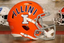
vs. Western Illinois ... Kick off this season's home opener with the uniforms that brought us the Citrus Bowl win and all of the ensuing hype we are currently enjoying!
View attachment 43228

at Duke ... Go back to the road uniform that brought us road wins at Nebraska and Rutgers, as well as a battle in Happy Valley. I think this will establish itself as the go-to road uniform, and I'm a fan.
View attachment 43229

vs. Western Michigan ... I really considered an O/B/B look here, as this is our only 100% guaranteed game under the lights at Memorial Stadium. However, I do think we should reserve our more unique looks for truly unique occasions, so we rock the same uniform as Week One.
View attachment 43228

at Indiana ... It's time, folks. #BPOTR is too perfect for this one, as it will likely be a super hyped road game, it very well could be in primetime and an opponent with red as its primary color is the exact time we should wear navy pants on the road, as it's a better contrast than the orange. Also, the Arched ILLINI helmet with this look just looks great and has this kind of retro swagger.
View attachment 43231

vs. USC (Homecoming) ... Again, IF we wore the Grange Era throwbacks, this would be it. However, I like the idea of always wearing O/B/O on Homecoming, and this would be a good time to finally see the Slant ILLINOIS helmet with the navy jersey for the first time.
View attachment 43234

at Purdue ... Back to the standard road uniform for what is hopefully an absolute beatdown in front of several thousand Illini fans who made the trip!
View attachment 43229

vs. Ohio State (Orange Out) ... While I really want to see the white pants with the orange jersey, I can be sympathetic to the idea that the "Orange Out" game should have us wearing all orange. I also think the Script helmet might look even better with the orange, but I think we have to go with Slant ILLINOIS here, as we wore it the last time we actually beat these guys. Also, this one might be under the lights if we are lucky, so let's go back to what got us the big-time win vs. KU last year.
View attachment 43237

at Washington ... Standard road uniform but bust out the Script helmet instead to show it off on the West Coast and hopefully usher in some good juju for a new era of actually winning some of these games where we travel to the Pacific Time Zone!
View attachment 43240

vs. Rutgers (Dads Day) ... Give the dads some Arched ILLINI for Dads Day! I also just feel like the O/B/B is very 1980s Illini in my head, so it goes naturally with this helmet.
View attachment 43236


vs. Maryland (Veterans Day) ... Basically last year's Veterans Day look but this time we get to see it with the white pants! I could be persuaded that we should keep the orange uniform "special" and only wear it once per year, but I think it looks good with the Slant ILLINOIS Veterans Day helmet.
View attachment 43238

at Wisconsin ... I know we "should" reserve the #BPOTR look for big-time road games (i.e., maybe once per year?) ... but this IS a big-time road game! Bielema's former team, revenge for the 2023 debacle, a possible chance to end the Fickell Era and possibly playing for a CFP spot. This time we utilize the Script helmet, but it's back to #BPOTR.
View attachment 43239

vs. Northwestern ... Standard home uniform for a standard beatdown of the Kitties. I also think (similar to Homecoming) we should always wear this for Senior Day.
View attachment 43228
Postseason Home ... I am not 100% tied to anything here, honestly; we have a lot of great looks. However, I would tend to lean toward the look that got us the Citrus Bowl victory!
View attachment 43228
Postseason Away ... As I said, I am not on board with ONLY using the Script for postseason play, so I say we go back to the ultimate big-game road uniform.
View attachment 43231

That's what I would do, anyway! Different strokes for different folks, and I am sure in actuality we will see multiple things I don't like, such as no #BPOTR yet again and at least one road game where we wear white pants. However, we have a solid uniform set, and even the "bad" combos are light years better than the Lovie Era uniforms, so I can't complain too much!
Couple thoughts:

I like the idea of wearing the Citrus Bowl uniforms and helmets for week 1. There’s something about connecting the two seasons that makes sense. With that being said, I also agree with others that the script should be reserved for special occasion/bowl games etc.

It was the 100th anniversary that brought back the throwback helmet designs. It’s been mentioned before, is there any reason to believe these will brought back again this year? And secondly, could there maybe be a new helmet design or throwback that we haven’t heard about yet?
 
#78      
Couple thoughts:

I like the idea of wearing the Citrus Bowl uniforms and helmets for week 1. There’s something about connecting the two seasons that makes sense. With that being said, I also agree with others that the script should be reserved for special occasion/bowl games etc.

It was the 100th anniversary that brought back the throwback helmet designs. It’s been mentioned before, is there any reason to believe these will brought back again this year? And secondly, could there maybe be a new helmet design or throwback that we haven’t heard about yet?
RE: The throwback helmets, the flip side prediction is that we only see Block I and Script this year ... I would be SHOCKED if that were the case. As others have mentioned, we have utilized the Slant ILLINOIS helmet and logo A LOT in social media posts and whatnot, and recruits are regularly posing in both the Slant ILLINOIS and Arched ILLINI helmets for staged photos. It would be surprising to me if the program is offering up these options for promotional photos all the while considering them officially retired.

I think the true "smoking gun" to a lot of people is that Luke also made a poll on his Instagram story asking fans to vote for a "helmet for the season" ... and the two options were Slant ILLINOIS and Arched ILLINI. So while I don't think we have retired the Block I or anything, I do think we will continue to wear some of the throwbacks. For better or for worse, I do think the Butkus Era helmet is likely done.
 
#79      
RE: The throwback helmets, the flip side prediction is that we only see Block I and Script this year ... I would be SHOCKED if that were the case. As others have mentioned, we have utilized the Slant ILLINOIS helmet and logo A LOT in social media posts and whatnot, and recruits are regularly posing in both the Slant ILLINOIS and Arched ILLINI helmets for staged photos. It would be surprising to me if the program is offering up these options for promotional photos all the while considering them officially retired.

I think the true "smoking gun" to a lot of people is that Luke also made a poll on his Instagram story asking fans to vote for a "helmet for the season" ... and the two options were Slant ILLINOIS and Arched ILLINI. So while I don't think we have retired the Block I or anything, I do think we will continue to wear some of the throwbacks. For better or for worse, I do think the Butkus Era helmet is likely done.

1. Recruits are still given the option of wearing the all-white helmet from Lovie’s tenure, though that has never been on the table. I don’t think that’s indicative. This one is from May ‘25
IMG_4698.jpeg


2. Luke was, I believe, making a selection on a new helmet shell, which was being modeled with different stickers. My guess is because it looked like it was in an equipment room with labels of helmet type under them. …I think Luke knew what he was doing, though.
 
#80      
RE: The throwback helmets, the flip side prediction is that we only see Block I and Script this year ... I would be SHOCKED if that were the case. As others have mentioned, we have utilized the Slant ILLINOIS helmet and logo A LOT in social media posts and whatnot, and recruits are regularly posing in both the Slant ILLINOIS and Arched ILLINI helmets for staged photos. It would be surprising to me if the program is offering up these options for promotional photos all the while considering them officially retired.

I think the true "smoking gun" to a lot of people is that Luke also made a poll on his Instagram story asking fans to vote for a "helmet for the season" ... and the two options were Slant ILLINOIS and Arched ILLINI. So while I don't think we have retired the Block I or anything, I do think we will continue to wear some of the throwbacks. For better or for worse, I do think the Butkus Era helmet is likely done.
While I wouldn’t be upset if the Block I just went away altogether and became its own throwback in 10-15 years, I can live with it a while longer. My suggestion would be to start phasing it out over the next season or two and reserve it for unique designs like the ivy for the Wrigley game or the stars and stripes for the Military Appreciation which I think is a very cool look. Use it once or twice a season on those special weekends.

I wouldn’t be upset with either the ILLINOIS or the Arched as a primary and an alternate in some combination.

I agree with you on the Butkus helmet, it’s cool but not a gamechanger.
 
#81      
I'm surprised how much I didn't really care for the Butkus helmet. Not that it's bad, just that the others (arched, underlined, and script) stand out as much better. I'd be fine with Butkus being once a year for say Homecoming, but if it's indeed not a part of the regular rotation I won't miss it.

As I have said before, my preference for the helmet rotation is:

1. Arched Illini for home blues and maybe BPOTR
2. ILLINOIS for orange alternates and most road games
3. Script Illinois for maybe a bowl game or opening game
4. I will throw Block I a bone and say they can wear Block I on Senior Day
 
#82      
I'm surprised how much I didn't really care for the Butkus helmet. Not that it's bad, just that the others (arched, underlined, and script) stand out as much better. I'd be fine with Butkus being once a year for say Homecoming, but if it's indeed not a part of the regular rotation I won't miss it.

As I have said before, my preference for the helmet rotation is:

1. Arched Illini for home blues and maybe BPOTR
2. ILLINOIS for orange alternates and most road games
3. Script Illinois for maybe a bowl game or opening game
4. I will throw Block I a bone and say they can wear Block I on Senior Day

The *only* problem I have with the Butkus-era helmet is the stripe. White-blue-white is just so ugly. And further, the helmet has even width of all three stripes. It’s subtle, but the current helmets actually have the white stripe about a third wider than the two outer stripes.
 
#83      
The *only* problem I have with the Butkus-era helmet is the stripe. White-blue-white is just so ugly. And further, the helmet has even width of all three stripes. It’s subtle, but the current helmets actually have the white stripe about a third wider than the two outer stripes.
Amen, brother ... if we had updated the striping to be like our other helmets, Butkus Era just might be my favorite. However, any striping pattern that goes light/dark/light is automatically trash to me, haha. This with a white facemask (beyond my MS Paint skills) would have been a winner:

Butkus Era Change.png
 
#84      
If they are going to use multiple helmet stickers/logos/wordmarks going forward, isn't there a good possibility that they move to a standard stripe for all of them? For the 100 year anniversary it makes sense to make them a bit more historically accurate, but they shouldn't be beholden to that going forward. I would think the same would apply to the logos/stickers themselves as well (i.e. swapping the wordmark color, adding/removing an outline, etc) but that seems less likely
 
#85      
I'm surprised how much I didn't really care for the Butkus helmet. Not that it's bad, just that the others (arched, underlined, and script) stand out as much better. I'd be fine with Butkus being once a year for say Homecoming, but if it's indeed not a part of the regular rotation I won't miss it.

As I have said before, my preference for the helmet rotation is:

1. Arched Illini for home blues and maybe BPOTR
2. ILLINOIS for orange alternates and most road games
3. Script Illinois for maybe a bowl game or opening game
4. I will throw Block I a bone and say they can wear Block I on Senior Day
I guess I'm alone on the Butkus helmet island. Remains my favorite for both sentimental and "exudes old fashioned smash mouth football" reasons.
 
#86      
Here me out…

We’re always trying to find the right opportunity or in what game(s) to wear the script helmets/script basketball jerseys. Suggestions always include big rivalries, national TV games, bowl/tournament games etc. etc.

Here’s an idea; there’s only one time this year where there will be basketball and football on the same day. Nov. 22, Football at Wisconsin/Basketball at home versus Long Island. Why not wear the script helmet/white script jersey on the same day? They're not necessarily big games or a special occasion but there is kind of a special synergy to it, I think.

They played on the same Saturday last season; What they both wore:

1755779648056.png
 
#87      
If they are going to use multiple helmet stickers/logos/wordmarks going forward, isn't there a good possibility that they move to a standard stripe for all of them? For the 100 year anniversary it makes sense to make them a bit more historically accurate, but they shouldn't be beholden to that going forward. I would think the same would apply to the logos/stickers themselves as well (i.e. swapping the wordmark color, adding/removing an outline, etc) but that seems less likely
That’s my thought. I’d keep the regular three stripe and change the decals out. That way, you have a good mix of standard and variety. Plus, the three stripe is consistent with the jersey and pants. I’m a big fan of the current jersey stripes, so I would want to make the helmet consistent.
 
#88      
Here me out…

We’re always trying to find the right opportunity or in what game(s) to wear the script helmets/script basketball jerseys. Suggestions always include big rivalries, national TV games, bowl/tournament games etc. etc.

Here’s an idea; there’s only one time this year where there will be basketball and football on the same day. Nov. 22, Football at Wisconsin/Basketball at home versus Long Island. Why not wear the script helmet/white script jersey on the same day? They're not necessarily big games or a special occasion but there is kind of a special synergy to it, I think.

They played on the same Saturday last season; What they both wore:

View attachment 43256
I mean, I strongly oppose reserving our Script (and Flyin' Illini) uniforms for big games only ... I would have thrown all the 1LL1NO1S uniforms in the trash yesterday, lol. We should get both throwback basketball uniforms in all three colors ASAP, and until then we should ONLY wear the two we have. Every game, no matter what.

RE: A white Script helmet, as I have previously said, I am "sold" on the idea of always wearing an orange helmet. However, someone did post a mockup of a white Script helmet one time, and I have to admit that it is an objectively slick helmet and looks absolutely fantastic. I could get on board with wearing it with our orange uniform for a designated special occasion (every year vs. Mizzou comes to mind as a good idea) or for a very rare all white look:

WOW Script.jpeg

WWW Script.jpeg
 
#89      
RE: A white Script helmet, as I have previously said, I am "sold" on the idea of always wearing an orange helmet. However, someone did post a mockup of a white Script helmet one time, and I have to admit that it is an objectively slick helmet and looks absolutely fantastic. I could get on board with wearing it with our orange uniform for a designated special occasion (every year vs. Mizzou comes to mind as a good idea) or for a very rare all white look:

View attachment 43258
View attachment 43259

Yeah it’s gorgeous in real life.
You_Doodle_2025-08-22T15_40_47Z.jpeg
 
#96      
Before the B1G expansion my favorite team to root for outside of Illinois was always Washington. We have almost no choice (since the shield seems dead) so we are backed into a corner and have to use a boring letter as out primary logo. Washington has had several cool Husky related logos in the past, yet they continue to use the W for some head-scratching reason. I'd kill for Illinois to have that kind of nickname to work with logo wise!
 
#97      
This relates to more than just uniforms, but I'd like to suggest that 1. Anyone who knows CFB knows who the orange block I represents and 2. It is nowhere near the worst one and in fact looks kinda cool!

View attachment 43271
Honestly, I'm not sure if this is or is not true. People on most sports boards will know, but I know what the green E near the bottom is and I know what the blue bird near the bottom is and the green eagle in the top right corner and actually think I could name nearly every university on here if pressed to, including the most obscure ones so I'm not sure that's saying a lot. People like us will know these logos, regardless of whether they are good or bad.
 
#98      
Before the B1G expansion my favorite team to root for outside of Illinois was always Washington. We have almost no choice (since the shield seems dead) so we are backed into a corner and have to use a boring letter as out primary logo. Washington has had several cool Husky related logos in the past, yet they continue to use the W for some head-scratching reason. I'd kill for Illinois to have that kind of nickname to work with logo wise!
IMO, a shield had the potential to be a strong and recognizable symbol. Unfortunately, the Rube Goldberg design incorporated too many elements making it too complicated in appearance.
 
Status
Not open for further replies.
Back