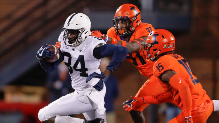
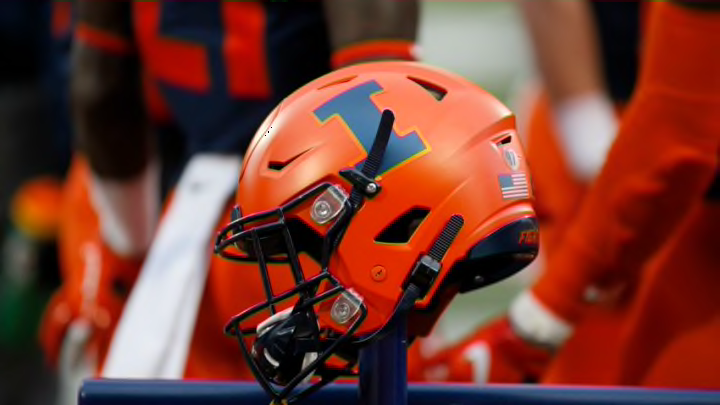
Illinois Football Uniforms

#51      
Now that I've had a couple weeks of reflection, I'm thinking those 9/11 Illinois helmets are the worst in (at least) my lifetime, probably longer.
Sentiment good. Execution bad.

That said…. I would argue that THIS was the worst helmet of my lifetime.

IMG_7235.jpeg
 
Last edited:
#54      
I need answers on this. Do we have some sort of obligation to keep the Block I helmet in rotation? Why would we otherwise be operating this way?
Lol, same. I feel like I can literally hear the conversation.

1) Dunning Kruger Effect middle manager person says, "Guys, we can't just wear our special or throwback helmets every game or they'll lose their appeal! Block I needs to remain the default, and we will work in the other ones for ~big games~ or other special occasions."

2) Actually sensible and capable intern points out that this is a really dumb and weird self-imposed limitation on simply looking our best all of the time. If we simply MAKE one of the throwback / "special" helmets our default, then there is no issue! They point out that countless iconic football programs from Michigan to Ohio State to Alabama to Notre Dame do not have their main primary logo on their helmets, so this is hardly some rule.

3) Middle manager gets subtly offended, subconsciously realizes the intern is right and nevertheless proceeds to double down and consider the matter closed.
 
Last edited:
#55      
Lol, same. I feel like I can literally hear the conversation.

1) Dunning Kruger Effect middle manager person says, "Guys, we can't just wear our special or throwback helmets every game or they'll lose their appeal! Block I needs to remain the default, and we will work in the other ones for ~big games~ or other special occasions."

2) Actually sensible and capable intern points out that this is a really dumb and weird self-imposed limitation on simply looking our best all of the time. If we simply MAKE one of the throwback / "special" helmets our default, then there is no issue! They point out that countless iconic football programs from Michigan to Ohio State to Alabama to Notre Dame do not have their main primary logo on their helmets, so this is hardly some rule.

3) Middle manager gets subtly offended, subconsciously realizes the intern is right and nevertheless proceeds to double down and consider the matter closed.
Some might disagree (especially with the pants) but if I were running the uniform dept this is what I’d do:

1. Orange ILLINOIS helmets
2. Blue jerseys at home
3. Orange pants always (giving us O/B/O at home and O/W/O on the road).
4. The biggest game of the year (ideally a night game), orange jerseys (O/O/O with an orange out).
5. Break out the script Illinois helmet for the bowl game.
 
#56      
Some might disagree (especially with the pants) but if I were running the uniform dept this is what I’d do:

1. Orange ILLINOIS helmets
2. Blue jerseys at home
3. Orange pants always (giving us O/B/O at home and O/W/O on the road).
4. The biggest game of the year (ideally a night game), orange jerseys (O/O/O with an orange out).
5. Break out the script Illinois helmet for the bowl game.
I like it overall, but I would need at least one #BPOTR game each year!
 
#57      
Some might disagree (especially with the pants) but if I were running the uniform dept this is what I’d do:

1. Orange ILLINOIS helmets
2. Blue jerseys at home
3. Orange pants always (giving us O/B/O at home and O/W/O on the road).
4. The biggest game of the year (ideally a night game), orange jerseys (O/O/O with an orange out).
5. Break out the script Illinois helmet for the bowl game.
To each his own. ILLINOIS version is my least favorite.
 
#59      
Arched Illini, white letters with blue outline. No need to overthink this one, make it permanent - it runs laps around the rest
I go back and forth, but I have to admit that when I see those old photos, this does seem to be the best candidate to establish a distinct brand identity. It's very unique, has actual history behind it and it looks cool.
 
#61      
Pretty strong indictment of our “base” helmet logo that people in this thread can bat around 3-4 compelling options for our best one, none of which is the Block I.
and yet I’ll still be surprised if anything changes from our current status quo
 
#65      
Anyone think we get any combos we've never seen this year, or will it be pretty straight down the middle for the rest of the season? Lol. I believe this weekend's game is the "Orange Out," so we will definitely be getting O/O/O ... not sure on the helmet, but I'll bet it's Slant ILLINOIS.

As for my initial question, I feel like we have actually gotten less and less "experimental" since these new uniforms came out, at least excluding bowl games. We wore navy pants twice at home in 2023, once in 2024 and then we have not since. We also seem to (thankfully!) not really be rocking the white pants on the road as much anymore. If I had to guess from here on out:

EDIT: Apparently we are doing a "Hail to the BLUE Out" vs. Nebraska?? Amending my picks to have us wear the same uniforms as the Music City Bowl for that one.

vs. Purdue - O/O/O and Slant ILLINOIS
at Michigan State - O/W/O and Block I
vs. Oregon - O/B/O and some new flag-themed helmet (Military Appreciation Day)
at Maryland - O/W/O and Block I
vs. Nebraska - B/B/B and Navy Script ("Blue Out" game)
at UCLA - O/W/W and Block I (We'll refuse to let the white pants on the road die, lol...)
vs. Iowa - O/B/O and Orange Script
at Northwestern - O/W/O and Block I (some "business trip" nonsense or something to justify wearing our worst helmet because it's the "default" or whatever)

I'm pessimistic about seeing Arched Illini, and we haven't seen the Orange Script since the Indiana disaster, so even that is a possibly overly optimistic guess. Alas, yet another year with no #BPOTR. :cry:
 
#66      
Anyone think we get any combos we've never seen this year, or will it be pretty straight down the middle for the rest of the season? Lol. I believe this weekend's game is the "Orange Out," so we will definitely be getting O/O/O ... not sure on the helmet, but I'll bet it's Slant ILLINOIS.

As for my initial question, I feel like we have actually gotten less and less "experimental" since these new uniforms came out, at least excluding bowl games. We wore navy pants twice at home in 2023, once in 2024 and then we have not since. We also seem to (thankfully!) not really be rocking the white pants on the road as much anymore. If I had to guess from here on out:

EDIT: Apparently we are doing a "Hail to the BLUE Out" vs. Nebraska?? Amending my picks to have us wear the same uniforms as the Music City Bowl for that one.

vs. Purdue - O/O/O and Slant ILLINOIS
at Michigan State - O/W/O and Block I
vs. Oregon - O/B/O and some new flag-themed helmet (Military Appreciation Day)
at Maryland - O/W/O and Block I
vs. Nebraska - B/B/B and Navy Script ("Blue Out" game)
at UCLA - O/W/W and Block I (We'll refuse to let the white pants on the road die, lol...)
vs. Iowa - O/B/O and Orange Script
at Northwestern - O/W/O and Block I (some "business trip" nonsense or something to justify wearing our worst helmet because it's the "default" or whatever)

I'm pessimistic about seeing Arched Illini, and we haven't seen the Orange Script since the Indiana disaster, so even that is a possibly overly optimistic guess. Alas, yet another year with no #BPOTR. :cry:

Hopefully for Oregon we get the Arched helmet from Maryland last year. Would like MSU and Iowa to be ILLINOIS
 
#69      
It is so obviously apparent how much better that helmet is than the Block I helmet.
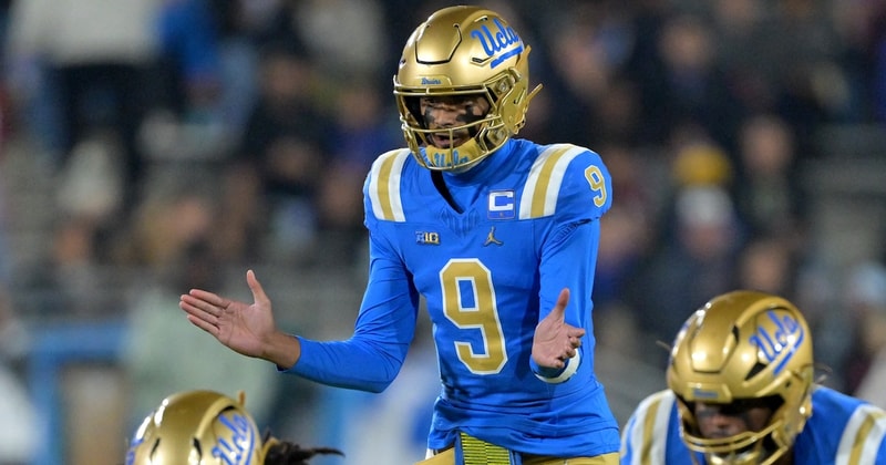
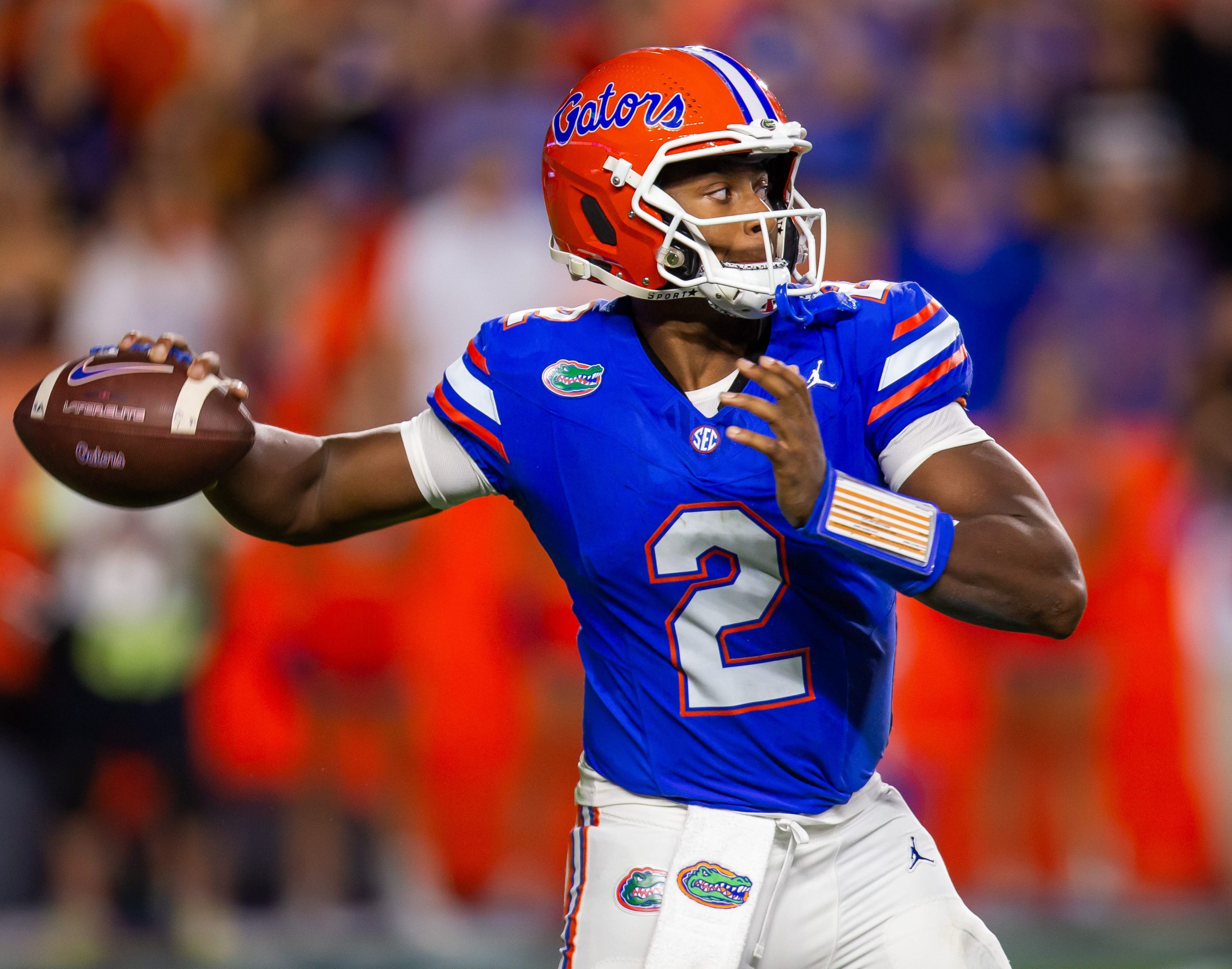
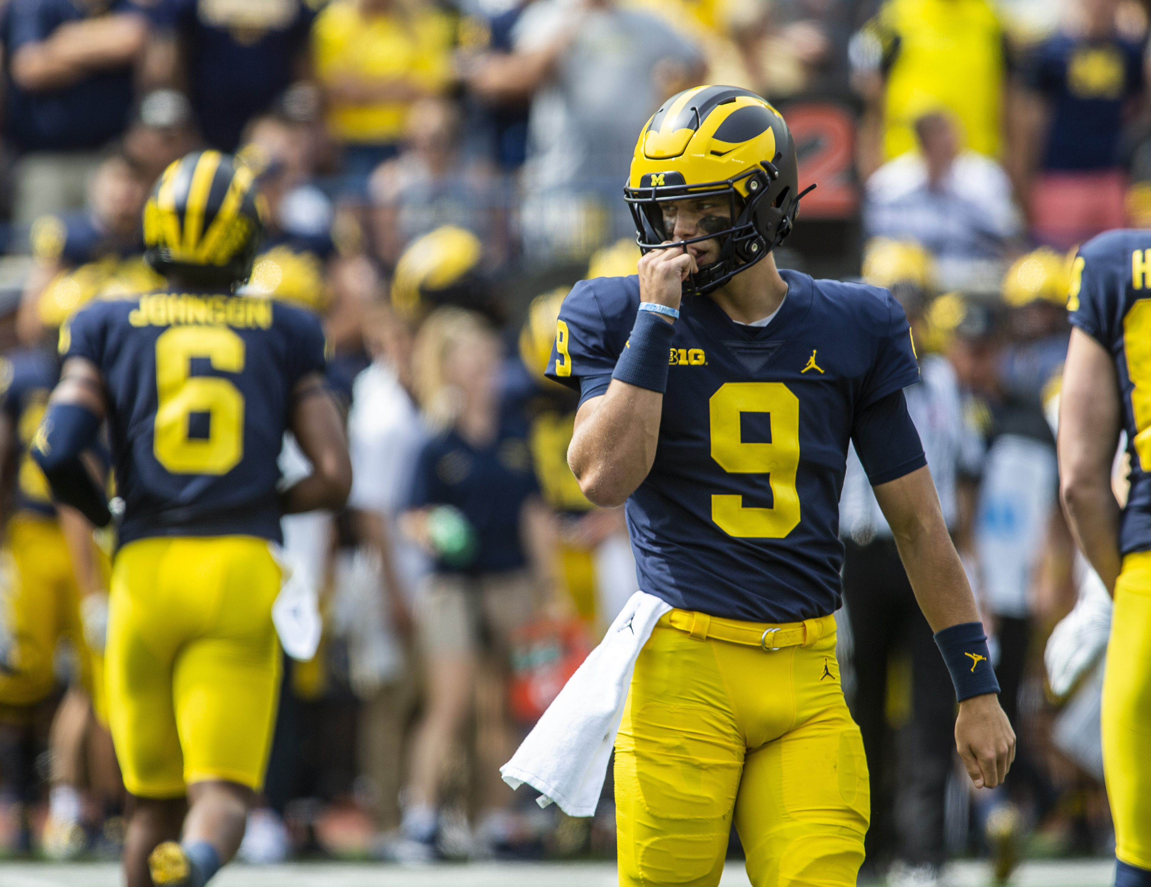
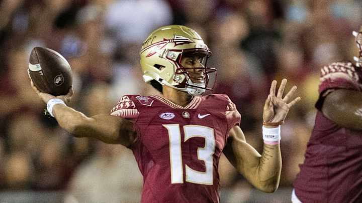
I never really thought about this in the past, but I totally agree with the point that some posters here have made (maybe @mattcoldagelli ?) that a tall / skinny logo looks SO much worse on a helmet than a short / wide logo. And all of our options besides the Block I - whether Script, Arched ILLINI, Slant ILLINOIS or even the Butkus Era star design - are at least as wide as they are tall ... and then the Block I just looks so weird and out of place.

Like, if a buddy and I were having a beer at a bar and he put me on the spot and asked what are some (non-Illini) college football helmets I liked, I'd probably blurt out these without much time to think:

2025-11-23T190806Z_1825885081_MT1USATODAY27663415_RTRMADP_3_NCAA-FOOTBALL-WASHINGTON-AT-UCLA.jpg

USATSI_24539425-scaled.jpg

ED7PPOWLPJER3DWBVBUGGSUYTU.jpg

2026_09_05_FootballNIU_TC012-1200x800.jpg

usatsi_19243556-4.jpg

86655220007-lsu-vs-south-carolina-football-7273.jpg

BNG-L-CALFBC-0901-01.jpg

gettyimages-2296157032.jpg


Only Iowa and Washington use JUST the primary logo, and only Washington uses just a block letter ... but all of these are so much wider than the Block I. It just looks strange and goofy to me to have this tall skinny object in the middle of a football helmet, haha, like it's accidentally perpendicular to what the natural design should be. :ROFLMAO:
 
#70      
I never really thought about this in the past, but I totally agree with the point that some posters here have made (maybe @mattcoldagelli ?) that a tall / skinny logo looks SO much worse on a helmet than a short / wide logo. And all of our options besides the Block I - whether Script, Arched ILLINI, Slant ILLINOIS or even the Butkus Era star design - are at least as wide as they are tall ... and then the Block I just looks so weird and out of place.

Like, if a buddy and I were having a beer at a bar and he put me on the spot and asked what are some (non-Illini) college football helmets I liked, I'd probably blurt out these without much time to think:

2025-11-23T190806Z_1825885081_MT1USATODAY27663415_RTRMADP_3_NCAA-FOOTBALL-WASHINGTON-AT-UCLA.jpg

USATSI_24539425-scaled.jpg

ED7PPOWLPJER3DWBVBUGGSUYTU.jpg

2026_09_05_FootballNIU_TC012-1200x800.jpg

usatsi_19243556-4.jpg

86655220007-lsu-vs-south-carolina-football-7273.jpg

BNG-L-CALFBC-0901-01.jpg

gettyimages-2296157032.jpg


Only Iowa and Washington use JUST the primary logo, and only Washington uses just a block letter ... but all of these are so much wider than the Block I. It just looks strange and goofy to me to have this tall skinny object in the middle of a football helmet, haha, like it's accidentally perpendicular to what the natural design should be. :ROFLMAO:
I think our block I is too tall. If it was decreased to 75% of what it is now it would look better. Also if it had a circle around it like we use to have with our Illini logos that would be even better.
 
#72      
I never really thought about this in the past, but I totally agree with the point that some posters here have made (maybe @mattcoldagelli ?) that a tall / skinny logo looks SO much worse on a helmet than a short / wide logo.
One of the things that made me so pro-Shield was that it gave us something with some width that could be used in more places. That's not like, just a nice-to-have, you know? We're an athletic department. We know the types of things we will need to use logos and typefaces on, it's not a mystery. Something needs to work on a helmet, at center court, in the end zone, on a t-shirt, on a bumper sticker, etc.

There are very few places that are a good fit for a standalone capital I. Really think about it - where on any of our uniforms does the Block I really "hit"? I can really only think of one place (maybe someone has some other suggestions):

1790967943652.png


That's a great use. I'm glad we have it to put there. But I'm way happier that we stumbled backwards into the Script, which works in so many more places.
 
#75      
All of the Lovie Era uniform combos were just awful, but the all-orange look - without a hint of white outline ANYWHERE to add an ounce of style - is actually hilarious looking back.

258840205629d71eb56f7c53e66ff27f40dd2fd5e50ee7fd4d1921ef0c34cfe1.jpg

resize


It's even funnier that we actually took the time to INCLUDE an outline around the navy Block I ... but that outline was (A) the same color as the helmet itself but (B) a different shade of that color. :ROFLMAO: Like, what is this?!?!

c0547b6318f9c8680ff11ff5d5069e56efaff6341826d1e8d974ca3ee0c064c3.jpg
 
Back