

You are using an out of date browser. It may not display this or other websites correctly.
You should upgrade or use an alternative browser.
You should upgrade or use an alternative browser.
Illinois Football Uniforms


Fighter of the Nightman

- Chicago, IL
PREACH! Just give it a try ONE week, Bret!

lstewart53x3

- Scottsdale, Arizona
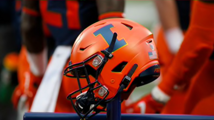
Looking at these two uniforms side by side is interesting because they aren't that different, yet they're different in all the ways that matter.All of the Lovie Era uniform combos were just awful, but the all-orange look - without a hint of white outline ANYWHERE to add an ounce of style - is actually hilarious looking back.
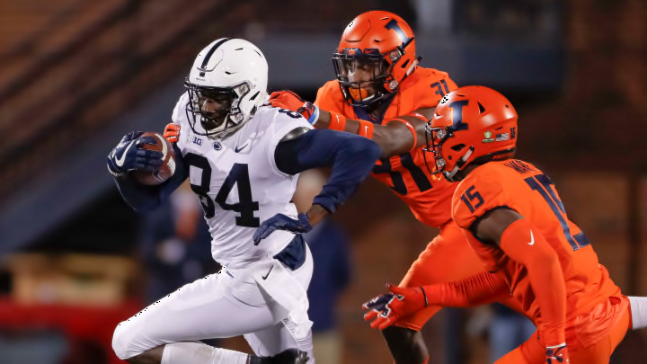

It's even funnier that we actually took the time to INCLUDE an outline around the navy Block I ... but that outline was (A) the same color as the helmet itself but (B) a different shade of that color.


Fighter of the Nightman
- Chicago, IL
Since our actual football team is unfortunately quite depressing right now ... I guess talking about uniforms is all there is left, lol! A lot of fans here have voiced the opinion that they would rather have a sleeve stripe design vs. the shoulder strip design we have, and I would probably be one of them. So, if you HAD to pick a non-shoulder-stripe-design option out of the other Big Ten schools (of course tailored to our colors and everything), who has the best replacement option?
Since I cannot post that many images and these are broad categories, I will try to eliminated some as options and group the others into "types."
Eliminated - Shoulder Stripe Design
Nebraska (new as of this year ... not a fan, lol)
UCLA (exact same as us)
USC
Eliminated - NO Stripe Design
Indiana
Michigan (technically have a very tiny design at the end of the sleeve on the away jersey)
Rutgers
Penn State
Eliminated - Too Unique
Oregon
1) Simple 2-Stripe Pattern
Wisconsin

2) Simple 3-Stripe Pattern
Washington
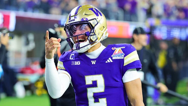
3) Slightly More Complicated 3-Stripe Pattern (Not All Stripes the Same Size and Gap)
Northwestern

Minnesota

Purdue

4) Three Stripes All Different Colors
Maryland

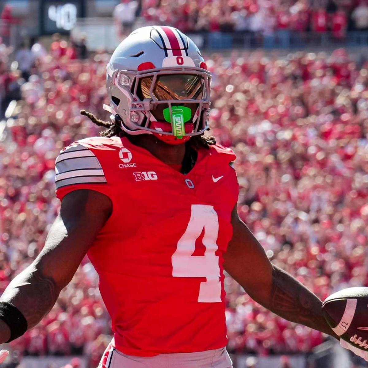
5) "Special" or "Complicated" Design (Would Need to Become Illini-Specific)
(The bar for "complicated" here is pretty much it's not the most plain, EA Team Builder-esque design you could easily replicate. )
Iowa

Michigan State (faint Greek Key design)

Ohio State
My thoughts would actually be pretty simple.
1) If someone actually came up with a cool "Illini-themed" design that only we would have and it was subtle and looked good ... I would obviously love that. Think like a faint version of our Grange Era Throwback design on the stomach but worked onto our sleeves:
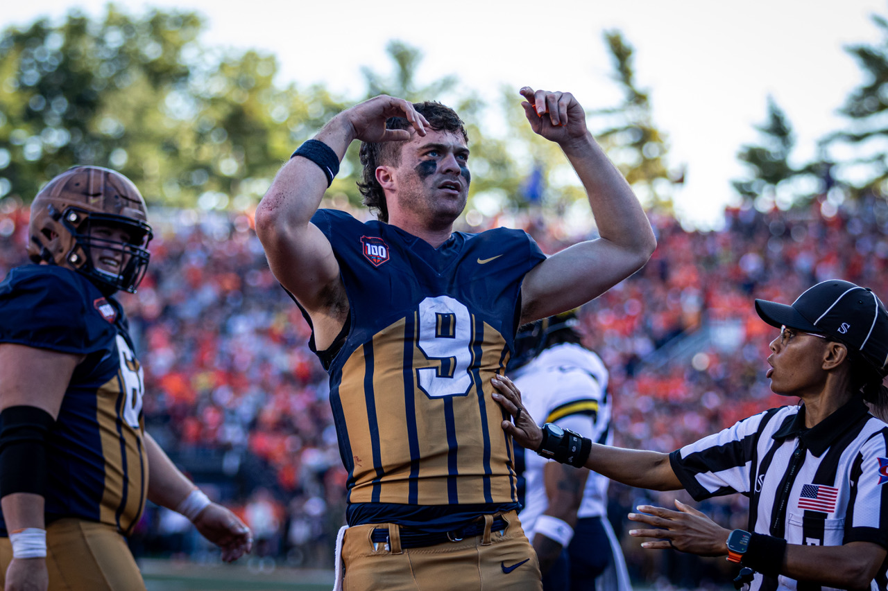
Just making it small enough to fit on the sleeve and changing the orange to our modern shade could look really cool and unique ... and then shift our white numbers currently on the sleeve up to the shoulders. We'd become the only team in the league besides MSU with something truly unique to us and memorable.
2) However, assuming that wouldn't happen for whatever reason, I think the Minnesota design specifically (with navy replacing maroon and orange replacing yellow) would work well with our uniforms. It's just a little more visually pleasing and less plain than what Washington has.
... I guess talking about uniforms is all there is left, lol! A lot of fans here have voiced the opinion that they would rather have a sleeve stripe design vs. the shoulder strip design we have, and I would probably be one of them. So, if you HAD to pick a non-shoulder-stripe-design option out of the other Big Ten schools (of course tailored to our colors and everything), who has the best replacement option?Since I cannot post that many images and these are broad categories, I will try to eliminated some as options and group the others into "types."
Eliminated - Shoulder Stripe Design
Nebraska (new as of this year ... not a fan, lol)
UCLA (exact same as us)
USC
Eliminated - NO Stripe Design
Indiana
Michigan (technically have a very tiny design at the end of the sleeve on the away jersey)
Rutgers
Penn State
Eliminated - Too Unique
Oregon
1) Simple 2-Stripe Pattern
Wisconsin
2) Simple 3-Stripe Pattern
Washington
3) Slightly More Complicated 3-Stripe Pattern (Not All Stripes the Same Size and Gap)
Northwestern
Minnesota
Purdue
4) Three Stripes All Different Colors
Maryland
5) "Special" or "Complicated" Design (Would Need to Become Illini-Specific)
(The bar for "complicated" here is pretty much it's not the most plain, EA Team Builder-esque design you could easily replicate.
)Iowa
Michigan State (faint Greek Key design)
Ohio State
My thoughts would actually be pretty simple.
1) If someone actually came up with a cool "Illini-themed" design that only we would have and it was subtle and looked good ... I would obviously love that. Think like a faint version of our Grange Era Throwback design on the stomach but worked onto our sleeves:
Just making it small enough to fit on the sleeve and changing the orange to our modern shade could look really cool and unique ... and then shift our white numbers currently on the sleeve up to the shoulders. We'd become the only team in the league besides MSU with something truly unique to us and memorable.
2) However, assuming that wouldn't happen for whatever reason, I think the Minnesota design specifically (with navy replacing maroon and orange replacing yellow) would work well with our uniforms. It's just a little more visually pleasing and less plain than what Washington has.
The Galloping Ghost

- Washington, DC
This has nothing to do with uniforms, but seeing that picture, man, it suddenly feels like we are a long way away from the absolute high and exhilaration of that game.
I've never been a real big fan of our shoulder stripe when they got introduced. I think these jerseys did the neck and sleeve stripes perfectly.Since our actual football team is unfortunately quite depressing right now
Since I cannot post that many images and these are broad categories, I will try to eliminated some as options and group the others into "types."
Eliminated - Shoulder Stripe Design
Nebraska (new as of this year ... not a fan, lol)
UCLA (exact same as us)
USC
Eliminated - NO Stripe Design
Indiana
Michigan (technically have a very tiny design at the end of the sleeve on the away jersey)
Rutgers
Penn State
Eliminated - Too Unique
Oregon
1) Simple 2-Stripe Pattern
Wisconsin
2) Simple 3-Stripe Pattern
Washington
3) Slightly More Complicated 3-Stripe Pattern (Not All Stripes the Same Size and Gap)
Northwestern
Minnesota
Purdue
4) Three Stripes All Different Colors
Maryland
5) "Special" or "Complicated" Design (Would Need to Become Illini-Specific)
(The bar for "complicated" here is pretty much it's not the most plain, EA Team Builder-esque design you could easily replicate.
Iowa
Michigan State (faint Greek Key design)
Ohio State
My thoughts would actually be pretty simple.
1) If someone actually came up with a cool "Illini-themed" design that only we would have and it was subtle and looked good ... I would obviously love that. Think like a faint version of our Grange Era Throwback design on the stomach but worked onto our sleeves:
Just making it small enough to fit on the sleeve and changing the orange to our modern shade could look really cool and unique ... and then shift our white numbers currently on the sleeve up to the shoulders. We'd become the only team in the league besides MSU with something truly unique to us and memorable.
2) However, assuming that wouldn't happen for whatever reason, I think the Minnesota design specifically (with navy replacing maroon and orange replacing yellow) would work well with our uniforms. It's just a little more visually pleasing and less plain than what Washington has.
Fighter of the Nightman
- Chicago, IL
... My thoughts would actually be pretty simple.
1) If someone actually came up with a cool "Illini-themed" design that only we would have and it was subtle and looked good ... I would obviously love that. Think like a faint version of our Grange Era Throwback design on the stomach but worked onto our sleeves:
Just making it small enough to fit on the sleeve and changing the orange to our modern shade could look really cool and unique ... and then shift our white numbers currently on the sleeve up to the shoulders. We'd become the only team in the league besides MSU with something truly unique to us and memorable...
I'm out of free images for the day and am apparently a bad communicator when it comes to Chat GPT.
However, if anyone wants to take this and run with it, I was trying to see what it would look like if we replaced any sleeve stripe pattern with a tailored version of that chest design on the 100th anniversary uniform. I gave Chat GPT this screenshot...... and asked if it could update the orange to match the rest of our uniform, put it on the sleeve of the player and then have the white number be on the sleeve rather than the shoulder. The final product before I ran out of images was moving in the right direction (compared to its first couple awful tries, lol...) but was not exactly it.
I'm super curious if having that unique Grange Era logo on our sleeves with the white number over it could look really, really cool. I would also be open to a ton of small changes, such as:
(1) Obviously putting a block number on the sleeve over the design, to echo the chest design of the Grange Era Throwback.
(2) Making the triangular stripes smaller than they are there here.
(3) Totally open to other, more subtle color combinations. For example, it might look cool for the stripes to just be a slightly different shade or texture of navy so that you can see them but that they are a bit more subtle ... somewhat similar to this chest stripe from the Beckman Era uniforms:
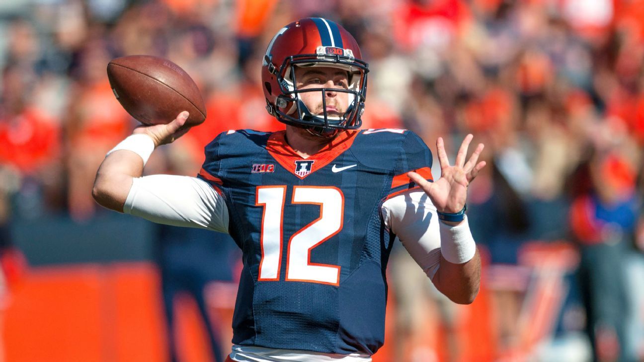
If we went that route, it might be cool to have the number in orange with a white outline just to add a little flair.
I hope someone more talented with graphic design and Chat GPT can do this! Haha.
mattcoldagelli

- Script Illinois Enthusiast
I'm not sure this would even be doable because the way sleeves are worn now anything along the bottom edge would just get vacuumed up into the shoulder pads.I've never been a real big fan of our shoulder stripe when they got introduced. I think these jerseys did the neck and sleeve stripes perfectly.
View attachment 51954
Fighter of the Nightman
- Chicago, IL
^^^ I'm turning into more of a Block I hater by the day (and I would not give it an "okay" designation, moving closer to objectively bad!), and my dislike for it intensifies with each passing week where we [ or insert people who pick the uniform combos ] treat it as if any helmet besides the Block I must justify its own use. In other words, Slant ILLINOIS might get an "Orange Out" and Navy Script might get the "Blue Out," but for any other given week the Block I will be the solidified choice unless there is some *argument* for why another helmet should be worn.
Of course, the only argument needed is that we should always look our best, and there are several options that are better than Block I. It shouldn't retain some "default" status just because reasons. If I obtained my dream side job of choosing Illini uniforms ... we'd rock this the rest of the year. Spoiler alert ... Block I gets the axe.
vs. Oregon - Use the simpler Veterans Day- / USA-themed helmet from two years ago for Military Appreciation Day ... the ones since then have been too busy.
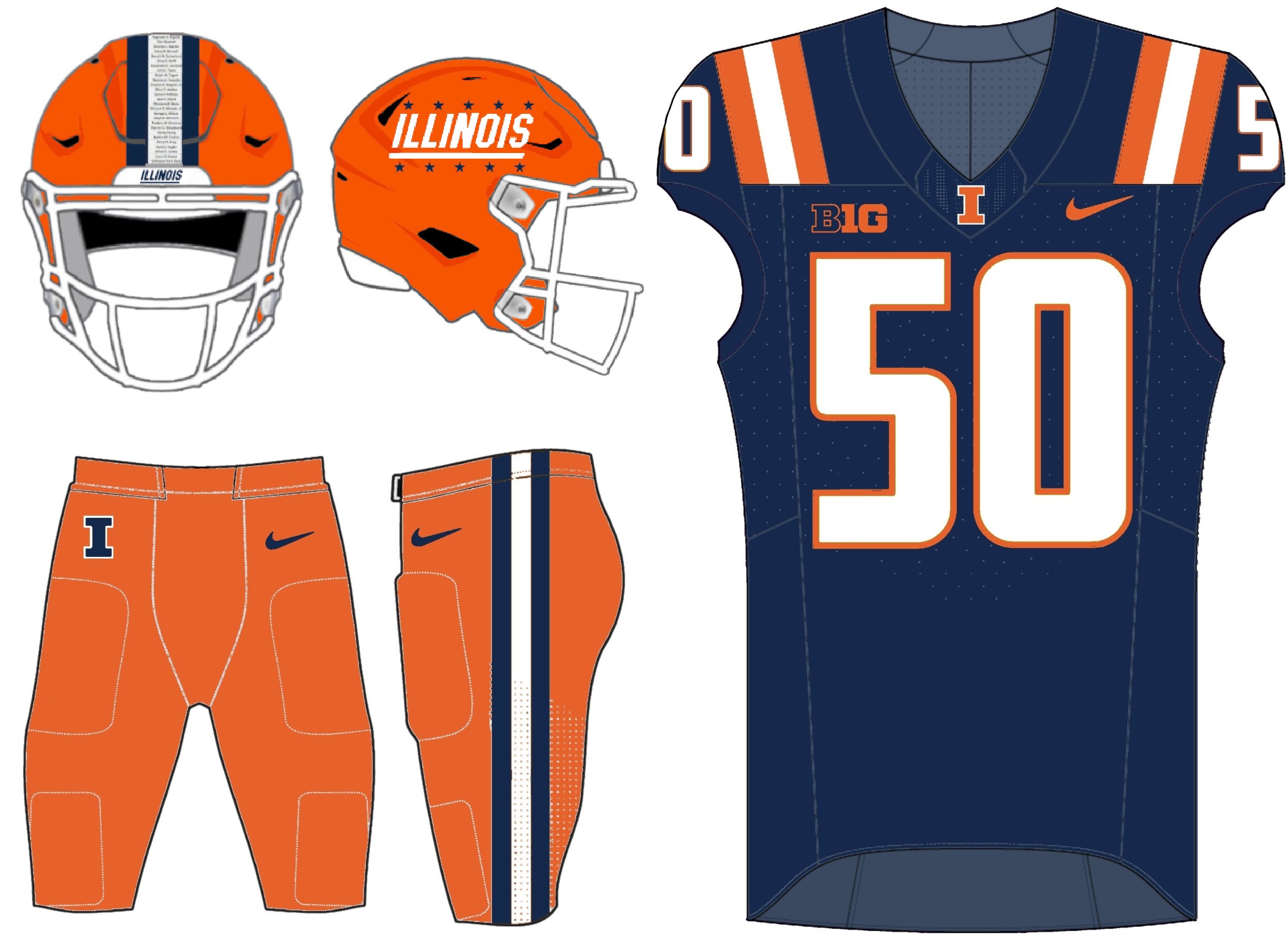
at Maryland - Whenever the staff is thinking about throwing the Block I in there, just resist the urge!
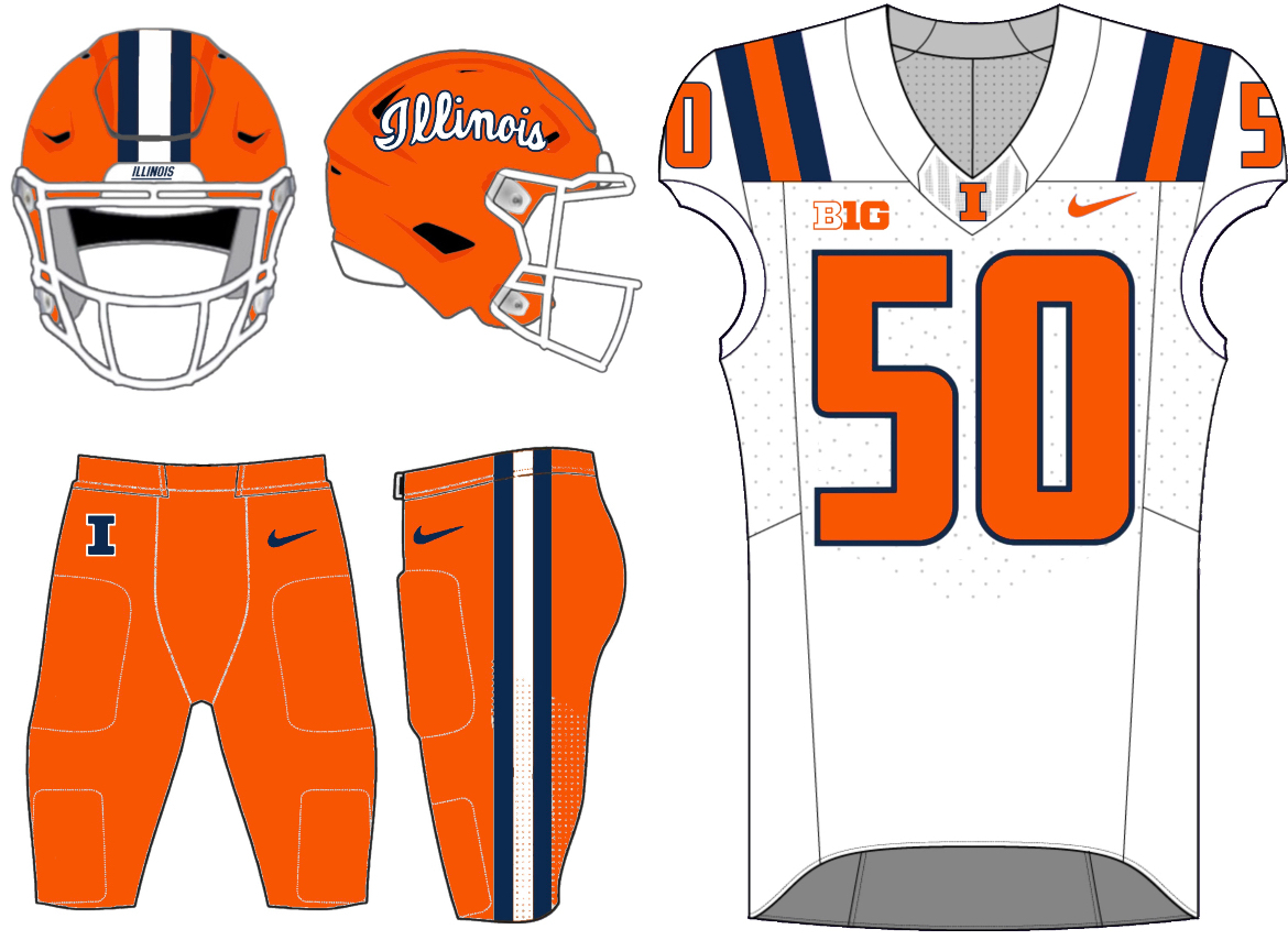
vs. Nebraska - Usually I would have busted out Arched ILLINI for Dads Day, but this is also apparently "Hail to the Blue Out."
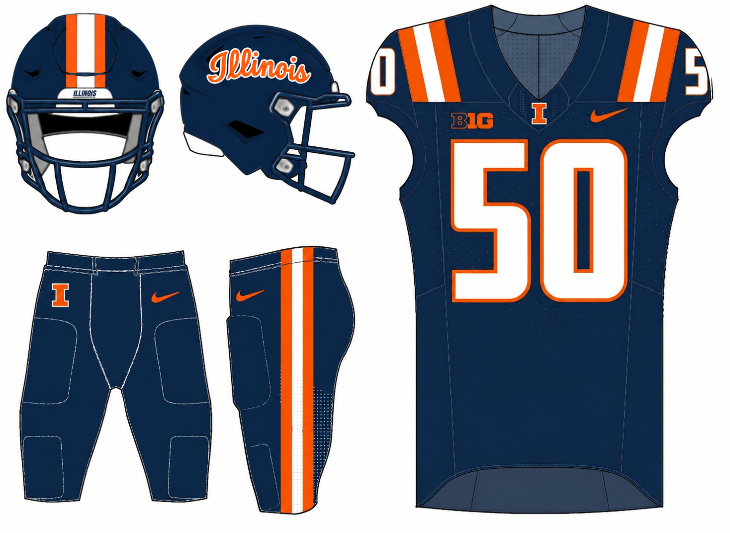
at UCLA - Pretty sure the last time we wore this combo for a big Friday night road game was when we won in Lincoln two years ago?
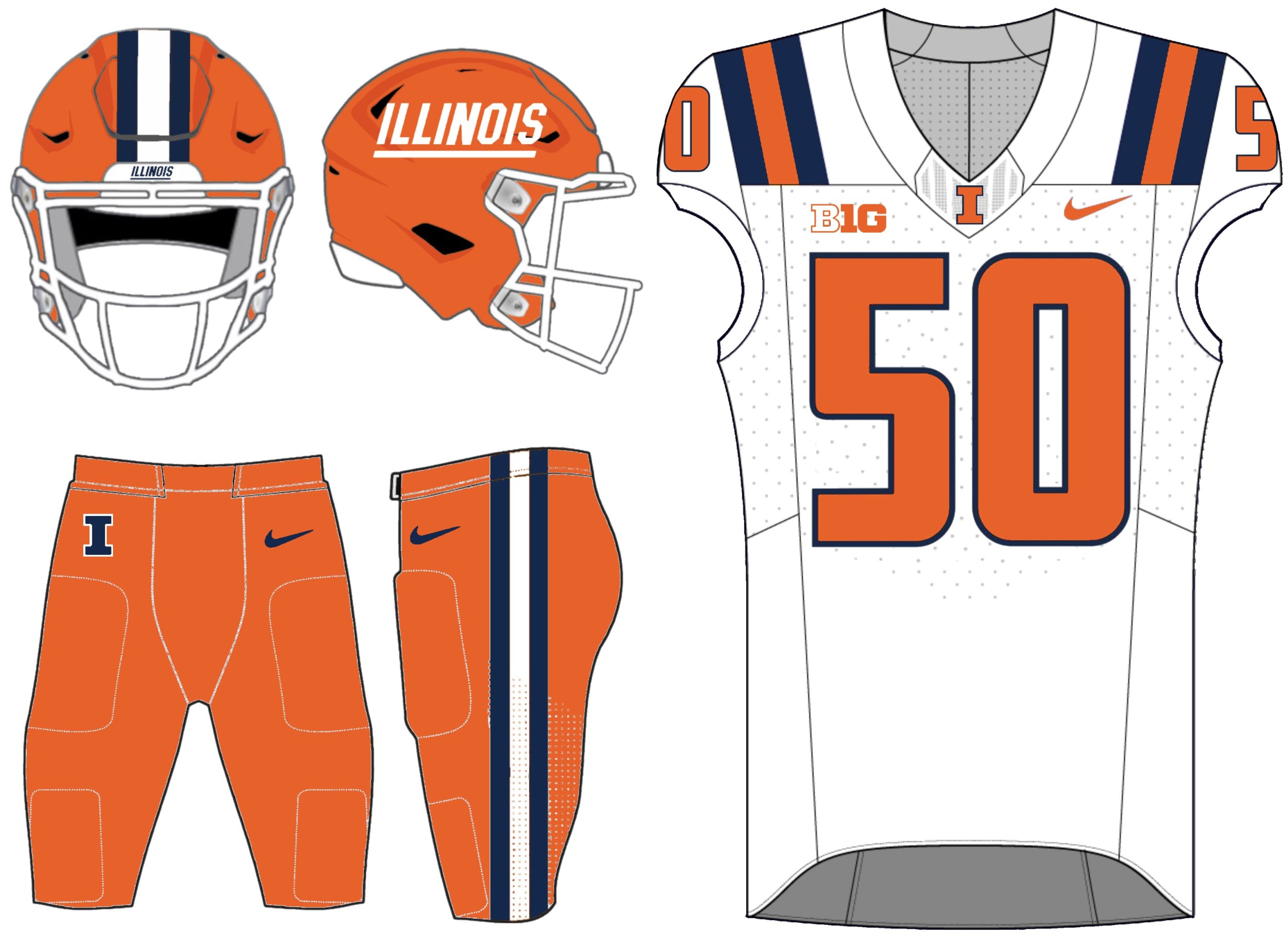
vs. Iowa - This should always be the uniform on Senior Day!
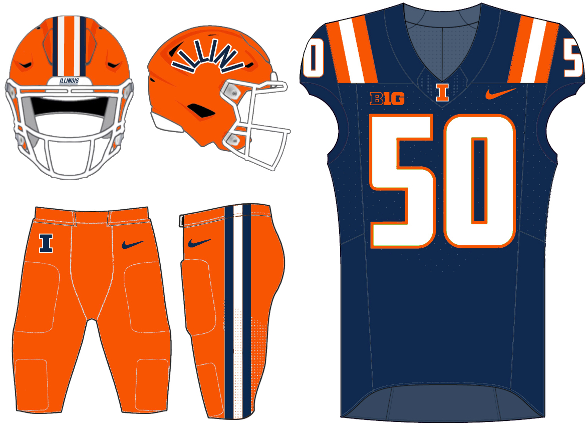
at Northwestern - For the love of God, Bret, just give us #BPOTR already.
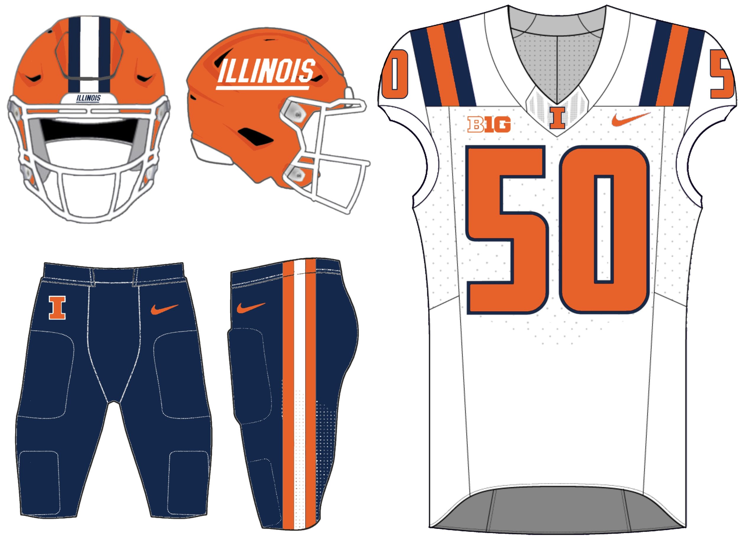
Bowl Game (I/A) - Totally open to a lot of different combos, but we should generally try to contrast with the other team's colors. Play Kentucky as the away team? Wear orange pants. Play Clemson as the away team? Wear navy pants. Some random thoughts:
1) We should never wear white pants on the road, period ... it's just a bad look, IMO. I'd favor wearing them at home when we wear an orange jersey, but the white pants on the road is just lame when you don't have a white helmet.
2) The Block I helmet just isn't better than any other "competitor" helmet it might go up against ... so there's no reason to wear it. It's as simple as that. The idea we "should" wear it because it's the default is so stupid I don't even know how to engage with that argument. Tons of iconic programs don't have their default logo on their helmets, and the Block I wasn't even EVER on our helmets until TIM BECKMAN was the coach ... that's the "tradition" to which we are clinging?!
3) While the Navy Script helmet looked surprisingly good, I would also be more than fine with wearing the Orange Script (with navy jerseys and navy pants) for any "Blue Out" games. An orange helmet, at this point, is very "engrained" in our program's history, and there isn't much reason to switch that up.
I'm sure we will not see a single one of these, but it's fun to day dream.
Of course, the only argument needed is that we should always look our best, and there are several options that are better than Block I. It shouldn't retain some "default" status just because reasons. If I obtained my dream side job of choosing Illini uniforms
... we'd rock this the rest of the year. Spoiler alert ... Block I gets the axe.vs. Oregon - Use the simpler Veterans Day- / USA-themed helmet from two years ago for Military Appreciation Day ... the ones since then have been too busy.
at Maryland - Whenever the staff is thinking about throwing the Block I in there, just resist the urge!
vs. Nebraska - Usually I would have busted out Arched ILLINI for Dads Day, but this is also apparently "Hail to the Blue Out."
at UCLA - Pretty sure the last time we wore this combo for a big Friday night road game was when we won in Lincoln two years ago?
vs. Iowa - This should always be the uniform on Senior Day!
at Northwestern - For the love of God, Bret, just give us #BPOTR already.
Bowl Game (I/A) - Totally open to a lot of different combos, but we should generally try to contrast with the other team's colors. Play Kentucky as the away team? Wear orange pants. Play Clemson as the away team? Wear navy pants. Some random thoughts:
1) We should never wear white pants on the road, period ... it's just a bad look, IMO. I'd favor wearing them at home when we wear an orange jersey, but the white pants on the road is just lame when you don't have a white helmet.
2) The Block I helmet just isn't better than any other "competitor" helmet it might go up against ... so there's no reason to wear it. It's as simple as that. The idea we "should" wear it because it's the default is so stupid I don't even know how to engage with that argument. Tons of iconic programs don't have their default logo on their helmets, and the Block I wasn't even EVER on our helmets until TIM BECKMAN was the coach ... that's the "tradition" to which we are clinging?!
3) While the Navy Script helmet looked surprisingly good, I would also be more than fine with wearing the Orange Script (with navy jerseys and navy pants) for any "Blue Out" games. An orange helmet, at this point, is very "engrained" in our program's history, and there isn't much reason to switch that up.
I'm sure we will not see a single one of these, but it's fun to day dream.
I like the arched ILLINI always used on senior day idea. I still think it’s our best helmet design by far. What if we put an ‘I’ behind it somehow?^^^ I'm turning into more of a Block I hater by the day (and I would not give it an "okay" designation, moving closer to objectively bad!), and my dislike for it intensifies with each passing week where we [ or insert people who pick the uniform combos ] treat it as if any helmet besides the Block I must justify its own use. In other words, Slant ILLINOIS might get an "Orange Out" and Navy Script might get the "Blue Out," but for any other given week the Block I will be the solidified choice unless there is some *argument* for why another helmet should be worn.
Of course, the only argument needed is that we should always look our best, and there are several options that are better than Block I. It shouldn't retain some "default" status just because reasons. If I obtained my dream side job of choosing Illini uniforms
vs. Oregon - Use the simpler Veterans Day- / USA-themed helmet from two years ago for Military Appreciation Day ... the ones since then have been too busy.
View attachment 52009
at Maryland - Whenever the staff is thinking about throwing the Block I in there, just resist the urge!
View attachment 52013
vs. Nebraska - Usually I would have busted out Arched ILLINI for Dads Day, but this is also apparently "Hail to the Blue Out."
View attachment 52010
at UCLA - Pretty sure the last time we wore this combo for a big Friday night road game was when we won in Lincoln two years ago?
View attachment 52014
vs. Iowa - This should always be the uniform on Senior Day!
View attachment 52011
at Northwestern - For the love of God, Bret, just give us #BPOTR already.
View attachment 52012
Bowl Game (I/A) - Totally open to a lot of different combos, but we should generally try to contrast with the other team's colors. Play Kentucky as the away team? Wear orange pants. Play Clemson as the away team? Wear navy pants. Some random thoughts:
1) We should never wear white pants on the road, period ... it's just a bad look, IMO. I'd favor wearing them at home when we wear an orange jersey, but the white pants on the road is just lame when you don't have a white helmet.
2) The Block I helmet just isn't better than any other "competitor" helmet it might go up against ... so there's no reason to wear it. It's as simple as that. The idea we "should" wear it because it's the default is so stupid I don't even know how to engage with that argument. Tons of iconic programs don't have their default logo on their helmets, and the Block I wasn't even EVER on our helmets until TIM BECKMAN was the coach ... that's the "tradition" to which we are clinging?!
3) While the Navy Script helmet looked surprisingly good, I would also be more than fine with wearing the Orange Script (with navy jerseys and navy pants) for any "Blue Out" games. An orange helmet, at this point, is very "engrained" in our program's history, and there isn't much reason to switch that up.
I'm sure we will not see a single one of these, but it's fun to day dream.
mattcoldagelli
- Script Illinois Enthusiast
2) The Block I helmet just isn't better than any other "competitor" helmet it might go up against ... so there's no reason to wear it. It's as simple as that. The idea we "should" wear it because it's the default is so stupid I don't even know how to engage with that argument. Tons of iconic programs don't have their default logo on their helmets, and the Block I wasn't even EVER on our helmets until TIM BECKMAN was the coach ... that's the "tradition" to which we are clinging?!
