redwingillini11
White and Sixth
- North Aurora
Nope! Throwback whites.Watch us wear our terrible whites tonight.
Nope! Throwback whites.Watch us wear our terrible whites tonight.
I know I’m a broken record, but HOLY moly are the Scripts infinitely superior to our regular whites. A beatdown of Michigan is always fun no matter what, but looking great while doing it is a nice cherry on top.Nope! Throwback whites.

PREACH!! Take my money!!And on a somewhat related note, can someone please make the half-zips the coaches are wearing tonight available for sale to the general public? I would part with my money in record time if I could by this white one with the script Illinois at Gameday or on the FightingIllini.com store.
While we can debate the pros and cons of coaches in suits vs more casual, what is not in dispute for me is that the Illini staff have had a number of great half-zips this season.
The only gray ones I remember had WHITE font with an orange outline (i.e., no navy), and it just looked awkward and like we were trying to be Tennessee.I know it's probably not a popular opinion, but I really liked those gray with blue lettering jersey's from a few years back.
Only thing I didn't like was the two tone team name lettering. Other than that they were a good set.View attachment 31116
These are probably my favorite uniforms we’ve had, other than the throwbacks, in my life time (born in ‘97). I always thought the orange and blue really popped on them and I really loved the ILLINI word mark as well. Only thing I didn’t like was how baggy the shorts were, unfortunately that was a product of the time.
I think it worked well on the whites, however I’m glad they went with solid lettering on the orange and blue sets.Only thing I didn't like was the two tone team name lettering. Other than that they were a good set.
EDIT: Found 'em.The only gray ones I remember had WHITE font with an orange outline (i.e., no navy), and it just looked awkward and like we were trying to be Tennessee.
/cdn.vox-cdn.com/uploads/chorus_image/image/55872153/usa_today_9139286.0.jpg)
They were awful when they rolled them out, and they are still awful today.EDIT: Found 'em.
It's crazy that regardless of the era or variation of the uniform, the longer I look at the slant 1LL1NO1S font, the more I hate it.
EDIT: Found 'em.
It's crazy that regardless of the era or variation of the uniform, the longer I look at the slant 1LL1NO1S font, the more I hate it.

I will say this ... if it's going to be boring, it better be classic. There is nothing "creative" about our Flyin' Illini jersey font ... but it's classic. The jersey Paul is wearing there (if you remove the two-tone) has at least a SOMEWHAT classic font, and putting "ILLINI" instead of "ILLINOIS" comes across as much more in tune with our history.Only thing I didn't like was the two tone team name lettering. Other than that they were a good set.
Man, that's like an old video of yourself doing the macarena. Sure it was popular at the time, but you still should've known betterEDIT: Found 'em.
It's crazy that regardless of the era or variation of the uniform, the longer I look at the slant 1LL1NO1S font, the more I hate it.

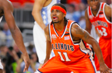
100%. The orange version of the default uni's worn last night are downright hideous, imo. Almost embarrassingly ugly on tv. The standard home white version is much easier on the eyes but would still like to see them all go away. Curious, when was the last time they wore the all navy w orange lettering (no white)?. That was a much better uni in this current style.Of all three of our crappy and boring default regular uniforms…
1. Navy
2. White
3. Orange
Nike, I beg you, just make us throwbacks in all three colors. Literally everyone would be financially and mentally better off.
The wore them ONE TIME this season - at home early on in the non-conference. I as well like them more than the default orange.100%. The orange version of the default uni's worn last night are downright hideous, imo. Almost embarrassingly ugly on tv. The standard home white version is much easier on the eyes but would still like to see them all go away. Curious, when was the last time they wore the all navy w orange lettering (no white)?. That was a much better uni in this current style.
For whatever reason, there’s a trend of bad luck when wearing our blue uniforms. However, we’ve won at Wisconsin wearing them the past few years so I’m assuming we will wear them again when we play at Madison. They’re also my favorite of our current modern set.The wore them ONE TIME this season - at home early on in the non-conference. I as well like them more than the default orange.
You've won me over, haha. I would be ecstatic with the Flyin' Illini set in white, orange and navy. Then, the Script can be our "big game" white uniform, and a 2005 throwback can be our orange throwback.My perfect world uniform-wise would use the same system we have currently with a 3 colorway primary set, an orange throwback, and a white throwback. Uniforms themselves would be Flying Illini in orange, white, and blue as our primary set, keep the script as our white throwback, and the 2005 jerseys as our orange throwback.
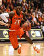
The current orange throwback has some pretty noticeable differences in the scaling and proportions from the original version from the 80s and 90s if you look at them side by side, but I think those small changes were all for the better. It really modernized the look to the point where the orange throwback barely looks like a throwback. It's the easiest route to the timeless and classic look that most of us are looking for out of our jerseys. As for these instead of the scripts as our main jersey set like others have suggested, I love the scripts, but as another comment mentioned earlier in the thread, the script is a trend right now and it may not last, so doing a full jersey rebrand off of the script may not be the best move forward. I think they'd lose a lot of what makes them so special if just made it our main jersey set with all three colors. With these uniforms, we honestly wouldn't need an orange throwback, but assuming the program likes the current system we have with a white and orange throwback, I'd want to go with the 2005 jerseys. They're not my favorite design overall, but the legacy they're tied to is undeniable. The only other good option would be an orange script jersey, and while it would look cool, I like the throwbacks being unique to each other.
/cdn.vox-cdn.com/uploads/chorus_image/image/57656345/usa_today_10419748.0.jpg)

This is exactly what I would love to see.You've won me over, haha. I would be ecstatic with the Flyin' Illini set in white, orange and navy. Then, the Script can be our "big game" white uniform, and a 2005 throwback can be our orange throwback.
And I definitely agree that the way they touched up the modern version of the Flyin' Illini jerseys looks really crisp and clean. Even just compare it to the white throwback we had a few years before:
It looks like the numbers are slightly less blocky, and the spacing is less jammed. I'd love to see the white version touched up a bit and become the default home, and I think a navy version would be awesome.
Between offering our throwbacks in all three colors to making Brad's script pullover available for sale, Nike and the DIA seem to be trying really hard to NOT accept all of our fans' money...This is exactly what I would love to see.
I'd also buy the updated white Fighting Illini jersey the second it goes on sale.
 . I REALLY hope they honor that awesome team with the respect they deserve & do a tribute throwback.