Illinois Football Uniforms

Status
Not open for further replies.
#226      
^ I actually really liked those, and all my Iowa friends were saying that we had pretty cool jerseys during that game.

Speaking of that game ... ouch. Was really fun for about three quarters!
 
#227      

ILL in IA

Iowa City
Regarding the often talked about zig zags....I think it is a cool look, that wasn't used the right way. It was featured in a big way when it should have been a small detail. It was a cool look when the zig zag was the waistband of the basketball shorts. Not sure where that fits in the football uniform. Maybe in the neckline, or not used at all in football.
 
#228      
So it was 2006 that Oregon first introduced the "all of our colors in each element of the uniform so we can mix and match and never wear the same thing twice" mode of college football uniforms.

Not sure if I'm alone in this, but by now it seems completely played out to me. Everyone does it. MAC schools do it. Even some high schools do it. It's been done to death. It is not remotely cool and unique anymore, it's the conventional wisdom that the cool and unique rebel from

That got me to thinking about this picture:

DgpXQ81W4AENwdB.jpg:small


Football helmets are very different than they used to be. When I was a lad, this was a football helmet

51CZT5YZBAL.jpg


A big, round, blank, uniform space that practically demanded some sort of adornment. Now because of the various technologies being worked into helmets for concussion-prevention purposes there are all kinds of holes and seams and irregularities. And on any given team there are a variety of different helmet styles for different players. We are not the only football team with "where to you put the decal?" problems arising from that. So what if you were designing a football helmet based on the realities of the modern canvas, so to speak?

One helmet I always thought was a classic was the mirror chrome finish ones Oregon wore for the 2012 Rose Bowl

120102FB-RoseBowl-1653.jpg


Being able to see the crowd and the sky and the other players in the reflection of the helmet, just spectacular.

Chrome helmets are kind of a fad these days, often with sort of a dulled finish that doesn't have the same reflectivity, but you can get that sort of effect with a colored shell as well:

13-copy-31.jpg


Again, you can recognize the stadium in the helmet! And with the elements, it's just an incredibly cool image, IMO.

But of course all of these are very inside the box of conventional helmet design. Just taking what you already have and making it chrome, sticking shiny versions of the decals you already have, etc. And it will be the matte version next week, and the gray-out the week after, etc etc. Done to death, as I said.

What if that mirrored chrome, the reflection of the surroundings, was the central design element around which the whole thing was built? Picture a helmet like that Washington one, with an orange color effect rather than gold, but with no stripe, no decals, no contrasting facemask, just an orange mirror.

Stick with that every week and it's never the same. The opponents are different, the stadiums are different, the weather is different, the time of day is different, every picture you see is completely one-of-a-kind. And you pick up a lot more in the reflection without the graphics stuff breaking it up.

To me, that's pushing things forward, not just going along with the crowd.

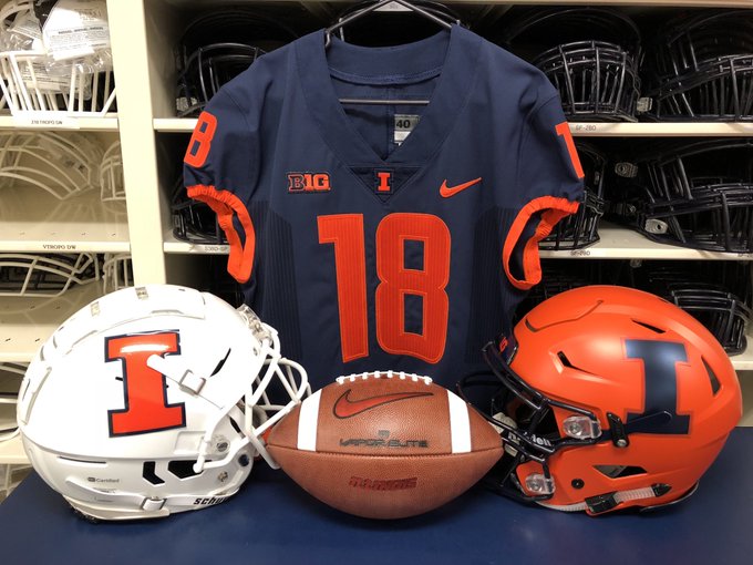
Another trend that is done absolutely to death is schools always foregrounding their most bright, garish color, in their uniforms and their student sections and fan wear. Illinois got its money's worth there, we were better at this trend than most, but nostalgia for the design sensibility of the 70's and 80's is out, and 90's nostalgia is in, big time. If Illinois wants to be ahead of the curve we've gotta pivot to navy blue.

b392d3d9d0aa30b47e807f0f8ccbefc7.jpg
nov-1995-quarterback-johnny-johnson-of-the-illinois-fighting-illini-picture-id229876
1126_spor_UI_NW945.jpg


That, with an unadorned orange mirror chrome helmet. Make the trends, rather than follow them.
 
#230      

BZuppke

Plainfield
I know we had a white helmet with a silver I. Anyone remember this?
 
#235      
BZuppke, I think you might be remembering this game --- but we were wearing the 'regular' white lids rather than the ones yo
illini.jpg
u are referring to.
 
#240      

DrewD007

Woodridge, IL
I just can’t get behind an Illini uniform that has no orange whatsoever.

Now that we’re talking about it, I wonder if they’ll have a new gray ghost uniform this year.
 
#242      

DrewD007

Woodridge, IL
illinifootball_uniforms_1000x1000_2gray_pose.jpg


I'm lukewarm on the whole Gray Ghost thing, but this is the best version of them IMO.

Whoops, definitely remember seeing those now. Don’t know how I forgot about them or maybe I just wanted to because of the lack of orange again.
 
#243      
Whoops, definitely remember seeing those now. Don’t know how I forgot about them or maybe I just wanted to because of the lack of orange again.
Well I think the whole point of the grey ghost unis is to capitalize on this weird trend of monochrome jerseys (albeit with a little blue thrown in there).

As a millennial, I think these are supposed to speak to me on an transcendental level. I like them, but they should only be worn one game a year (and I dont think they should be during homecoming).
 
#244      

dgcrow

Kelso, WA
Noooo, keep fighting the good fight!


And the oh-so-clever middle school art project at Washington State (which has only been around since 1995, I was shocked by that)

washington_state_football.png


Just stick with anything and it becomes iconic. The problem is that the Block I is too basic to be stuck to, even if the DIA made an effort. It's not that recruits on twitter announcing offers from us sometimes use the old slant Illinois logo, it's that it's every time. I have literally never seen the new block I used one single time. It's not a logo and it's never going to be a logo in the way that term refers to a versatile symbol that is recognizable and usable across contexts.
 
#246      

LeinieGuy

Will work for bourbon
Lexington, KY
We're both class of '92 (she was an Illini football recruiting assistant), and the wife and I agree: These uniforms are plain and ugly.
 
#247      

lstewart53x3

Scottsdale, Arizona
I’m out in Arizona (Scottsdale) and all my friends in their mid 20’s who I’ve shown our new uniforms to absolutely love them (many of whom are not ILLINI fans).
 
#248      
According to Washington State University website, that school's athletic logo was created by Randall Johnson in July, 1936, then modified slightly in 1959 when the school changed from a "college" to a "university":

https://news.wsu.edu/2007/02/22/cougar-logo-creator-dies-at-age-91/

Huh. That makes more sense, I swore I'd seen that earlier. This was my source for the claim:

http://www.sportslogos.net/logos/list_by_team/905/Washington_State_Cougars/

And they did used to have "Cougars" written in script on the helmet up to the Ryan Leaf days, so it's new as a helmet logo anyway.
 
#249      

As I said, the Block I will NEVER be able to stand on its own. It needs more to be recognizable so people are going to continue to reach outside the branding standards to jazz it up. The state outline thing is awful, but that or something like it is going to end up as the primary logo. The center cannot hold.

See the light folks :shield::shield::shield:
 
#250      

Deleted member 654622

D
Guest
As I said, the Block I will NEVER be able to stand on its own. It needs more to be recognizable so people are going to continue to reach outside the branding standards to jazz it up. The state outline thing is awful, but that or something like it is going to end up as the primary logo. The center cannot hold.

See the light folks :shield::shield::shield:

If I am allowed to "get out of my lane" here for a moment. But isn't the shield just a block I with some jazz around it?
 
Status
Not open for further replies.