Illinois Football Uniforms

Status
Not open for further replies.
#176      
The problem the shield has is that it can't coexist with the Block I. It's a primary logo, that's been clear from day 1. And so long as the Block I exists as part of the sports branding portfolio it gives safe harbor to those who want to connote the shield with youngness and anti-Chiefness and Mike Thomas and Nike and erasing tradition and all of that. You're always relying on culturally traditional football coaches as an architect of your brand identity, and when you give them a backward-looking option they're gonna take it.

What needs to happen is that the DIA needs to be willing to just take the plunge all the way. Leave the Block I for the academic side, get your ducks in a row so that the day you flip the switch whether it's the helmet logo, midfield, midcourt, the wardrobes of your coaches, wherever, it's all shield and no block I. Work with Google to make the image search up to date.

It will be odd for a year or two and then it will be the only thing anyone can ever remember, partially because people are sheep, but mostly because the shield is just an unbelievably elegant solution to the bazillion problems inherent in trying to create a visual identity for U of I. I am still amazed they pulled it off.
 
#177      

skyIdub

Winged Warrior
The problem with the shield is that it is a very nice small logo (on a shirt, sleeve, collar etc) that becomes a terrible logo when you blow it up. To put it mid court/field at that size it starts to look like the front of a steam locomotive or a spike. It doesn’t bring to mind anything relatable to the UofI until you put the Block “I” inside. I genuinely like the shield on the collar last year.

The “I” is the only logo that can transcend all eras and continue to be relatable across all sports. Like the M in scUM, the O in OhowihateOhiostate, etc....
 
#178      

Ransom Stoddard

Ordained Dudeist Priest
Bloomington, IL
The “I” is the only logo that can transcend all eras and continue to be relatable across all sports. Like the M in scUM, the O in OhowihateOhiostate, etc....

I regret that I have only one Like to give, and that reddit gold doesn't apply here.

I've got no issue with the shield, but we are :illinois:
 
#179      
The problem with the shield is that it is a very nice small logo (on a shirt, sleeve, collar etc) that becomes a terrible logo when you blow it up.

Disagree. The Illinois logo that is true of is the Chief logo which is a work of art in large scale but loses all of its detail when shrunken down. Not to mention the Block I which doesn't have anything to it to catch the eye at a larger size.

It doesn’t bring to mind anything relatable to the UofI until you put the Block “I” inside.

This is the wrong way to look at it. It's an "I", that's what makes it relatable to the U of I. There's the subtle "F" for "Fighting", and there's the columns thing, and it presents a certain vibe that's evocative of the campus and whatever but all of that is secondary. It's supposed to be simple and easy to identify in any context.

One of these is not like the others:

2e4585419c5ab23cd5c0927cd7b84145.jpg
8_TH_OUTLINE-B.jpg
university-of-arizona-wildcats-white.jpg
s-l300.jpg
il_340x270.1138367287_ou2b.jpg
images


The “I” is the only logo that can transcend all eras and continue to be relatable across all sports.

Never. You can't just make these disappear

175px-Illinois_Fighting_Illini_primary_logo_1947_-_1956.jpg
13631773b1e24052a0fd12e527f9f505.jpg


On the contrary, the unadorned Block I has basically no tradition as an Illinois logo whatsoever. It has always been considered to anonymous to be anything other than secondary. You will never, ever, ever, EVER kill slant Illinois as long as you try to cling to the Block I. Because it is so anonymous it demands further explanation, people will always reach for a use where it incorporates further information.


Like the M in scUM, the O in OhowihateOhiostate, etc....

Those are both terrible logos. Both suffer from the anonymity problem and the need for further information problem

Split+M+1990s.bmp
ohio_state_buckeyes_1987-2012_a.png


Everybody mixes up tradition with iconography. They are not the same. If we begin a dynasty of winning football under Lovie and a number of successors this year, we will all grow to love the new block I and it will become sacrosanct and synonymous with winning and tradition and pride and all of that. But it will still be a terrible logo and a brand identity that doesn't so much invite as mandate confusion and inconsistent usage.
 
Last edited:
#180      
Here's a good way to sum up the problem.

The Shield can do this:
1023-DEFAULT-m.jpg


The Block I turns into this:

bWYqsFq.jpg


And that's not even the worst of it, because as we've seen in this thread, apparently it's also brand-appropriate to put a blue I with an orange border on an orange background, and an orange I with a blue border against a blue background.
 
#181      

BZuppke

Plainfield
The problem with all of this is that what is a good logo is mostly in the eye of the beholder. Some hate/love the shield etc. I for one hate the slant Illinois (New York Giants copy) but it is significant to some because we had some great moments during its use. Have some great moments with the shield and it may become iconic for some. We know what our problem is: We have nothing to work from. I applaud them for coming up with the shield as it represents something we can rally around. Finally, I'm as ardent a chief fan as any, but the chief logo isn't coming back. Give it up. To say that you won't accept the shield because it means you have to concede the chief isn't coming back is, well, stupid.
 
#182      
Finally, I'm as ardent a chief fan as any, but the chief logo isn't coming back. Give it up. To say that you won't accept the shield because it means you have to concede the chief isn't coming back is, well, stupid.


My ultimate hope is that I someday get so rich i can influence the University so much they are forced to bring back the Chief. Would probably have to grease the NCAA and B1G too, but I would imagine a billion or two would go a long way. Thats my solution to the logo issues, and as always donations are welcome, I'm only approx. 2 billion away from my goal!
 
#183      

Ransom Stoddard

Ordained Dudeist Priest
Bloomington, IL
On the contrary, the unadorned Block I has basically no tradition as an Illinois logo whatsoever. It has always been considered to anonymous to be anything other than secondary.

I strongly disagree. And this isn't even the "real" Block I, but there's no way an orange I on a blue field, or v/v, is anything other than Illinois.

b615e249079b40c1a5f390209444d9a3.jpg
 
#184      

skyIdub

Winged Warrior
Exactamundo. Just like there’s little chance anyone mistakes a maize M on a blue background, or a red O on a grey background, or an orange F on a blue background, or a red W on a white background, or a crimson I on a cream background, or a crimson A on a white background, or a black MIZNOZ on a gold background.
If you follow major collegiate sports even moderately, this is easy.
The shield can coexist with the Block I. Countless programs have more than one logo. Choices. Who doesn’t like choices?
 
#185      
The problem with all of this is that what is a good logo is mostly in the eye of the beholder.

Aesthetics is in the eye of the beholder, true. Recognizability in any format and reproduceability across any context is not.

The new block I is a better looking logo than the old one with slant Illinois going across it, on that I would certainly agree. But that old logo, the Chief logo, and the Shield all have objective, desirable attributes that the new block I does not.

We know what our problem is: We have nothing to work from.

Yes. This doesn't matter per se, but I think it deserves amplifying. We have no mascot. We have a nickname that defies being anthropomorphized. We have a very excellent and very specific visual history that we are forbidden from meaningfully drawing from. Interlocking letters is out because Indiana has flooded the zone there. Stylizing a single letter a la Wisconsin is next to impossible when it's an I. They did the best they could with the new Block I.

The degree of difficulty was a 15 out of 10, and they absolutely nailed it. It's simple, it's obvious, it has nuance but it's not remotely overcomplicated, I was blown away the second I saw it.

And the way people perceive it as this flashy, trying-too-hard, gotta-bulldoze-tradition, lets-please-the-recruits thing drives me totally up a wall. I understand just as a matter of history and telling the story why people react to it like it's a picture of Mike Thomas' face (IMO it's that more than the Chief replacement angle, though there's some of both), but I absolutely money back guarantee that if they really went for it and left the block I behind, it would have a 100% approval rating in 3 years AND make the program more recognizable around the country. We're missing out on a tap-in here.
 
#186      
Exactamundo. Just like there’s little chance anyone mistakes a maize M on a blue background, or a red O on a grey background, or an orange F on a blue background, or a red W on a white background, or a crimson I on a cream background, or a crimson A on a white background, or a black MIZNOZ on a gold background.
If you follow major collegiate sports even moderately, this is easy.

No question.

1478296608053_3487413796509623812.450w.jpg
1477688711861_-3320544195126213537.450w.jpg


No one has any doubt that those are college sweaters and what team they are. Just the color and the letter, in the right format, is iconic.

But those aren't logos. There would be lots and lots of room for there to be an orange I on a blue sweater for a classic Sunday barbecue look. You wouldn't lose one iota of that by dropping it from official DIA use. Quite the opposite, you'd clarify it, you'd put it in its proper context. The Block I is misplaced as a primary athletic department logo, it's being stretched too thin.
 
Last edited:
#188      

mattcoldagelli

The Transfer Portal
I can understand people not liking the Shield for whatever reason.

I can understand that dislike leading one to prefer the Block I over the Shield.

I cannot understand anyone arguing that the Block I is a good logo in its own right. It is definitionally boring. It’s an eyesore on a helmet. It looks terrible on any and all apparel, non-golf polo division. It delivers on zero of the attributes you would want a logo to deliver on, as S&C has detailed at length.
 
#190      
The shield is bad. It is a shoehorned, meaningless, ugly design that was, from what i can tell, created only to check the "secondary logo" box on the Nike branding rollout. It is as silly as the other checked boxes of that redesign, like our eye-gouging two-toned font and grey uniforms. The same secondary logo, font with meaning, and alternate uniform color are checked boxes in all of the other Nike redesigns of the period. The branding standards resulting from that redesign are about as useless, which is why you won't see the white block I from the grid above used anywhere.

The outline of the helmet decal is, my guess, the result of another idiotic Nike-led design process that decided the current primary logo should be used, but the color white should be avoided in the uniforms as part of the two-tone-only, excessively simple look we have now. I am not sure why the decals have any outline at all, other than to use the outlined/curvy block I.

The university clearly feels much differently about the block I than those here - making it the primary logo for the university to, "take advantage of the instant global recognition that the block “I” enjoys".
 
#191      
The shield...was, from what i can tell, created only to check the "secondary logo" box on the Nike branding rollout....The same secondary logo, font with meaning, and alternate uniform color are checked boxes in all of the other Nike redesigns of the period.

This is undoubtedly true. And the font is meh, the two-tone is ugly and too-clever-by-half, and the gray is painfully 2014. Then they got onto the logo piece of their paint-by-numbers approach hit it completely out of the park. It's not about the process, it's about the results.

The branding standards resulting from that redesign are about as useless, which is why you won't see the white block I from the grid above used anywhere.

Yeah, it definitely doesn't quite look right and seems unnecessary. Even if it's in the official branding standards I'd agree that it seems unlikely that they'd use the white I anywhere conspicu....
images


Oh.

The outline of the helmet decal is, my guess, the result of another idiotic Nike-led design process that decided the current primary logo should be used, but the color white should be avoided in the uniforms as part of the two-tone-only, excessively simple look we have now. I am not sure why the decals have any outline at all, other than to use the outlined/curvy block I.

They don't have to! The branding standards clearly indicate that a one-color version exists, essentially with the border and the I merging into the same color. That indicates to me that this border nonsense came from in-house, but who knows.

The university clearly feels much differently about the block I than those here - making it the primary logo for the university to, "take advantage of the instant global recognition that the block “I” enjoys".

Most schools don't use the same logo for the academic side and the athletic side, as the use cases are super different. IMO the new block I makes perfect sense as the academic side's logo, and that usage would be enhanced by getting it off of football helmets and tailgate accessories and Rivals.com pages.

And by the way, aesthetics are in the eye of the beholder, yes, but I do object to words like "meaningless" and not "relatable" and all that.

Foellinger.jpg
union.jpg
hallene_gateway2_480x360.jpg
front.jpg


Some people just naturally gag on the "oh we took flourishes of inspiration from iconic local sources to design this new lampshade" type stuff, and I'm usually one of them, but it's there, you have to admit it's there. U of I doesn't have the world's most unique college campus architecture by any means, but you think about how those MS columns so literally signify the origin of the name "Fighting Illini" and the reverence the school still has for guys like Grange and Dike Eddleman in a way most schools don't and the visual cues of that time period, it's just there. Two absolute truths are that you stand almost no chance of doing this in a different way without being so Poochie you want to gouge your eyes out and that you couldn't just transport the Shield concept to UCLA or Boston College or any old school. It's amazing they were able to do what they did with such clarity and simplicity.

I gotta shut up about this now, so I'll just close with a couple points.

1. If it were up to me we'd stick with the Chief logo. Let the Chief performance rest in the past, and I don't want to open the whole political pandora's box, but just as a matter of full disclosure, my love for the Shield does not totally blind me. But of course we can't and that's crying over spilled milk.
2. The center ain't gonna hold on the Block I. When it's 2028 and recruits are still using 2003 logos (and they will), change will come. We'll end up in one of four directions:
- Some awful new mascot logo. May I be six feet under before we see the day. I'm saying I'll shut up but one of you is gonna bring up the stupid doughboy thing and make me yell at you.
- The Shield
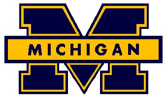
- A reboot of the slant Illinois concept. You could throw the new font in front of a slightly rejiggered block I and it could accomplish the same stuff the Shield does and be basically no different than those Michigan and OSU logos. Problem solved in the blah-est manner possible.
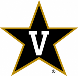
- Some spin on the old Nike Circle I idea. Which was fine. Think Vandy
Vanderbilt-Commodores-Star-V-e1433364270769.png


Again, fine. Blah.

Those are your choices. Don't pretend you've got choices you don't have.

(PS: Don't think I haven't considered that being the most obnoxious pain in the *** poster on this influential message board with the Shield as my avatar might be.....a risk. A chance I'll take :thumb:)
 
Last edited:
#192      

mattcoldagelli

The Transfer Portal
It is as silly as the other checked boxes of that redesign, like our eye-gouging two-toned font and grey uniforms. The same secondary logo, font with meaning, and alternate uniform color are checked boxes in all of the other Nike redesigns of the period

Again, people have made arguments as to why the Shield doesn’t do it for them aesthetically, which is fine. But LOTS of people are giving the game away that the Shield is just their proxy for whining about how things change, how Nike didn’t treat us like special snowflakes, or some combination of the two.
 
#194      

Serious Late

Peoria via Denver via Ann Arbor via Albuquerque vi
I don't mind the clear over-the-top exaggeration of an opinion to highlight an appreciation for the Shield logo. I do take a bit of umbrage with the comment "those who want to connote the shield with youngness and anti-Chiefness and Mike Thomas and Nike and erasing tradition and all of that."

I could be wrong, but that isn't the primary complaint around the Shield. I was very excited for a new, fresh secondary logo. I bought a shield shirt my first time back in C-U after it was unveiled. But from day 1, I have felt a complete dissatisfaction that unfortunately has not gone away. My first thought was that it looked like a generic logo generated by the local Wal-Mart that didn't have a license to sell official merch. I legitimately hoped it would pass, but the distaste for the logo has actually grown. I do like it as a mini symbol on the collar of the football jerseys, but is that a compliment to say you only appreciate it when it is borderline indistinguishable?

End of the day, I definitely think it is a possibility that no real good solution exists outside acceptance. A secondary logo is a good idea, and borderline essential. You can't just keep trying over and over hoping to find something eventually that hits a vast majority of the public. I suspect if the Shield doesn't continue to gain momentum, then a mascot is the next approach to the issue. That isn't going to help the overall unification of Illini nation.

However, having said that, I can't just say that no real good solution means I can fall in line and push the current option. The current generic shield logo underwhelms now, and until a team wins big with it as a primary logo, will underwhelm long term.

I suppose the only real solution is to incorporate the shield logo into a well designed jersey worn by an iconic team. 😁

Absent that, I am debating whether I would prefer 1) forcing myself to find love in the shield, 2) fight for block I exclusive, 3) grit teeth through another re-brand or 4) embrace the idea of a mascot.

I am uncomfortably close to siding with the idea of #4...
 
#195      

skyIdub

Winged Warrior
I really enjoy all of these points, honestly. I also don’t disagree that the Block I is not a “logo” in the sense that the shield or Chief are.
But the shield on the helmet is so much worse than the “I”, it’s beyond civil discussion. It is akin to the ridiculous Purdue helmet from a few years ago.

http://saturdaytradition.com/wp-content/uploads/2016/04/DSC1968_FullRes.jpg

Guess what’s on their helmet now? Correct.
Case closed.
 
#196      
The font is meh, the two-tone is ugly and too-clever-by-half, and the gray is painfully 2014. Then they got onto the logo piece of their paint-by-numbers approach hit it completely out of the park. It's not about the process, it's about the results.

Yeah, it definitely doesn't quite look right and seems unnecessary. Even if it's in the official branding standards I'd agree that it seems unlikely that they'd use the white I anywhere conspicu....

One bad use of the block I on the helmets has given way to another. The white block I sees significantly less use than other colors across all of athletics. That's important, maybe, when considering how a logo is tied to the identity of a school. My point is maybe better stated that the color-switching of the 2014 rebrand is dumb and bad - the white block I isn't showing up next to Illinois on ESPN broadcasts, ever.

Most schools don't use the same logo for the academic side and the athletic side, as the use cases are super different.

This article I found says that isn't totally true and is becoming less true. Maybe Michigan, Ohio State, Oregon, Washington, and Oklahoma don't understand that the use cases are super different

Two absolute truths are that you stand almost no chance of doing this in a different way without being so Poochie you want to gouge your eyes out and that you couldn't just transport the Shield concept to UCLA or Boston College or any old school

I like the columns too, but this is silly. The inspiration is not apparent in the result, and lest you let us forget, it's about results

(PS: Don't think I haven't considered that being the most obnoxious pain in the *** poster on this influential message board with the Shield as my avatar might be.....a risk. A chance I'll take :thumb:)

Don't think I haven't considered that your behavior is unrelated to the shield being bad
 
#197      

mattcoldagelli

The Transfer Portal
Guess what’s on their helmet now? Correct.
Case closed

Their stylized “P” that’s a well-functioning logo? Yeah, the case is closed, just not the one you think.

(Also, that train logo has very little in common with the Shield- it’s overdetailed, never been used in any other uniform capacity, needlessly contains the full word “Purdue”, etc.)
 
#198      

skyIdub

Winged Warrior
Their stylized “P” that’s a well-functioning logo? Yeah, the case is closed, just not the one you think.

(Also, that train logo has very little in common with the Shield- it’s overdetailed, never been used in any other uniform capacity, needlessly contains the full word “Purdue”, etc.)

I didn’t say “Their stylized “PT “that’s a well-functioning logo”, I am saying it’s light years better than that train wreck. Same as the Block I is light years better....on the helmet....than the shield.

Case closed. Triple stamped it, no erasies, touch blue make it true! :ROFLMAO:
 
#199      

Deleted member 631370

D
Guest
The Shield logo is great......for a superhero character. But for an athletic program? No. On a football helmet or at midfield or midcourt, that logo would be embarrassing.

Ultimately though, I couldn't really care less. Alabama's A logo, Tennessee's T logo, Michigan's M........none of those are remarkable, and frankly, they're all quite boring. But they're iconic because people associate those logos with long traditions of winning.

Branding becomes a whole lot easier when you have an attractive product to brand.
 
Status
Not open for further replies.