You are using an out of date browser. It may not display this or other websites correctly.
You should upgrade or use an alternative browser.
You should upgrade or use an alternative browser.
Illinois Football Uniforms
- Status
- Not open for further replies.
TheFlyingIllini1317
- Chicago, IL
Still hard for me not to be disappointed with the new uniforms. Maybe they will grow on my but they are in no way better than our last set. Our last set looked like Illinois, they had nice contrast, the colors worked well together, and if Lovie didn't like the shield the only thing to replace was the logo on the collar. I don't see why we couldn't have kept the last set and just replaced the color shield.
mattcoldagelli
- Script Illinois Enthusiast
I'll not hear of this blasphemy.Lovie didn't like the shield
Love the look of the new Navy lids. As long as those white ones (and the white pants) collect some dust I'm happy.
Deleted member 654622
D
Guest
Love the look of the new Navy lids..
I agree. I think the tops look good!
redwingillini11
White and Sixth
- Batavia
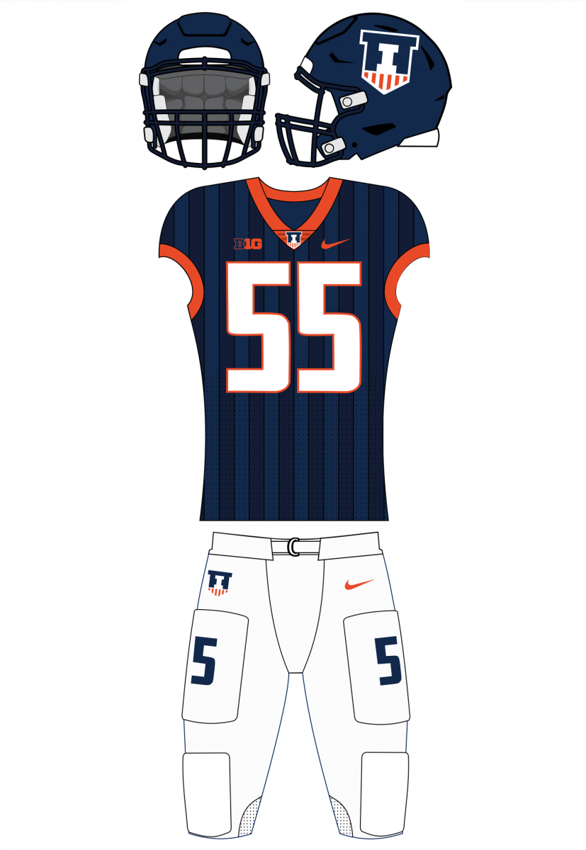
The new navy helmets are absolutely gorgeous.
I was happy when we got the old uniform set, because we were finally beyond a 10 year old basic Nike template, and because it was a unique look. However, I just think when you compare those to the rest of the college landscape, it was a really clunky looking uni set. The collar was too thick, the numbers were a bit thick when looking at the rest of the jersey, and the shield (imo) was also bulky. College football is moving in a more sleek direction, and thats certainly what we achieved with the new set.
I know the new set looks quite a bit Syracuse-esque. I said as much when I first saw the mock ups last summer. But on Saturday afternoons I'm not going to be thinking about Syracuse football when I see our boys play (It would maybe be different if we were copying a recognizable look from a big name program). I'm going to be thinking about Illinois football looking good, and hopefully playing better.
TheFlyingIllini1317
- Chicago, IL
Given everything I just said I do agree the navy helmets are sweet.
Illini_1979
- Oregon
What, no comment from Second and Chalmers about the placement of the I?First look at the new blue lids

DrewD007
- Woodridge, IL
Still hard for me not to be disappointed with the new uniforms. Maybe they will grow on my but they are in no way better than our last set. Our last set looked like Illinois, they had nice contrast, the colors worked well together, and if Lovie didn't like the shield the only thing to replace was the logo on the collar. I don't see why we couldn't have kept the last set and just replaced the color shield.
I think the fact white isn’t used as an accent color is the main draw back of these, but they have grown on me since first being released.
So the orange helmets have a decal with an orange border, and the blue helmets have a decal with a blue border.....got it
I actually like the blue helmet tho. Would rather see it with the orange jersey and blue pants, while the orange helmet can go with the whites.
I actually like the blue helmet tho. Would rather see it with the orange jersey and blue pants, while the orange helmet can go with the whites.
Every time I start to talk myself into these new uniforms, I see a picture of the old ones and realize that while not terrible, they are an unquestionable downgrade :tsk:
I like the shield, but the shield on the helmet would instantly become one of the worst helmets in D1 football.
Jamal Milan disagrees
I'll give him the benefit of the doubt and say he was trying to recreate the Red Grange subtle striping effect our jerseys already had.
BananaShampoo
Captain 'Paign
- Phoenix, AZ
I clicked on the link. I think ours was the best looking one aside from Michigan, because, well, you can't mess up that uniform as long as you keep the awesome wolverine helmet design.Jamal Milan disagrees
I'll give him the benefit of the doubt and say he was trying to recreate the Red Grange subtle striping effect our jerseys already had.
Jamal Milan disagrees
I'll give him the benefit of the doubt and say he was trying to recreate the Red Grange subtle striping effect our jerseys already had.
While I really like Jamal Milan as a football player, I am glad he does not design our football uniforms.
Deleted member 654622
D
Guest
I clicked on the link. I think ours was the best looking one aside from Michigan, because, well, you can't mess up that uniform as long as you keep the awesome wolverine helmet design.
I really think the Michigan State helmets look pretty cool in that.
Someday Team Shield is going to force you all to see the light.
I really think the Michigan State helmets look pretty cool in that.
What link are u guys referring to?
Deleted member 654622
D
Guest
The blue writing "Jamal Milan disagrees" that is at the top left of the team shield nightmare uniformsWhat link are u guys referring to?
Deleted member 631370
D
Guest
I clicked on the link. I think ours was the best looking one aside from Michigan, because, well, you can't mess up that uniform as long as you keep the awesome wolverine helmet design.
Some of those are utter abominations. Maryland is already getting too cute with their uniforms, and their design is atrocious. Inverting the maize and blue color scheme on the Michigan helmet is painful. The NW uniform is just awful. Awful.
On the flip side, the Minnesota uniform is pretty cool. Very cartoonish, but at least they're having fun with the gopher. And kudos to Nebraska for sticking to their tradition -- unlike Penn State's design which would almost certainly cause rioting in Happy Valley.
Someday Team Shield is going to force you all to see the light.
That light is gonna reflect off the shield and blind us all, saving us from the sight of the shield.
Deleted member 654622
D
Guest
That light is gonna reflect off the shield and blind us all, saving us from the sight of the shield.
BananaShampoo
Captain 'Paign
- Phoenix, AZ
- Status
- Not open for further replies.