Illinois Football Uniforms

Status
Not open for further replies.
#201      
Absent that, I am debating whether I would prefer 1) forcing myself to find love in the shield, 2) fight for block I exclusive, 3) grit teeth through another re-brand or 4) embrace the idea of a mascot.

I am uncomfortably close to siding with the idea of #4...

Noooo, keep fighting the good fight!

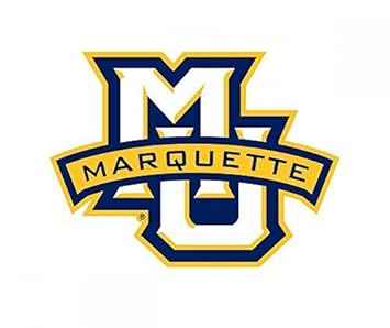
If we just backslid toward a letter with a word in front of it, we would hardly be the only major school to have flown that particular white flag

41GVAnlQlpL._SX355_.jpg
brand.gif
wallpaper_20101001012601_17448780552.jpg
ohio_state_buckeyes_1987-2012_a.png


If that's the direction we decide to go, fine, whatever. That would be my prediction, frankly.

But to the point of grinning and bearing it, I think we underrate our ability to get used to things. For example, here's a logo from a Nike rebrand less than a year before ours:

oregon-state-beaver-face_color_3.jpg


There is no school in the country with more reason to be angry at Nike than Oregon State, for obvious rivalry-related reasons. And this is a very strange effort. Why is it shaped like that!? Everyone made fun of this thing when it debuted, lots of Oregon State fans hated it, and who can really blame them? It looks weird!

But Oregon State had the courage to go all-in. That little fella is on the helmet, he's at midfield, he's at midcourt, he's on every website page, there are other OSU branding standards, but no "other logo" to compete with. The new beaver is the guy. And I would argue that 5 years down the line that it has completely settled in and that's just the OSU logo, as if it had always been there. And if you agree, you would agree for the Shield too. I'm being an annoying parody of myself telling everyone what they actually would think, but I'm right.

Just like West Virginia's homage to the Lynda Carter-era Wonder Woman movies

210527-bigthumbnail.jpg


And Kansas State's wildcat that...um...has a 3-part jaw for some reason?

kansas_state_wildcats-_1989-pres_a.png


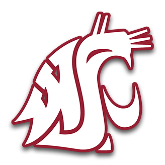
And the oh-so-clever middle school art project at Washington State (which has only been around since 1995, I was shocked by that)

washington_state_football.png


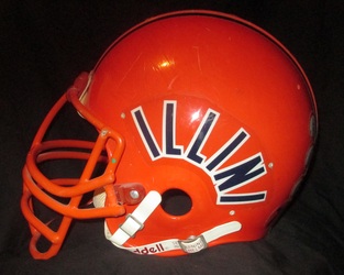
Just stick with anything and it becomes iconic. The problem is that the Block I is too basic to be stuck to, even if the DIA made an effort. It's not that recruits on twitter announcing offers from us sometimes use the old slant Illinois logo, it's that it's every time. I have literally never seen the new block I used one single time. It's not a logo and it's never going to be a logo in the way that term refers to a versatile symbol that is recognizable and usable across contexts.
 
#202      

Hoppy2105

Little Rock, Arkansas
The problem is that the Block I is too basic to be stuck to, even if the DIA made an effort. It's not that recruits on twitter announcing offers from us sometimes use the old slant Illinois logo, it's that it's every time. I have literally never seen the new block I used one single time. It's not a logo and it's never going to be a logo in the way that term refers to a versatile symbol that is recognizable and usable across contexts.

Only sith speak in absolutes.

On the twitter edit of Massey that is currently on the loyalty front page there is a new block I. (White, top right corner mirroring the Miznoz tigger)

While I agree many still use he slant Illinois, I have seen plenty with the new I. Either you exaggerated for emphasis or simply don’t see a lot of these tweets. ;)
 
#203      
On the twitter edit of Massey that is currently on the loyalty front page there is a new block I. (White, top right corner mirroring the Miznoz tigger)

That's an edit by an Illinois-affiliated recruiting-twitter-meme-maker-guy (what a world). But you're right, I'm sure some recruit somewhere used the correct I at some point in the little 3-picture collages that twitter does. But four years after the rebrand, honestly, I probably see correct branding even less than I did in the months after it happened.
 
#206      

mattcoldagelli

The Transfer Portal
Why would we want to model a corporate logo like that, exactly?

“Man, that’s second-rate and embarrassing. No sports organization worth its salt would use something like that.”

“Literally the most valuable sports brand in the world uses something almost jarringly similar.”

“Yeah, well it’s too slick and corporate then.”


Again, it’s *almost* as if people aren’t being entirely forthright with their motivations here.
 
#208      

Deleted member 631370

D
Guest
Because that's the single most popular sports brand in human history?

Listen, I hate the NFL, but what kind of question is that?

Do you honestly think the NFL is successful because of their logo?

Or that adopting some superhero shield logo will make us even the least bit more recognizable?

I guess these are the sorts of conversations that occur on message boards when both major sports are in the total dumps. Blinding flash of the obvious here, but some shield logo wouldn't move the needle of Illinois's brand one iota to anybody outside of this fan base.

If it's aesthetically pleasing to you, great. We all have our preferences. But you should probably leave the conversation there rather than attempt to suggest it would improve our standing in any way.
 
Last edited by a moderator:
#209      
Do you honestly think the NFL is successful because of their logo?

tenor.gif


Or that adopting some superhero shield logo will make us even the least bit more recognizable?

It's funny the way things are seen differently by different people. I don't get the "superhero" connotation at all. Like when I think of the Superman "S" I'm reminded more of the Georgia and Green Bay "G".

I guess these are the sorts of conversations that occur on message boards when both major sports are in the total dumps. Blinding flash of the obvious here, but some shield logo wouldn't move the needle of Illinois's brand one iota to anybody outside of this fan base.

If it's aesthetically pleasing to you, great. We all have our preferences. But you should probably leave the conversation there rather than attempt to suggest it would improve our standing in any way.

I don't want to go to a "we would get recruits and win games if we adopted the logo I like" place with it, because that's both lame and not true.

But at the same time, athletic departments (and pro teams, and corporations, and everybody these days) doesn't do this branding stuff just for kicks. Putting an appealing face forward is worth something. We should get it right. Illinois always gets it wrong, at everything, all of the time, for basically my entire adult life. So of course we've got this right thing staring us in the face and we're doing the wrong thing again. Same old story, a lack of attention to detail and a spirit of "good enough". If we can change THAT, a lot more than t-shirts are going to improve around here.
 
#210      

BananaShampoo

Captain 'Paign
Phoenix, AZ
*types ten million word defense of the Shield*

*takes shower*

*opens dresser drawer*

Oh you know what today is baby

View attachment 3383
Completely forgetting about this ongoing message board debate, guess which shirt I put on today? That's right, my Shield "Fighting Illini" shirt. Shield looks great on the gray shirt background.
 
#212      
It’s no surprise I do not like the shield logo ... looks weak and generic to me ... seems like a lazy attempt at a ‘new’ logo.
With that being said, the smaller it is, the better it is (like as a ‘pride sticker’ on a helmet ... the shield would be a terrible logo decal for a football helmet ... one that would be rediculed by outsiders ... the best Illini helmet decal in the past 50 years (and one that would be far better than the Block I or the shield logo) ... is the curved ‘ILLINI’ decal.
 
#213      
F
It’s no surprise I do not like the shield logo ... looks weak and generic to me ... seems like a lazy attempt at a ‘new’ logo.
With that being said, the smaller it is, the better it is (like as a ‘pride sticker’ on a helmet ... the shield would be a terrible logo decal for a football helmet ... one that would be rediculed by outsiders ... the best Illini helmet decal in the past 50 years (and one that would be far better than the Block I or the shield logo) ... is the curved ‘ILLINI’ decal.
From the 1980's
 
#214      

skyIdub

Winged Warrior
It’s no surprise I do not like the shield logo ... looks weak and generic to me ... seems like a lazy attempt at a ‘new’ logo.
With that being said, the smaller it is, the better it is (like as a ‘pride sticker’ on a helmet ... the shield would be a terrible logo decal for a football helmet ... one that would be rediculed by outsiders ... the best Illini helmet decal in the past 50 years (and one that would be far better than the Block I or the shield logo) ... is the curved ‘ILLINI’ decal.

7093799.jpg


So, you were stoned for most of the 80's? Or blind? Both?:LOL:

It's like they let grade schools across C-U hold a helmet art lettering contest and the 3rd graders won.
 
#217      
These concept uni's were being floated around just before the rebrand ... I like the ILLINI decal (and its placement) on the helmets ... I still say something like this for a helmet decal would be better than the block I or the shield.
image.jpg
 
#218      

wILL-INI

Charlotte, NC
These concept uni's were being floated around just before the rebrand ... I like the ILLINI decal (and its placement) on the helmets ... I still say something like this for a helmet decal would be better than the block I or the shield.View attachment 3386

I mean, I dont know about you guys. But I agree with this! ;)
 
#221      

Deleted member 654622

D
Guest
Wow this was a long discussion this weekend I missed. I am going to be lazy and not read all these. Then leave my opinion and probably ignore anymore comments. Like a normal American

The Block I looks good on the helmet. Doesn't mean it should be the one and only logo. The slant Illinois sucks. Good Day
 
#222      
My expectations are incredibly low after enduring this most of the time when I was growing up:

UI_logo.png


Absolutely and pathetically horrible. Say what you want about The Shield™ , but it doesn't look wimpy and insecure to me like ILLINOIS (LOL, it's like a kid using Miscrosoft Word REALLY wanted to emphasize this so he made it bold, italic AND underlined) on the Block I does. I am a straight-up Illini apologist in real life, so I will learn to tolerate whatever we do and won't spend time openly dissing our uniforms in front of non-Illini fans. However, I think the ones we had last year with the shield on the chest were the best we've had in a long time. I would still really like to see us settle on a World War I style secondary logo, but that is probably wishful thinking at this point.
 
#223      

BZuppke

Plainfield
Lots of good discussion here - does anyone remember the all white uniforms we wore after the re design I believe it was at Nebraska. I recall white helmets with silver I’s. Did I dream this?
 
#224      

ILL in IA

Iowa City
Lots of good discussion here - does anyone remember the all white uniforms we wore after the re design I believe it was at Nebraska. I recall white helmets with silver I’s. Did I dream this?
I thought we had a stormtrooper all-white look in Iowa City. I think it was year 1 under Lovie. But it did not have a silver I.
 
Status
Not open for further replies.