Illini_1979
- Oregon
We need a poll.
Anybody?
Anybody?
We need a poll.
Anybody?
")
I'm a sucker for these classic designs. This looks awesome.The new uni set would be greatly improved with some sort of striping. Also, I think there’s an opportunity to blend traditional elements with the current branding with something like this:


Sent from my iPhone using Tapatalk
I'm a sucker for these classic designs. This looks awesome.
I'm a sucker for these classic designs.
I see your point. Too many modern elements in Hawk19's design to call it truly "classic." I said classic because the stars over the number on the side of the helmet is a totally retro/vintage design.I really just cannot understand how a busy, cluttered, thoroughly modernized mishmash of random elements gets coded as "classic" while just copying the Butkus-era jerseys to the stitch is "there goes Nike again with their hoverboards and their vape pens".
It's everything to do with the source and the perceived intent clearly. Something to learn about sociology there I suppose.
(For the record, I don't want to be taken to criticize anyone who uses their artistic skills to mock up their ideas for us. I thank those people and admire their skills greatly as someone who can't draw a stick figure.)
Any chance the university revisits these incredibly ugly uniforms and tweaks them a bit? Really, really hope so....
IDK- hard to roll back a design that you just publicized so heavily.
But fixing the helmet decals is easy, quick and cheap. Is there some DIA directory where I can email the equipment staff?
But fixing the helmet decals is easy, quick and cheap. Is there some DIA directory where I can email the equipment staff?
Had a dream I saw us playing in the new jerseys and they looked better on tv. Hope that comes true
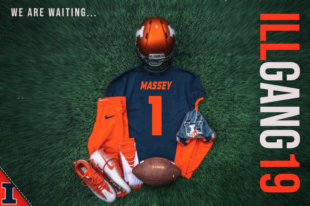
This might just be a photoshop, but could they be using the new font as the NOB.
I like it? I'm surprised that I do.
The evidence that the font looks better when it's the same color as the numbers is becoming overwhelming.
Still don't like the metallic helmets.
The above helmet does not look to be the same as the most recent uniform release...
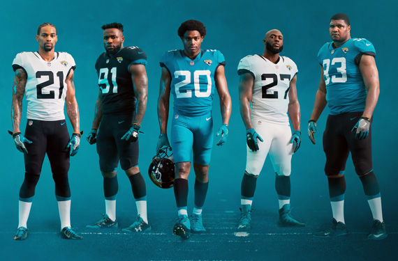
https://www.forbes.com/sites/demetr...look-with-new-football-uniforms/#6a7ceaf3e1aa
Now if you'll excuse me I'm going to go jump off a bridge after being reminded of the orange block I border against an orange helmet shell.