TheBossIllini
T
Guest
Football uniforms are pretty decent
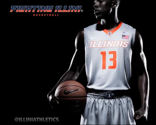
White Football jerseys and Silver Basketball jerseys are awesome. Others are good but not great.
What silver jerseys?
Football uniforms are pretty decent
White Football jerseys and Silver Basketball jerseys are awesome. Others are good but not great.
* All the uni's looked good in artwork but on the athletes themselves...nothing special.
The Good -
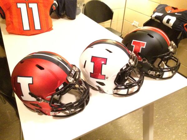
* Football uni's are nice. Matte finish helmets are sweet.
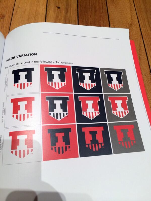
* I can get on board with the victory shield
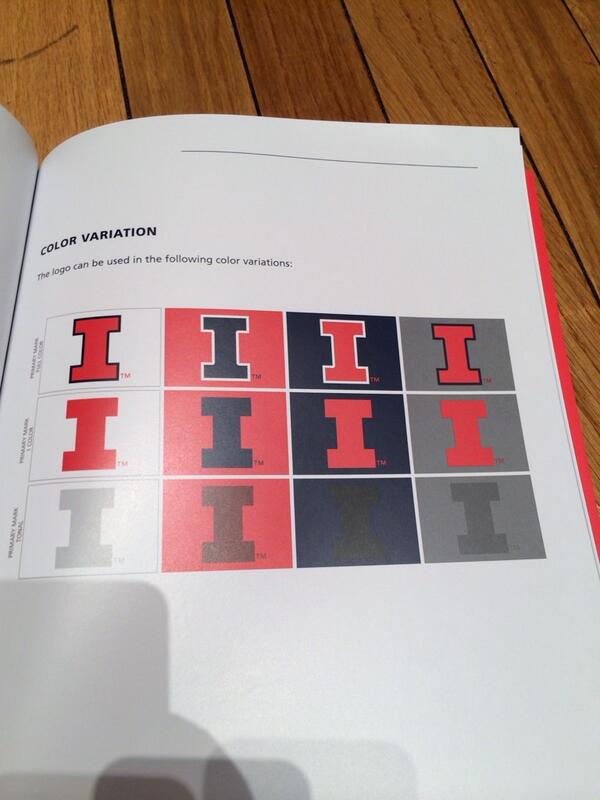
* Two-tone treatment of "Illinois" is interesting
The Bad -
* The zig zags remind me of those zubas pants
* All the uni's looked good in artwork but on the athletes themselves...nothing special.
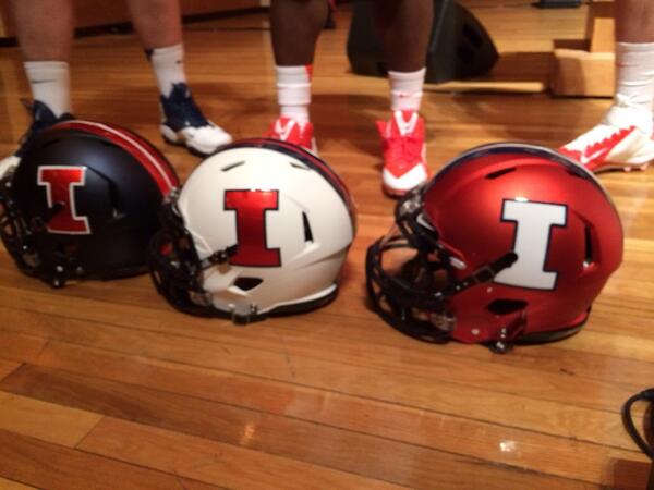
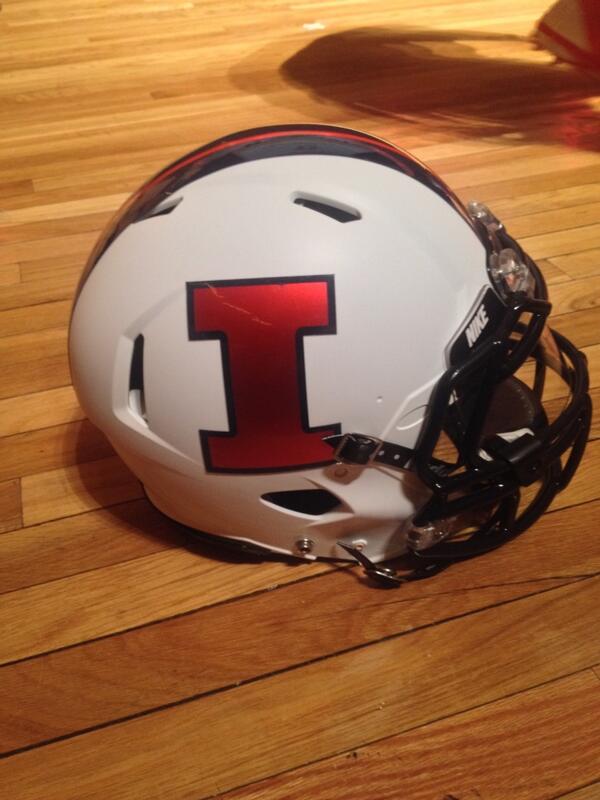
Maybe the lighting made the I look blue because Illinois just posted pictures that had the orange I on both sides of the helmet.
No.i called it.its a lighting bolt. Rest of it good for hoops. But way to much going on w the side panel!! Epic failure!!! W the side panel.period.reminds me of depauls.bad! I'm pretty sure however that can b changed in the future. It's not a primary or secondary logo it a design they can an sure will. No fighting illini another epic failure. Jmho
Looks like the orange block I on the white helmet is chromed too? or is the helmet just shiny?
The Champaign Room @Champaign_Room 1m
"This white is niiiice." -@Donovonn_Young pic.twitter.com/C6fUbLX35i
Josh Getzoff @JGetzoffWICD 58s
Spoke w/John Groce. Told me his favorite jersey isn't available to eyes yet. "We still have some tricks in our pocket." Fighting #Illini?
What silver jerseys?
Illinois Basketball @IlliniHoops 4m
New gray alternate uni to go along with the usual white, orange & blue. #Illini @Nike pic.twitter.com/N84q2o3r7T
Nice helmets. I just don't like Illinois in blue helmets. Save that for the Bears. Orange and white are both great. I like that the "I" on the orange helmet is white.
Silver one or something more???