It's so bad, though. My god, look at that 4.
Forsaking that though I would give the overall an 11?
It's so bad, though. My god, look at that 4.
Hopefully, whatever change takes place, I hope that it surpasses the last rebrand.


To be impossibly pedantic, new uniforms would not be a rebrand. The rebrand is just the standardization of colors and logos and typefaces. Where we choose to go uniform-wise within that "brand" can and will continue to change and evolve. Baseball, for example, has moved on from the initial uniforms that came out after the rebrand, and IMO they look fantastic
What was once a mishmash that had nothing in common with the rest of campus:
The Illini are starting to reap the rewards in recruiting from the subliminal message (Illinois is #1) in the new font, and now you guys want to get rid of it???
TownieMatt, your F looks weak, like it's already lost the fight before it even began. Hardly the kind of character I want leading the Fighting Illini. The new F, now that's a character with some fight in it. It's angled, as if it's rearing back to clock your weak sauce F in its ugly face. In fact, it looks like it stole part of your F and is flaunting it. Yeah, we know who is #1.
My favorite jersey styles I saw this year were the
FGCU "eagles" ones in cursive
Loyola (Chi) cursive ones
Something simple and traditional that says "fighting illini" would be awesome IMO.

My favorite jersey styles I saw this year were the
FGCU "eagles" ones in cursive
Loyola (Chi) cursive ones
Something simple and traditional that says "fighting illini" would be awesome IMO.
:hurl:cursive
The Illini are starting to reap the rewards in recruiting from the subliminal message (Illinois is #1) in the new font, and now you guys want to get rid of it???
TownieMatt, your F looks weak, like it's already lost the fight before it even began. Hardly the kind of character I want leading the Fighting Illini. The new F, now that's a character with some fight in it. It's angled, as if it's rearing back to clock your weak sauce F in its ugly face. In fact, it looks like it stole part of your F and is flaunting it. Yeah, we know who is #1.
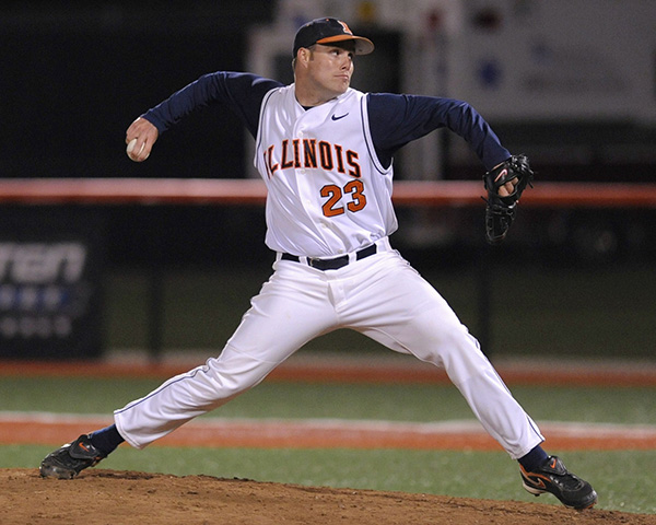
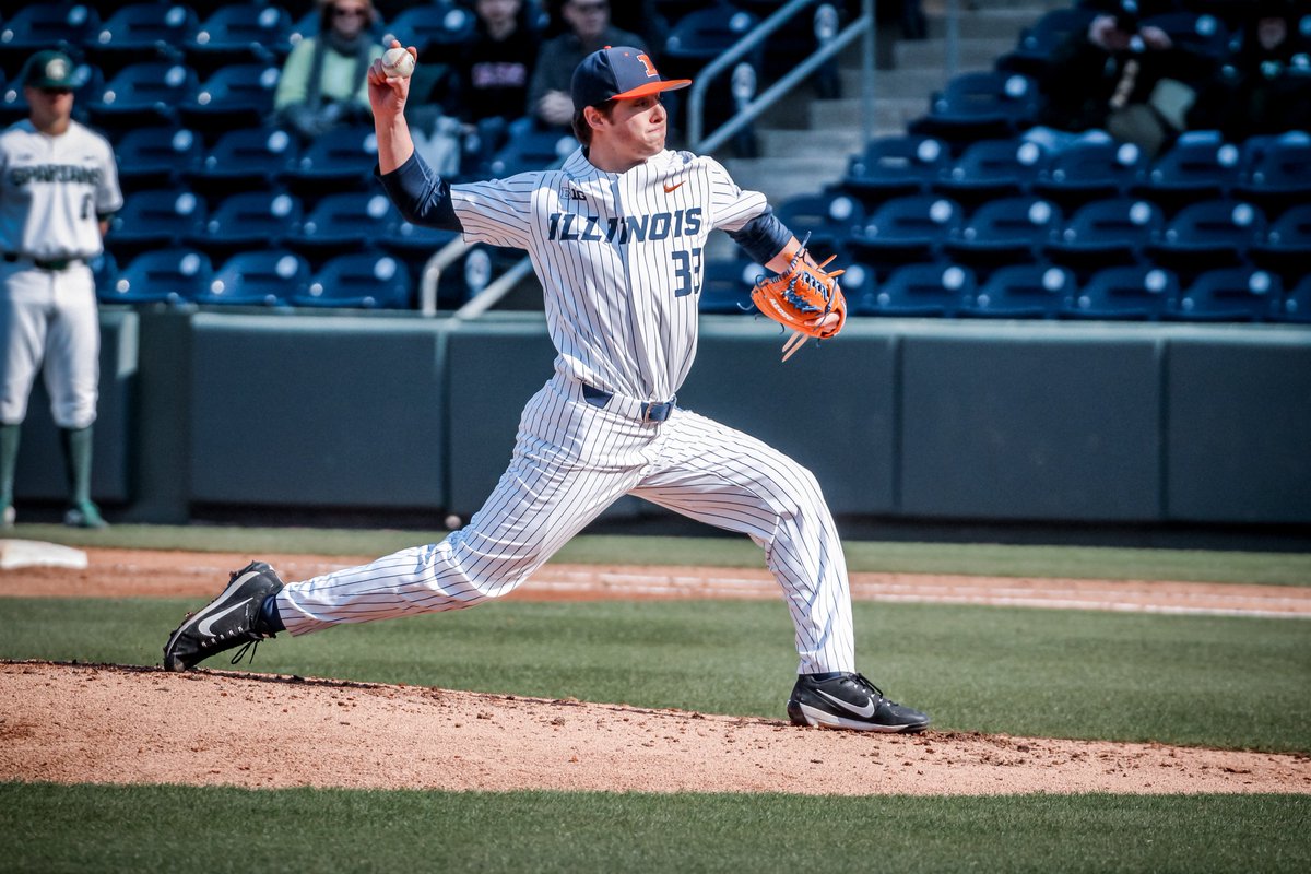
I'll avoid quoting S&C's post due to the pictures but yes - the key is to thread the needle of being consistent while taking advantage of certain sport-specific opportunities (like pinstripes for baseball).
Bravo, sir.I see what you did there. This whole thread seems to be about patching the holes in our brand image. Stitching together uniforms from various branding scraps will never work as well as a whole cloth approach. And we can't just pin our hopes on some brand manager, or let Nike fleece us. Darn it, we need to stop hemming and hawing, and get this ironed out. I know it may seam silly, but this issue can be wooly. If we have to needle the DIA, pipe up and interface with Whitman, or just spool up a bunch of suggestions, then sew be it. If we do it right, our branding could really surge forward.
Just thinking out loud, would having the letters and the numbers in the same color like they are on those baseball uniforms tone down the kinda-Poochie aggressiveness of the font a little bit?
I don't suppose any of our illustrious design heads could mock that up?
Sorry for the thread drift.....but I saw those baseball pictures and noticed the glove....now I want one of these so bad.
Get on 44progloves.com
Pretty awesome custom made gloves...if your in to that sort of thing
I see what you did there...
I see what you did there. This whole thread seems to be about patching the holes in our brand image. Stitching together uniforms from various branding scraps will never work as well as a whole cloth approach. And we can't just pin our hopes on some brand manager, or let Nike fleece us. Darn it, we need to stop hemming and hawing, and get this ironed out. I know it may seam silly, but this issue can be wooly. If we have to needle the DIA, pipe up and interface with Whitman, or just spool up a bunch of suggestions, then sew be it. If we do it right, our branding could really surge forward.
Just picking a knit, but I would have spelled it "serge". Otherwise, brilliant. :thumb:
